Page MenuHomePhabricator

Components Guidelines: Explore solutions to make its images easier to maintain
Closed, ResolvedPublicSpike

Description

Background goal

Now that we've implemented the component guidelines for each component in the Codex site, we need to make them more maintainable for both designers and developers since:

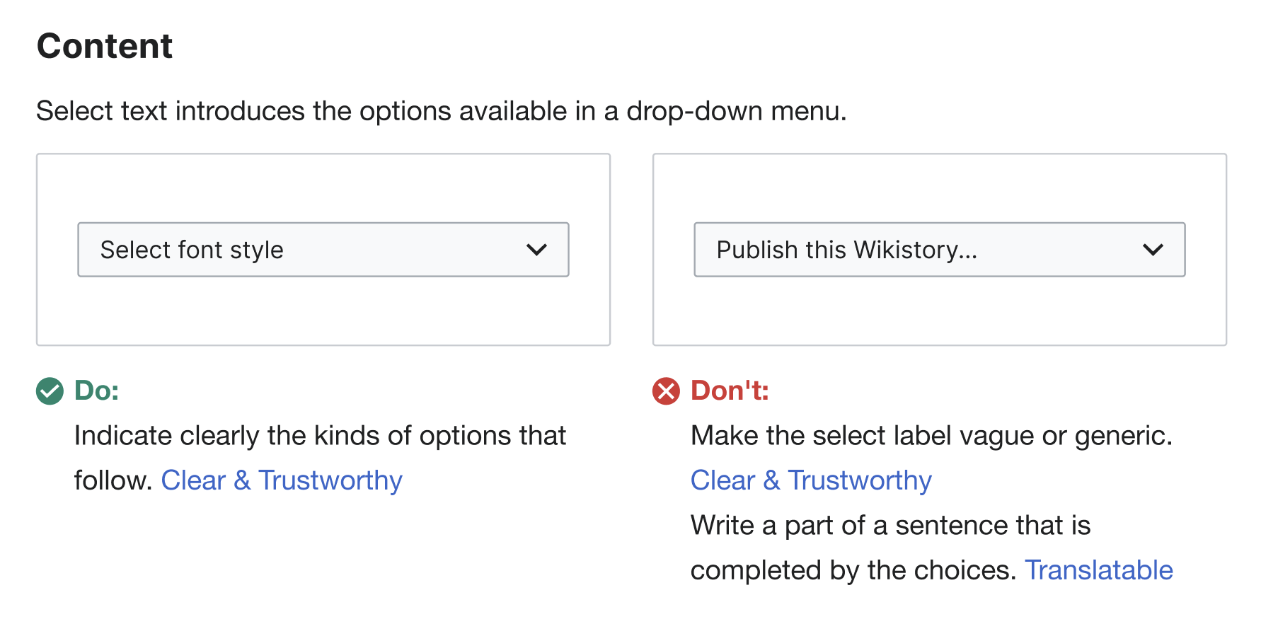
  • These guidelines are illustrated using SVG images, so every time we update a component or we fix an error in the Figma component, we need to update the images design, export them as SVG and update them in the Codex site. This requires both design and development work.
  • There are often errors in the exports of these SVG images, making them harder to maintain as we need to update them frequently.

Given that the component guidelines in Codex should be the source of truth for users to understand how a component behaves and its different use cases, we should make them easier to maintain.

Possible solutions

  1. Replace the images in the components guidelines with coded demos (as we do in the "Demos" section). This will ensure that the component examples are automatically updated when we update them in code.
  2. Replace images with embedded Figma links
  3. Avoid using images to illustrate the guidelines as much as possible, using them just when they are really needed.

Open questions

Acceptance criteria

  • Explore possible solutions to make the components guidelines more maintainable in the Codex site
  • Discuss solutions with the DST and decide on the best solution

Future tasks

Event Timeline

bmartinezcalvo renamed this task from Components guidelines in Codex: Find solution to make them easier to maintain to Components guidelines in the Codex site: Find solution to make them easier to maintain.Jan 22 2024, 9:53 AM
bmartinezcalvo updated the task description. (Show Details)
CCiufo-WMF renamed this task from Components guidelines in the Codex site: Find solution to make them easier to maintain to Explore solutions to make the component guidelines easier to maintain.Jan 22 2024, 4:30 PM
CCiufo-WMF changed the subtype of this task from "Task" to "Spike".
CCiufo-WMF updated the task description. (Show Details)
bmartinezcalvo renamed this task from Explore solutions to make the component guidelines easier to maintain to Components Guidelines: Explore solutions to make its images easier to maintain.Feb 15 2024, 5:01 PM
bmartinezcalvo updated the task description. (Show Details)

After exploring various solutions to simplify the maintenance of our component guidelines images, here are the options I've identified:

Op.1: Replace the images with coded demos

Captura de pantalla 2024-02-16 a las 13.10.14.png (882×1 px, 121 KB)

Pros:

  • The demo will be automatically updated every time we update the component in code.
  • Responsiveness will work properly in these demos.

Cons:

  • Demos don’t cover all our needs (e.g. they cannot be used to illustrate the “Specifications” or “Interaction States” sections), So we will need to create some images anyway.
  • The component in the demo will be displayed in its default state (e.g. collapsed). So in case we need to represent an expanded or active state in the guidelines, users will need to interact with the demo to understand how the component behaves.
  • We will need support from developers to create the demos for the first time we include the demos in the Guidelines. Then the demos included will be automatically updated. |
Op.2: Embed Figma (example)

Captura de pantalla 2024-02-15 a las 18.57 1.png (280×498 px, 11 KB)

*We need to ensure the Figma file containing the embedded Figma frames is made public so that any user can access the embedded view. I'm not sure if this might cause any additional issues, but I wanted to mention it here just in case.

Pros:

  • We can easily include any type of image, so embedded Figma images cover all our needs (including the “Specifications” or “Interaction States” sections).
  • Embedded images will be automatically updated when we update its design in the Figma frame embedded.
  • Responsiveness will work properly since the user can zoom in and out on them.

Cons:

  • Load Time: Large Figma designs can increase page load times. We will need to optimize the size of the embedded frame or use lazy loading techniques.
  • Accessibility: how we can include Alt text within an embed Figma?
Op.3: Just use images when they are really needed (example)

Captura de pantalla 2024-02-16 a las 13.12.54.png (480×1 px, 80 KB)

Pros:

  • Easier to maintain: guidelines will be easier to maintain since they will be mostly text.
  • We can design any type of image if needed, so we can cover all our needs (including the “Specifications” or “Interaction States” sections).

Cons:

  • Guidelines will be less visual in some cases: Since they will be text in mostly of the cases, they will be less illustrative. The user could play with the demo, but they might need visual representation in other cases.
  • Hard to maintain: although we would reduce the use of images, these will need to be updated anyway if we update the component. We will need to be careful with its SVG export as well to avoid export errors.
  • Responsiveness: the images used in some of the guidelines will not be enough readable on mobile in some cases.

After analyzing all the options, it seems Option 2 (Figma embed) is the best one in terms of maintainability, but it might not be the best one in terms of visibility or accessibility. So in case we want to use embed Figma images, we should test this in some way before implementing it in al components pages in Codex. @mwilliams let me know your thoughts.

@bmartinezcalvo Option 2 seems super reasonable to me! I haven't seen this done in practice - like you've mentioned, perhaps testing this for a certain component and sharing back here might be the best way to ensure this is the right decision.

@bmartinezcalvo Option 2 seems super reasonable to me! I haven't seen this done in practice - like you've mentioned, perhaps testing this for a certain component and sharing back here might be the best way to ensure this is the right decision.

Thank you @mwilliams. As decided during the DST Sprint Planning, we are going to solve this sprint task since the explorations have been completed. I've filed this new task T358027: Components Guidelines: test Figma embeds in one component's page to create a patch with a component's demo using Figma embed instead to test if it will work properly. And then we will decide if we want to replace all guidelines images with Figma embed.

Since we explored Figma embeds in T358027 and we decided to refrain from using them due to the load time, we will continue utilizing images in the guidelines for now since it seems that there is currently no better alternative.

Considering that we are actively contributing patches to improve Codex design guidelines, it would be beneficial to streamline the workflow for updating images so we can simplify the process for designers when updating images for component guidelines, reducing optimization issues or errors during the patch submission for image updates.