Background
We would like to finalize the language and copy for the final version of the settings menu
Acceptance criteria
- Write and test the copy for the settings menu prior to beta release
| ovasileva | |
| Nov 15 2023, 1:57 PM |
| F41524037: Screenshot 2023-11-22 at 8.53.54 AM.png | |
| Nov 22 2023, 6:07 PM |
| F41524035: Screenshot 2023-11-22 at 8.55.24 AM.png | |
| Nov 22 2023, 6:07 PM |
| F41524033: Screenshot 2023-11-22 at 8.54.07 AM.png | |
| Nov 22 2023, 6:07 PM |
We would like to finalize the language and copy for the final version of the settings menu
| Status | Subtype | Assigned | Task | ||
|---|---|---|---|---|---|
| Open | Jdrewniak | T341631 [EPIC] Q1 Main hypothesis: Typographical and palette customizations | |||
| Open | Jdrewniak | T313828 [EPIC] Typography: improve typography and allow for variable typography settings | |||
| Duplicate | Florian | T50946 Add font size adjustment feature | |||
| Duplicate | Jdlrobson | T91201 [GOAL] Accessibility settings/preferences on desktop and mobile | |||
| Open | Jdlrobson | T345359 [Goal] Allow logged-out and logged-in users to set preferred typography | |||
| Resolved | ovasileva | T351307 Finalize language and copy for typography settings | |||
| Resolved | ovasileva | T351867 Update copy for typography settings |
@ovasileva and I jammed on these and put them through a bunch of iterations. Our guiding principles were clarity, translatability, accessible reading level, and carrying over existing labels on similar elements. Here's where we landed:
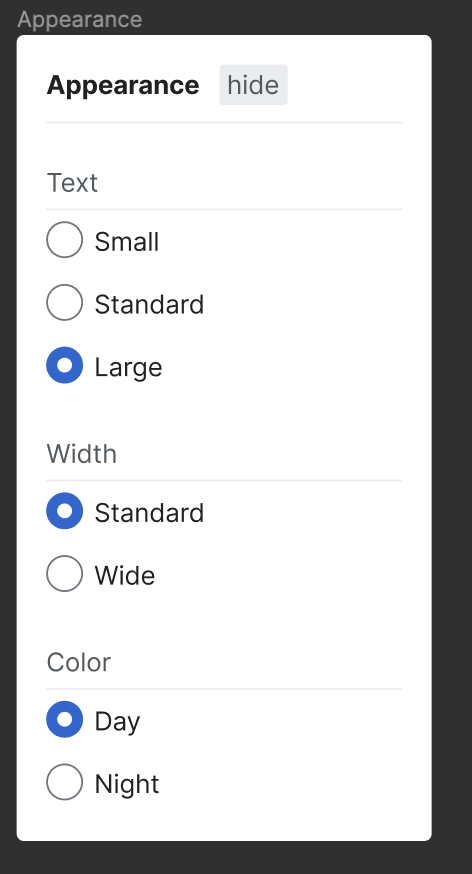
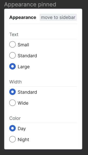
"Appearance" is already in use and translatable. It creates some ambiguity with the existing appearance menu in settings and gadgets, but those areas are already very confusing, and there's no reason not to use the label in this prominent place because it's being misused in less prominent places.
Fo the typographic settings, Text was the clearest label that has the most literal reference to the function.
The word "standard" is used as a gentle nudge showing that these are the WMF-recommended settings.
We didn't use "dark mode" or "light mode" because "dark" has a lot of value-laden connotations in the languages we speak and would presumably be so for other languages as well. Night/day is a very translatable label that we assume has less fraught value connotations across languages.
LGTM. Olga we should create a ticket for changing the labels, or fold this acceptance criteria into T351141
Set up T351867: Update copy for typography settings for implementation. Resolving this one. Thanks @JScherer-WMF!
The word "standard" is used as a gentle nudge showing that these are the WMF-recommended settings.
The default option for text is small though? I hardly doubt the font-size of standard is WMF-recommended.
@Sjoerddebruin - thanks for your comment. If you're curious, we've published some of the literature review and research we did with communities on the project page. You will find more details on the new standard recommendation there.