Page MenuHomePhabricator

Field: demo with horizontal layout is broken
Closed, ResolvedPublic3 Estimated Story PointsBUG REPORT

Description

Steps to replicate the issue (include links if applicable):

What happens?:

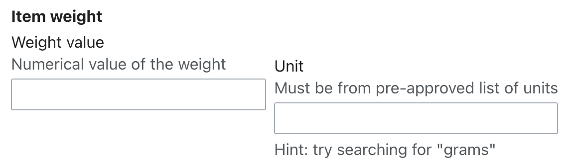
The horizontal layout is broken due to a margin-top on the second field:

image.png (330×1 px, 44 KB)

What should have happened instead?:

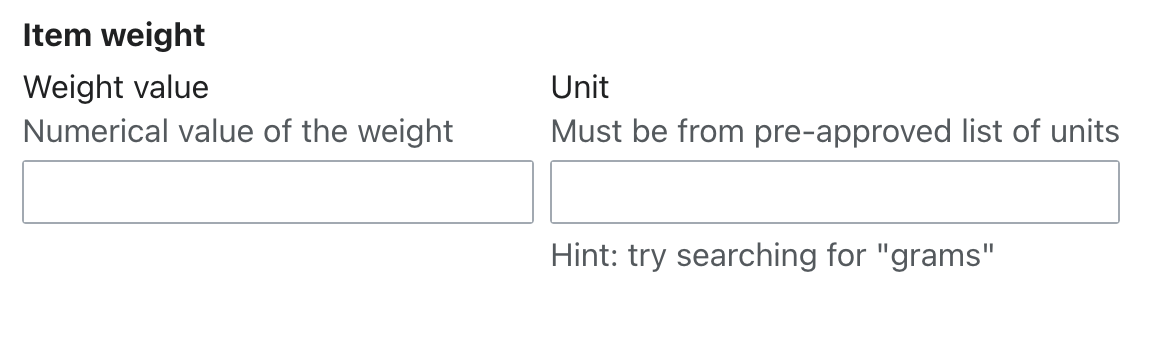
The two fields should appear vertically aligned to the top:

image.png (342×1 px, 41 KB)

Software version (skip for WMF-hosted wikis like Wikipedia): Codex 1.3.5


Solution

We need to determine how to solve this—is it an issue with the margin-top placed on fields in Codex, or an issue with this specific demo?

We do not explicitly support horizontal field layouts at this time. The new margin for fields only takes into account a vertical layout. If we want to continue this paradigm, we should simply add a style to the demo to remove the margin-top of the second field.

However, if we want to at least improve support for horizontal field layouts, which we do recommend in the field/form guidelines, we should reconsider the margin-top. Some other options:

  1. Use a margin-bottom instead (removing it on the last field). This would make horizontal layouts appear less broken, but the margin-bottom would still be problematic in the case that the last field is longer (taller) than the ones next to it, yet it has no margin-bottom, so the spacing between the horizontal field layout and whatever's below it is too small. The demo in question is an example of this - if it had, say, another fieldset below it, the margin between the two fieldsets might appear too small, since the "Weight value" field's margin-bottom doesn't start below the "Unit" field's help text.
  2. Set the vertical margin by default, but add an option to set a horizontal margin instead

I think a combination of these might be ideal. However, since we haven't determined exactly how to support horizontal field layouts in Codex, I recommend we just do the first one for now.


Acceptance criteria

  • Agree on a solution and document it in this task
  • Implement the solution

Event Timeline

AnneT added subscribers: lwatson, Volker_E, Catrope.

Tagging @lwatson, @Catrope, and @Volker_E since y'all have discussed this margin recently. I don't know exactly why it was implemented the way it was, so please feel free to update my opinionated summary in the task if you have more insight!

Thanks for filing this @AnneT - We discussed approaches to add spacing between Fields but didn't account for horizontal Field layouts. Margin-top was considered the best approach - but only for vertically stacked Fields.

Following the new Constructing forms guidelines, the padding between elements within a module grouping multiple fields and/or actions should use the spacing-100 token (equivalent to 16px in the default Codex theme). So we should increase the padding between these 2 fields in the set:

image.png (342×1 px, 41 KB)

cc: @DTorsani-WMF

@bmartinezcalvo Thanks for adding this spacing guideline. That is true. 16px is the spacing between fields within a fieldset, since they are more closely related, with 24px being the default spacing between fields. That being said, we may want to update this guidance for ease of implementation and a more consistent visual flow, since then some fields would be spaced slightly differently even when vertically stacked just because they're in a fieldset, which might look a bit unintentional.

In case it's relevant here: the spacing between fields on the login form is currently 15px. I have a temporary override in place to keep that the same for now, but if we remove that and let Codex's default behavior take over, then the spacing between each of the fields on the login form would be 24px, which does look pretty spacious.

Thanks for testing this @Catrope. Are you specifically testing this spacing between horizontal fields or also vertically stacked fields?

That comment was about vertically stacked fields, which is why I wasn't sure it was relevant. To see the login form thing that I'm talking about, compare the current appearance of the login form (with the legacy 15px spacing) with this demo of what the login form would look like if we removed the legacy styles and allowed Codex's default field styles (with 24px spacing) to apply. I brought it up mostly because, if there's any discussion of reevaluating the 24px spacing and perhaps changing it to 16px, then that might affect what we do with the login form and how carefully we roll it out (16px is so close to the existing 15px that we wouldn't expect anyone to notice, whereas 24px would be a visible change to a prominent form).

image.png (576×407 px, 27 KB)
image.png (645×407 px, 27 KB)
Current appearance (15px spacing)Codexified appearance (24px spacing)

That's a great point. Thanks for demonstrating this. I think changing this to be 16px between fields is the right solution. We will need to update the forms guidelines on the docs site but I can take care of that.

Here is the task for updating this which I will work on.

Change #1017184 had a related patch set uploaded (by VolkerE; author: VolkerE):

[design/codex@main] docs: fix nested Fields vertical alignment

https://gerrit.wikimedia.org/r/1017184

Change #1017184 merged by jenkins-bot:

[design/codex@main] docs: fix nested Fields vertical alignment

https://gerrit.wikimedia.org/r/1017184

Change #1020918 had a related patch set uploaded (by Eric Gardner; author: Eric Gardner):

[mediawiki/core@master] Update Codex from 1.3.6 to 1.4.0

https://gerrit.wikimedia.org/r/1020918

Change #1020918 merged by jenkins-bot:

[mediawiki/core@master] Update Codex from 1.3.6 to 1.4.0

https://gerrit.wikimedia.org/r/1020918