Page MenuHomePhabricator

Prototype an improved version of Recent Change designs
Closed, ResolvedPublic

Description

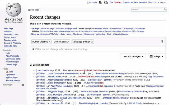
Based on research observation on users use of our initial prototype for Recent Changes designs (T142785), we identified several areas to improve: filter navigation (T147549), combining filters and highlights (T147351), and using multiple highlights (T147295).

The following improvements are proposed:

From T147549: Design a way to better discover and navigating between filtering and results:

  • Separate tags from the filter entry point to make it easier to access.
  • Provide an option to clear all filters to facilitate repetitive use.
  • Make the filter invite more explanatory to indicate users can either browse or start typing to get results.
  • Make the filter panel less wide to facilitate navigation between filtering and the results as well as anticipating the effect of changes.

From T147351: Design a way to help users understand the difference between Highlighting and Filtering, and to use both effectively:

  • Provide a separate highlight mode in the filtering menu to avoid confusion with filtering.

From T147295: Design a way to better orient users when combining multiple highlights:

  • Use color bullet points to signal individual highlight colors.

Updated prototype

You can check the updated prototype or view the quick screencast below:

highlight-proto-small.gif (14 MB)

(view in full size at F4584506 )

Related Objects

StatusSubtypeAssignedTask
Resolved DannyH
Resolved DannyH
Resolved jmatazzoni
Resolved jmatazzoni
ResolvedMooeypoo
ResolvedMooeypoo
ResolvedSBisson
ResolvedMooeypoo
ResolvedMooeypoo
ResolvedMooeypoo
ResolvedMooeypoo
ResolvedMooeypoo
Resolved Mattflaschen-WMF
ResolvedSBisson
Resolved jmatazzoni
ResolvedMooeypoo
ResolvedMooeypoo
ResolvedMooeypoo
Resolved jmatazzoni
ResolvedMooeypoo
Resolved jmatazzoni
ResolvedSBisson
ResolvedMooeypoo
ResolvedMooeypoo
ResolvedMooeypoo
Resolved jmatazzoni
Resolved jmatazzoni
OpenNone
ResolvedMooeypoo
Resolved jmatazzoni
ResolvedMooeypoo
ResolvedMooeypoo
DeclinedNone
ResolvedMooeypoo
ResolvedMooeypoo
Resolved Mattflaschen-WMF
Resolved jmatazzoni
ResolvedNone
InvalidNone
ResolvedSBisson
ResolvedMooeypoo
Resolved jmatazzoni
ResolvedSBisson
ResolvedCatrope
Resolved jmatazzoni
ResolvedSBisson
ResolvedPginer-WMF
DuplicateNone
ResolvedPginer-WMF
Resolved jmatazzoni
ResolvedTrizek-WMF
ResolvedPginer-WMF
ResolvedCatrope

Event Timeline

The the updated prototype has been completed with the changes discussed.

In the process, we decided to go with solution #3 for T147351: Design a way to help users understand the difference between Highlighting and Filtering, and to use both effectively, since the drawbacks of a separate highlight menu (as in solution #2) became more apparent as we reviewed the the initial iterations on the prototype.

I added the info to the ticket description with a quick screencast to illustrate some of the changes.

I've played with the prototype.

Do the following action is illogical to me:

  1. select various filters
  2. find somewhere it is possible to highlight them (I've searched because I knew it was possible), on the top of the list
  3. activate highlights
  4. go back and find on the list the choices I've made before (long list, no highlight until you guess it is possible to click on the filter to go to it on the list)

Not easy.

The problem of filtering and then highlighting is complicated. If we want to have filtering first, shouldn't give the opportunity of highlighting when 2 or more filters are selected?

And still that melted colors issue.

Thanks for the input @Trizek-WMF

There is still an open question about how much prominent should "highlighting" be. As an auxiliary layer of information you may not need it for simple cases where you want the list of contributions that meet a given criteria.

There are several options to make the highlighting option more prominent and easier to reach such as making the header area of the filter panel to become sticky. That however comes at a price of leaving less room for the filters which are the main element in most cases.

There is also a bug that made the panel to remain at the previous scroll position when you close and reopen it, which was making the highlight option to go out of sight much easily. That is now fixed in the prototype.

The problem of filtering and then highlighting is complicated. If we want to have filtering first, shouldn't give the opportunity of highlighting when 2 or more filters are selected?

We want to support also the case of highlighting based on criteria that you are not filtering. For example, you should be able to filter for damaging edits and additionally highlight those cases where editors are newcomers but viewing also results of damaging edits made by more experienced users.
Given that it is complicated to anticipate the ways filters and highlights may be combined (and communicate that in an effective way) we opted for providing highlights as an optional layer that is secondary but independent from filtering.

And still that melted colors issue.

We are watching close in our new research round to see how T147295 helps clarifying things or not.

Although we continue to touch up the prototype, the prototype in general is in a state that feels relatively complete—and it's posted on a wide variety of tickets. So I'm closing this task. Feel free to reopen if you object.