Page MenuHomePhabricator

Design a way to help users understand the difference between Highlighting and Filtering, and to use both effectively
Closed, ResolvedPublic

Assigned To
Authored By
jmatazzoni
Oct 4 2016, 8:03 PM
Referenced Files
F4581211: RC2-filter.png
Oct 10 2016, 11:37 AM
F4581207: RC2-initial.png
Oct 10 2016, 11:37 AM
F4581219: RC2-highlighted.png
Oct 10 2016, 11:37 AM
F4581217: RC2-filter Copy.png
Oct 10 2016, 11:37 AM
F4581209: RC2-filter.png
Oct 10 2016, 11:37 AM
F4559616: Highlight-integrated-step6.png
Oct 5 2016, 1:20 PM
F4559623: Filter-Highlight-integrated-step3.png
Oct 5 2016, 1:20 PM
F4559621: Filter-Highlight-integrated-step2.png
Oct 5 2016, 1:20 PM

Description

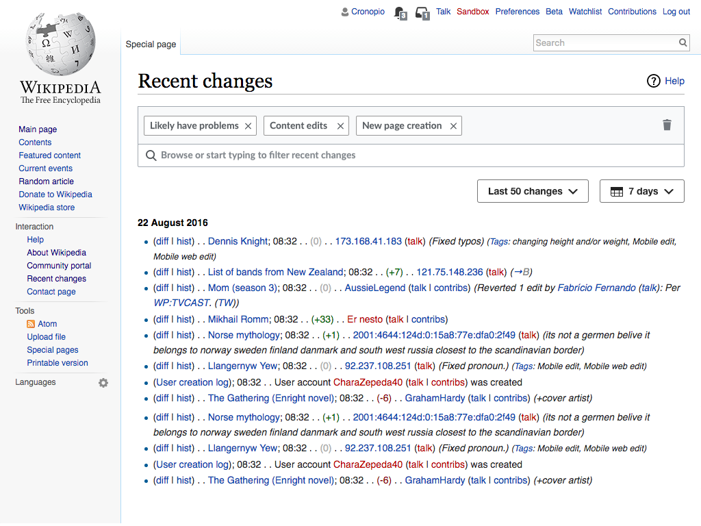
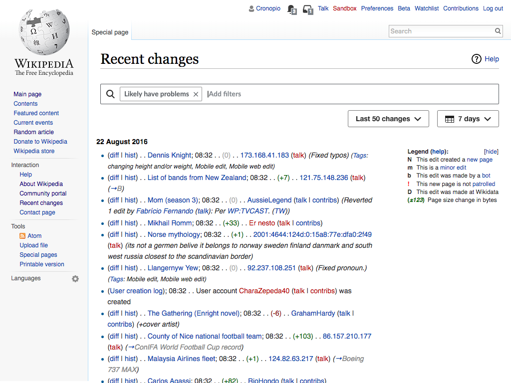
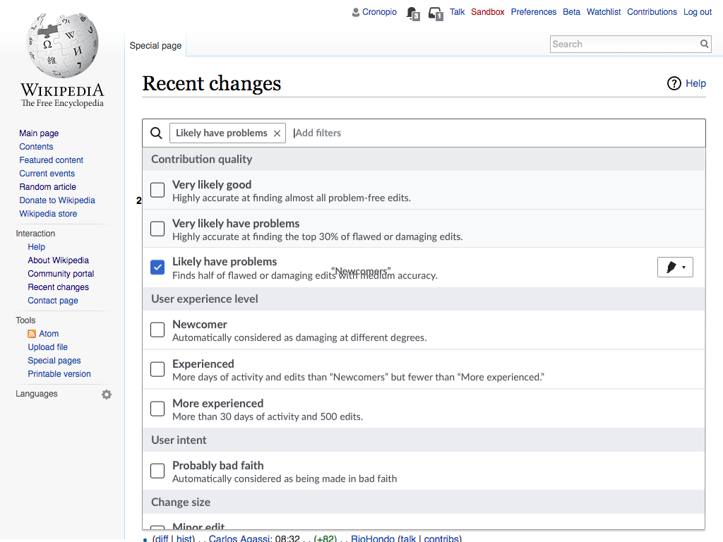
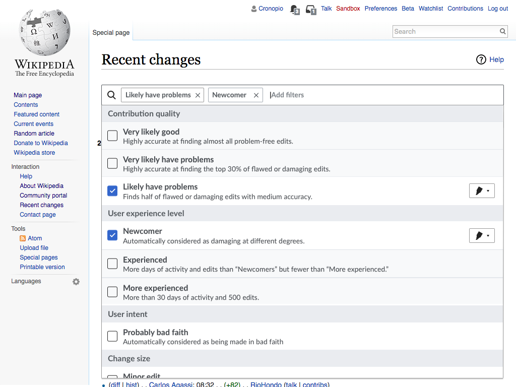
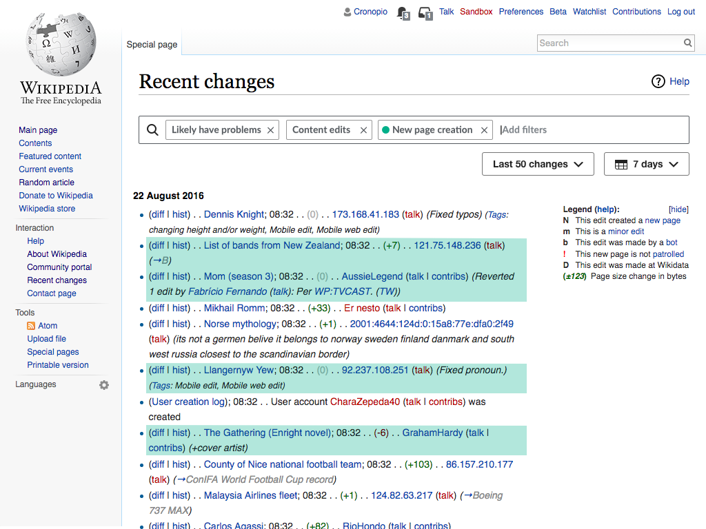
As part of the new designs proposed for the Recent Changes page (T142785), users can highlight the results in the list of recent changes to better focus on specific aspects as they process the list (see the current prototype). It sometimes happens, however, that users want to highlight a quality that they don't necessarily want to filter for (especially because, when filters in different groups are selected, the system returns only the intersection of both) To get around this limitation, an "ignore filtering" button was added. This is a helpful option, but in early testing users experienced a number of difficulties, some of which are described below. This task will explore solutions to these issues.

The problem

We want users to combine filters and highlights in useful ways, understanding the possibilities and when to apply each. We have identified issues at different levels:

  • Problem #1: Discovery of the ways to combine filters and highlights Users make their filtering choices inside the filtering dropdown. When getting to the list of results, even if they realise they do not meet their expectations, it is not clear where to go to change that.
  • Problem #2: Understanding the need for controlling filter behaviour The concept of "ignore filtering and just highlight" is an unusual one which makes it hard for users to figure out that is what they need in the corresponding scenarios.
  • Problem #3: Provide enough flexibility The interaction of filtering and highlighting can be complex, with numerous opportunities for users to get results that they weren't intending. In some cases users want highlights to be considered when filtering while it is not desirable for other contexts as illustrated in the scenarios below.

Example scenarios

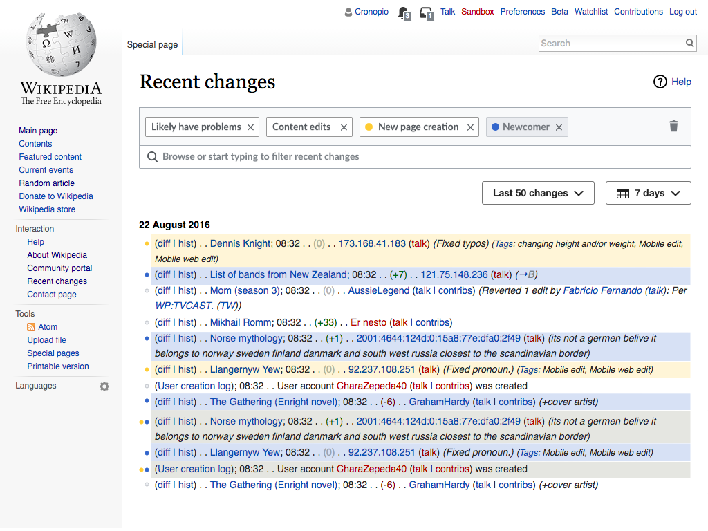
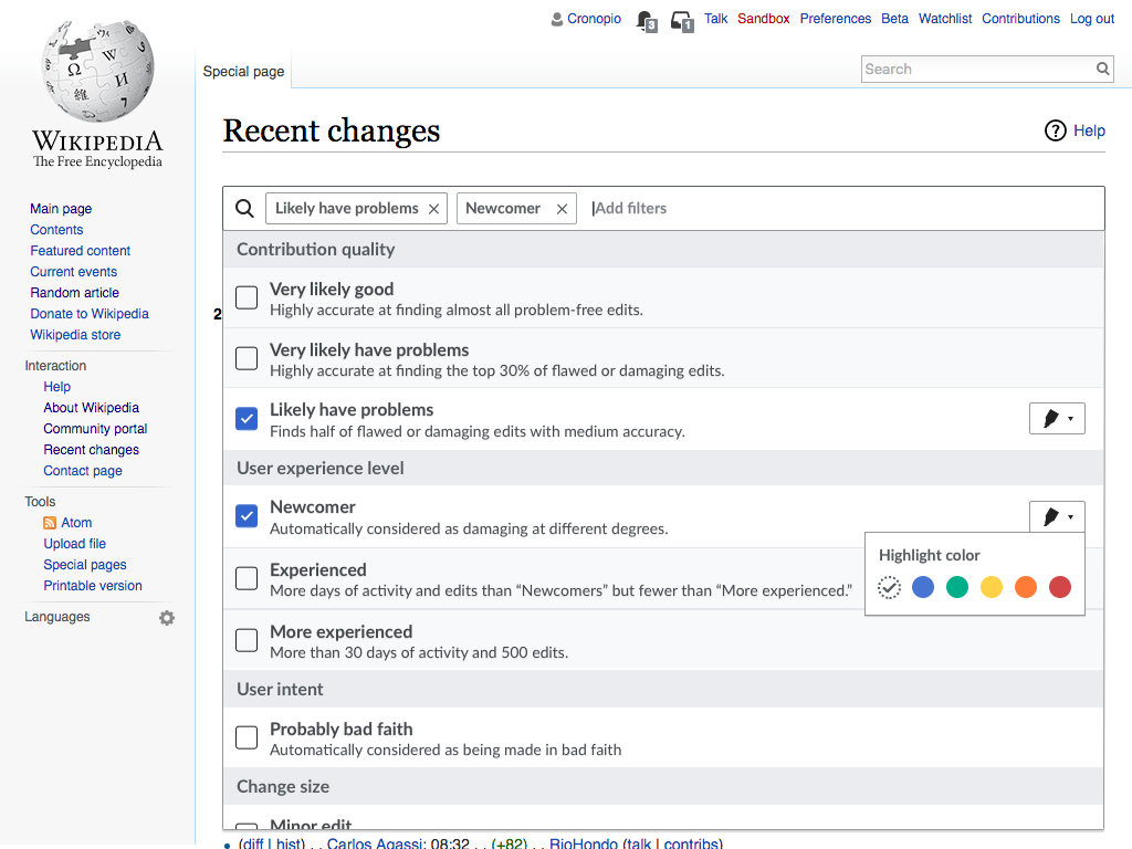
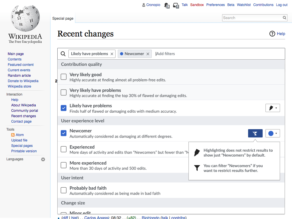
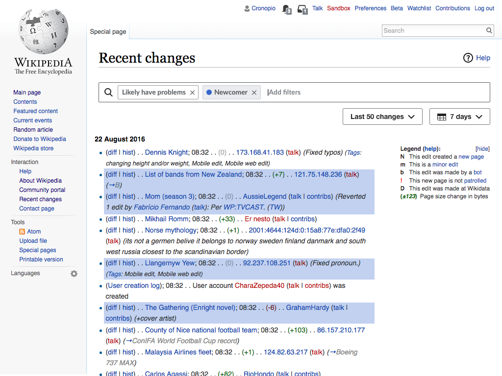
  • Scenario #1: Reviewing damaging contributions with special interest on newcomers A vandal fighter is interested in reviewing all potential edits that are "likely to have problems". She is interested in noticing which of those are from "newcomers" to review them with extra care (e.g., point them to the Teahouse). The expected result is to view only the "likely to have problems" but highlighting some of these in blue when they are contributed by "newcomers". Applying filters for both aspects would be problematic: it would lead to just the small set of damaging edits by newcomers (showing all of them highlighted in blue), which is not what the user is interested in.
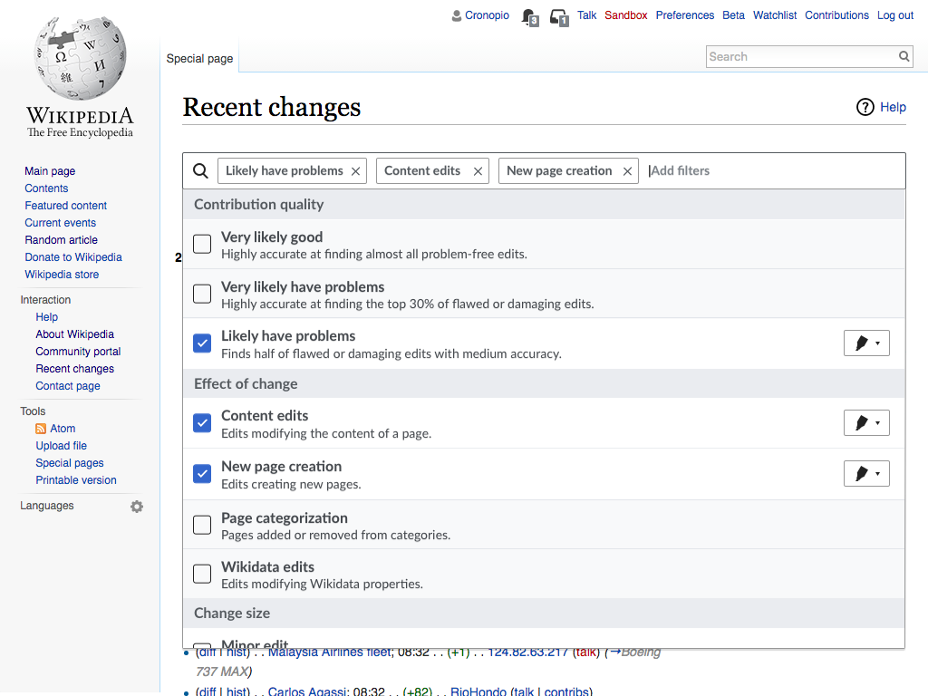
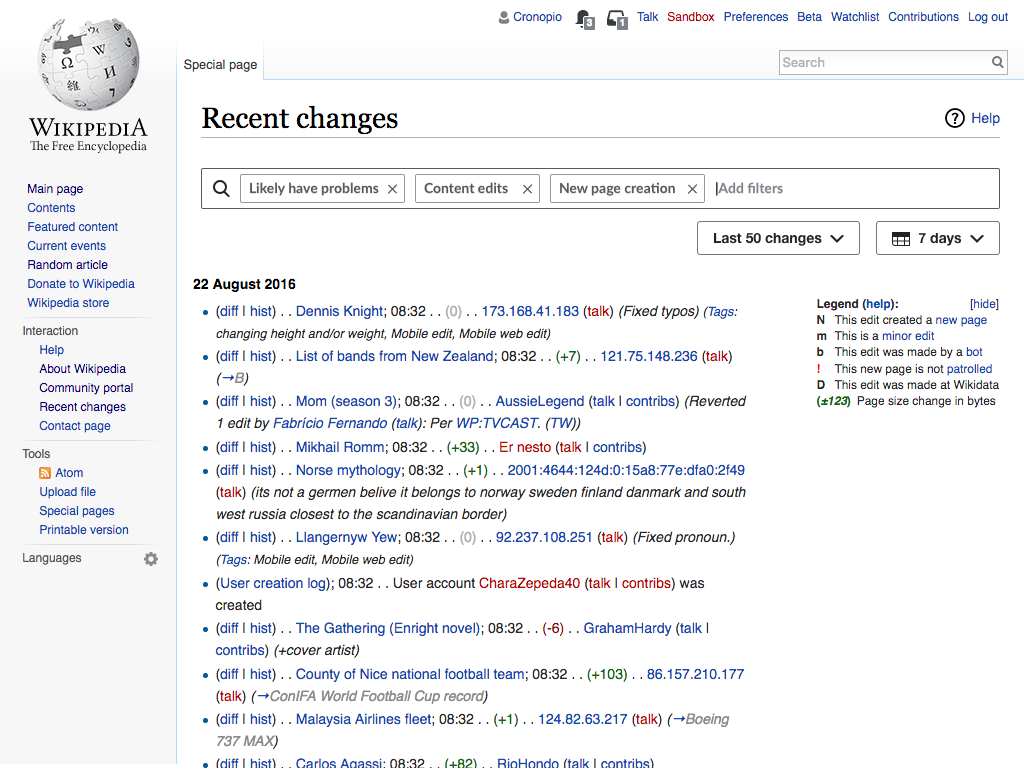
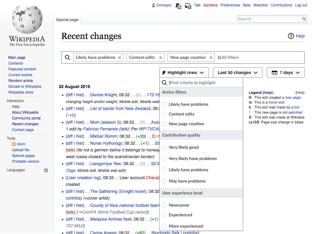
  • Scenario #2: Reviewing damaging contributions with special interest on new articles A vandal fighter is interested in reviewing edits that are "likely to have problems" of the default types: Content edits and New page creation (i.e., not including Wikidata or changes in page categories). She is interested in noticing new page creations (but still wants to go through regular edits). The expected result is to view only the "likely to have problems" edits that either change content or create new pages (showing the later highlighted in green). Ignoring the application of filters for highlight would be problematic: if "page creation" is not considered for filtering only "content edits" is shown, which is not what the user is interested in.

Design goals

  • Clarity. Making more explicit the effects of user actions may help to reduce the gap between the actions and the intent.
  • Simplicity. While providing support for more scenarios, we don't want to complicate the most simple ones where users may not even need highlighting at all.

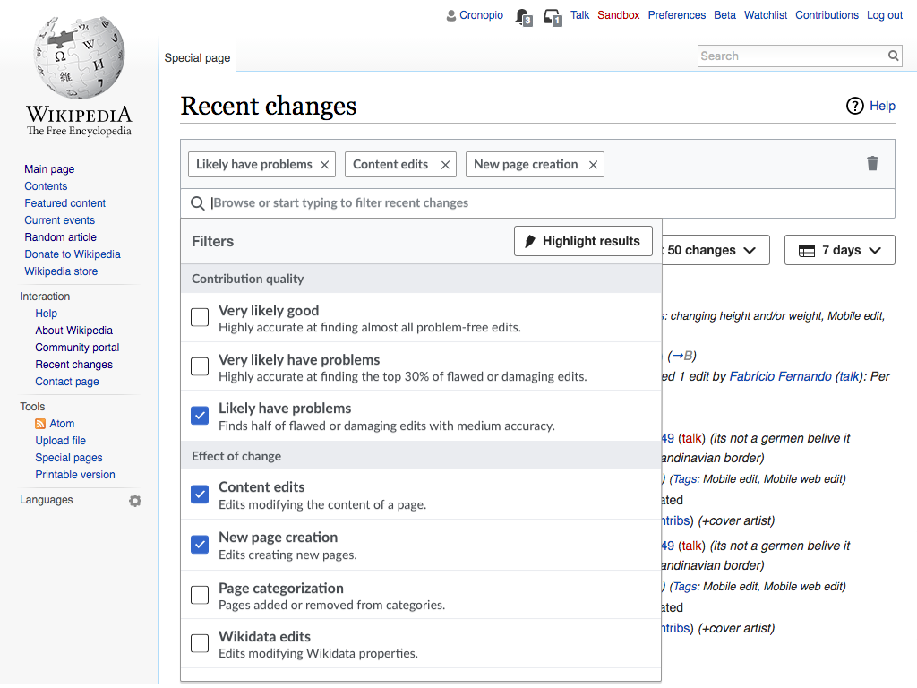
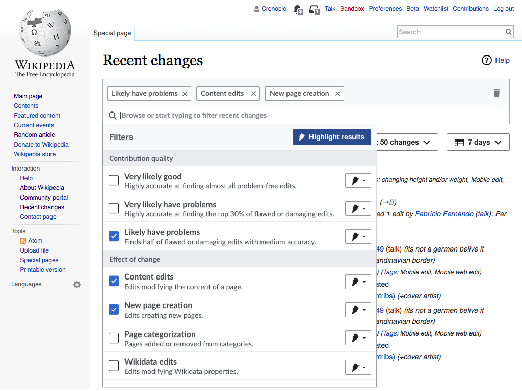
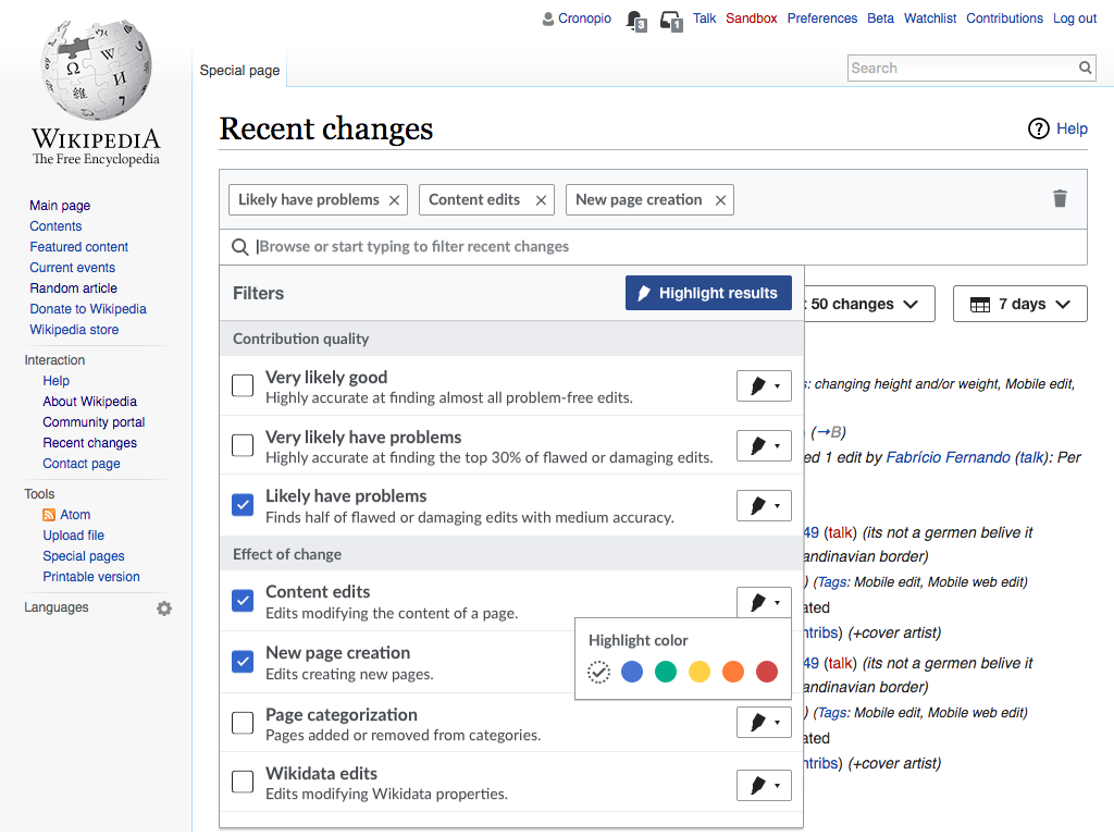
Solution explored #1

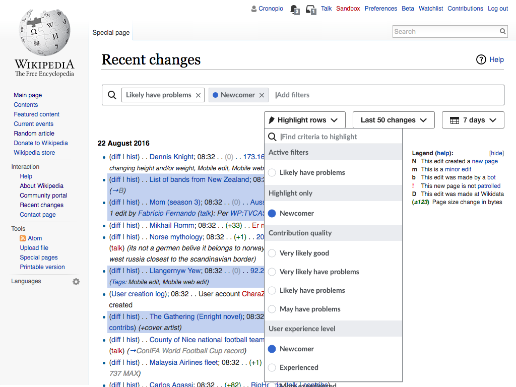
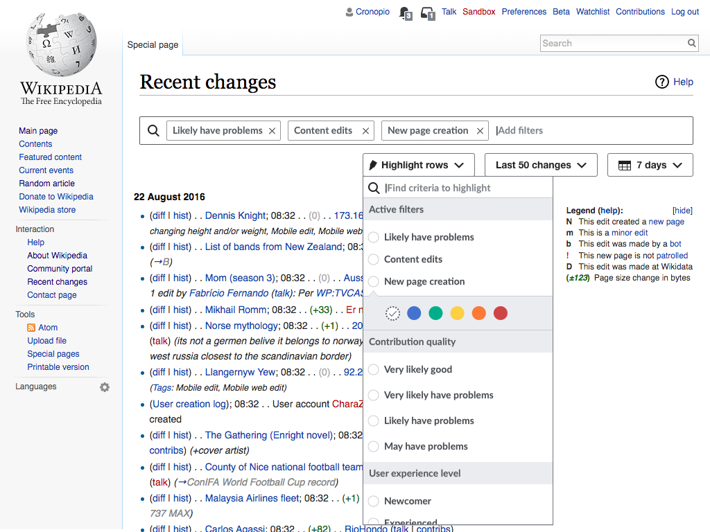
This approach provides the highlight control for each item on the filter panel, once the user selects a highlight color. The first time the option is shown, an introductory tooltip provides additional details.

The new option will allow to "skip filtering", and the default value will depend on whether other filters are selected in the same group:

  • If there are no other filters in the same group, the new highlight won't filter. In these cases, filtering always would lead to all items being highlighted.
  • If there are other filters being applied, highlighting will keep the filter active.

The two example scenarios are illustrated below:

Scenario #1: Reviewing damaging contributions with special interest on newcomers

Highlight-integrated-step1.png (768×1 px, 270 KB)

Highlight-integrated-step2.png (768×1 px, 177 KB)

Highlight-integrated-step3.png (768×1 px, 179 KB)

Highlight-integrated-step4.png (768×1 px, 184 KB)

Highlight-integrated-step5.png (768×1 px, 192 KB)

Highlight-integrated-step6.png (768×1 px, 276 KB)

Scenario #2: Reviewing damaging contributions with special interest on new articles

Filter-Highlight-integrated-step1.png (768×1 px, 273 KB)

Filter-Highlight-integrated-step2.png (768×1 px, 187 KB)

Filter-Highlight-integrated-step3.png (768×1 px, 192 KB)

Filter-Highlight-integrated-step4.png (768×1 px, 187 KB)

Filter-Highlight-integrated-step5.png (768×1 px, 277 KB)

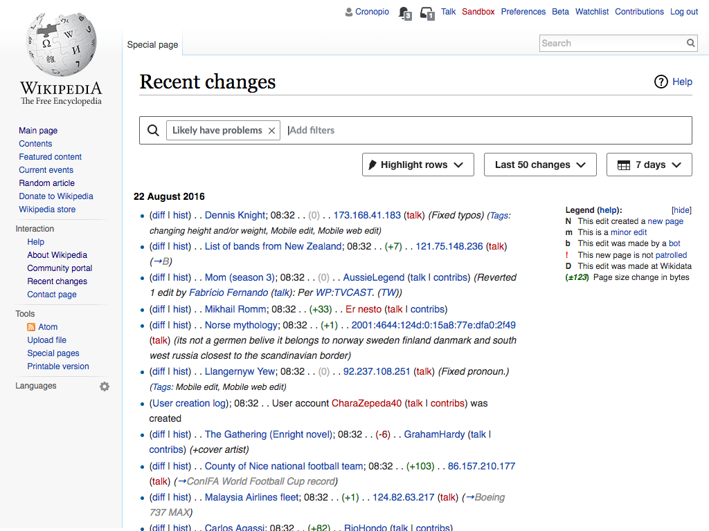
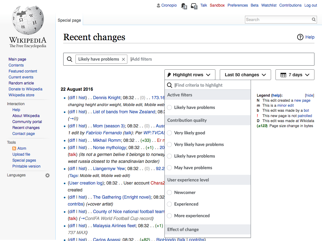
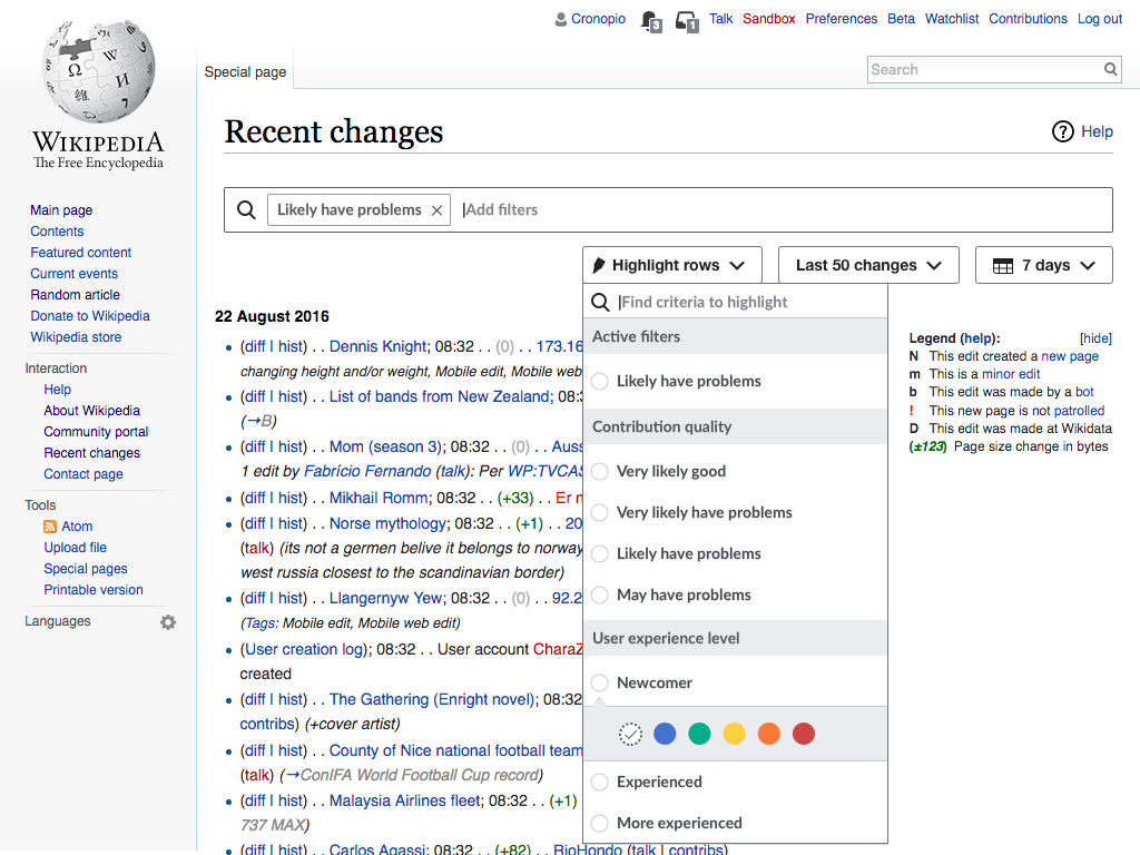
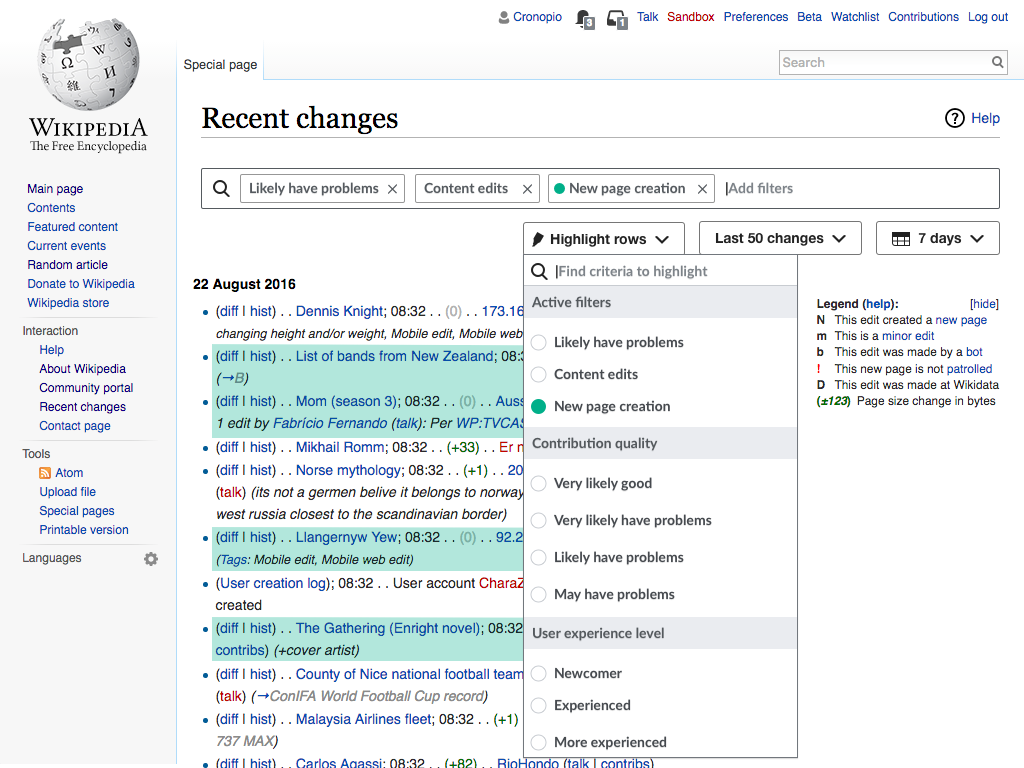
Solution explored #2

This approach provides a separate entry point to control highlighting. Filtering is provided as the main entry point but users can access highlight options when needed. The separate highlight menu surfaces the selected filters to make it easy to act on them when both filtering and highlight are needed; but provides access to other criteria for the cases where users just want to highlight.

The two example scenarios are illustrated below:

Scenario #1: Reviewing damaging contributions with special interest on newcomers

Highlight-separate-step1.png (768×1 px, 271 KB)

Highlight-separate-step2.png (768×1 px, 270 KB)

Highlight-separate-step2.png (768×1 px, 271 KB)

Highlight-separate-step3.png (768×1 px, 274 KB)

Highlight-separate-step4.png (768×1 px, 277 KB)

Scenario #2: Reviewing damaging contributions with special interest on new articles

Filter-Highlight-separate-step1.png (768×1 px, 273 KB)

Filter-Highlight-separate-step2.png (768×1 px, 276 KB)

Filter-Highlight-separate-step3.png (768×1 px, 276 KB)

Filter-Highlight-separate-step4.png (768×1 px, 278 KB)

Filter-Highlight-separate-step5.png (768×1 px, 279 KB)

Solution explored #3

This approach integrates highlight into the list of filters (to avoid duplication), but still provides the highlight access less prominent than regular filtering. Users enable the highlight layer only if they are interested in it and they can apply it independently of filters. The "highlight results" button allows also to quickly switch between showing the results highlighted or remove all highlights.

RC2-initial.png (768×1 px, 280 KB)

RC2-filter.png (768×1 px, 216 KB)

RC2-filter.png (768×1 px, 221 KB)

RC2-filter Copy.png (768×1 px, 225 KB)

RC2-highlighted.png (768×1 px, 289 KB)

Related Objects

StatusSubtypeAssignedTask
DuplicateQgil
ResolvedQgil
ResolvedQgil
OpenNone
ResolvedJohan
ResolvedTrizek-WMF
Resolved jmatazzoni
Resolved DannyH
Resolved DannyH
Resolved jmatazzoni
Resolved jmatazzoni
ResolvedMooeypoo
ResolvedMooeypoo
ResolvedSBisson
ResolvedMooeypoo
ResolvedMooeypoo
ResolvedMooeypoo
ResolvedMooeypoo
ResolvedMooeypoo
Resolved Mattflaschen-WMF
ResolvedSBisson
Resolved jmatazzoni
ResolvedMooeypoo
ResolvedMooeypoo
ResolvedMooeypoo
Resolved jmatazzoni
ResolvedMooeypoo
Resolved jmatazzoni
ResolvedSBisson
ResolvedMooeypoo
ResolvedMooeypoo
ResolvedMooeypoo
ResolvedPginer-WMF
Resolved jmatazzoni
Resolved jmatazzoni
OpenNone
ResolvedMooeypoo
Resolved jmatazzoni
ResolvedMooeypoo
ResolvedMooeypoo
DeclinedNone
ResolvedMooeypoo
ResolvedMooeypoo
Resolved Mattflaschen-WMF
Resolved jmatazzoni
ResolvedNone
InvalidNone
ResolvedSBisson
ResolvedMooeypoo
Resolved jmatazzoni
ResolvedSBisson
ResolvedCatrope
Resolved jmatazzoni
ResolvedTrizek-WMF
ResolvedTrizek-WMF
ResolvedTrizek-WMF
ResolvedTrizek-WMF
ResolvedTrizek-WMF
ResolvedTrizek-WMF
ResolvedTrizek-WMF
Resolved jmatazzoni
ResolvedCatrope
ResolvedCatrope
ResolvedSBisson
ResolvedHalfak
ResolvedTrizek-WMF
Resolved jmatazzoni
Resolved jmatazzoni
Resolved jmatazzoni
ResolvedTrizek-WMF
ResolvedCatrope
ResolvedPginer-WMF
Resolved jmatazzoni
DuplicateNone
ResolvedPginer-WMF
Resolved jmatazzoni
ResolvedPginer-WMF
ResolvedPginer-WMF

Event Timeline

I have reorganised and I illustrated two different directions.
I renamed the problems to make them a bit more general, and tried to simplify the problematic scenarios. Let me know if something is missing, and feel free to provide feedback and/or ask for clarifications on the approaches proposed.

Responses to the design solutions shown above

We're definitely making progress. I think both ideas have merit but both still need work. Below are my thoughts for each. I hope something here will help us move forward.

Overall

  • It looks like both solutions enable users to apply highlighting independently of filtering. I think that makes sense.
  • The tradeoffs seem to be this: Solution 1 keeps everything in the same menu, which makes sense but makes that menu more complex. Solution 2 separates the highlight and filtering functions into two menus, which makes the controls simpler and spreads out the users' decisions, but feels a little duplicative.

Solution #1

"Ignore" button design

  • I like that the ignore filter option appears right next to the highlight menu when you've selected a highlight.
  • I like the explainer popup, which would, I assume, appear the first X number of times.

Logic overall

  • There's a significant issue that makes this feel inelegant: to highlight only, I have to 1) select a filter so I can 2) select the highlight, so I can 3) unselect (ignore) the filter.
  • The simplest way to get around that would seem to be this to simply decouple highlighting and filtering entirely. Meaning I shouldn't have to check Filter to see Highlight controls. Which means highlighting should be available by default for all filters.
    • Under that scheme, If I select a only a highlight, I get only a highlight . If I want to highlight and filter, I have to select highlight and select filter. But I no longer need any ignore button.
    • When properties are excluded, the option to highlight them would disappear. E.g., if I choose Unregistered, the Registered highlight would gray out. This would give users good information about what is happening.
    • A training popup after I select a highlight is still a good idea, but it would explain, basically, “if you want to filter AND highlight, you need to check the box.”

Solution #2

logic overall

  • This one feels simpler in that it totally separates highlighting from filtering. I like that they are two different processes.
  • The inelegance here is that we have two partially redundant menus that are similar but different: one is inside the search box, one isn't; one has explanations, the other doesn't; one has help links, the other doesn't….
  • The filter menu is clearly meant to be more primary, but watching users, there's no reason to expect that they will discover the Filter dropdown before the Highlight menu. On the contrary, Filter is hidden and Highlight is not. In tests, no one has clicked into the Search box to see if there's a menu there unprompted. The point being that all the help links and explanations are to no purpose if the user starts exploring Highlight first.
    • Which makes me think: if we're going this way, why not put BOTH menus below the search box, side by side. One would say “Filter results” and the other “Highlight results.” (The date and counter controls would need to go elsewhere.) This could be positive in a number of ways:
      • No one would overlook the Filter menu.
      • Because it would be visually longer and positioned to the left of the Highlight menu, it might naturally appear more “primary” and “first” in order. These factors might implicitly forestall the question, “why is Filter so much more verbose and robust”?
      • By putting these two side by side with a similar look, the design may naturally establish that they are related, parallel tools.
      • Maybe best of all, if the Filter menu doesn't cover up the whole width of the results area, users will be able to more easily see the effects of filtering while they're making choices—something they clearly want to do.

Filter menu design

  • “Rows” is a little odd in “Highlight rows.” “Results”, I think?
  • I see why it makes sense to repeat the Active Filters—since someone has already expressed an interest in that property. But repeating the “Filter Only” stuff just seems to clutter things up – it's already shown in the search bar.
  • James was put off by the use of what he saw as radio buttons, since to him that implies exclusive choices.
  • As above, this menu would need to update to reflect filtering choices. (E.g., so that highlighting is not available for properties that are being filtered out).

Thanks for the feedback @jmatazzoni. Some comments below:

  • There's a significant issue that makes this feel inelegant: to highlight only, I have to 1) select a filter so I can 2) select the highlight, so I can 3) unselect (ignore) the filter.

The intended logic is as follows: you select the criteria you are interested in. By default, it gets filtered. If you want it to get highlighted instead, you are provide the behaviour you probably want (avoiding getting all results in one color (scenario #1: highlighting a criteria with no other filter in the group) or getting the highlighted elements to get lost (scenario #2: when highlighting a criteria for which a filter exists in the same group) with an indicator telling you what is going on. In the examples, users didn't had to change the "ignore" status.

  • The simplest way to get around that would seem to be this to simply decouple highlighting and filtering entirely. Meaning I shouldn't have to check Filter to see Highlight controls. Which means highlighting should be available by default for all filters.

This means that everytime a user is interested in a set of contributions they have to choose and understand the difference between filtering and highlight. Given that most of the time, I expect users to just filter to get a set of relevant results, I think this would be taxing the common simple cases at the expense of the fewer complex ones.

Solution #2

  • The inelegance here is that we have two partially redundant menus that are similar but different: one is inside the search box, one isn't; one has explanations, the other doesn't; one has help links, the other doesn't….

In which way do you think this will impact users in terms of allowing them to highlight what they want and don't get confused with filtering?

  • The filter menu is clearly meant to be more primary, but watching users, there's no reason to expect that they will discover the Filter dropdown before the Highlight menu. On the contrary, Filter is hidden and Highlight is not. In tests, no one has clicked into the Search box to see if there's a menu there unprompted. The point being that all the help links and explanations are to no purpose if the user starts exploring Highlight first.

I'm not sure what "no one has clicked into the Search box to see if there's a menu there unprompted". I have just seen 2 of the research sessions and I have seen people being able to filter when they need to.
The key question is whether people will be able to filter when they want to filter, and whether they would be able to highlight when they want to highlight.

  • Which makes me think: if we're going this way, why not put BOTH menus below the search box, side by side.

I think the goal should be to make filtering more prominent, not providing both filtering and highlight at the same level. As I mentioned before, our goal should be to make the most common actions easier to access.

I think that we should aim for making filtering more prominent, easier to access and facilitate the navigation between filter options and results, but that is a different story worth of its own ticket (I created T147549 with a proposal for this).

  • “Rows” is a little odd in “Highlight rows.” “Results”, I think?

Sounds good

  • I see why it makes sense to repeat the Active Filters—since someone has already expressed an interest in that property. But repeating the “Filter Only” stuff just seems to clutter things up – it's already shown in the search bar.

The purpose is not only let the user know which are the active filters (for which I agree the search bar provides the information). The goal is to facilitate the scenario where you want to do both filter and highlight by reducing the effort to search for the same thing twice. This compensates for the main drawback of the separation of filters and highlights.

  • James was put off by the use of what he saw as radio buttons, since to him that implies exclusive choices.

We can iterate on the visual treatment to avoid confusion. We are using the circles in different places to indicate color (inside tags, the color selector), the problem in this context may be that we are communicating the default white (or no color) highlight. Adjusting the metaphor to communicate more the "no color" idea (e.g., dotted line as in the selector, stroked content or similar treatments) may add some clarity.

  • As above, this menu would need to update to reflect filtering choices. (E.g., so that highlighting is not available for properties that are being filtered out).

Yes

New designs solve this problem. Closing task.