Page MenuHomePhabricator

Explore ways to represent visually the ORES-related filters and associated tradeoffs
Closed, ResolvedPublic

Description

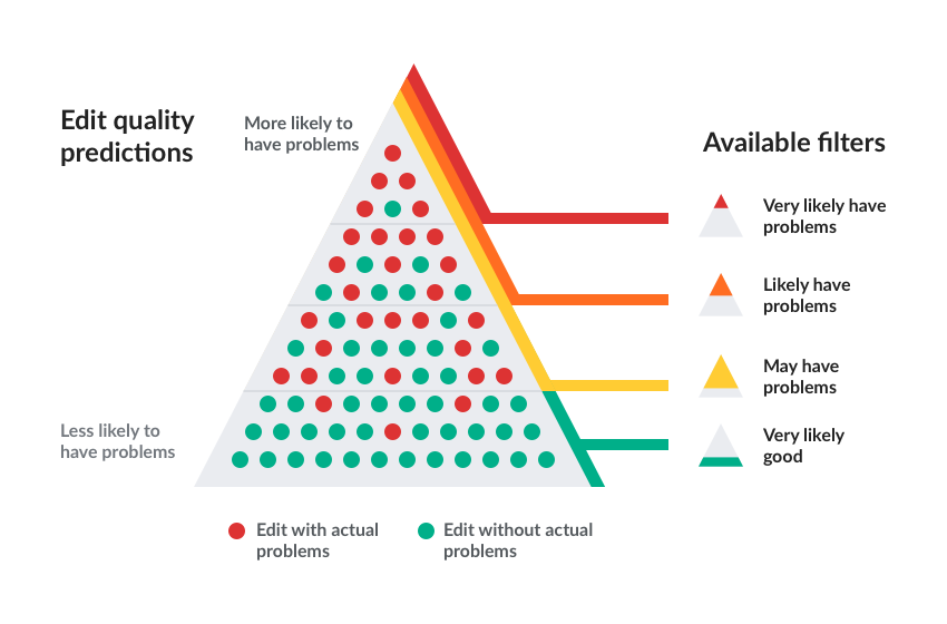
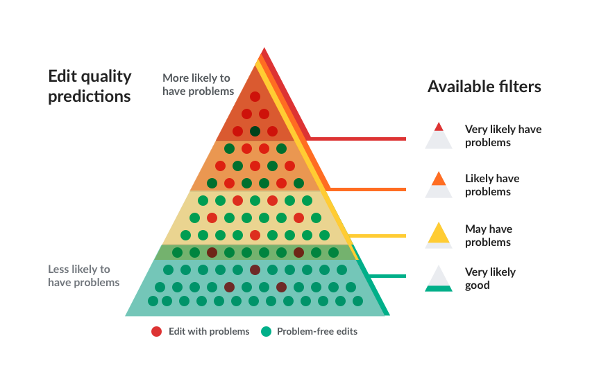
Users may wonder why there are several levels of filtering (very likely have problems, likely have problems, may have problems...). The tradeoff to be made between accuracy and coverage ("recall" technically) is not always obvious.

The following illustrations (to be used in documentation may help) may help to clarify the concepts:

ores-diagram-split.png (689×1 px, 73 KB)

ores-diagram-unified.png (560×850 px, 66 KB)

ores-diagram-unified-mixed.png (560×850 px, 67 KB)

Related Objects

StatusSubtypeAssignedTask
Resolved DannyH
Resolved DannyH
Resolved jmatazzoni
Resolved jmatazzoni
ResolvedMooeypoo
ResolvedPginer-WMF
ResolvedPginer-WMF
ResolvedPginer-WMF
ResolvedPginer-WMF
OpenNone
ResolvedPginer-WMF
OpenNone
ResolvedPginer-WMF
ResolvedPginer-WMF
ResolvedMooeypoo
ResolvedMooeypoo
ResolvedMooeypoo
ResolvedCatrope
ResolvedSBisson
ResolvedNone
ResolvedTrizek-WMF
ResolvedCatrope
ResolvedCatrope
DuplicateNone
OpenNone
ResolvedTrizek-WMF
ResolvedTrizek-WMF
ResolvedMooeypoo
ResolvedSBisson
ResolvedMooeypoo
ResolvedMooeypoo
ResolvedMooeypoo
ResolvedMooeypoo
ResolvedMooeypoo
Resolved Mattflaschen-WMF
ResolvedSBisson
Resolved jmatazzoni
ResolvedMooeypoo
ResolvedMooeypoo
ResolvedMooeypoo
Resolved jmatazzoni
ResolvedMooeypoo
Resolved jmatazzoni
ResolvedSBisson
ResolvedMooeypoo
ResolvedMooeypoo
ResolvedMooeypoo
Resolved jmatazzoni
Resolved jmatazzoni
OpenNone
ResolvedMooeypoo
Resolved jmatazzoni
ResolvedMooeypoo
ResolvedMooeypoo
DeclinedNone
ResolvedMooeypoo
ResolvedMooeypoo
Resolved Mattflaschen-WMF
Resolved jmatazzoni
ResolvedNone
InvalidNone
ResolvedSBisson
ResolvedMooeypoo
Resolved jmatazzoni
ResolvedSBisson
ResolvedCatrope
Resolved jmatazzoni
ResolvedSBisson
ResolvedPginer-WMF
Resolved jmatazzoni
ResolvedTrizek-WMF
ResolvedPginer-WMF
Resolved jmatazzoni
ResolvedCatrope
ResolvedPginer-WMF

Event Timeline

I've read the article in French and didn't understood a lot of it. I don't understand the schema you are linking to as well.

@Halfak, I totally understand why we shouldn't try to reinvent what has been already done by the scientific community but we have to popularize all of it. We really need to provide an explantation, a simple one, to our users.

Right, I agree. Let's build off of the reference material that is available though. In order to do that, we need to know what's lacking about what we have an figure out a way to fill in that gap.

I like this direction. As we discussed, I'd like to see 1) the filters cover the edits, instead of just running alongside them, and 2) more problem-free edits represented, just to indicate the idea that these are the bulk of all edits (you don't have to represent the actual percentages).

Also, a point I didn't think of before: "Very likely good" actually has a significant overlap with "May have problems." That might be surprising for people to learn, but probably useful to illustrate—as long as we explain it in the caption.

I like this direction. As we discussed, I'd like to see 1) the filters cover the edits, instead of just running alongside them, and 2) more problem-free edits represented, just to indicate the idea that these are the bulk of all edits (you don't have to represent the actual percentages).

I created a version where the colors overlap the different areas, and there are more green than red dots (a total of 58 green vs. 20 red):

ores-diagram-unified-mixed.png (560×850 px, 67 KB)

Also, a point I didn't think of before: "Very likely good" actually has a significant overlap with "May have problems." That might be surprising for people to learn, but probably useful to illustrate—as long as we explain it in the caption.

That overlap is certainly counter-intuitive. I think adding it may create more confusion than clarity at this level.

That overlap is certainly counter-intuitive. I think adding it may create more confusion than clarity at this level.

Yep. :/

It seems that the only other alternative is to not make it clear what the UI is doing. Is that really what we want to do here?

That overlap is certainly counter-intuitive. I think adding it may create more confusion than clarity at this level.

Yes, but we're here to explain how things actually work. I'd like to see it, at any rate.

Plus, I'm not sure it's so very counter intuitive. Add another row of all green at the bottom. Make the overlap cover the row that has 2 red but not the one with one red. Readers will understand (and he caption will explain) that the overlap is to make sure that the filters get more of what they're looking for. (Also, while we're not aiming for true numerical accuracy, I do think we need to increase the amount of green a little, just to make it so this looks a bit less like people's conception of everything being vandalism and junk. It's not true!.)

It seems that the only other alternative is to not make it clear what the UI is doing. Is that really what we want to do here?

Yes, but we're here to explain how things actually work. I'd like to see it, at any rate.

When explaining (especially visually) we need to consider that the more messages we send, the less effective each of those normally become. A system has many different aspects, but that does not mean we need to include all of them with 100% precision for a communication to be useful and effective. For example, subway maps are not accurate in the exact distance between stations or the real routes of the rails. They do lots of simplifications to focus on the main purpose of helping users to move through the transportation system.

For me the main purpose of this visualisation is not to communicate users how the system exactly works. For me the main purpose is to explain why we provide three different filters for bad edits instead of just one, and help them decide which one is more appropriate for each case. Some of these implications are derived from aspects of machine learning, boolean logic or set theory, but our goal should not be to teach them about their general concepts but to describe the purpose of the filters we provide.

Plus, I'm not sure it's so very counter intuitive. Add another row of all green at the bottom. Make the overlap cover the row that has 2 red but not the one with one red. Readers will understand (and he caption will explain) that the overlap is to make sure that the filters get more of what they're looking for. (Also, while we're not aiming for true numerical accuracy, I do think we need to increase the amount of green a little, just to make it so this looks a bit less like people's conception of everything being vandalism and junk. It's not true!.)

I don't understand the sentence "the overlap is to make sure that the filters get more of what they're looking for". For me it is hard to see how the overlap between "may have problems" and "very likely good" helps the user making any decision about which filter to use. In any case, I tried to capture what you described in case it helps:

ores-diagram-unified-mixed-overlap.png (560×850 px, 68 KB)

I think this diagram does the trick. Great job Pau. Yes, the overlap adds some complexity, but explaining the complexity is the whole purpose of having this diagram. The caption will address.. I will add this to the help doc.

My only tiny suggestion might be to change the key at the bottom to read"

Edits with problems
Problem-free edits

My only tiny suggestion might be to change the key at the bottom to read"

Edits with problems
Problem-free edits

Sure. Here there is an updated version:

ores-diagram-unified-mixed-overlap.png (560×850 px, 68 KB)