Page MenuHomePhabricator

Better communicate that resolved topics can be expanded
Open, HighPublic

Description

Topics become collapsed when marked as resolved. Most of the time that is helpful to focus on the active conversations but sometimes the summary is not enough and users need to expand them. Although it is currently possible (clicking on the reply counter or the topic title), it is not completely obvious.

There are some small tweaks that can help to better communicate that topics can be expanded:

  • When hovering a resolved topic title make the cursor to be the hand cursor to convey interactivity.
  • Make the "10 comments" label become "Expand 10 comments" when the topic is a resolved topic in collapsed state (and "Hide 10 comments" when it is expanded ).
  • Adjust the visual style of the collapsed posts (only when they are collapsed) to convey that content is folded inside (view mockup below).
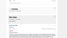
expand-resolved-topics.png (578×1 px, 88 KB)

Event Timeline

Pginer-WMF raised the priority of this task from to Needs Triage.
Pginer-WMF updated the task description. (Show Details)
Pginer-WMF subscribed.
DannyH triaged this task as Medium priority.Jun 26 2015, 6:56 PM
DannyH subscribed.

I think the first two tweaks will be very helpful -- having the hand cursor on cover, and "expand/hide 10 comments" in the header.

I think the folded visual style is too subtle to be seen with the naked eye. You can see the difference when they're next to each other, but on its own in a board with open threads, I think the light gray line just looks like a slightly different border. I don't have any brilliant suggestions or anything :) -- but I wouldn't expect much from that visual change.

cookies comparison.jpg (265×842 px, 50 KB)

I don't have any brilliant suggestions or anything :) -- but I wouldn't expect much from that visual change.

cookies comparison.jpg (265×842 px, 50 KB)

As far as I user Flow (and now on my volunteer page), I think this idea will be very welcome! :)

DannyH raised the priority of this task from Medium to High.Aug 24 2015, 10:50 PM

From the comments I read about the issue, the problem does not seem to be about identifying the topics as closed/collapsed (for which the lack of content and the tick mark seem to work) but being aware that there is a way to expand them. That is, that a topic being collapsed does not mean that the whole content is permanently hidden until the topic gets reopen.

When thinking in context ("a user reaches a topic that is collapsed") are we providing enough queues to let them know the content is there? The visual change is a subtle clue about content being there but it is only one piece complementing the other two which are aligned with clear issues: using the hand icon to communicate interactivity (currently the user needs to figure out that they can click on the header without any announcement), and stating explicitly the action (an explicit "expand 10 comments" label will be there).

We can always increase the visual prominence if the problem persist (e.g., a subtle animation on hover, adjusting the colors or even show part of the initial message) but I think that considering that the current way we announce the expansion is basically none, the overall proposal already makes it easier to discover. I can illustrate some of these ideas if them seem worth considering.

It took me a while to realize that and how I can access content of resolved conversations on Flow pages and I would have appreciated a pointer.

GNOME tried to tackle the undiscoverability of the application menu shown when clicking onto the application name in the desktop's top bar by adding a triangle pointing down (▼) to the application name.
I could imagine the displayed resolved checkmark to turn into such a triangle when hovering over with the mouse or focusing the thread summary by the Tab key (I fail in Firefox 40 to open a resolved conversation via keyboard only, which looks like an accessibility issue).

Disclaimer: This was my one clueless "I'm not a designer but..." comment this year.

Pau -- yes, I think your analysis of the situation is correct. The problem is helping people to understand that there's hidden content that they can access.

Spage added a project: good first task.
Spage added subscribers: DannyH, Spage.

This happened to me, I often click on the wrong thing. I can only expand if I click after the text in the h2, but not too close to the watch star.

I think the first two tweaks will be very helpful -- having the hand cursor on cover, and "expand/hide 10 comments" in the header.

I think 1 is trivial to fix: add cursor: pointer to .flow-topic-title, so I added good first task to this bug. 2 isn't much harder, just add title="{{l10n "flow-collapsed-comments-title" reply_count}} to the h2 in flow_topic_titlebar_content.partial.handlebars; then JS could dynamically improve the title to reflect Show/Hide.

I think the folded visual style is too subtle to be seen with the naked eye. You can see the difference when they're next to each other, but on its own in a board with open threads, I think the light gray line just looks like a slightly different border. I don't have any brilliant suggestions or anything :) -- but I wouldn't expect much from that visual change.

(F183740)

Yup, a single line isn't enough to indicate more comments. It needs to be two lines to indicate a stack of stuff, and perhaps only indented to the right (or left in RTL). Then the issue is whether clicking these lines should also expand like the h2 title. I think so, because when the topic has a summary this stack of lines will be some distance from the h2 title.

T60800: Flow: Topic bar CSS defeats its active button behavior suggested making the titlebar a more obvious button. But now that it isn't a mw-ui-button and only sometimes has toggle behavior, I closed that

From the comments I read about the issue, the problem does not seem to be about identifying the topics as closed/collapsed (for which the lack of content and the tick mark seem to work) but being aware that there is a way to expand them. That is, that a topic being collapsed does not mean that the whole content is permanently hidden until the topic gets reopen.

When thinking in context ("a user reaches a topic that is collapsed") are we providing enough cues to let them know the content is there? The visual change is a subtle clue about content being there but it is only one piece complementing the other two which are aligned with clear issues: using the hand icon to communicate interactivity (currently the user needs to figure out that they can click on the header without any announcement), and stating explicitly the action (an explicit "expand 10 comments" label will be there).

We can always increase the visual prominence if the problem persist (e.g., a subtle animation on hover, adjusting the colors or even show part of the initial message) but I think that considering that the current way we announce the expansion is basically none, the overall proposal already makes it easier to discover. I can illustrate some of these ideas if them seem worth considering.

@Pginer-WMF: This issue has been assigned to you more than a year ago. Could you please share a status update? Are you still working (or still plan to work) on this issue? Is there anything that others could help with? In case you do not plan to work on this issue anymore, should you be removed as assignee (via 'Assign / Claim' in the 'Actions' dropdown menu) to avoid cookie-licking?

@Pginer-WMF: This issue has been assigned to you more than a year ago. Could you please share a status update? Are you still working (or still plan to work) on this issue? Is there anything that others could help with? In case you do not plan to work on this issue anymore, should you be removed as assignee (via 'Assign / Claim' in the 'Actions' dropdown menu) to avoid cookie-licking?

The ticket description already has a design proposal that can be implemented (or further discussed). I'm removing myself as the assignee in case that is adding confusion. thanks for pointing this out, @Aklapper.