Design a weekly translation rate chart for CXStats.
Description
Description
| Status | Subtype | Assigned | Task | ||
|---|---|---|---|---|---|
| Open | None | T99230 [Master] Improved analytics page for CX | |||
| Resolved | Amire80 | T111774 CXStats: Reorganise the headings to communicate the hierarchy | |||
| Resolved | santhosh | T105192 show trend of translation rate on Special:CXStats | |||
| Resolved | Pginer-WMF | T110325 Design a weekly translation rate chart for CXStats |
Event Timeline
Comment Actions


The goal is to better understand the growth in user productivity. Making it easier to answer questions like:
- Are more articles being published now than there used to in a past period?
- Is the publication pace increasing? (to get a better picture we may need to compare this with the info about users which have no visualisation at all. Related tickets: T100034, T100035)
- How was the pace of publication affected by a change we made on date X?
My current thinking is based on the following:
- Avoid adding clutter. Frequency is an alternative view on the existing published translations graph. It makes sense to present
- Avoid confusion about views. To avoid confusion, it is important to visually distinguish whether the graph represents values accumulated or not. For that purpose, I'd recommend using a line for accumulative values (values are connected) while use a bar chart (not connected to each other) to represent independent values.
- Adjust the scale, With the current system the local language is shown compared to "al languages" however, the difference in scale makes the local language graph hard to interpret intuitively. Options to select which graph to view (local language, all languages or both) will be useful if the scale is adjusted. This is related to T102408.
Design details
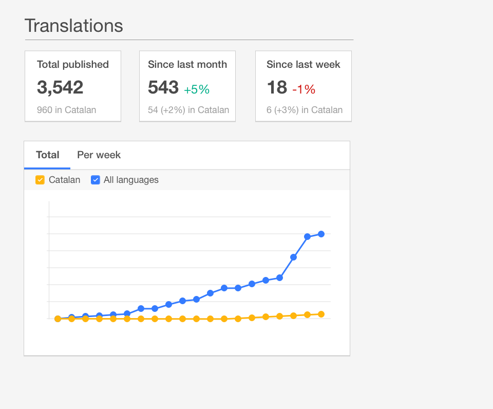
Current accumulative view showing the evolution of the total number of translations (default view):
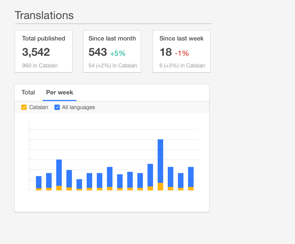
Translations per week:
Translations per week (once the "all languages" have been disabled:
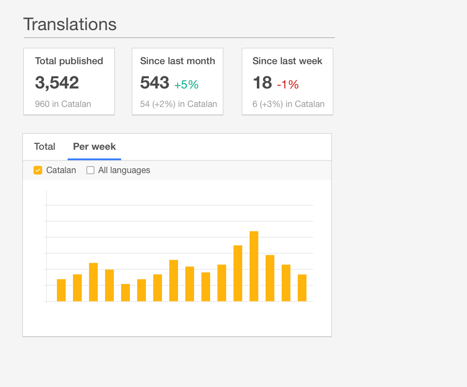
Note that we should not allow disabling both checkmarks (an empty graph is of little use for anyone). Thus, if there is only one checkbox checked, the result of disabling it would be the other checkbox to become enabled.
Comment Actions
There is a problem in this design as it conflicts with the idea in T90538
If a single graph shows two languags, we cannot show total, draft, deleted in same graph because they are different concepts.
I would suggest the following:
- At any time show graph for one and only one language. Or graph for all languages total. Do not mix them up. If we do, for many languages, the scale of difference between total and local language is very big and the visualization wont make sense.
- The above design shows both language only when user select both check boxes, but I suggest removing the check boxes and make it tabs. Or even list the total and local language one after another. Either of this approach automatically address T102408
- For a language or total graph, always show total, draft, deletion in different colors. - So that the relative plotting is always about status of translation.
- weekly trend bar chart shows weekly translation, deletion, draft trends too
For the iterative implementation of T102408, T90538 and T105192, I suggest the following iterations:
- Separate the total and local language graphs, show them one after another under different headings ( https://gerrit.wikimedia.org/r/#/c/236529/ )
- Show draft counts with a different color line for both graphs (https://gerrit.wikimedia.org/r/#/c/236529/)
- Show deletion counts with a different color line for both graphs (https://gerrit.wikimedia.org/r/#/c/236538/)
- Just like the cumulative graphs, show trend bar charts, show deletion, translation, draft trend in same graph(https://gerrit.wikimedia.org/r/#/c/236764/)
- Club the cumulative and trend under tabs
- (if needed) club the total and local language under tabs
Comment Actions
We need new ticket for
- Club the cumulative and trend under tabs
- (if needed) club the total and local language under tabs
and then we can close this ticket