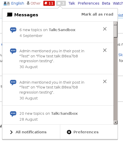
Has a width of 12px and a clickable width of about 18px, which is very small...
Description
Description
Details
Details
| Subject | Repo | Branch | Lines +/- | |
|---|---|---|---|---|
| Make 'x' button in notifications bigger | mediawiki/extensions/Echo | master | +1 -1 |
Related Objects
Related Objects
Event Timeline
Comment Actions
This is not a close button. It's 'mark as read' for an individual notification, of which there may be many. Not sure if that affects whether we want it bigger or not.
Comment Actions
@Mattflaschen I don't think it does - although it does raise another issue, which is that it definitely looks like a close button. I expect when clicking on a 'x' for the item to disappear, so perhaps we should use a different icon as well.
Comment Actions
I agree with Esanders that the 'x' icon is confusing, and symbolizes "delete" more strongly than it does "mark as read".
Comment Actions
For me the "X" renders as shown by @Esanders, which seems definitely too small.
it does raise another issue, which is that it definitely looks like a close button. I expect when clicking on a 'x' for the item to disappear, so perhaps we should use a different icon as well.
In this context, the user intent is basically closer to "discard" for which the "X" seem to fit. Let's imagine the user has 5 new notifications, and the 2nd one is irrelevant. By discarding the 2nd notification, it will disappear from the highlighted group on top and became part of the greyed out group of notifications at the bottom.
I think that if you are not interested in a notification, clicking the "X" seems to align well with the purpose and other metaphors based on the read/unread status may need for you to figure out what to do to change such status. It is true that you may expect items to disappear, but the item being demoted to a different group seems close enough for not causing much surprise. In any case, it would be great to verify these assumptions by checking current user behaviour.
Comment Actions
Change 251315 had a related patch set uploaded (by Mooeypoo):
Make 'x' button in notifications bigger
Comment Actions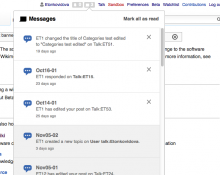
Checked in betalabs with Chrome 46, FF 41, and Safari 9.0.1
The closing/read button - &-markAsReadButton - "oo-ui-iconElement-icon oo-ui-icon-close" looks consistent through browser: e.g.
