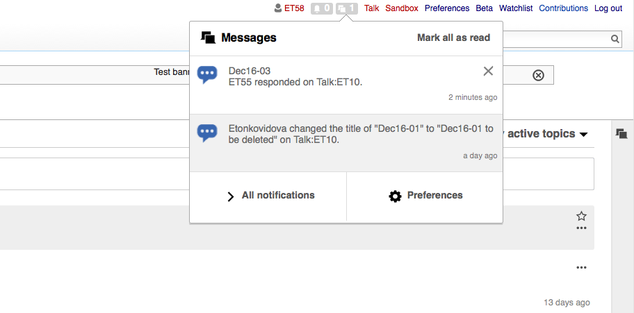
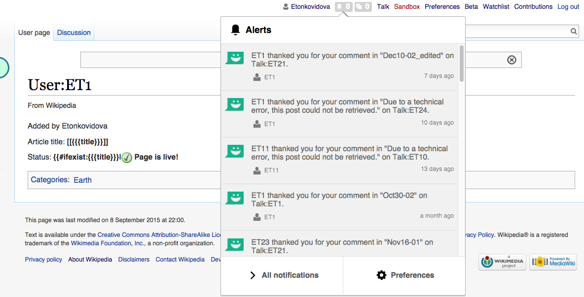
Even without T115418: API should expose enough structured data about notifications that frontend can render them, we can start working on the front-end work for T114357: Notifications panel: simplify notification items, using fake data. This will also inform what the API output needs to contain.
Changes needed (adapted from T114357#1716968; see T114357 for mockups):
- Move timestamp to the bottom right, make its font a bit larger
- (While we're at it, we may want to fix T112217: Mark as read 'x' button is very small as well)
- Notification text will no longer contain links
- Add secondary actions at the bottom left. Secondary actions have a label, an icon, a tooltip and an href (link target)
- "More" menu (dotdotdot icon) with more secondary actions.
- "Explicit" secondary actions render outside of the more menu, "implicit" ones render inside of it.
- For secondary actions rendered inside the more menu, the tooltip becomes the subtitle.
- "Mark as read" is a built-in implicit secondary action for every notification type.
- The volume control features in the mockups are out of scope for this task.
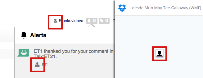