Page MenuHomePhabricator

Notifications panel: simplify notification items
Closed, ResolvedPublic

Description

A more structured framework for notifications is proposed where notifications only have a main action associated to their message but can include several secondary actions specific to the particular notification (link to the user or page involved) or more general (unmark as read or control notification volume).

Design details

Check this prototype.

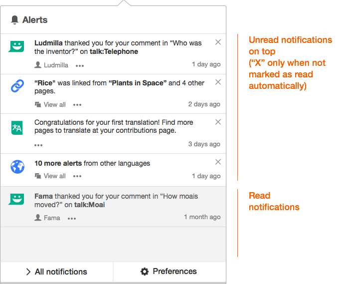
The notification panel will show unread notifications on top and read notifications at the bottom as it currently does. If there are unread notifications from other wikis, they will appear at the end of the unread notifications section.

Panel.png (569×704 px, 89 KB)

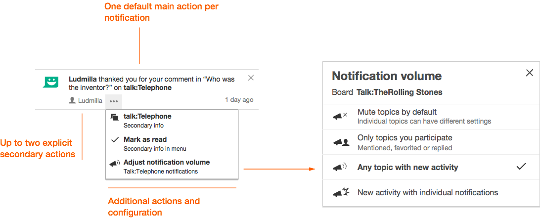
Panel - item only.png (128×492 px, 14 KB)

Notification items are structured in the following way:

  • Icon based on the type of notification.
  • Mark as read "X".
  • Notification text. Can be rich text but not include links since clicking anywhere should trigger the default action.
  • Default action. It will lead to the main piece of content associated to the notification when clicking anywhere (except on secondary actions and menus).
  • Secondary actions. One or two actions (different from the default one). Actions will have an icon, a label and a short description (shown as a tooltip). These actions are specific to the notification and are initially visible.
  • More menu. A menu for additional actions either specific for the notification item or general (including marking as read/unread and volume controls)
  • Timestamp.

Panel - item menu.png (441×1 px, 92 KB)

Related Objects

Event Timeline

Pginer-WMF raised the priority of this task from to Needs Triage.
Pginer-WMF updated the task description. (Show Details)
Pginer-WMF added a project: Notifications.
Pginer-WMF subscribed.
Restricted Application added a subscriber: Aklapper. · View Herald Transcript

My interpretation of what we need to do for this task, please correct/add where necessary:

Frontend work:

  • Move timestamp to the bottom right, make its font a bit larger
  • Remove links from notification text
  • Add secondary actions at the bottom left. Secondary actions have a label, an icon, a tooltip and an href (link target)
  • "More" menu (dotdotdot icon) with tertiary actions.
    • Tertiary actions have a label, optionally a secondary label, an icon and an href.
    • In addition to notification-defined tertiary actions, there are also built-in tertiary actions, such as "Mark as read"
    • "Adjust notification volume" is strange because it behaves like a built-in (it's not just a link to somewhere) but it's also specific to certain notification types. But it's probably out of scope for this task anyway.

Backend/middleware work:

  • Add the concept of tertiary actions (or perhaps these are just secondary actions with a property that controls whether they appear inside or outside the more dropdown?)
  • Allow secondary actions to have icons and tooltips

Questions:

  • Does the secondary label (the smaller text below the main bolded label) of the tertiary actions (the ones in the more menu) replace the tooltip? I was thinking this could be implemented in a way where secondary and tertiary actions have the same types of information (short label and long label) but render them differently (secondary renders long label as tooltip, tertiary renders it as text below the main label).
    • Making secondary and tertiary actions only differ in rendering style would also help with T114356, where we presumably want both secondary and tertiary actions to be rendered in the more menu for notifications inside bundles.
  • Which other tertiary actions exist? These screenshots only show "Mark as read" (for every notification type, presumably) and "Adjust notification volume" (specific to certain types); is that all?
  • Is the "notification volume" part out of scope of this ticket? If not, can we split it off? Volume control requires backend work, and even on the frontend it's special in all sorts of ways, so it would be nice to split that off.
  • When a notification is marked as read, what should happen? Should it disappear, move down to the read section, or just change background color while it stays in place?

Does the secondary label (the smaller text below the main bolded label) of the tertiary actions (the ones in the more menu) replace the tooltip? I was thinking this could be implemented in a way where secondary and tertiary actions have the same types of information (short label and long label) but render them differently (secondary renders long label as tooltip, tertiary renders it as text below the main label).

Your comment summarises what I had in mind. Secondary and tertiary conceptually form a unified list of notification actions. The secondary actions are emphasised to make them easier to access (and their description is only visible as a tooltip), while the tertiary actions are behind a menu (where we have enough room to display the description directly) just to avoid presenting too much info at the same time. Building all actions consistently makes sense and will provide more flexibility (e.g., notifications inside a bundle show all their actions inside the "..." menu to save more space).

Which other tertiary actions exist? These screenshots only show "Mark as read" (for every notification type, presumably) and "Adjust notification volume" (specific to certain types); is that all?

Notification actions (secondary, and tertiary) can be provided either by (a) the specific notification item or (b) the general notification system. The former ones are out of our control (the extension launching the notification will provide the action info) and they will be presented as secondary or tertiary options (if more than 2 are provided). Regarding the actions from the general notification system, we have some rough ideas (mark/unmark as read and volume control) but the list may grow. I think of it as a framework, where new actions will be surfaced here as other features are developed (T114351).

Is the "notification volume" part out of scope of this ticket? If not, can we split it off? Volume control requires backend work, and even on the frontend it's special in all sorts of ways, so it would be nice to split that off.

"Notification volume" is not part of this ticket. I created T115264 as a separated ticket.

When a notification is marked as read, what should happen? Should it disappear, move down to the read section, or just change background color while it stays in place?

All unread notifications are always presented at the top of the panel without unread notifications in-between. Recent read notifications, are presented together at the bottom of the panel, in the grey area. So reading a notification should remove it from the unread group on top and add it to the corresponding place of the grey group in the bottom (inside each group, notifications are ordered chronologically). Marking as read should act in the same way as reading the notification.

Notes from talking through this with @MSchottlender-WMF:

  • There are two ways to mark something as read (the X icon and the one in the action menu)
    • Should there be two?
    • Should they have different icons? (Tick mark vs X, which have somewhat opposite meanings typically)

There are two ways to mark something as read (the X icon and the one in the action menu)

Regarding the scope of this ticket, the important aspects is to have a framework where different actions can be associated with notification items. Some will be initially visible (not more than 2 of the actions specific for the notification item) other actions will be behind the "..." menu (including specific actions for the notification item but also other generic actions). Regarding the general actions, I expect to get more details as we explore areas such as volume control (T115264), and similar tickets.

Regarding the specific case of "mark as read", there are several interconnected topics here.
The main purpose is to provide a way to "mark as unread" for read notifications. That is useful in scenarios like "After checking a notification about a new response in a conversation I participate, I don't have time to reply but I want to keep the notification unread to remind me there is a pending action item".

I think it makes sense to provide "mark as unread" as a notification action for read notifications. Keeping the opposite action for read notifications keeps the symmetry but adds duplication (and inconsistency in the way it is presented). So I'm ok to start with just providing the "mark as unread" on read notifications. I created a specific ticket for this area: T115581.

matmarex subscribed.

This task was a part of a project that seems to have been completed in 2016. I think we can close it now.