Page MenuHomePhabricator

Provide a color palette and design for buttons that are purely highlighted links, to distinguish them from actual UI buttons
Open, LowPublic

Description

Problem: Many people are using "colored buttons", purely for high-visibility. (example list, below). Many of them use the exact OOUI scheme.

  1. This undermines the meaning the colors/buttons are meant to have.
  2. It makes any broken or vandalised link, into something that erodes trust in the actual interface. (e.g. "the last time I clicked a big green button it didn't work [or took me somewhere horrible]...")

Solution (suggested): We should provide a distinct/different set of styles to the community, to help them achieve this visibility purpose, without their resorting to "buttons" that are 100% ambiguous with site UI.

Context: The OOUI color-buttons are intended to have specific meanings, per


Sample list of problems (I.e. these are just plain links, but are given fancy styling for increased visibility):

LocationAlternatives and UX/design feedback (updated 2019-12-20)
https://en.wikipedia.org/wiki/Portal:Contents/TOC_navbar No colored button anymore…
https://de.wikipedia.org/wiki/Wikipedia:Wiki_Loves_Monumentsseems (semi-)correct, should be two progressive, non-primary buttons in a group instead
https://meta.wikimedia.org/wiki/Grants:APGShould be a tab-like representation/real need for colored buttons?
https://meta.wikimedia.org/wiki/Grants:TPS – “Apply button”Should be a primary progressive button, not a red button!
https://meta.wikimedia.org/wiki/Template:Social_media_navigationShould be a tab-like representation/no need for colored buttons! Only comment: sans-serif instead of heading serif font
https://meta.wikimedia.org/wiki/Translation_of_the_week/Translation_candidates#New_candidates_.28group_5.29 seems (semi)correct as both are primary type buttons, only comment: second call-to-action should still be progressive, not destructive
https://outreach.wikimedia.org/wiki/EducationShould be a tab-like representation/no need for colored buttons!
https://outreach.wikimedia.org/wiki/Education/TrainingsShould be a tab-like representation/real need for colored buttons?
https://fr.wikipedia.org/wiki/Wikip%C3%A9dia:Forum_des_nouveaux Doesn't seem to have colored buttons any more…?
https://www.mediawiki.org/wiki/MediaWiki/Homepage_redesign/Preview Doesn't seem to have colored buttons any more…?
https://wikimediafoundation.org/wiki/Annual_Report Doesn't exist anymore

Semi-relevant usages, but using the wrong color

Mixture of appropriate and inappropriate:

(Close, but not exact copies of OOUI)

Note: the easiest way to find these examples, is to search the projects for insource:"mw-ui-progressive" (and -constructive and -destructive and -button). E.g. https://fr.wikipedia.org/w/index.php?title=Sp%C3%A9cial:Recherche&search=insource%3A%22mw-ui-progressive%22&fulltext=Rechercher&profile=all


Related tasks:
Event Timeline

Quiddity raised the priority of this task from to Needs Triage.
Quiddity updated the task description. (Show Details)
Quiddity subscribed.
Quiddity set Security to None.

There are the "quiet" buttons too ("frameless" in OOUI), which I personally think useless, but YMMV.

https://commons.wikimedia.org/wiki/Template:Clickable_button isn't even using mw-ui- classes, I think it's using some jQuery UI precursor. The problem of garish buttons for links long predates Agora/MediaWiki UI, see Template:Big Blue Button :-) .

There are the "quiet" buttons too ("frameless" in OOUI), which I personally think useless, but YMMV.

Editors can add CSS class mw-ui-quiet and they will get a gray link that only colorizes on hover and click.

OOUI's frameless (framed: ""?) buttons are also quiet, but with different rollover behaviors. And neither matches the text in https://livingstyleguide.wmflabs.org/wiki/Buttons#Quiet_buttons , which says "Buttons in the quiet style do not display the Intention color or draw a button boundary unless the user interacts with them via hover or focus." I don't see a button boundary on hover/focus/click in either toolkit.

I proposed supporting OOUI widgets in wikitext with T101666: Create parser tag(s) that render OOUI PHP widgets. If it were easy enough to use MediaWiki's UX elements, maybe wikis would not invent their own.

OOUI's frameless (framed: ""?)

framed: false, yes.

And neither matches the text in https://livingstyleguide.wmflabs.org/wiki/Buttons#Quiet_buttons , which says "Buttons in the quiet style do not display the Intention color or draw a button boundary unless the user interacts with them via hover or focus." I don't see a button boundary on hover/focus/click in either toolkit.

Yeah, I don't think showing the button border on hover was ever implemented. OOUI frameless buttons used to be gray until hovered, but that was changed per T108086. I don't think anybody is still reading or updating any of the numerous living style guides that were created (maybe other than you :) ).

violetto moved this task from Researching… to Doing… on the UI-Standardization board.
violetto subscribed.

@Quiddity, do you think the solution described in this response under "GREEN" works as a solution to this issue?

If I understand the task correctly, it sounds like it consists of two parts:

  • Provide a color palette
  • Design for buttons that are purely highlighted links, to distinguish them from actual UI buttons

That might work, yes.
The https://outreach.wikimedia.org/wiki/Education page already uses the green button style, for an example.
Though ideally we'd provide a style that isn't used in (ambiguous with) the default site UI.

Yes, those 2 bulletpoints sound like a clearer description of the overall request. :-)

Just simple quick note - the easiest way, how to disallow people semantically incorrectly abusing built-in styles is to sanitize relevant classes. In this particular case, trim all mw-ui-* and oo-ui-*.

Just simple quick note - the easiest way, how to disallow people semantically incorrectly abusing built-in styles is to sanitize relevant classes. In this particular case, trim all mw-ui-* and oo-ui-*.

If I understand correctly, that sounds like what one dev wrote to me over year ago: "this is SPECIFICALLY why I was trying to restrict the usage of these to <a>, <button>, and <input> tags" - I think something like that would be good, in combination with the outcome of this task, to prevent user confusion.

That actually wouldn't not cover everything, since the parts of OOUI are also classes for generic wrapper tags (div/span) which are permitted in wikitext, so those would remain abusable.

From task description, I'm not sure anymore, if our components don't have all the use cases covered. Color palette seems covered now.
Most open questions are around a tab-like interface, not a certain color emphasis.
If something should be a button versus a normal link, that's an issue with the editors trying to put too much visual emphasis on too many elements of the page, not sure how much we can cover this as technical solution versus trying to clarify user-interface design and patterns.

I don't think the task description as is provides a clear solvable problem statement right now, it should either be declined or slimmed down.

Aklapper removed a subscriber: Spage.

This task has been assigned to the same task owner for more than two years. Resetting task assignee due to inactivity, to decrease task cookie-licking and to get a slightly more realistic overview of plans. Please feel free to assign this task to yourself again if you still realistically work or plan to work on this task - it would be welcome!

For tips how to manage individual work in Phabricator (noisy notifications, lists of task, etc.), see https://phabricator.wikimedia.org/T228575#6237124 for available options.
(For the records, two emails were sent to assignee addresses before resetting assignees. See T228575 for more info and for potential feedback. Thanks!)

@Volker_E to clarify my intent in filing this task: I'm hoping for:

  1. Official documented recommendations to NOT re-use UI-elements outside of their intended use-cases (as UI-elements) except within documentation - i.e. "Templates should not mimic the style off these buttons, because [...]."
  2. Ideally, if there is a clear need for Templates (and images) which do something similar but distinct, then Design Team could help create those.

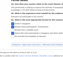
E.g. I just saw this related example, where someone has chosen to use Images of the "MediaWiki checkbox" as part of a standard page design. Hence there are now hundreds of pages that look like this, with elements that look as if I can click them. And anyone who does click them, will get sent to the file page, and thus slightly mistrust clicking on actual checkboxes in the future.

image.png (504×550 px, 68 KB)

Buttons should look/work like buttons (invoking an action)
Links should look/work like links (navigating to a new page)
Text-structure should not look like UI.