Page MenuHomePhabricator

Consolidate progressive and constructive buttons
Closed, ResolvedPublic

Assigned To
Authored By
Isarra
Aug 27 2015, 5:27 PM
Referenced Files
F3680687: PhabButtons.png
Mar 20 2016, 8:39 PM
F3283987: pasted_file
Jan 26 2016, 11:06 PM
F3283979: Screen Shot 2016-01-26 at 2.57.28 PM.png
Jan 26 2016, 10:59 PM
F3059922: Photo Dec 08, 7 54 24 PM.jpg
Dec 9 2015, 4:41 AM
F3059960: Photo Dec 08, 8 03 48 PM 2.jpg
Dec 9 2015, 4:41 AM
F3059958: Photo Dec 08, 8 03 48 PM.jpg
Dec 9 2015, 4:41 AM
F3059963: Photo Dec 08, 7 57 25 PM.jpg
Dec 9 2015, 4:41 AM
F2474416: Screenshot 2015-08-28 09.53.15.png
Aug 28 2015, 5:03 PM
Tokens
"Heartbreak" token, awarded by Tomybrz."Dislike" token, awarded by TerraCodes."Piece of Eight" token, awarded by RandomDSdevel.

Description

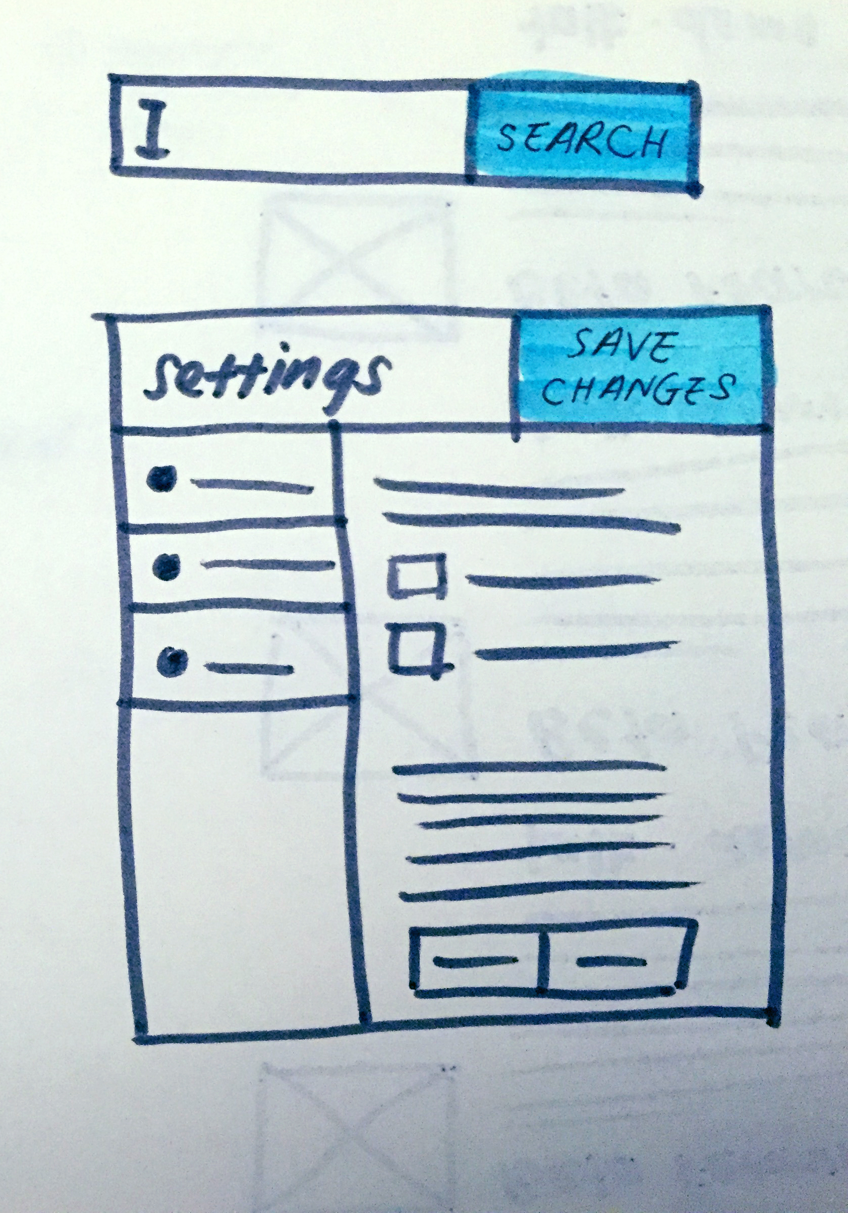
Currently we have progressive and constructive button styles for highlighting non-scary important buttons so they stand out more (generally by making them solid green/blue, though this may vary by theme). A bit like how the 'create task' button on here is blue and the cancel button is plain grey.

There are a few issues with having two separate highlighted button styles:

  • The distinction between which is which is often somewhat subjective or even arbitrary; things can be both progressive and constructive, or argued either way
  • Adds complication when designing forms for designers, mw developers, third-party extension developers, gadget developers, on-wiki template designers, lua module writers, and others; they all often have enough to worry about even without adding this on top of everything else
  • Adds complication to the form backend to properly support, rendering it more difficult to develop and maintain
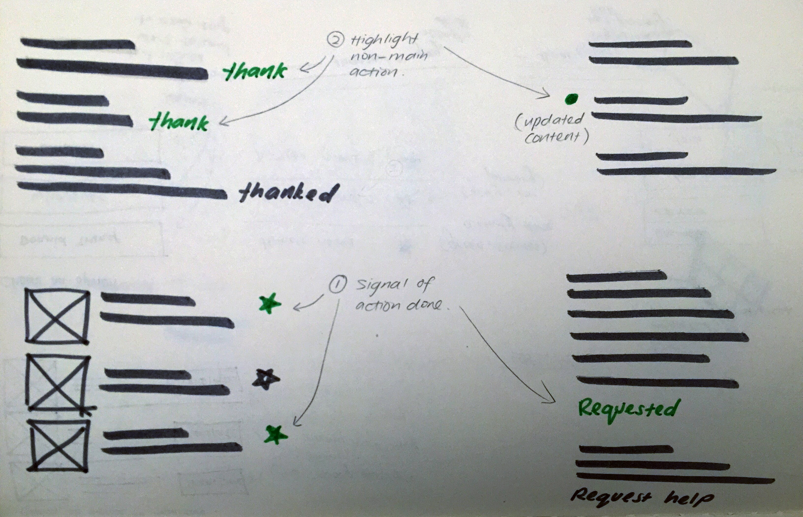
  • Users are more likely to notice that something is highlighted than how it's highlighted, especially when the colours are this similar (less of an issue with destructive because the colour is so different)
  • Lacks flexibility; different themes will not necessarily be able to use this many colours effectively, and designing things expecting more colours can lead to unnecessarily inconsistent user experiences with the same software

We should consider consolidating them into a generic 'important/main button' class, and test if they have any impact over this on the users themselves.


The items affected are listed in full at https://phabricator.wikimedia.org/T126309#2101800
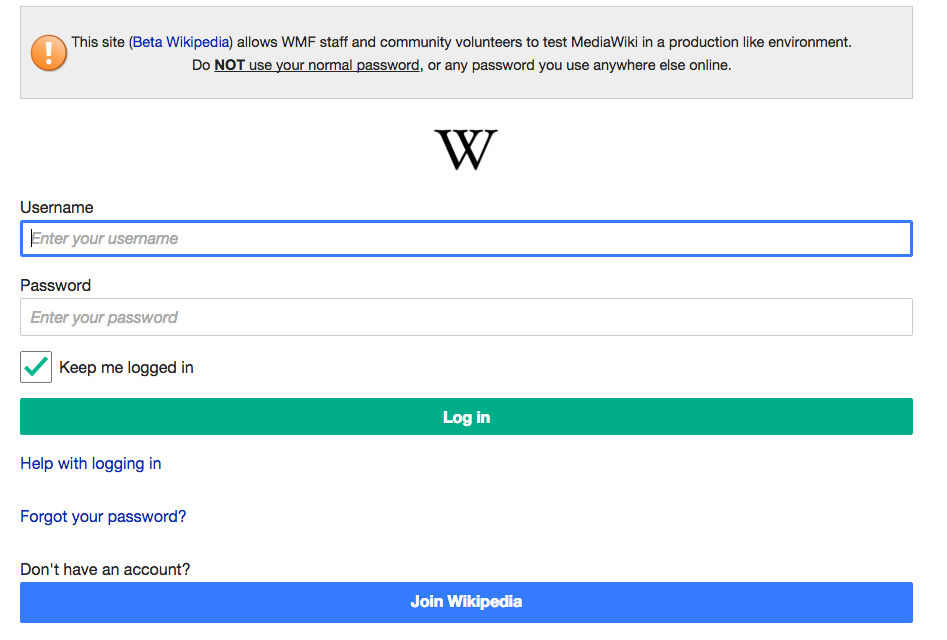
(An incomplete overview: SpecialMovepage button, Usercreate and UserLogin submit buttons, VE's citation "insert" button (and maybe others), Flow's save buttons and watchlist stars, CX Start and Publish buttons, Mediaviewer's download button, uploadwizard on Commons, Thanks' no-JS button, and a few others)

Related Objects

Event Timeline

There are a very large number of changes, so older changes are hidden. Show Older Changes

I solicited thoughts on this topic on the design list. Full thread: https://lists.wikimedia.org/pipermail/design/2015-October/002414.html

The TLDR is:


About constructive buttons:
used to indicate an action that creates something rather than modifying
provide hint that something will be created, regardless of steps
several people have mentioned that green constructive that doesn’t “create” anything


Constructive vs. progressive buttons

@Isarra mentioned: "If it's shown to help, that's all we need. We have a justification for the maintenance overhead and stuff." Unfortunately we do not have proper resources to help us figure this out. But the current situation is that we've had confusions from developers and community members in understanding when and where to use constructive vs. progressive. For our users to learn the association of constructive button being the last action in a process and progressive being the in-betweens, it "requires [the pattern] to be applied consistently to work" as @Pginer-WMF mentioned. Also, in certain complex processes, it's hard to tell which would be the last step. An example given by @Tgr was:

"…after you submit the login form and MediaWiki verifies your credentials, depending on your user settings you might or might not be presented with a two-factor challenge; so submitting the user name and password might or might not be the last step of the form."

The idea of constructive vs. progressive sounds like an aid for going through a multi-step process. Its underlying purpose is to keep users informed of where they are within a process. My thoughts are that this progressive/constructive solution sounds like it stemmed from the user need of "knowing where I'm at within a process/workflow."

We can solve this more effectively. @Volker_E linked us to a discussion on SO where a user mentioned: "Apple hardly ever uses Wizards for set-up processes, and when they do, the Apple set-up assistants are (in my opinion) always easier to figure out than the Microsoft equivalents. I'd suggest looking at the differences and try to identify the tricks employed by Apple." I can agree with this—a better form /workflow experience.

There is also a good amount of rationale as to why we wouldn't need this sort of variation, which mainly stated complications in applications by the community members and devs and that we have no resources in place to find out if the variation complication outweighs the advantages.

@Spage suggested that we use "Green for Thanks, because in an unfriendly often toxic "community" it's a nice Constructive thing to do."


My suggestion after these observations are:


BLUE

The main reasons why we use blue button is to (in order of importance):

  • (1) Help users with clear step to move forward within a page / workflow (if there is only one way to move on)
  • (2)To suggest and highlight (if there are multiple options to move on). If no specific suggestion, they remain uncolored.

Example of (1):

Photo Dec 08, 8 03 48 PM 2.jpg (2×1 px, 2 MB)

Example of (2):

Photo Dec 08, 8 03 48 PM.jpg (1×1 px, 1 MB)

Photo Dec 08, 7 57 25 PM.jpg (2×3 px, 3 MB)


GREEN

There are also a few reasons why we would use green for links or icons

  • (1) To signal that an action has been taken only when it helps users navigate a page / workflow
  • (2) To highlight a suggested action although not the main action (secondary) on the page or workflow

Examples of (1) & (2):

Photo Dec 08, 7 54 24 PM.jpg (2×3 px, 4 MB)


Because more colors means more confusion than help, we should have restrictions such as

  • Only one color type of button(s) per page / workflow. Either a blue or red.
  • Never a colored link / icon next to a colored button. Remember, colored buttons are to help users move forward, more colored links / icons dilute the intention.
  • Use green links and icons minimally. Highlight most important only and only when necessary to help users.

Overall, I'm still skeptical that we can make this a binary decision. I think there's only not-so-good and good decisions. Good judgement is the most effective. That is why guides are there to help someone make the best informed decisions while giving space for creativity. The most immediate example that comes to mind is the log in form. Both are possible ways of moving forward and both are equally primary actions. But say, as a team, we want to drive more sign ups, so instead of highlighting both, we highlight only one. It's possible that both are highlighted, but not recommended because when everything is in focus, nothing is in focus, but this is a less extreme example of that).

In the other example of blue (2), one can use blue buttons repeatedly because there is much content around a call-to-action button that warrants a need for focus.

In conclusion, let's retire the idea of constructive and progressive. Instead, we have primary (blue), secondary (green), and destructive (red).

Help me poke holes in my thoughts with more use cases or perhaps strengthen them with more examples and better guides.

violetto's summary seems nice and thorough, though I'm obviously biased.

On a less biased note, not only would one colour be less confusing, it'd also lend itself better to different themes. We like blue or whatever, but suppose WikiHow could use green buttons for everything more easily!

I just put this task under review stage to give everyone some time to respond. I'm planning to wrap this task up on the 24th to meet the quarter deadline. :)

@violetto One thing I'm missing in the discussion above and the conclusion from different inputs is concerning the current implementation in OOjs UI.
There is already a (normal/secondary) ButtonWidget that has just a border and a (constructive or progressive) colored text and a primary button style with the different sub-types (constructive, progressive, destructive).

I've cited this elsewhere before, color should not be the only method of conveying information – true for accessibility reasons, but stands true for improving interaction clarity in general.
So going for a primary button style with full background-color and a secondary button style like currently already provided as normal button style with border and white (neutral) background in OOjs UI seems to be a useful solution to consider instead of staying with relabeling the colors.

Related to T110565: Evaluate when you should use each style of button (primary, flagged, frameless) and clarify in style guide

@violetto One thing I'm missing in the discussion above and the conclusion from different inputs is concerning the current implementation in OOjs UI.
There is already a (normal/secondary) ButtonWidget that has just a border and a (constructive or progressive) colored text and a primary button style with the different sub-types (constructive, progressive, destructive).

To my best knowledge, VE made these additional buttons for their own use. Hence, we prompted some clarifications around use cases from anyone. There are more previously filled and open tasks about this T88481 & T88617

I've cited this elsewhere before, color should not be the only method of conveying information – true for accessibility reasons, but stands true for improving interaction clarity in general. So going for a primary button style with full background-color and a secondary button style like currently already provided as normal button style with border and white (neutral) background in OOjs UI seems to be a useful solution to consider instead of staying with relabeling the colors.

To understand better, what would you say are the main differences with "relabeling the colors" and "going for a primary button style with full background-color and a secondary button style like currently already provided as normal button style with border and white (neutral) background in OOjs UI"?

Thanks for all your input and collaboration in getting this decided in such timely manner. Special thanks to @Isarra!

Passing the baton over to you @Volker_E!

In terms of the mobile site, this change could be made via an update to mediawiki ui library in core. I have no strong opinions either way.

My only concern is the sign up page and that this would lead to two blue buttons next to each other - which will be confusing - please let's make sure we make sign up a neutral button if we do this and check that there are no mw-ui-constructive buttons alongside mw-ui-progressive.

Screen Shot 2016-01-26 at 2.57.28 PM.png (640×947 px, 72 KB)

In OOUI the solid filled buttons are 'primary' buttons. A non-primary (secondary?) button is white with a coloured border and text:

pasted_file (405×241 px, 30 KB)

So for the login we could probably use primary and non-primary progressive buttons.

@Jdlrobson There's already a patch for mediawiki.ui at https://gerrit.wikimedia.org/r/#/c/264248/ that I made dependent on the OOjs UI change in order to move this best possibly simultaneously. While updating the current OOjs UI patch set, I will stay with dependencies in order to not miss out on other places where we use the three affected colors of the current task.

Volker_E renamed this task from Consider consolidating progressive and constructive buttons to Consolidate progressive and constructive buttons.Feb 9 2016, 12:30 AM

After broad agreement on the shortcomings of current approach, we will consolidate the two button types into one primary constructive and will – in the next step – provide a secondary color for links in the main stylesheets.

Change 269352 had a related patch set uploaded (by VolkerE):
[DEPRECATING CHANGE] MediaWiki theme: Scrap constructive flag

https://gerrit.wikimedia.org/r/269352

Change 269358 had a related patch set uploaded (by VolkerE):
Deprecating: Consolidating progressive & constructive buttons

https://gerrit.wikimedia.org/r/269358

Jdforrester-WMF raised the priority of this task from Medium to High.
Jdforrester-WMF moved this task from Backlog to Doing on the OOUI board.

Worth a User-notice too?

https://www.mediawiki.org/wiki/OOjs_UI/Widgets/Buttons_and_Switches has stuff that could use updating, maybe other pages of that guide too.

Change 269352 merged by jenkins-bot:
[DEPRECATING CHANGE] MediaWiki theme: Scrap constructive flag

https://gerrit.wikimedia.org/r/269352

Change 269358 merged by jenkins-bot:
Deprecating: Consolidating progressive & constructive buttons

https://gerrit.wikimedia.org/r/269358

Change 274465 had a related patch set uploaded (by Bartosz Dziewoński):
Revert "Deprecating: Consolidating progressive & constructive buttons"

https://gerrit.wikimedia.org/r/274465

Change 274465 merged by jenkins-bot:
Revert "Deprecating: Consolidating progressive & constructive buttons"

https://gerrit.wikimedia.org/r/274465

Change 274472 had a related patch set uploaded (by Bartosz Dziewoński):
Deprecating: Consolidating progressive & constructive buttons

https://gerrit.wikimedia.org/r/274472

Change 274472 merged by jenkins-bot:
Deprecating: Consolidating progressive & constructive buttons

https://gerrit.wikimedia.org/r/274472

matmarex removed a project: Patch-For-Review.

This happened! The change (to old-style MediaWiki UI buttons and new-style OOjs UI buttons) will roll out to Wikimedia wikis next week with MediaWiki 1.27.0-wmf.17, per https://www.mediawiki.org/wiki/MediaWiki_1.27/Roadmap.

Awesome, thanks to everybody involved: @Isarra for raising this and @violetto for collecting the wide range of affected interfaces and constructively leading the path and developers for their feedback and review-power.

Isn't this change in colision with T111088? On testwiki this was a preview three months ago:

PhabButtons.png (310×1 px, 19 KB)

and now? What color (button class) of Save button will be there in order to make it different from remaining two if green is not supported anymore?

All green (constructive) buttons turned into blue, not into colorless, so the distinction there is preserved.

Bug.

{{Clickable button 2|{{FULLPAGENAME}}|class=mw-ui-constructive}}

@Green_Zero It's a bug in the template, it overrides the mw-ui-constructive styling (which is now blue) with its own colors. I can't fix it, because it's protected.

Better to remake it according cswiki (colors here depends on MediaWiki OOjs UI classes) https://cs.wikipedia.org/wiki/%C5%A0ablona:Klikateln%C3%A9_tla%C4%8D%C3%ADtko

User @CabbagePotato made a demo of the template applying a misfitting inline background-color on top of mw-ui-constructive at https://en.wikipedia.org/wiki/User:CabbagePotato/sandbox2

@Green_Zero It's a bug in the template, it overrides the mw-ui-constructive styling (which is now blue) with its own colors. I can't fix it, because it's protected.

So, what we must to do to fix that?

When will the green button come back?

When will the green button come back?

I would also like to see the green button come back.

I'd like to see the green button come back to life