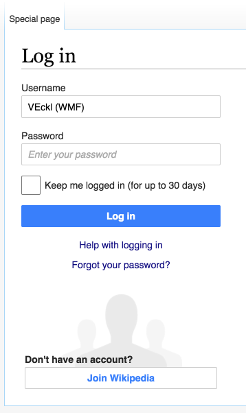
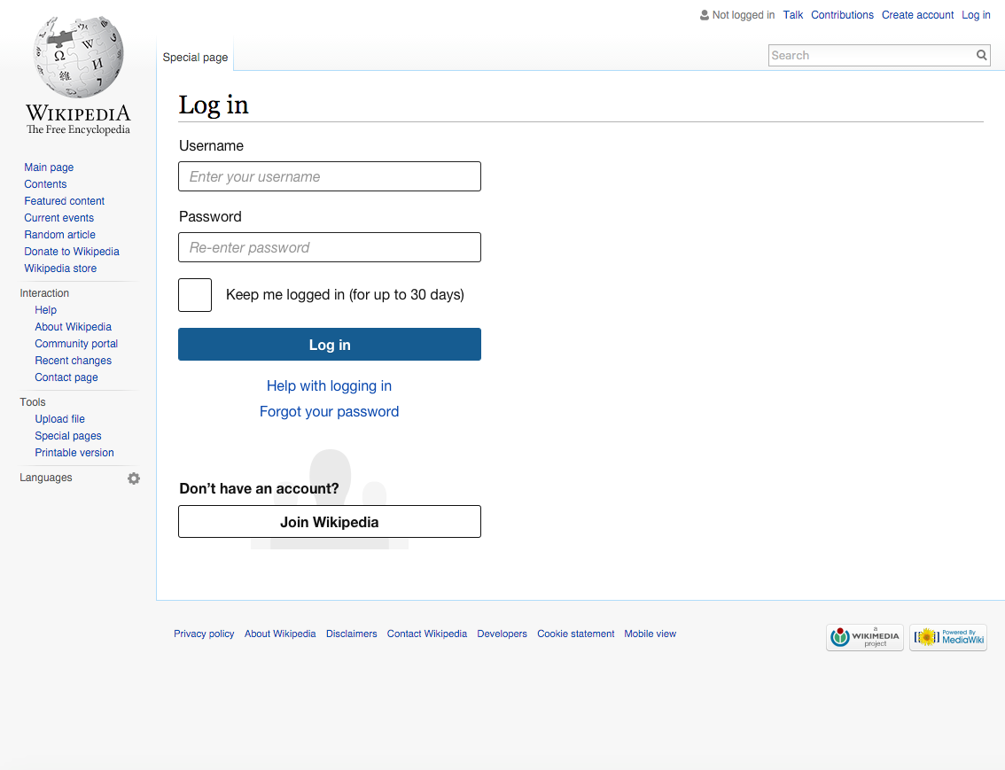
The login form looks erroneous to me.
Shouldn't this 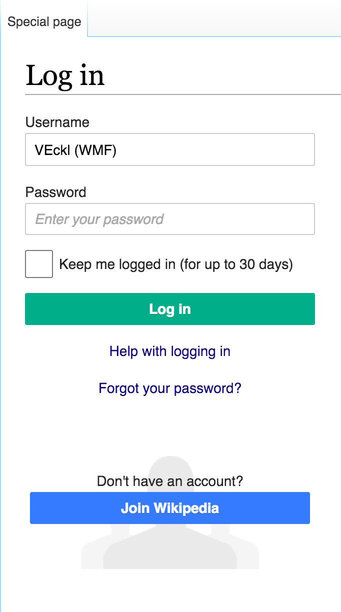 | be more like? 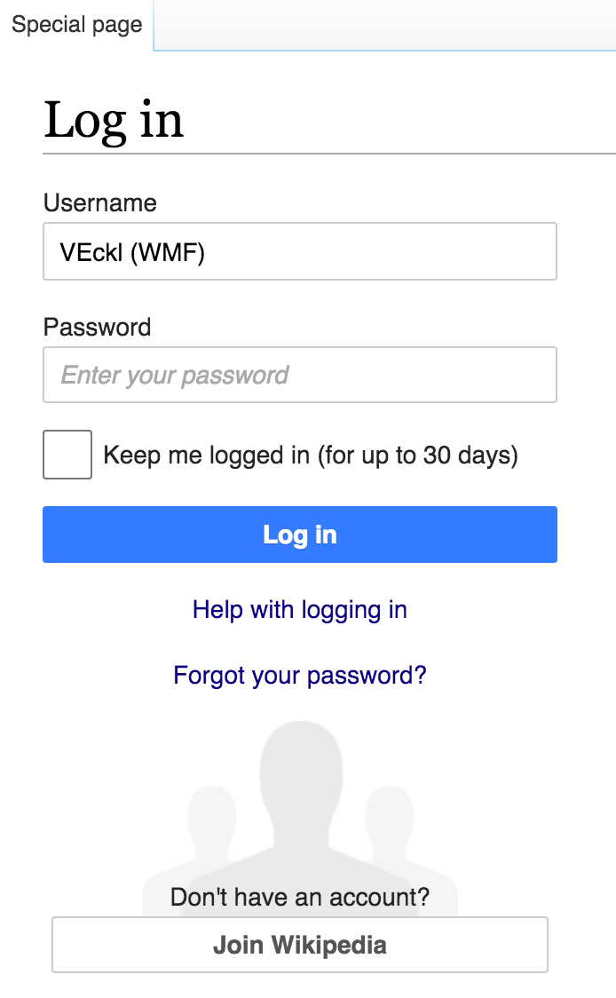 |
Update 2016-04-29 (current implementation)
| Volker_E | |
| Feb 9 2016, 5:01 AM |
| F3947457: T126307 en.wikipedia.org Log in - Wikipedia 2016-04-29.png | |
| Apr 29 2016, 9:33 PM |
| F3707047: daily registrations.png | |
| Mar 25 2016, 1:03 AM |
| F3705348: account creation drop.png | |
| Mar 24 2016, 7:44 PM |
| F3630452: log-in areas.png | |
| Mar 14 2016, 11:39 AM |
| F3568301: pasted_file | |
| Mar 8 2016, 11:07 PM |
| F3520441: wiki-login.png | |
| Mar 4 2016, 4:28 PM |
| F3333669: Screenshot 2016-02-11 22.26.21.png | |
| Feb 11 2016, 2:36 PM |
| F3325821: T126307_en.wikipedia.org_2016-02-08_20-59_current.png | |
| Feb 9 2016, 5:04 AM |
The login form looks erroneous to me.
| Shouldn't this | be more like? |
Update 2016-04-29 (current implementation)
| Subject | Repo | Branch | Lines +/- | |
|---|---|---|---|---|
| Minor update on login form on layout and buttons | mediawiki/core | master | +13 -13 |
| Status | Subtype | Assigned | Task | ||
|---|---|---|---|---|---|
| Resolved | Volker_E | T126307 Design for login form without constructive buttons | |||
| Resolved | Volker_E | T89860 Buttons on login page are inconsistent with the policy of "only one primary button"; make the sign-up button unflagged primary |
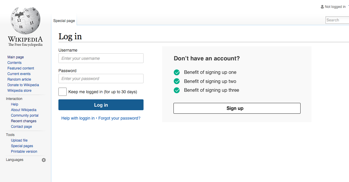
I can provide some background. If I recall correctly the idea was to highlight the two main options. Log-in with a progressive color (green at that time) since it allowed to move forward, and "join wikipedia" using the constructive color (then blue). Later button colors were switched, remaining this as an inconsistency.
Regarding the change you propose, given that the two options are no longer presented at the same level as a choice, we may want to emphasise the "Don't have an account?" label a bit more. Otherwise this option may get lost among less frequent options such as log-in instructions.
I'm also wondering about the position of the "Don't have an account? >Join Wikipedia<" part. It looks to me like a gag.
There is some backgorund info on the designs and A/B testing that the Editor Engagement Experiments team (later known as Growth team) did in this area, which may be of interest. You can check it at https://www.mediawiki.org/wiki/Account_creation_user_experience
We can explore an option to this effect that does not depend on the color of a button to show its presence.
I'm totally ok with the idea of exploring alternatives for the log-in/account creation view. However, given that this is an important workflow for contributors, we may want to consider:
@Pginer-WMF @violetto Given the [[ https://gerrit.wikimedia.org/r/#/c/269358/ | current merge of the consolidate progressive and constructive buttons ]] we should higher-prioritize this task.
@Pginer-WMF @violetto Exploring the alternatives seems good to me too, given the importance of the login form we should definitely involve Analytics for feedback and User Research for testing our ideas upfront.
As this is a longer process we should also weigh in the short-term alternative results of consolidating of either having
For now, I think we can update the "Join wikipedia" button to avoid the presence of two main buttons:
Once we have some resources for testing, we may want to explore other alternatives involving bigger changes.
I'm positive we should use that short-term alternative of making the "Join Wikipedia" button a secondary one as in the latest mockup by @Pginer-WMF as long as we closely watch the conversions.
I won't touch the input border-colors adaptions in M101 in the short-term. Waiting for @violetto on explanations for changing the color from #777 to #111. See also M101
There has been also Analytics tests back in 2012: https://meta.wikimedia.org/wiki/Research:Account_creation_UX
Change 275748 had a related patch set uploaded (by VolkerE):
Minor update on login form on layout and buttons
Change 275748 merged by jenkins-bot:
Minor update on login form on layout and buttons
@Pginer-WMF The patch got merged pretty quickly in connection with T110555: Consolidate progressive and constructive buttons.
It might need some extra work depending on the discussions on M33.
The current patch set involves:
I also wanted to challenge the 'increased weight' as the label is currently in #252525 and the button features #555.
Please control the output and give me feedback if needed.
I think that the current relationship between the people image and the button makes it push the latter down too much making it harder to discover.
Having some overlap would make it feel as a single bigger element and directing the attention to the button.
Regarding, the bolding, I was thinking of presenting the account creation option as part of a different subsection not as just another field label.
@Pginer-WMF I understand both your statements. We can refine the position in the next deployment train, if there is agreement around that or outcomes of T129293 tells us to get to action.
The issue with setting the label bold in contrast to your layout building on M101 is, that neither the border nor the button text color of the button have been resembling darker mockup colors in production environment.
That said, if the label (#252525) is set to bold, the current layout with the less contrast button (#555) seems complicatedly composed.
What to do about it? Staying with non-bold label or setting this specific label to bold and fine-tune the color?
I agree with this, actually. The button is far away from the rest of the form, and without the eye-melting blue, there's just not much to draw attention to it. In my opinion, we should fix this before Tuesday's deployment rather than waiting to see what happens, it's a clear regression at the moment to me.
@matmarex @Pginer-WMF The distance from text-top of login headline to baseline sign up button in the old version on Wikipedia desktop browser rendering is 555px, versus the new one is 538px – there is actually a minor error with a newly introduced margin-bottom being not specific enough.
So with the layout change, like moving the people background-image further up, we are actually already winning a few pixels. Concerning other prominence attributes, like using another kind of button (attention, T110565) we need to have design input here before going into action.
My point was not about the distance, it is about how the relationship between two elements can make them look part of the same group (making the aggregate easier to identify) or making one push the other (making the one below harder to identify). I tried to illustrate below how I perceive the element groups (log-in and account creation) and how separating the people image too much from the button creates a kind of buffer area (in grey):

@Pginer-WMF That perception issues would probably need user tests. The group could also be identified with the background-image top. I don't see a strong argument here for or against current layout.
For the upcoming deployment we're running out of time. Considering adding the non-primary progressive (= secondary?) button to mw.ui – this would also make setting font-weight: bold on the preceding label possible. Obstacles, @Pginer-WMF or anybody else?
@Pginer-WMF That perception issues would probably need user tests.
Totally agree. However, this is not really a change proposed, since in the original design (which was subjected to some A/B testing) the button was already over the people image, and it seems to be changed later as part of the adjustment of button colors. I'm just pointing potential issues for deviating from the original design, which I agree with you that it would be great to be confirmed/discarded based on some user observations.
Interesting read in connection with this topic: http://www.lukew.com/ff/entry.asp?571
Just wanted to say thanks. I think the current master state is better than it was and makes it less likely to be confused/distracted by the "Join" button when logging in.
It does make it harder to discover the button, but it's also important to remember that unlike other websites we don't share a single entry page for Login and Sign up. We have separate links in the top right corner when logged-out ("Create account" and "Log in" are separate links with separate destinations).
So this is the page one gets when clicking the Log in button. It's important to keep that context in mind, which makes the success of account creation from the log-in page slightly less of a concern compared to success of smooth log in.
I do like this design as well. I think we had something similar a while back as part of an experiment. Curious how that worked out. Beware though that this two-column layout won't work well on mobile, so on mobile we probably want to keep the page as-is (single-purpose).
Change 277647 had a related patch set uploaded (by VolkerE):
Further improving sign-up portion of the login form
@Krinkle Thanks for your comment and your thoughts! :)
Please also look at my latest patch set, that incorporates @Pginer-WMF's comment on making the label before the "Join" button bold to clearer represent a new section and takes (that's a compromise given the available time) OOjs UI's progressive ButtonWidget design for the Join button to resemble it's being clickable clearer.
In today's Design Review I've proposed to revisit the login form in one of the next quarters with more time – necessarily accompanied by Design-Research – and we will then look into further improvements, like the idea by @violetto
In the meantime we'll carefully audit the conversion rates with Analytics.
Regarding the two columns, we'll definitely design and implement with mobile usage in mind. The two columns could for example be addressed by making them float – also in regards to rtl languages and help of CSS Janus.
It does make it harder to discover the button, but it's also important to remember that unlike other websites we don't share a single entry page for Login and Sign up. We have separate links in the top right corner when logged-out ("Create account" and "Log in" are separate links with separate destinations).
That's a good point for understanding the context in which this is commonly used. In addition to that, for some workflows that require the user to be logged in (e.g., relate to image uploading, watchlists, notifications, translations, etc.) we may be directing the user just to the log-in page and still have a path for those without an account yet. So I don't think we can assume the user had a clear choice before landing the form in all cases.
Please also look at my latest patch set, that incorporates @Pginer-WMF's comment on making the label before the "Join" button bold to clearer represent a new section and takes (that's a compromise given the available time) OOjs UI's progressive ButtonWidget design for the Join button to resemble it's being clickable clearer.
Thanks Volker. Would it be possible to have a screenshot in the ticket?
This has caused a pretty drastic drop in new account creations:
https://snapshot.raintank.io/dashboard/snapshot/zzm6IWvUMAmXlFRwEsrfLzy0ianX3oHs
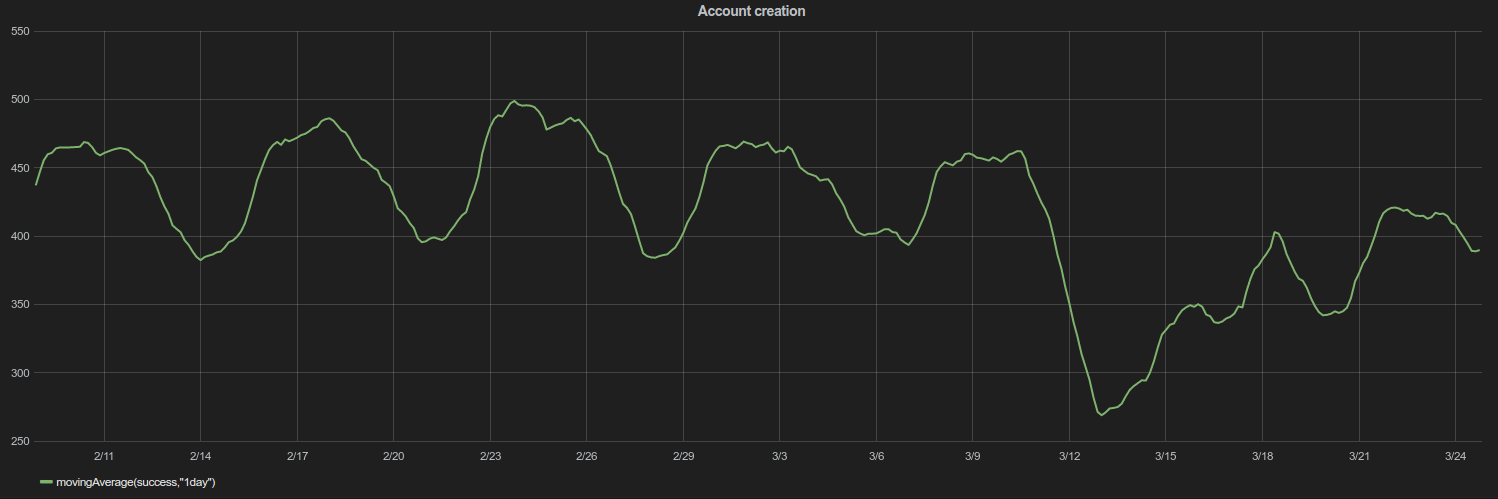
I queried the ServerSideAccountCreation logs (which might be where Gergő's graph came from too) and got the following:
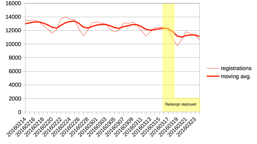
It looks like the worst drop was some kind of temporary aberration (the normal weekend drop accounts for a significant part), but that there has been a moderate drop in the underlying conversion rate. @Volker_E, this says to me we should keep iterating (I like the direction of @violetto's mockup) but that there's no need for an immediate rollback. Also, I'm happy to look at the numbers again after your latest tweak is deployed.
Actual query was:
SELECT
	LEFT(timestamp, 8) as "day",
	COUNT(*) as "registrations"
FROM ServerSideAccountCreation_5487345
WHERE
	LEFT(timestamp, 8) >= "20160210"
GROUP BY day;
It's from the MediaWiki.authmanager.accountcreation.web.success.sum graphite metric, with an 1d moving average. The dashboard of authentication metrics is at https://grafana.wikimedia.org/dashboard/db/authentication-metrics.
MediaWiki.site.users.sum is another metric you can look at: https://graphite.wikimedia.org/render/?width=586&height=308&from=-45days&target=MediaWiki.site.users.sum (the big drop in February is T125054).
accountcreation counts global accounts, site.users the total number of local accounts.
If "ServerSideAccountCreation logs" includes all kinds of creations, is it possible to isolate the specific effect of the log-in form (i.e., those requests with "campaign=loginCTA")?
It is not clear right now which are the next steps in this front. Do we have plans to explore some options and test the most promising ones with some A/B testing?
@Tgr, thanks! Do you know where I can find the configuration for the Grafana dashboards? (I looked through rOSGR but didn't find anything.) Just in general, I'd like to know how to find out what underlying data a dashboard comes from.
@Pginer-WMF, good suggestion. I put the login CTA numbers in a Google spreadsheet here. It makes the drop look somewhat more dramatic, but it doesn't really increase my assessment of the urgency here.
The only next step I have planned is checking these numbers again after Volker's follow-up patch is deployed this week. I certainly support A/B testing and further iteration but unfortunately I don't have the space to help with that right now.
@Pginer-WMF There might be a chance to include work on it into my next quarter. We should decide after looking at the numbers succeeding next week's deployment, which priority we gonna give it in contrast to the other issues.
It's JSON stored in a database. Replace grafana with grafana-admin in the domain name (use the LDAP password), and you will have a configuration menu with a "view JSON" option. Also, click on a graph near the edge (where the pointer turns into a hand), select Edit, and you'll get a graph GUI. (Changes are not saved unless you click on the disk icon.)
Thanks for the update @Neil_P._Quinn_WMF!
The only next step I have planned is checking these numbers again after Volker's follow-up patch is deployed this week. I certainly support A/B testing and further iteration but unfortunately I don't have the space to help with that right now.
My second point was more general (sorry if the initial mention made it look I was asking directly to you). In any case, thanks also for the input about this.
Ok. Once plans to further work on this are confirmed, I'd be happy to help with the exploration of some options.
No worries! It's definitely something worth doing, so when I said "unfortunately" I meant it :)
@Neil_P._Quinn_WMF I'd be interested in an update of the numbers since the change on progressive quiet “Join” took place.
@Volker_E: I've updated the Google spreadsheet. It looks like there's been a partial recovery after the redesign rolled out (possibly due to your tweak), so the long term change seems to be from ~3 500 registrations per day to ~3 000.
Also, now that I've started using Google spreadsheets to do ad-hoc analysis like this, I'm never going back to LibreOffice. :D
Thanks @Neil_P._Quinn_WMF for the update.
Adding in @Jdforrester-WMF – to both of you, should we continue to worry or call it good for now (maybe keeping it stalled)?
@Volker_E, I updated the spreadsheet and it still shows the same result (a long-term change from ~3 500 registrations per day to ~3 000). I talked to James about this, and it's not something he's particularly worried about (in part because registrations are not a key metric for us).
I think it makes sense to revisit this page in the future with the help of Design Research, but for now I think we can consider it done
@Neil_P._Quinn_WMF Thanks for the update here. Insightful!
Ok, then we all agree that this can marked resolved by now and we will probably revisit it in a consecutive task.