Page MenuHomePhabricator

Adjust layout for the new notification panel designs
Closed, ResolvedPublic

Description

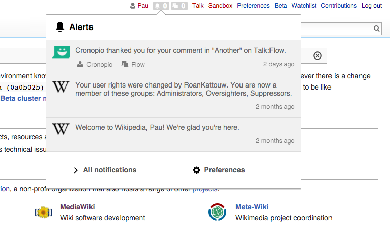
As shown below, alignment of some items is unbalanced:

missaligned.png (358×684 px, 51 KB)

  • The icon is not centered between the left margin and the text to its right (highlighted in green in the screenshot).
  • The "X" for closing is not right-aligned with the timestamp (highlighted in blue).
  • The padding for the whole notification is also inconsistent: Top margins (in yellow) and side margins (green and blue) are different.
  • The timestamp text also looks too small.

action-layout.png (456×733 px, 87 KB)

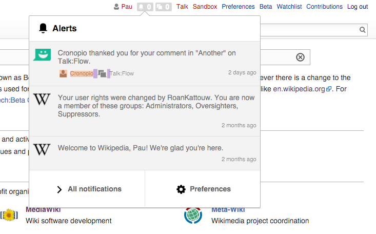
  • For actions, the text and icon are very different in size (highlighted in orange).
  • The separation between actions is small. Icons should be closer to their label than they are to the previous action in order to group visually the items that belong together. Note the purple highlight does not represent a significative difference in space.

Proposed adjustments

Adjusting the above layout we can get a more consistent spacing:

notifications-adjusted.png (358×707 px, 54 KB)

The adjustments I made (indicated in Ems since those are the units used despite I'm not a fan):

  • Notification item (.mw-echo-ui-notificationItemWidget). Adjust padding to 0.8em in all sides. This requires to adjust the notification content (.mw-echo-ui-notificationItemWidget-content) left padding to be 3.3em (so that the icon has 0.8em space on both sides).
  • Close button (oo-ui-icon-close). For a button, it makes sense to have an active target space around it, but that causes it to be misaligned. I move it 0.5em to the right so that it is visually aligned with the timestamp below by making it's position relative (not sure if there is a better option).
  • Small text (mw-echo-ui-notificationItemWidget-content-actions). I've set the text size to 0.9em. The former 0.8em seemed too small.

Screen Shot 2015-12-30 at 11.40.00.png (452×699 px, 81 KB)

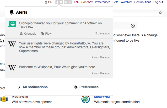
  • Action icon (oo-ui-iconElement-icon), Adjust the size to 1.5em to avoid the icon being too big compared with the text (which was increased to 0.9em as part of the timestamp adjustment described above)
  • Actions (".mw-echo-ui-notificationItemWidget-content-actions-button:not(:last-child)") separation. Set right margin to 1em to separate actions more clearly.
  • Action group (".mw-echo-ui-notificationItemWidget-content-actions"). Margin top adjusted to 0.8em.
  • Panel width. Additionally, we could increase the general width of the panels (both notifications and alerts) from the current 450px to 500px:

Screen Shot 2015-12-30 at 11.46.39.png (454×767 px, 90 KB)

Event Timeline

Pginer-WMF raised the priority of this task from to Needs Triage.
Pginer-WMF updated the task description. (Show Details)
Pginer-WMF added a project: Notifications.
Pginer-WMF subscribed.
Restricted Application added subscribers: StudiesWorld, Aklapper. · View Herald Transcript
MtDu subscribed.

I'll work on this. Haven't done this a lot before, so I may edit the wrong files, or may not edit enough files. Please review my patches. Thanks!

Change 263805 had a related patch set uploaded (by MtDu):
Adjust layout for new notification panel designs

https://gerrit.wikimedia.org/r/263805

Not sure about these:
For setting notification item to the same on all sides, I'm not sure if I was supposed to do that for both files I did it in. Same for adjusting the notificatio content to 3.3em. Not sure where css for close button is. Not sure where action icon is (do you mean set it to 1.5em by 1.5em width and height?) Also, not sure why it caused two file modes to change. Not sure how to revert those.
Thanks!
MtDu

Not sure where action icon is (do you mean set it to 1.5em by 1.5em width and height?)

Screen Shot 2015-12-30 at 11.40.00.png (452×699 px, 81 KB)

The "Thanks" notification in the example above includes two actions: "Cronopio" (i.e., view the user page who thanked you), and "Flow" (view the discussion page where you were thanked).
The proposal is to have the size of these actions to be 1.5em for both height and width.

The current rule I found through the browser inspection capabilities is the following:

.oo-ui-buttonElement.oo-ui-iconElement > .oo-ui-buttonElement-button > .oo-ui-iconElement-icon {
    width: 1.875em;
    height: 1.875em;
}

This may not be specific to the Notifications code (seems to be a general rule of our widget system) so we may need to override it for this case. @Mooeypoo who is more familiar with the code and the general Mediawiki infrastructure may be able to provide better guidance on the technical aspects.

@Mooeypoo,
Hello! Could you take a look at my comment on gerrit and guide me a little?
Thanks,
MtDu

@Mooeypoo,
Hello! Could you take a look at my comment on gerrit and guide me a little?
Thanks,
MtDu

Hi @MtDu, I'd love to help -- which comment are you referring to? Is it related to this task or another gerrit commit that I have missed?

@Mooeypoo,
The comment is on this gerrit patch. https://gerrit.wikimedia.org/r/#/c/263805/ Related to this task.
Thanks!
MtDu

Ok. After Pginer's comment, I did a little digging. Here are my questions:

  1. These are files in core. This is the oojs-ui-mediawiki-noimages.css file https://dpaste.de/QFtN#L122,123,124,125 and this is the oojs-ui-apex-noimages.css. https://dpaste.de/xpHW#L122,123,124,125

I am supposed to edit both of those?

  1. This is the jquery.ui.theme.css file. https://dpaste.de/nhDu#L167

Is that the icon I am supposed to move over by .5em? (I'll have to convert it to pixels if it is)

  1. These files are in Echo, please look at my patch for reference. For setting notification item to the same on all sides, I'm not sure if I was supposed to do that for both files I did it in. Same for adjusting the notification content to 3.3em. I did this to two files, and I'm not sure if that's right.
  2. Please review the patch to see if edits are as desired.

Thanks,
MtDu

Ok. After Pginer's comment, I did a little digging. Here are my questions:

  1. These are files in core. This is the oojs-ui-mediawiki-noimages.css file https://dpaste.de/QFtN#L122,123,124,125 and this is the oojs-ui-apex-noimages.css. https://dpaste.de/xpHW#L122,123,124,125

I am supposed to edit both of those?

You shouldn't edit those directly, because they're exports from the OOUI library, but what I think you probably want to do instead is write a CSS rule specifically for the notification panel that overrides the width and height of the icon.

  1. This is the jquery.ui.theme.css file. https://dpaste.de/nhDu#L167

Is that the icon I am supposed to move over by .5em? (I'll have to convert it to pixels if it is)

Why are you looking at jquery.ui? That shouldn't be in use anywhere near this stuff.

@Catrope,
Gotcha. I got part 1 down. I'm not sure where the icon I mention in 2. is though. Could you help me? It's the oo-ui-icon-close.
Thanks,
MtDu

@Catrope,
Gotcha. I got part 1 down. I'm not sure where the icon I mention in 2. is though. Could you help me? It's the oo-ui-icon-close.
Thanks,
MtDu

The icon itself is in OOUI, but you should be trying to style the thing that contains the icon, and that style should be in Echo. Does that make sense?

(If you prefer to ask questions interactively, you can also join #wikimedia-collaboration on IRC, where the Echo/Flow devs hang out)

@Pginer-WMF: these changes should be on beta in 15 mins or so, please check if we got it all right.

Change 263805 merged by jenkins-bot:
Adjust layout for new notification panel designs

https://gerrit.wikimedia.org/r/263805

@Pginer-WMF: these changes should be on beta in 15 mins or so, please check if we got it all right.

Looks good to me. Thanks!
The "X" may still need some adjustment, but the issue seems more related to the size of the element, so I created a separate ticket for it (T124025).

@MtDu, thanks for the commit! we are usually keeping the merged code fixes open so QA can go over them and approve.

Reopening for QA review.

@Mooeypoo,
Ok thanks for the notice. I just needed to clean up some of the tasks I was assigned. (May be too many. :))
Thanks,
MtDu

Verifying the fixes in betalabs - going through the list of @Pgner-WMF's Adjustments
(some issues with cross-wiki layout was filed separately):

Screen Shot 2016-01-19 at 1.45.05 PM.png (345×817 px, 64 KB)

Screen Shot 2016-01-19 at 1.45.32 PM.png (411×649 px, 64 KB)

  1. >Notification item (.mw-echo-ui-notificationItemWidget). Adjust padding to 0.8em in all sides.

Presently,

mw-echo-ui-notificationItemWidget 
    padding: 0.8em;
    background-color: #F1F1F1;
    border-bottom: 1px solid #DDD;
    white-space: normal;
    line-height: 16px;
  1. Close button (oo-ui-icon-close) is right-aligned now with a timestamp

Small text (mw-echo-ui-notificationItemWidget-content-actions). I've set the text size to 0.9em. The former 0.8em seemed too small.

Presently,

.mw-echo-ui-notificationItemWidget-content-actions {
    margin-top: 0.8em;
    font-size: 0.9em;
  1. oo-ui-iconElement-icon has now:
mw-echo-ui-notificationItemWidget-icon img {
    height: 30px;
    width: 30px;
  1. .mw-echo-ui-notificationItemWidget-content-actions{margin-top:0.8em;font-size:0.9em}

Panel width. Additionally, we could increase the general width of the panels (both notifications and alerts) from the current 450px to 500px:

Presently,

<div class="oo-ui-popupWidget-popup" style="width: 500px; height: auto; margin-left: -250px;">