Page MenuHomePhabricator

SelectFileWidget: Improve the thumbnail area (size, image appearance)
Closed, ResolvedPublic

Description

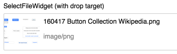
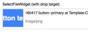
Current implementation of thumbnail area in SelectFileWidget with drop area (as of OOjs UI v0.17.1) includes a few user interface approaches, that we should reconsider:

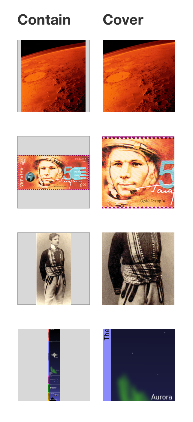
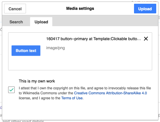
  • Uploaded images get background-size: contain applied, which can lead to dissatisfying or confusing appearance of images for the user (see below)
  • Thumbnail size (currently 5.5em width and height which is rendered at default zoom level as 70.391px should best possibly be aligned with sizes elsewhere and probably increased
  • Thumbnail position with no margin to the drop area border can result in bad appearance.
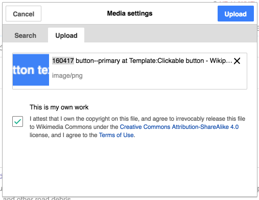
  • Does the MIME type mean anything to the majority of our users or is it more confusing? >>Filed T142883
  • Overlong filenames should be broken into the next line in the SelectFileWidget with drop area
  • When file selection is not supported, dropTarget doesn't need to take up space, because it won't get suddenly supported in same browser, so no reflow possible

Current appearance:

T134670 SelectFileWidget thumb OOjs UI Demos 2016-05-07_example01.png (105×345 px, 14 KB)

T134670 SelectFileWidget thumb OOjs UI Demos 2016-05-07_example02.png (111×303 px, 14 KB)

Event Timeline

On 1. Uploaded images are applied background-size: contain

Regarding the image preview, it seems that "cover" may be the preferred strategy when the image aspect radio does not deviate too far from a square. Since it provides a a less fragmented look, and the non-visible parts are not affecting the goal of providing the general feedback of having uploaded the right image.

We could evaluate the aspect ratio of the image and for the cases where it exceeds a certain threshold apply the "contain" strategy instead. That could help with images with extreme aspect ratios such as panoramas.

I compared both approaches in a set of examples below:

imatge-adjustments.png (1×643 px, 712 KB)

Citing @RHo from an internal conversation:

[I]s there a set of thresholds we could introduce which switches thumbs from cover to contain?
Eg., anything where width:height ratio is 2.0 or under 0.5 presents as contain thumbs. This way, it is easily distinguishable to the user at a glance when they have uploaded an extremely wide or tall image, and you’re less likely to get weird cropping for panoramas and portraits (crotch shots)

In T133245#2270486, @Ricordisamoa brought up the interesting point of appearance might mislead users into false-believe about functionality of the widget:

Please make sure users don't think they can only upload square images or the ones they uploaded are being cropped.

On 2. Thumbnail size should align to sizes elsewhere
There has been T356: RfC: Standardized thumbnails sizes started a while ago, also collecting requested thumb sizes on Wikipedia upload varnish backend back in 2013.
Candidates from that collection (the ones above 1000 requests) close (within +50px) to current 70px:

  • 120px
  • 100px
  • 80px
  • 90px

70px itself is 35th requested size – again back in begin 2013. We load the full uploaded picture as background-image currently, so there are no containing box size restrictions regarding the four candidates.

Volker_E updated the task description. (Show Details)

Re 1, I liked the original idea from https://gerrit.wikimedia.org/r/#/c/284642/ of just using 'contain'. I don't think the "fragmented" look is going to be a problem, since the background of the widget and of the thumbnail is the same (white), not grey like in Pau's mockup. Thumbnailing different images differently could be confusing.

Re 2, I don't think that we should care about the sizes MediaWiki uses. The purpose of our thumbnails is, as Pau put it, "providing the general feedback of having uploaded the right image"; the purpose of thumbnails in articles is to display the image in size large enough to see the details. (And the purpose of the RFC was to improve performance and reduce required disk space by limiting the possible thumbnail sizes, which is not relevant here as the thumbnails are generated client-side.) I think the current 70px was largely accidental, but I think it was a happy accident. Let's not forget that this is just a form widget, and not make it huge.

@matmarex To the third questioned element brought up, do you have more information what lead to the decision to include the MIME type?

To 2.:
The main current implementation is in the “Media settings”(!) Upload dialog.

T134670 SelectFileWidget thumbnail drop area - Editing Front end - Wikipedia 2016-05-09.png (391×507 px, 43 KB)

Going from 70px to 100px and adding 10px margin is improving the experience and we have the screen real estate for it. Proposal:
T134670 SelectFileWidget thumbnail drop area - Editing _proposal Front end - Wikipedia 2016-05-09.png (392×511 px, 42 KB)

@matmarex To the third questioned element brought up, do you have more information what lead to the decision to include the MIME type?

No idea. @Anomie implemented it that way in 233916544e587a249d669b970c0129f9af31cd4b (T91146).

Because the information is there. I had the file size included too at one point, but Matma complained that it would take "huge libraries" to do it right and I didn't want to mess with it.

@Anomie Ok, thanks! “Because the information is there” could be said about email headers en length as well, but most email programs hide it. ;)
Repeating my uncomforable feelings about adding that information. I guess, majority of our users have no idea what a MIME type is at all, the way operating systems deal (in large parts badly) with file types is an encyclopedia of computer history on its own.
There's two ways to improve this from my point of view:

  • Hiding the information entirely (IMO currently easiest improvement and best solution)
  • Improving it by adding descriptor like for example “File MIME type: image/png”

There's two ways to improve this from my point of view:

  • Hiding the information entirely (IMO currently easiest improvement and best solution)
  • Improving it by adding descriptor like for example “File MIME type: image/png”

I'd be more in favor of removing it. Exposing users to the MIME concept or making the effort of translating the mime strings into human-friendly text is probably not worth it.

For some context on how this control was intended to be used you can refer to T115860#1745586

Regardless of possibly removing it, we also gonna make sure, that overlong filenames are broken into the next line in the SelectFileWidget with drop area. Adding this to the task description.

Volker_E updated the task description. (Show Details)
Volker_E moved this task from Doing… to Done on the UI-Standardization-Kanban board.