Page MenuHomePhabricator

<maplink> and/or <mapframe>: Markers with white labels on light backgrounds
Closed, ResolvedPublic

Description

Map markers always have white symbols or labels. If a light background like yellow is used this could not be read easily. In case of light backgrounds black labels should be used.

This task was mentioned at Community-Wishlist-Survey-2017 (https://meta.wikimedia.org/wiki/2017_Community_Wishlist_Survey/Miscellaneous/Kartographer_improvements), which got the No.1 out of 214 proposals.
Event Timeline

I don't think this is supported by Kartotherian (Kartotherian-Maki) at the moment, but maybe there is a way (low cost) to add support for it?

This seems low priority to me, as finding a darker background feels easy enough.

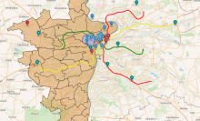
Here is the map of Prague. I turned off the dark background one region, to compare darkish and no fill. Hopefully some of the "map markers" we're taking about are here ? Which markers here, if any, are the problem. Or, if they're not here, can anyone please show a map that demonstrates the problem?

Screen Shot 2018-02-11 at 1.25.19 PM.png (755×1 px, 1 MB)

I thought about the marker pushpins themselves. If they are for instance yellow then it is difficult the read the pushpin inscription.

As follow-up from this, we should recommend that stimple-style have the ability to set the text and marker colours independently.

TheDJ removed Yurik as the assignee of this task.Apr 7 2020, 10:05 AM
thiemowmde subscribed.

Solved as part of the WMDE-GeoInfo-FocusArea, see T302861: Actually update the Maki icons and the many linked tasks. The relevant code was added via github.com/wikimedia/makizushi/pull/8 and later improved.