Page MenuHomePhabricator

Actually update the Maki icons
Closed, ResolvedPublic8 Estimated Story Points

Assigned To
None
Authored By
thiemowmde
Mar 2 2022, 9:35 AM
Referenced Files
F35553065: image.png
Oct 7 2022, 12:19 PM
F35485203: image.png
Aug 23 2022, 9:20 AM
F35485198: image.png
Aug 23 2022, 9:20 AM
F35485116: image.png
Aug 23 2022, 7:52 AM
F35485114: image.png
Aug 23 2022, 7:52 AM
F35483728: image.png
Aug 22 2022, 10:18 AM
F35483724: image.png
Aug 22 2022, 10:18 AM
F35483718: Screenshot from 2022-08-22 12-02-46.png
Aug 22 2022, 10:12 AM

Description

This ticket is about realizing what we found during T300040: Investigation: update Maki icons .

To do:

  • Adjust size of icons to match previous version (at s/m/l sizes)
  • Center icons.
  • Verify that alphanumeric markers are centered.
  • Agree on how missing icons from maki 0.5.0 will be aliased.
  • Dynamic and static maps must be consistent.

Should be separate sub tasks:

  • Document new icons, as well as aliased icons from maki 0.5.0, updating the help page. --> T312752
  • Deploy to the beta cluster so we can validate. --> T315646

Code changes:
https://github.com/wikimedia/makizushi/pull/2
https://github.com/wikimedia/makizushi/pull/3
https://github.com/wikimedia/makizushi/pull/4
https://github.com/wikimedia/makizushi/pull/6
https://github.com/wikimedia/makizushi/pull/7
https://github.com/wikimedia/makizushi/pull/8
https://github.com/wikimedia/makizushi/pull/9
https://github.com/wikimedia/makizushi/pull/10
https://github.com/wikimedia/makizushi/pull/11
https://github.com/wikimedia/makizushi/pull/13

Icon grids:
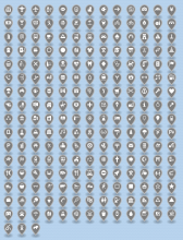
Reviewing the "circle-stroked" marker at each size, we're pixel-perfectly centered and sized.
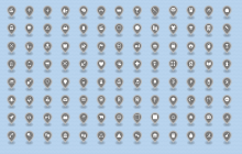
Maki 0.5 grids at small / medium / large:

maki0-grid-s.png (314×491 px, 57 KB)
maki0-grid-m.png (315×482 px, 83 KB)
maki0-grid-l.png (336×501 px, 89 KB)

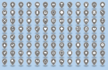
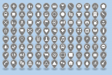
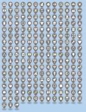
Maki 7 grids:

maki7-grid-s.png (635×476 px, 125 KB)
maki7-grid-m.png (641×490 px, 156 KB)
maki7-grid-l.png (650×498 px, 180 KB)

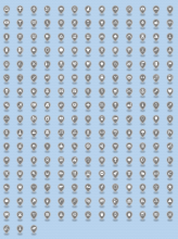
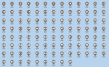
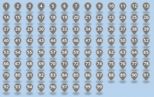
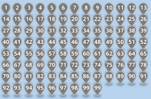
Here are the new numeric markers--at the moment, I haven't replicated the feature where the font size is decreased for two-digit numbers:

image.png (294×477 px, 61 KB)
image.png (306×481 px, 81 KB)
image.png (315×480 px, 88 KB)

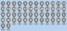
New letters:
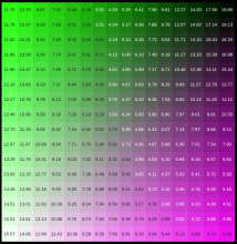
image.png (83×473 px, 15 KB)
image.png (92×478 px, 20 KB)
image.png (99×489 px, 22 KB)

Related Objects

Event Timeline

There are a very large number of changes, so older changes are hidden. Show Older Changes
awight set the point value for this task to 8.May 5 2022, 12:48 PM
This comment was removed by awight.
awight updated the task description. (Show Details)
awight moved this task from Doing to Tech Review on the WMDE-TechWish-Sprint-2022-08-17 board.
awight added a subscriber: MSantos.

Here are the new numeric markers--at the moment, I haven't replicated the feature where the font size is decreased for two-digit numbers:

@awight It looks like you created a new implementation for numbers and letters. Does this open up the option of 3-digit numbers too?

Here are the new numeric markers--at the moment, I haven't replicated the feature where the font size is decreased for two-digit numbers:

@awight It looks like you created a new implementation for numbers and letters. Does this open up the option of 3-digit numbers too?

It would be possible with the current technique, but probably inadvisable. Each extra digit will take an order of magnitude more disk and memory because we're pre-rendering every possible number. It would be possible to go up to 199 with only 2x the storage, maybe that's good enough for now?

There's also a more radical approach we could look into, of dynamically rendering. But let's keep that discussion on a separate ticket perhaps.

It would be possible with the current technique, but probably inadvisable. Each extra digit will take an order of magnitude more disk and memory because we're pre-rendering every possible number. It would be possible to go up to 199 with only 2x the storage, maybe that's good enough for now?

Even increasing to 199 would be a big improvement. This was a very requested feature and if we are able to do it, I think that would be great.

There's also a more radical approach we could look into, of dynamically rendering. But let's keep that discussion on a separate ticket perhaps.

Maybe a good topic for story time?

@ECohen_WMDE Thiemo found something important during review, that Maki has dropped the outlines on symbol icons, so we should consider doing the same for the alphanumeric markers we're generating in our code. Here's what that would look like:

image.png (193×434 px, 30 KB)

image.png (199×457 px, 40 KB)

image.png (203×440 px, 42 KB)

(Also note that all of these outline-less icons become hard to see on light-colored pin backgrounds.)

Examples of the outline-less markers with light backgrounds:

image.png (70×30 px, 1 KB)
image.png (70×30 px, 831 B)

Perhaps we should flip the color scheme when using a light background? The PNG is actually a black numeral, so the current renderer is "xor"-ing or inverting the icon. We could flip to additive rendering when the color is light. For example:

image.png (70×30 px, 1 KB)

We've included a bit of code that flips color when a relative luminance of 0.5 is crossed, using this WCAG formula: https://www.w3.org/TR/WCAG20/#relativeluminancedef

L = 0.2126 * R + 0.7152 * G + 0.0722 * B

Resulting icons look like:

image.png (70×30 px, 1 KB)
image.png (50×40 px, 1 KB)
image.png (70×30 px, 1 KB)

Update: I've combined the WCAG recommendations for color contrast and corrected the relative luminance formula. This gives a threshold of about L=0.179 for a contrast ratio of 4.5:1 against both black and white. Here are icons around the threshold, using the updated software thresholds to decide which symbol color to use:

image.png (70×30 px, 1 KB)

@awight Thanks for all the notes! I think dropping outlines is a an improvement for readability, especially at small sizes (for both icons and letters/numbers). So that seems great, and it seems like you have come up with a solid solution to deal with the primary downside.

Update: I've combined the WCAG recommendations for color contrast and corrected the relative luminance formula. This gives a threshold of about L=0.179 for a contrast ratio of 4.5:1 against both black and white. Here are icons around the threshold, using the updated software thresholds to decide which symbol color to use:

In this example are you showing icons with almost the exact same color but slightly different to essentially demonstrate the "break point" of switching from black to white?

My only comment is that instead of black, we should use a dark grey. Maybe then the calculation has to be adjusted (or maybe this will happen automatically?). Can you use Base10 (#202122) instead of black for the dark icon version? Also for the dark letters and numbers.

In this example are you showing icons with almost the exact same color but slightly different to essentially demonstrate the "break point" of switching from black to white?

Yes, sorry I forgot to explain what these murky snapshots were all about ;-)

My only comment is that instead of black, we should use a dark grey. Maybe then the calculation has to be adjusted (or maybe this will happen automatically?). Can you use Base10 (#202122) instead of black for the dark icon version? Also for the dark letters and numbers.

Sure, lemme try this. Yes and good point that the threshold would have to be adjusted! Actually, making that automatic feels like a big maintenance improvement since the next time I look at this code to adjust colors I'll have forgotten everything I learned last week...

Yes, sorry I forgot to explain what these murky snapshots were all about ;-)

Ok cool, thanks for the confirmation. Based on eye alone it seems like it might be switching to black too soon. But I'll also trust your contrast calculations if this is technically the right place for the switch to happen.

Sure, lemme try this. Yes and good point that the threshold would have to be adjusted! Actually, making that automatic feels like a big maintenance improvement since the next time I look at this code to adjust colors I'll have forgotten everything I learned last week...

Great thanks!

For reference: I wrote a little demo to play around with possible black vs. white thresholds. The numbers in the image are the contrast ratios according to WCAG. Higher numbers = better. When we use Wikimedia base10 as the dark icon color instead of pure black I ended with 0.25 as the best threshold in my experiments. This favors white icons a little more while still being as close as possible to the curve where the numbers left and right of the black vs. white curve are close to 4.5, which is what's required to pass AA.

<style>
body {
	background: #000;
	color: #fff;
	font-family: sans-serif;
	font-size: 12px;
}
.grid {
	border-collapse: collapse
}
.grid td {
	font-size: 12px;
	height: 40px;
	text-align: center;
	vertical-align: middle;
	margin: 0;
	padding: 0 0.5em;
}
</style>

<table class="grid"></table>
<p>Ramps: <span></span></p>

<script>

function luminanceFrom8BitRgb( r8Bit, g8Bit, b8Bit ) {
	var R = luminanceValueFrom8BitRgb( r8Bit ),
		G = luminanceValueFrom8BitRgb( g8Bit ),
		B = luminanceValueFrom8BitRgb( b8Bit );
	return 0.2126 * R + 0.7152 * G + 0.0722 * B;
}

function luminanceValueFrom8BitRgb( value8Bit ) {
	var valueSrgb = value8Bit / 255;
	return valueSrgb <= 0.03928 ?
		valueSrgb / 12.92 :
		Math.pow( ( valueSrgb + 0.055 ) / 1.055, 2.4 );
}

var colorRamps = [
	0,
	0,
	0,
	0,
	0,
	127,
	255
];
var numberOfRamps = colorRamps.length,
	rChannelRamp = ( Math.random() * numberOfRamps ) | 0,
	gChannelRamp = ( Math.random() * numberOfRamps ) | 0,
	bChannelRamp = ( Math.random() * numberOfRamps ) | 0;
document.getElementsByTagName( 'span' )[0].firstChild.data = rChannelRamp + ', ' + gChannelRamp + ', ' + bChannelRamp;
// rChannelRamp = 5; gChannelRamp = 1; bChannelRamp = 2;

var table = document.getElementsByClassName( 'grid' )[0];
var step = 16;

for ( var x = 0; x < 256; x += step ) {
	var tr = document.createElement( 'tr' );
	for ( var y = 0; y < 256; y += step ) {
		colorRamps[0] = x;
		colorRamps[1] = y;
		colorRamps[2] = 255 - x;
		colorRamps[3] = 255 - y;
		var r = colorRamps[rChannelRamp],
			g = colorRamps[gChannelRamp],
			b = colorRamps[bChannelRamp];

		var backgroundLuminance = luminanceFrom8BitRgb( r, g, b );
		var threshold = 0.25;
		var useDarkIcons = backgroundLuminance > threshold;

		// @wmui-color-base10: #202122;
		var iconLuminance = luminanceFrom8BitRgb(
			parseInt( useDarkIcons ? '20' : 'ff', 16 ),
			parseInt( useDarkIcons ? '21' : 'ff', 16 ),
			parseInt( useDarkIcons ? '22' : 'ff', 16 )
		);
		var wcagContrastRatio = useDarkIcons ?
			( ( backgroundLuminance + 0.05 ) / ( iconLuminance + 0.05 ) ) :
			( ( iconLuminance + 0.05 ) / ( backgroundLuminance + 0.05 ) );

		var td = document.createElement( 'td' );
		td.style.backgroundColor = 'rgb( ' + r + ', ' + g + ', ' + b + ' )';
		td.style.color = useDarkIcons ? '#222' : '#fff';
		td.append( document.createTextNode( wcagContrastRatio.toFixed( 2 ) ) );
		tr.append( td );
	}
	table.append( tr );
}

</script>

Screenshot from 2022-08-22 12-02-46.png (718×699 px, 145 KB)

@ECohen_WMDE Here are some pins with Base10 as the dark symbol color. The backgrounds cross the break point, 7e7e7e and 7f7f7f.

image.png (44×30 px, 1 KB)

image.png (43×29 px, 1 KB)

When we use Wikimedia base10 as the dark icon color instead of pure black I ended with 0.25 as the best threshold in my experiments.

I don't have a preference about whether we use the theoretically "correct" threshold or one that looks better on our screens. FWIW, I did run the resulting colors through online contrast checkers and they report that the calculated threshold gives equal contrasts against the light and dark background.

With Base10 as the dark color, the calculated threshold is L = 0.211

With my experimental approach I can confirm 0.211 is also a great threshold. My suggestion to go up to 0.25 is because of what @ECohen_WMDE wrote: "it seems like it might be switching to black too soon". Personally I agree with that.

My suggestion to go up to 0.25 is because of what @ECohen_WMDE wrote: "it seems like it might be switching to black too soon". Personally I agree with that.

Yes this sounds great. With the updated screen shots I still think it should stay white for a bit longer.

Thanks for all the investigation and explanation!

My suggestion to go up to 0.25 is because of what @ECohen_WMDE wrote: "it seems like it might be switching to black too soon". Personally I agree with that.

Yes this sounds great. With the updated screen shots I still think it should stay white for a bit longer.

This would be fine with me, of course! I agree that the white symbol would probably be better at the break point, on my specific screen. That makes the achromatic break point roughly #898989, giving a calculated contrast of 3.5 vs. white, and 6 vs. black, so in theory the white symbol will fail the WCAG guideline of a minimum contrast of 4.5. It looks slightly better to my simple eye, but at the same time it's a very subtle change. We could also consider more extreme approaches such as tweaking the alpha mask so that the marker background fades towards the center.

Here are renders around the breakpoint, at #898989 and #8a8a8a

image.png (42×34 px, 1 KB)
image.png (51×28 px, 1 KB)

I'm seeing very different results if we use the ACPA formula (online calculator). Encouragingly, this argues that WCAG far overestimates black contrast and points towards moving our break point to a much lighter color. I'll check where the balance point is using these numbers.

It was difficult to solve the APCA equation theoretically so I found the balance point just by playing with the online calculator. It's around #a7a7a7 or a relative luminance of 0.386 . Icons to either side look like this, with backgrounds of #a7a7a7 and #a6a6a6. Looks quite good to me!

image.png (51×30 px, 1 KB)

image.png (46×29 px, 1 KB)

We noticed some small variations between the different outputs we've created. The source of the variation is that the Maki 7.1 release doesn't correspond to a git tag (should have been v7.1.0), so we've used slightly different versions of the source for these various tasks. We think the 7.1 release matches commit ed764be51d9f70c51c69b650fcfd93d48f671037 .

Here's how files correspond to specific versions of Maki:

  • List of Maki 7 icon names, for example in Lua module -> Maki v7.2
  • SVG images we uploaded to Commons -> Maki v7.1
  • makizushi package.json -> Maki v7.1
  • PNG renders commited into makizushi -> Maki v7.2

We'll discuss the best way to align all versions, either downgrading the PNGs or upgrading the other two outputs.

@awight, I think this is not correct: "List of Maki 7 icon names → 7.1". The list I see in https://www.mediawiki.org/wiki/Module:Maki_icon_overview is from Maki 7.2, as proven by the new icons, e.g. tunnel.

The list I see in https://www.mediawiki.org/wiki/Module:Maki_icon_overview is from Maki 7.2, as proven by the new icons, e.g. tunnel.

Thanks, you're right--I've edited the comment above.

@awight Is there a test page to see the new markers, numbers and letters live on beta - in addition to the images in the task description? I'd like to review the sizing and placement of the icons.

Currently it looks like the letters and numbers still have outlines. Can these be removed to match the icons?

We noticed and removed the outlines already. Here is a live example: https://maps-beta.wmflabs.org/v4/marker/pin-m-29+0a0@2x.png.

Glad to hear that.

I'd still like to see all of them at once. Is there a page where this is already possible? Maybe the ones used to generate all those screenshots?

I'd still like to see all of them at once. Is there a page where this is already possible? Maybe the ones used to generate all those screenshots?

Here's a quick one to start with: https://de.wikipedia.beta.wmflabs.org/wiki/Hilfe:Extension:Kartographer/Icons/Alphanumeric

We found that snapshots included a mix of Maki 0.5 and 7.2 icons, and after some digging discovered that geojson-mapnikify keeps its own cache of markers, in node's os.tmpdir()/geojson-mapnikify-<md5>.png. In order to refresh the snapshot icons, it's necessary to shut down the server, remove these files, and restart.

Thiemo found /.../ Maki has dropped the outlines on symbol icons

https://labs.mapbox.com/maki-icons/editor/ suggests that outline (stroke) is just optional and it can be added.

I notice that due to colour flip, which as I understand is a workaround to missing outlines, icons have turned black in some Wikipedia articles. I'd assume in these articles users had chosen pin colours on which light icon generally looked fine before, whereas thick black icons may add unneeded contrast to light-coloured map as a whole. Different colours on maps also generally convey different meanings, as outlined in map legend. If different pin colours are used for different types of features then now there may be different icon colours as well (e.g. see last example here), and if user wants to harmonize icon colours then it's difficult to do so as it's difficult to hit colour flip boundaries.

Maybe you can consider restoring icon outlines after all, as an alternative to colour flip? I think these outlines generally made sense for our use case where any pin/background colour is allowed.

https://labs.mapbox.com/maki-icons/editor/ suggests that outline (stroke) is just optional and it can be added.

...

Maybe you can consider restoring icon outlines after all, as an alternative to colour flip? I think these outlines generally made sense for our use case where any pin/background colour is allowed.

Thank you for finding this helpful detail! Dropping the outline was accidental from our perspective, so I think everyone is still open to restoring it. I've put the question on my team's TODO list and we'll get back to you shortly.

@Pikne: The Technical Wishes team talked about this proposal to restore icon outlines, and we identified two obstacles. The biggest issue is that the light-colored icon on a light background is less visually accessible even with the outline, and so the software should discourage or avoid this combination. The other is that quick experiments show that the outline seems to damage the icon readability. The outer stroke isn't carefully designed into the icons, it's just an effect applied to existing graphics. Comparing with and without the outline (in the maki icon editor, which renders slightly differently than our maps service):

image.png (96×218 px, 5 KB)

The shapes with an outline are smaller and harder to discern against a dark background.

Your concern about the choice of black vs white icons apparently carrying information is certainly valid, but maybe you can post some examples here if you come across them. Happy to look at it again!

Hello,

As the research lead behind APCA I want to add a little bit to the discussion.

  1. WCAG 2.x contrast math is incorrect and is not based on actual science. It should not be used as a reference for the flip point between white and black.
  1. WCAG 2.x contrast does not follow human perception particularly of self-illuminated displays, meaning computer monitors or devices.
  1. Blindly following WCAG 2.x contrast can be harmful to accessibility, for instance there are cases where WCAG 2.x contrast Will reject colors that are helpful for color vision impairments, while passing colors that are substantially worse for color vision impairments, Orange being one of many examples.
  1. Human contrast perception is much more rooted in the spatial frequency of the stimuli, and for our purposes this mean size, font weight, line thickness, or the density of a repeating pattern.
  1. Luminance is a linear measure of light as it exists in the real world. However human perception is not linear to light.

REGARDING PERCEPTUAL MID-POINT

Human perception interprets lightness/darkness differences based on their context, including spatial frequency, but also substantially affected by the surrounding luminance and the illuminance of the overall environment, and the eye's adaptation state to the current environment.

As a result, it is impossible to give an absolute "center point" luminance of a background, around which one should flip the stimuli between black or white. But also, a full-blown contrast equation is not required to determine that flip point. For a self illuminated display, it so happens that 0.38 Y is _about_ middle contrast under most typical conditions involving small text.

Yes it varies (between about 0.32Y and 0.44Y), and yes this is an over simplification. But if you are flipping text black or white, the simple answer can be a useful one, such as for auto-text color in a spreadsheet. This is demonstrated and discussed at "flip for color".

There's also a repo called "fancy font flipping" on Github, and has an associated codepen and some live webpages that you can experiment with as far as center point determination.

MIDDLE BG RANGE

While it's impossible to define a specific middle point because it is so affected by ambient conditions, we can make a few assumptions and narrow it down a bit. In most operating conditions we can say that background colors that are darker than sRGB #999 are best with white (#fff) text, and background colors that are lighter than sRGB #aaa are best with black (#000) text. The zone between #999 and #aaa is a no-fly zone for spatially small/thin elements.

Note also I want to point out the enormous difference between solid filled, and outline icons. "Hollow" icons, being defined by a thin outline, require substantially more contrast than solid filled icons, because once again contrast is more a function of the spatial characteristics than of any specific color pair.

I hope you find this information helpful, and please let me know if you have any questions.

Thank you for reading