Page MenuHomePhabricator

Make bookmark icon gray out when unavailable instead of disappearing
Closed, ResolvedPublic

Description

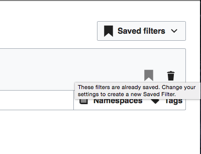
A user writes: "I was looking for the save button [meaning the bookmark icon] and it doesn't appear unless there are changes in the filter. That makes it harder for new users to discover that it exists. I would advocate to show the icon grayed out instead of letting it completely disappear."

This is an easy change to make and I agree that it would improve discoverability of the feature. The disabled state should follow the standard widget colors (the "IconWidget (disabled)‎" section in the widget demo has an example).

To make the functionality more clear, let's include a tooltip in the grayed out state only, as follows:

  • These filters are already saved.

Event Timeline

jmatazzoni updated the task description. (Show Details)

@Pginer-WMF, are you opposed to this change? If not, can you spec out what the grayed-out gray value would be?

@jmatazzoni: good first task tasks are self-contained, non-controversial issues with a clear approach and should be well-described with pointers to help the new contributor. Given the current short task description (no steps were provided where and how to reproduce the problem and as https://phabricator.wikimedia.org/tag/edit-review-improvements-integrated-filters/ does not explain where to actually find the codebase to look into, which gray value to use) I am removing the good first task and #GCI-2017 tags. Please re-add these tags once the task description has been polished and provides sufficient information for a new contributor. Thanks!

@Pginer-WMF, are you opposed to this change? If not, can you spec out what the grayed-out gray value would be?

It is not clear to me how this would improve the discoverability of the feature. Currently, the bookmark action is visible initially and even when filters are empty by default. The only case where the bookmark is not present for a user is when the user already had saved filters, which seems an indicator that the feature was already discovered.

The user comment seems to suggest to a different issue: being not obvious why the bookmark feature they already discovered is not available. Making it present but disabled can help to better connect the dots. We can consider this since the initial visibility of the feature was already increased anyways.

I'd recommend using a much shorter tooltip such as "Filters already saved", instead of "Bookmarking is unavailable because the current filter set is already saved. Change your settings to create a new Saved Filter". for a user that already used the feature to save those filters, that reminder should be enough to realise that these filters are already bookmarked.

The disabled state should follow the standard widget colors (the "IconWidget (disabled)‎" section in the widget demo has an example).

Change 389697 had a related patch set uploaded (by Petar.petkovic; owner: Petar.petkovic):
[mediawiki/core@master] RCFilters:Make bookmark icon gray when unavailable

https://gerrit.wikimedia.org/r/389697

Change 389697 merged by jenkins-bot:
[mediawiki/core@master] RCFilters:Make bookmark icon gray when unavailable

https://gerrit.wikimedia.org/r/389697

Checked in betalabs - the bookmark icon works according to the specs; the tooltip is in place.

Screen Shot 2017-11-07 at 4.42.26 PM.png (198×1 px, 41 KB)

QA Recommendation: Resolve

@Petar.petkovic, looking at this, I feel like the darkness of our "disabled" color makes the whole thing slightly more ambiguous than I'd wished. Can we please beef up the tooltip slightly? Let's make it say:

These filters are already saved. Change your settings to create a new Saved Filter.

Change 390167 had a related patch set uploaded (by Petar.petkovic; owner: Petar.petkovic):
[mediawiki/core@master] Change disabled saved filter tooltip

https://gerrit.wikimedia.org/r/390167

@Petar.petkovic, looking at this, I feel like the darkness of our "disabled" color makes the whole thing slightly more ambiguous than I'd wished. Can we please beef up the tooltip slightly? Let's make it say:

These filters are already saved. Change your settings to create a new Saved Filter.

Changing the message is easy, and I have submitted a patch for message update. Pau's comments on this ticket - T179743#3737091 - were against the long tooltip message, but last one suggested is much shorter than initial message that Pau found too long.

Also, color of disabled button is coming from OOJS. It can be changed, of course, but we want uniformity.

Change 390167 merged by jenkins-bot:
[mediawiki/core@master] Change disabled saved filter tooltip

https://gerrit.wikimedia.org/r/390167

Checked in betalabs.

FF 56

Screen Shot 2017-11-13 at 3.02.55 PM.png (187×470 px, 24 KB)

Chrome 61 and Safari will put the tooltip on two lines.

Screen Shot 2017-11-13 at 3.15.19 PM.png (306×400 px, 25 KB)

QA Recommendation: Resolve