Description
Details
| Subject | Repo | Branch | Lines +/- | |
|---|---|---|---|---|
| Add explicit padding and margins for all ul elements | mediawiki/skins/Timeless | master | +5 -0 |
| Status | Subtype | Assigned | Task | ||
|---|---|---|---|---|---|
| Resolved | Isarra | T173152 Timeless: Usability issues on mobile devices | |||
| Open | None | T181275 Watchlist items are narrow and hard to read on mobile devices |
Event Timeline
This is exactly why we introduced the MobileWatchlist in MobileFrontend. The whole HTML markup of core is mobile unfriendly and it's a huge endeavor to make that behave well on a mobile screen :-(
To be honest, I like even this better than the alternative MobileWatchlist is providing. Compared to a collapsible watchlist, it has a incredibly low information density and isn't usable by users with more than a few items on their watchlists at all.
Change 428284 had a related patch set uploaded (by Evad37; owner: Evad37):
[mediawiki/skins/Timeless@master] Add explicit padding and margins for all ul elements
Change 428284 merged by jenkins-bot:
[mediawiki/skins/Timeless@master] Add explicit padding and margins for all ul elements
Honestly this seems like a core problem - that the watchlist as-is does not translate well across resolutions, and as such needs to be fixed in core to be responsive.
Normally I'd just say that if we have an existing solution (the MF approach), that should be incorporated into the core feature, but from the sound of it I'm gathering the MF approach may not actually be better in practice?
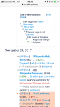
The above patch reduced the overly-large left margin on watchlist items, but when the new filters for edit review are enabled the large margin returns. And this whole task is also relevant to responsive MonoBook.
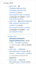
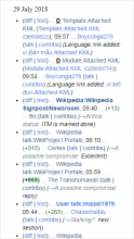
Screenshots:
| Timeless | With filters | Without filters |
| Watchlist | ||
Same situation with Recent changes, and with Responsive MonoBook.
The extra width is used to show the other coloured dots when multiple filters are highlighted, which is fine on a wider screen, but on small screens it makes the changes themselves narrower than is necessary, and harder to read.
Since on such narrow screens items are always going to take up multiple lines, the dots should be able to be shown in two or three rows, taking up less of the limited horizontal space. Or if possible, only take up the space required to show the number of coloured dots which are actually present.
Okay, yeah, that is not a design that translates well to mobile, especially with the grouped version.
Step one would probably be to figure out a better grouped recent changes layout for mobile, and then based on whatever THAT turns out to be, use a highlight approach that works with that for that or not that.
Basically I'm assuming we've currently got a desktop layout that works, we probably just need another one entirely for mobile. >.>
The Growth team discussed this today in our triage meeting. Going back to what Jon said above:
This is exactly why we introduced the MobileWatchlist in MobileFrontend. The whole HTML markup of core is mobile unfriendly and it's a huge endeavor to make that behave well on a mobile screen
Our team doesn't have the capacity to take on that kind of project in the short-to-medium term, but we'll leave this task open as people are using it to discuss patches to MonoBook, Timeless, etc.
We should copy the Minerva skinStyles that we applied to the Advanced mode across to core to fix this.


