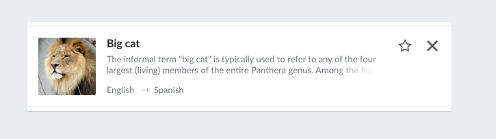
While working on T117604 (main problem described on that ticket was solved in T176663), there was a suggestion to truncate suggestion item descriptions to three lines. Descriptions are almost never that long to exceed three lines on screen sizes larger than 500px, but can easily be long enough to overflow portrait oriented mobile device, with screen size usually less than 420px.
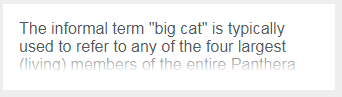
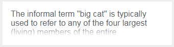
Limiting text to three lines is pretty straightforward, but indicating that text is truncated is not well supported, and there is no clean, pure CSS solution. All solutions require some kind of trade-off and current implementation settled on making text justified, so rightmost (for LTR languages) word stays aligned with ellipsis indicator. However, justified text can look really ugly and unreadable on devices that need truncation the most. Here is screenshot how it can look on mobile device:

In addition, T179148 reports problems of added dot and bad placement of ellipsis. This is not rechecked after T178669 is resolved, though.
@Pginer-WMF was not convinced by settling with text-align: justify approach and suggested using gradient to indicate truncated text - T117604#3671912.
That method has it's own fair share of trade-offs to be made, but will be further explored.
Explore how different approaches with gradient work with long descriptions
Pure CSS solution, without Javascript would be preferred when considering different approaches for indicating truncation of long descriptions.
JS possibilities
- Limit by number of words. This approach would be really expensive since word detection is harder for languages that don't use spaces to separate words.
- Limit by number of characters.
- "Define a fixed number of characters and then find the nearest white space, but it varies by script (and language if you use more M's than I's)"
- Using DOM containers and detecting overflow with Javascript.
- Not yet fully explored this alternative.
Javascript solutions would probably include ellipsis indicator, which is localized to many languages and may be more natural way of indicating truncation than gradient.
Making gradients work
Original solution dropped the idea of using gradients to indicate truncated text because gradients cannot be transitioned yet. There are some signs this feature will be available in the future, with making interpolation during the transition, but not available at the time of writing this. We need to transition the gradient, to have it stay unnoticed while whole suggestion item changes background color, transitioned while doing so.
Although transition on gradients is not supported, there may be some alternative workaround to have similar behavior.
- Positives to using gradients:
- Pure CSS solution
- May turn out to be easier than JS solutions
- Negative sides:
- Ellipses may be more natural indicator of truncated text
- Depending on where we put gradient indicator, it can be too big or too small (About this, @Pginer-WMF had some good thoughts: "I think we should aim for a solution that deals well with most cases without affecting the non-problematic ones. For example, with the "justified text" approach we were affecting all cases, even those that didn't exceed the maximum number of lines, just to deal better with fewer cases that did." )
Two possible positions for gradient
| End of paragraph | Whole line indicator (full line) | Whole line indicator (half line) |
|---|---|---|
 |  |  |
About this, I will again quote: