Page MenuHomePhabricator

CX's suggestion with long description overflows
Closed, ResolvedPublic

Description

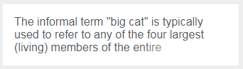
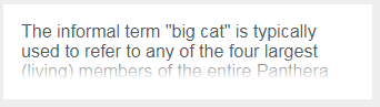
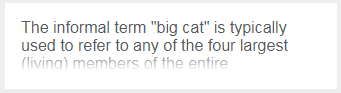
Suggestions in Content Translation occasionally have description far too long and it oveflow to the next suggestion. This make both the description and the next suggestion hard to read.

The suggestion system should fix it somehow. Possible options:

  • enlarge the box for suggestion
  • cut end of the description, possibly greying it out

eowiki - EnhavTradukado - sugesto - tro longa priskribo - malgranda.png (484×789 px, 103 KB)

Event Timeline

KuboF raised the priority of this task from to Medium.
KuboF updated the task description. (Show Details)
KuboF added a project: ContentTranslation.
KuboF subscribed.

Change 382602 had a related patch set uploaded (by Petar.petkovic; owner: Petar.petkovic):
[mediawiki/extensions/ContentTranslation@master] Truncate long suggestions descriptions

https://gerrit.wikimedia.org/r/382602

The cause of this long description overflows is changed in T176663: Adjustments for mobile UI , because item height can now increase, per changes in patch for that ticket, and other changes prevent overlaps with source > target language indicator at the bottom of the suggestion item.

The other request, limiting the number of lines is quite tricky and is notorious for not having good pure-CSS solution. Keeping maximum number of lines at three (that's the number I've used) is easy, but adding some kind of indicator that rest of the description is truncated requires some trade-offs. On desktop view, there are hardly many descriptions that would ever take more than three lines, but introducing three lines limit is much more important on smaller screen sizes. The submitted patch uses ellipsis indicator and the trade-off is that it needs text-align: justify to keep ellipsis aligned to last appearing word. This can cause some ugly-looking spacing between words, but from my experience, it mostly happens at extra small screen sizes.
Here are two examples how it looks in narrow (below 700px) views. @Pginer-WMF, please take a look.

Around 700px widthAround 400px width
long-description.png (381×599 px, 35 KB)
text-is-justified.PNG (659×319 px, 44 KB)

I have kept focus on suggestion items on above screenshots, but there is actually 50px padding left and right around the list of suggestion/translation items. On extra large screens that space gets increased, as main piece of content is limited at 1500px, per T175004: Avoid Translation dashboard to stretch too far on wide screens. But on screen sizes near 400px, like second screenshot above, there is actually 100px width reduction for suggestion items, making their width 300px actually. This is maybe good time to consider decreasing the padding on smaller screens, as it would impact the spacing between words in description (among other things), because it mainly happens on really small screens.

Change 382602 merged by jenkins-bot:
[mediawiki/extensions/ContentTranslation@master] Truncate long suggestions descriptions

https://gerrit.wikimedia.org/r/382602

I'm not convinced with the justified text approach. The gaps in the text, even when it is not heavily noticeable break the reading flow.

Would it be possible to make the text to fade as it approach the end of the last line using a transparent-to-white gradient over it?

I created a codepen as an example and illustrated the result below:

cx-item-long-desc copy.png (203×725 px, 38 KB)

Limiting the number of lines that are showing is quite easy, but showing indicator that there is more text has no perfect solution. You have used gradient shadow, which is most commonly indicator of truncated text. But actually, it has more problems than using ellipsis (some are specific to our use-case).

The problem that I'm solving for is the case when last word is not stretching all the way to the right (for left-to-right languages). The same problem is present when using gradient shadow. Following screenshot is taken from your codepen example.

gradient-shadow-indicator.PNG (97×342 px, 4 KB)

I have reduced size to illustrate the point and made some words longer so they break into next line (since I've tried this method, I know there are actual suggestions descriptions which can break like this on small screens). Illustrated problem is especially noticeable on mobile view (screenshot above would be about 520px wide). Notice that we have 50px padding left and right on dashboard, suggestion item image and action items. On largest dashboard width (limited to 1500px) there are hardly any descriptions so long that overflow will be issue.

The other problem, which isn't present when using ellipsis, is the fact that linear gradients are not animatable. Our list items change background color on hover, so, for any kind of indicator to stay unnoticeable, it needs to change color as well (and be animated doing so, to align with background color transition).

If you really want this to be done with linear gradient, I will try to find other ways of hiding the problem with transitions.
And for the first problem, maybe we could put really wide gradient indicator (although not perfect solution) or have linear gradient appear from bottom of the last line full width and indicate that there is more text below, which is illustrated with following images:

Full lineHalf line
gradient-to-bottom.PNG (97×342 px, 6 KB)
gradient-to-bottom-short-last-line.PNG (93×341 px, 5 KB)

I agree there is no perfect solution for this case. I think we should aim for a solution that deals well with most cases without affecting the non-problematic ones.
For example, with the "justified text" approach we were affecting all cases, even those that didn't exceed the maximum number of lines, just to deal better with fewer cases that did.

I think that making the gradient element at the end of the text wide enough, should work for most of the cases even if we don't extend it to the whole line. We can accept a few cases of unusually long words in a specific position where the description crops more abruptly.

The change of background color on hover is a good point. The codepen was for a simple illustration of the approach, I guess that the ":after" pseudo-element cannot be used in a final solution.

The approach you mention of extending the gradient to the whole line is a valid approach, but it also makes the fact that the description is incomplete more visible than needed. Overall, I's prefer to show the gradient at the end of the paragraph and making it wide enough to reduce the number of problematic cases. If we found it more problematic than expected, we can move to the full-line gradient approach.

Checked the fix in wmf.5 (the cases that I could find with long descriptions)

Screen Shot 2017-10-27 at 2.22.18 PM.png (396×824 px, 81 KB)