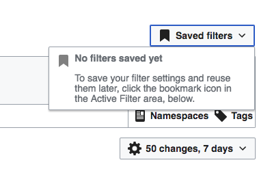
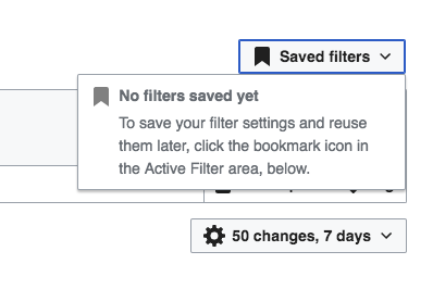
After the update on icons and default text sizes, the empty state of the Saved filters menu needs some adjustments.
Currently the title is not aligned vertically with the icon, there is too much separation with the information below it, and such information text has too little separation between lines. Below is an example of the current issues and the proposed adjustments:
| Current | Proposed |
|---|---|
The changes proposed are:
- Adjust the "No filters saved" top margin to be 3px. Since the text font-size is 14px tall and the icon is 20px tall, this 3px should center the text.
- Adjust the "No filters saved" bottom margin to be 7px (3x to keep it centered as mentioned above + 4px separation)
- Adjust the explanation text to use the standard 1.5em line height.


