Page MenuHomePhabricator

Explore how to make filters more compact
Open, Needs TriagePublic

Assigned To
None
Authored By
Trizek-WMF
Aug 7 2018, 5:46 PM
Referenced Files
F25422217: WL-old.png
Aug 27 2018, 12:17 PM
F25422224: WL-new.png
Aug 27 2018, 12:17 PM
F25422295: RC-new.png
Aug 27 2018, 12:17 PM
F25422287: RC-old.png
Aug 27 2018, 12:17 PM
F24690296: watch-chev-left-collapsed.png
Aug 8 2018, 2:51 PM
F18997373: watch-chev-left-collapsed.png
Aug 8 2018, 7:15 AM
F18997370: watch-chev-left-initial.png
Aug 8 2018, 7:15 AM
F24644037: Capture d’écran_2018-08-07_19-45-40.png
Aug 7 2018, 5:46 PM

Description

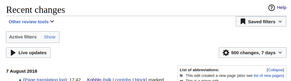
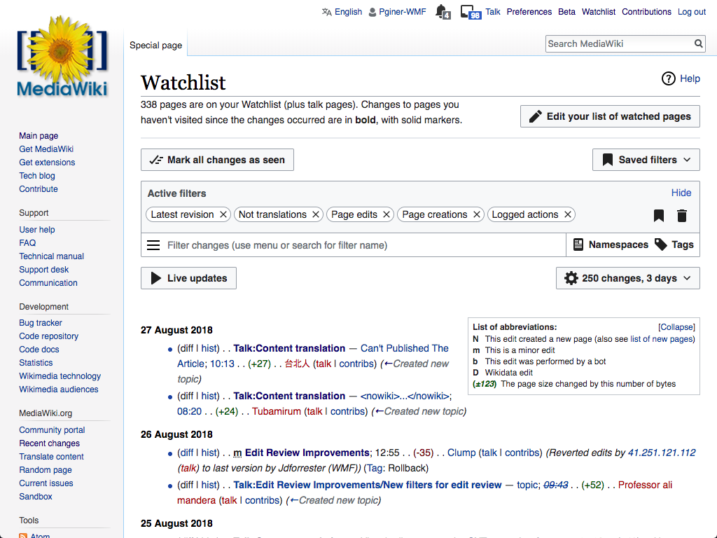
Based on that discussion with 4 users, it appears that the current compact more is not compact enough and could be improved. The different users haven't clearly said what they expected, but they are looking for a way to fill the blankspaces left.

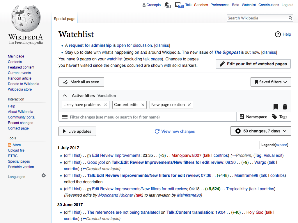
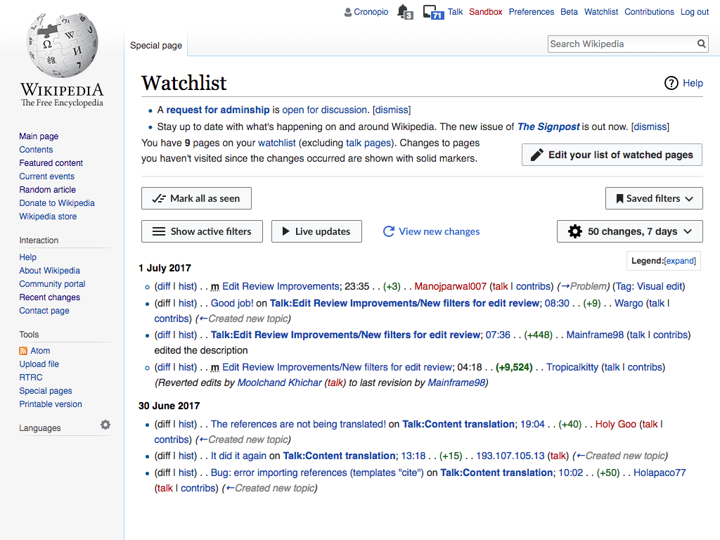
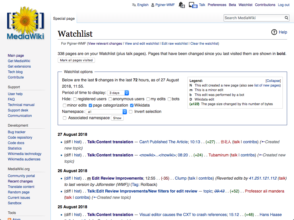
Current compact mode is:

Capture d’écran_2018-08-07_19-45-40.png (272×975 px, 43 KB)

Event Timeline

Thanks, @Trizek-WMF -- we will make a triage decision on this once you send over the background and info on all filters issues.

Unknown Object (User) subscribed.Aug 7 2018, 8:39 PM

We explored several options in T177206#4266985

Optimizing space was not the only criteria for selecting the solution, and it would be useful to understand the problems the issue causes beyond the need to feel empty space. In any case, I illustrated one of the options that was providing a more compact result:

watch-chev-left-initial.png (768×1 px, 251 KB)
watch-chev-left-collapsed.png (768×1 px, 268 KB)

(You can check it live in this prototype)

Assuming that people know the meaning of all icons, couldn't we go for something like that?

watch-chev-left-collapsed.png (666×1 px, 234 KB)

Assuming that people know the meaning of all icons, couldn't we go for something like that?

watch-chev-left-collapsed.png (666×1 px, 234 KB)

I think it make sense for the UI to make good use of the available space, but that should not be the only goal to consider.
Grouping elements visually helps to communicate how they are related, which helps users to use them and avoids accidents. For example, marking everything as red cannot be undone, and placing it with no label next to the refresh action may be problematic. It makes more sense for "Live updates", which represents a continuous refresh to be near the refresh action.

The proposal I shared above distributes functionality in two rows of controls. The first row more general about completely switching to a different activity (with a different saved filter) and clearing the pending items. The second row is about iterating on the current results to tweak them by manipulating their filters, the way they are displayed, or refreshing to get new results for the same task. Combining all these types of functionality into a single row seems too much.

I haven't really thought about the order of the buttons. :)

Anyway, the request is to have the most compacted design as possible. That's a frequent request from experienced users who like to "save space". Anyway, in the discussion, no one has the same expectation. Let's wait if there is more input on that.

(This topic came up on dewiki a couple of days ago. If you are looking for community feedback on your ideas, feel free to post there or ping me.)

Make the entire top region collapsible, leave nothing more than a link or button labeled with timestamp to unfold any options and explanations. This goes for many special pages and similar evaluations.

Just insert collapsible elements in HTML.

  • Then add jquery.makeCollapsible into dependencies.
  • If user did not activate JavaScript those additional elements should vanish.
  • There might occur some FOUC while loading, remembering the availability of further options.
  • The ultimately shortest rendering is to use timestamp as label, but reduction of the top region into timestamp, followed by the usual expand icon button is fine as well.

Date and timestamp are important.

  • They give me an idea when I retrieved this page last time.
  • Often I keep a browser tab open and review new created template pages once a day. Perhaps after two days. If updated five hours ago there is no need to refresh right now.
  • Both in collapsed and in expanded presentation the timestamp of evaluation should be mentioned.

Since many pages could benefit, on persistent WebStorage the recent state may be memorized.

  • Always starting with full view.
  • A URL parameter may be introduced to override the stored default; &collapsed=0 for bookmarks etc.

Create a common ResourceLoader module with shared code, that will implement administration of LocalStorage, with jquery.makeCollapsible as dependency.

collapsingElements
{ Newpages: true,
  Recentchanges: false,
  Watchlist: true,
  history-legend: true
}

(This topic came up on dewiki a couple of days ago. If you are looking for community feedback on your ideas, feel free to post there or ping me.)

Thank you @Cirdan for the ping. My translation engine is not that good on that conversation. If you see anything that could be useful, can you please report it? Thanks!

The discussion first was specifically about Special:NewPages, I filed T201333: Allow users to hide the filter settings on Special:NewPages.

Then it turned into a general discussion about the fact that the filters (and in general the switch to the larger OOUI elements) take up a lot of space. Users need to scroll a lot to arrive at the interesting parts of a page. The users in the discussion are all very active users who review edits a lot, be it through their watchlist, RC or NewPages. They go to these pages to see whether anything new has come in, for which they do not need the filters at all. Hence, they would like for the filters to be as small as possible (either collapsed or much more dense), or have a user setting to switch back to the old page layout.

If you have any specific questions for these users, let me know and I'll try to collect some voices.

JTannerWMF moved this task from Needs Discussion to Q1 2018-19 on the Growth-Team board.
JTannerWMF subscribed.

Since this is useful functionality that is no longer in the new interface, we’ll leverage previous design to bring it back in Q1

Then it turned into a general discussion about the fact that the filters (and in general the switch to the larger OOUI elements) take up a lot of space. Users need to scroll a lot to arrive at the interesting parts of a page. The users in the discussion are all very active users who review edits a lot, be it through their watchlist, RC or NewPages. They go to these pages to see whether anything new has come in, for which they do not need the filters at all.

As part of the design work in this area we kept in mind that the list of results were the main piece of content and the efforts on organizing the UI should not de-emphasise those. I added below some comparison of the old and new pages using 1024x760 window size where you can check that the new filters are not pushing the content down compared to the old ones.

Old WatchlistNew Watchlist
WL-old.png (768×1 px, 281 KB)
WL-new.png (768×1 px, 265 KB)
Old Recent ChangesNew Recent Changes
RC-old.png (768×1 px, 278 KB)
RC-new.png (768×1 px, 311 KB)

Note that for the new versions the filters are shown expanded since it is their default state, but they can be collapsed to give even more focus to the results and less to the filters.

Hence, they would like for the filters to be as small as possible (either collapsed or much more dense), or have a user setting to switch back to the old page layout.

Given the above I'm not sure how switching to the old version would make things better in this regard.

We can always explore how to make better use of the available space while providing clarity and advanced filtering capabilities, but I don't think we should define the problem as a regression from the previous version. If there are specific cases where there are issues, it would be useful to have the details to understand in which circumstances the layout becomes inefficient.

Thanks for the comparison!

We can always explore how to make better use of the available space while providing clarity and advanced filtering capabilities, but I don't think we should define the problem as a regression from the previous version. If there are specific cases where there are issues, it would be useful to have the details to understand in which circumstances the layout becomes inefficient.

I'm not a regular user of the recent changes page myself, so I'm afraid I cannot say much about its usability. I was asked to report T201333: Allow users to hide the filter settings on Special:NewPages on behalf of members of our community, which I believe is an example of a specific case where the layout is inefficient for many users.

(I came to this task to notify you that there was some recent discussion regarding the size/display of filter options and therefore a good chance to get some community feedback on possible ideas.)