Page MenuHomePhabricator

Make Active Filter display area collapsible on Watchlist and Recent Changes
Closed, ResolvedPublic

Description

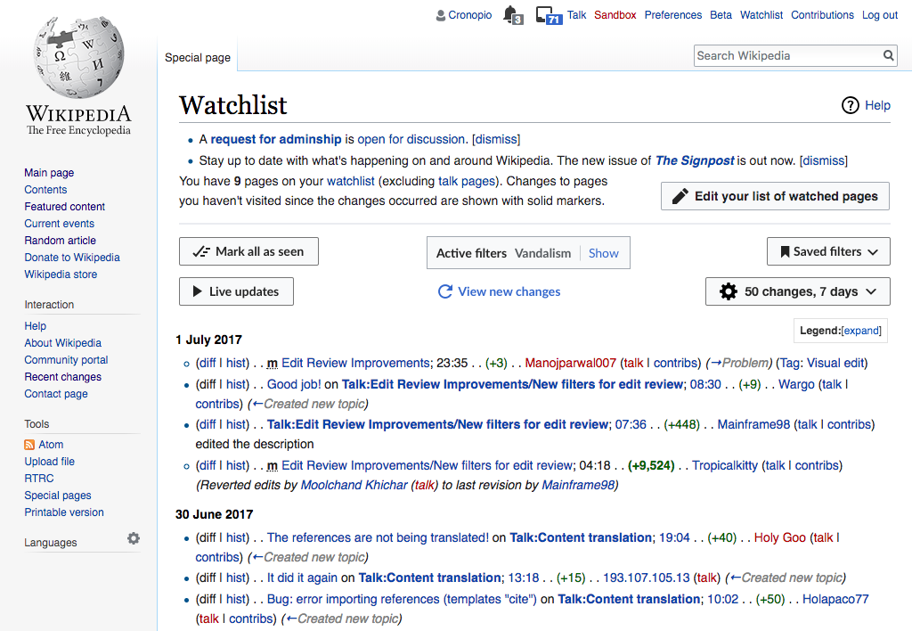
Filters may not be equally relevant in all kinds of changes listings. For the case of the Watchlist, in particular, some users have expressed their feeling that a lot of weight is given to filter controls when those are not as frequently used.

We can provide filter options in a way that the list of changes is the main focus while users with Saved filters, in particular, can use full functionality of the page. The default state is to show filters.
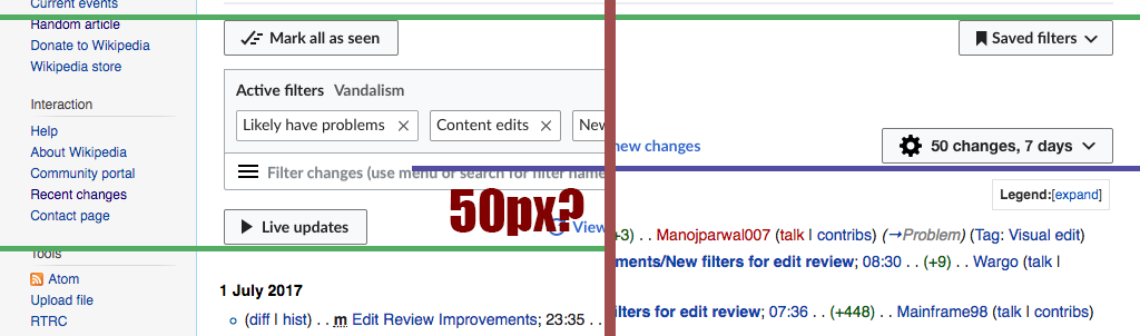
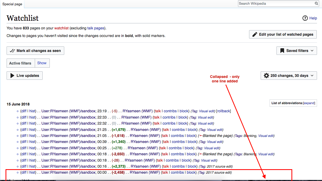
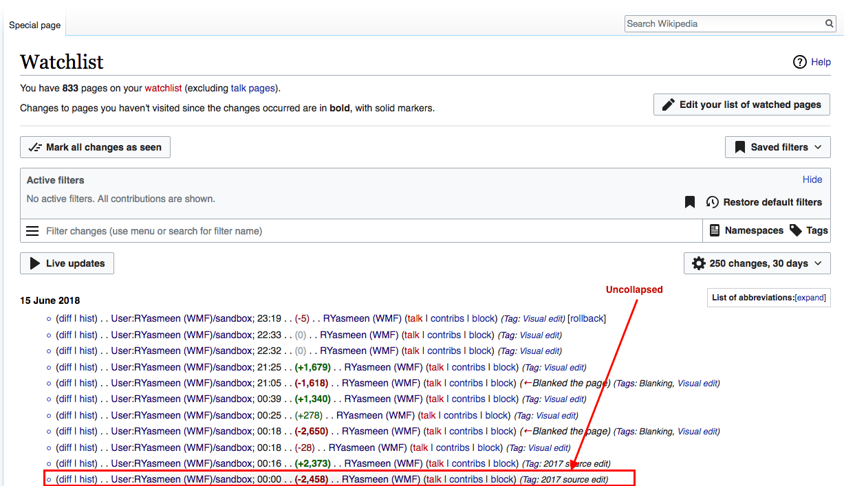
CollapsedFilter view
watch-link-right-initial.png (768×1 px, 251 KB)
watch-link-right-compact.png (768×1 px, 270 KB)

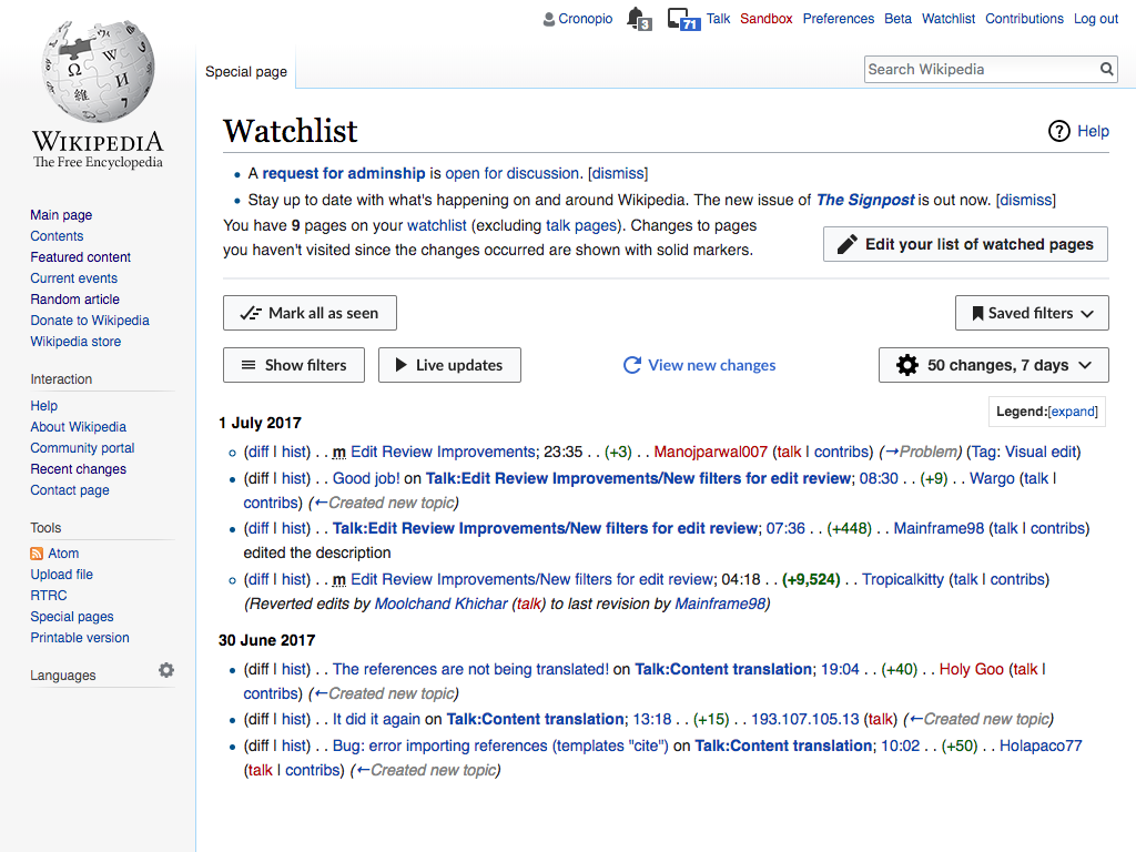
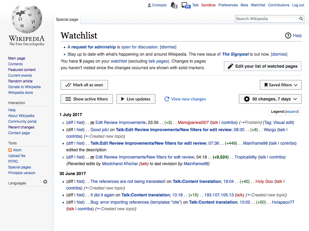
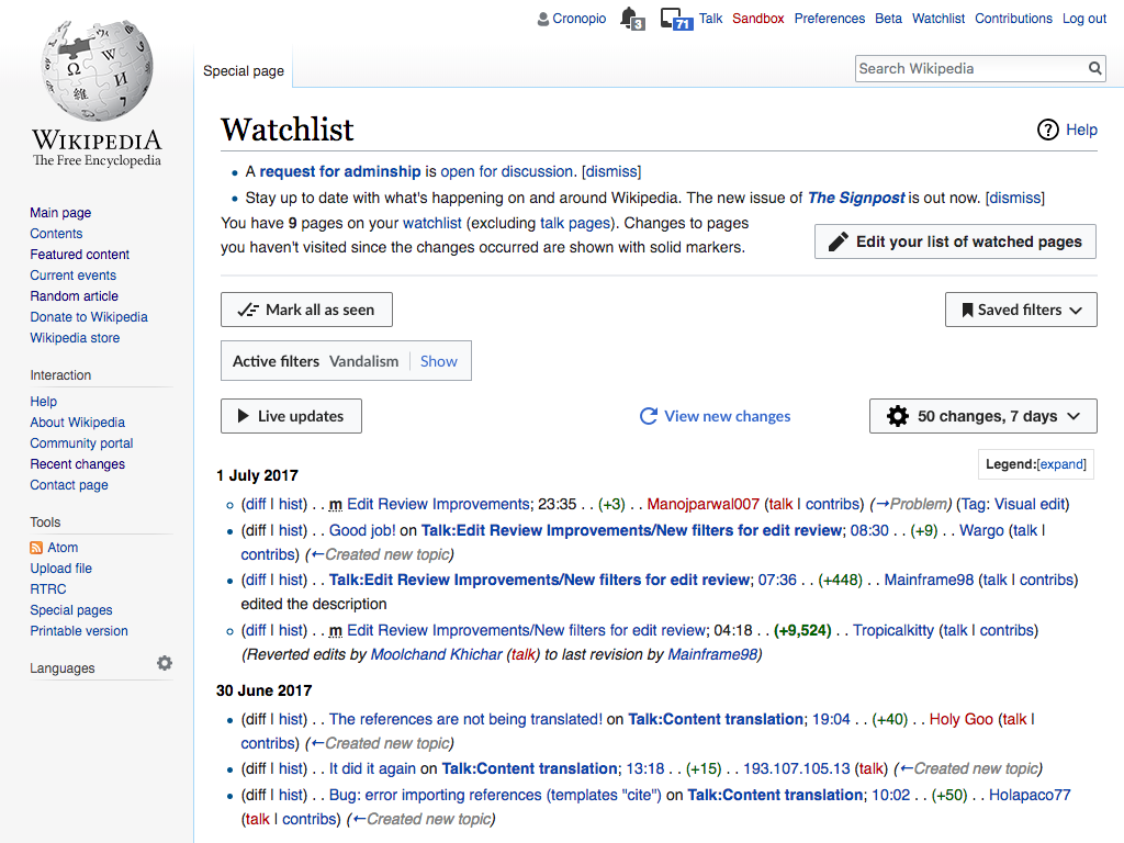
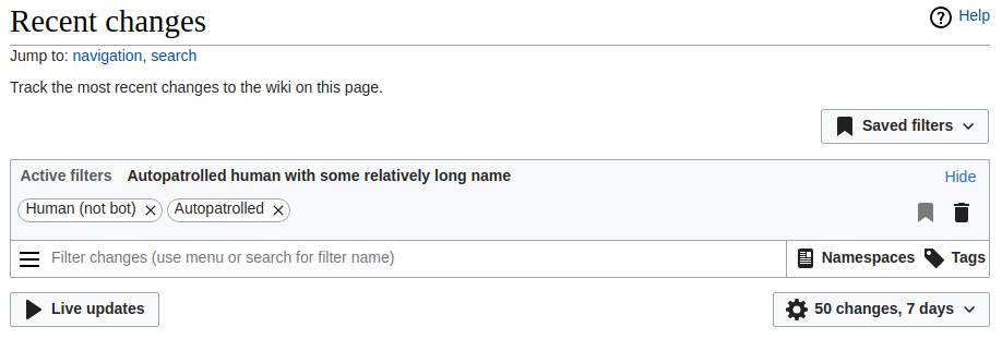
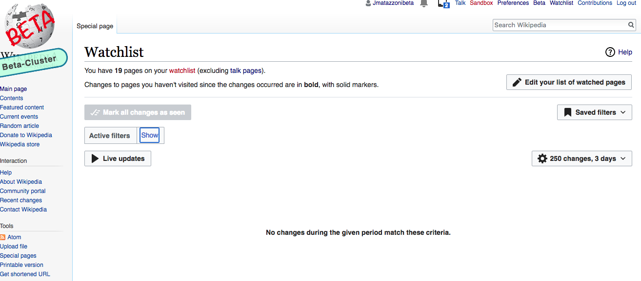
Filters in "Show" state

  • "Show" filters state is the default state.
  • A "Hide" button floats in the right. Clicking it hides the Active Filter Display and the search areas; the link changes to "Show.'
  • The "Hide" link has a tooltip: Hide Active Filters area
  • Both states are persistent, so whatever change a user makes the filters stay in that state until the user changes again.

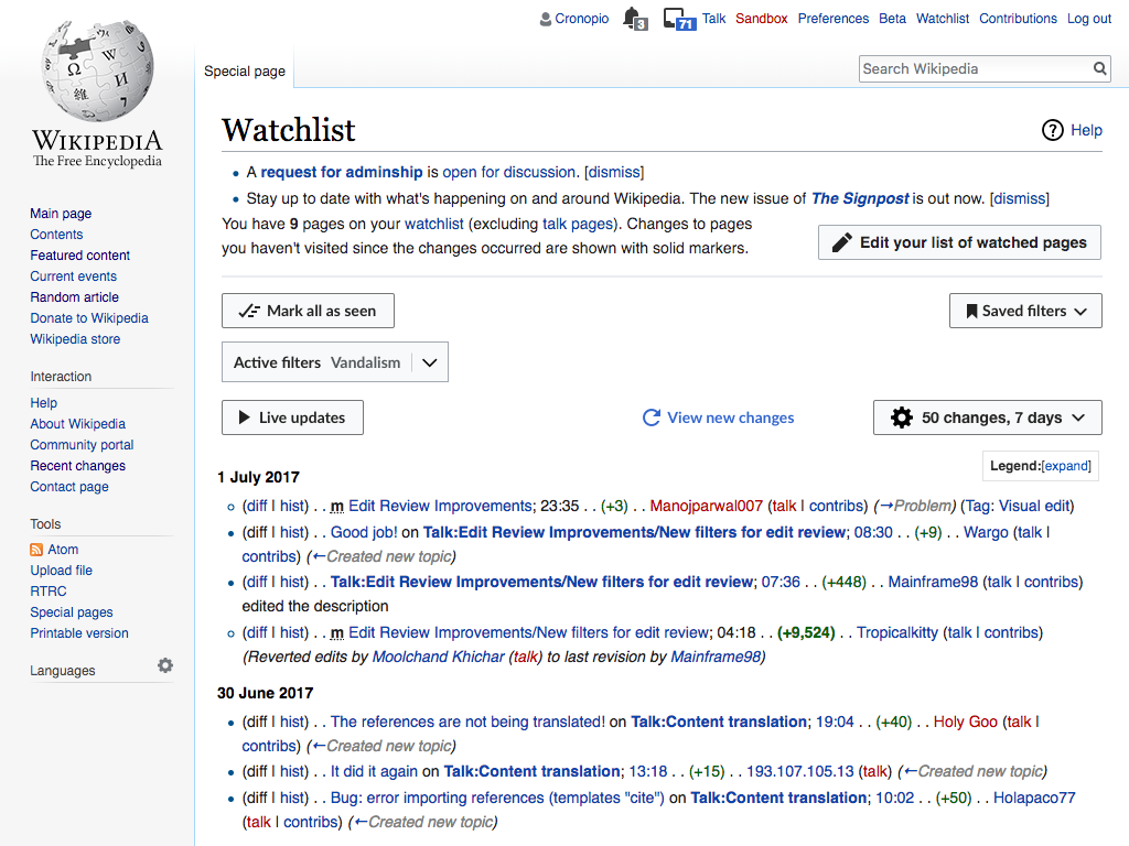
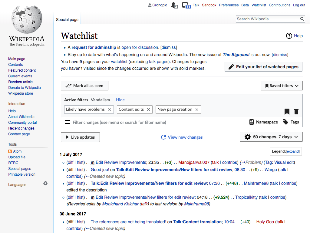
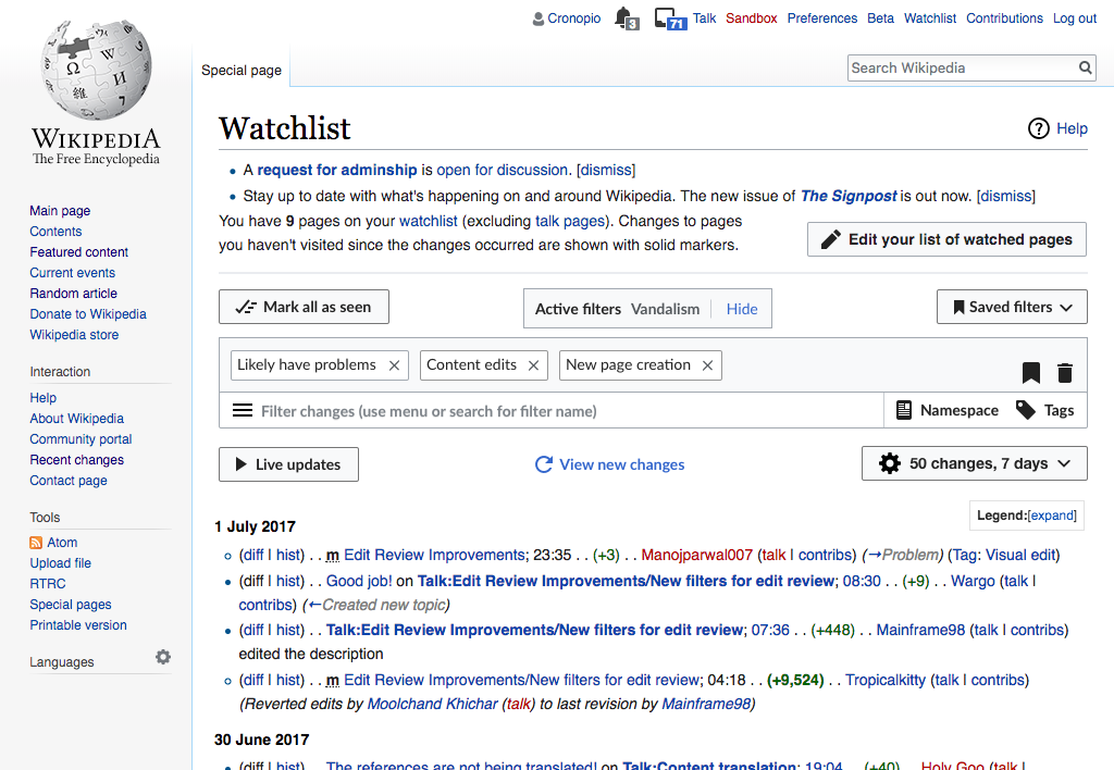
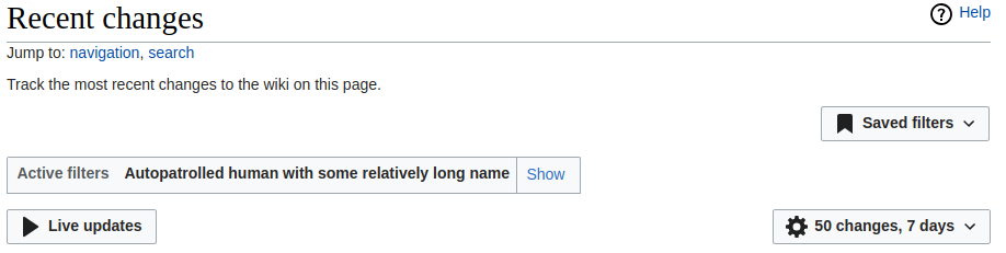
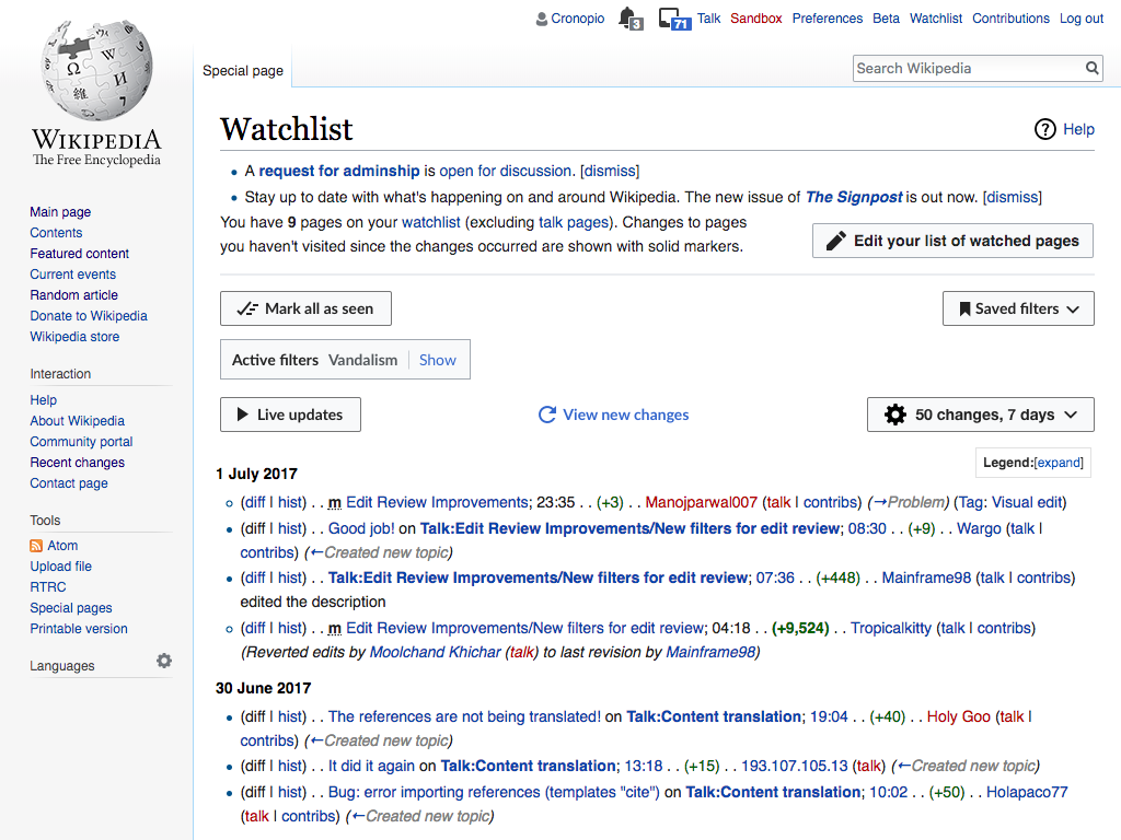
Filters in "Hide" state

  • Active Filter display area is collapsed and persists as collapsed until the user "Shows" it again.
  • A button to "Show" allows to expand the filters.
  • The "Show" link has a tooltip: Show Active Filters area

Event Timeline

I think this will please some RC users as well.

When a user saves a set of filters, there is great chances that the set will not be changed soon. So the collapsed state is a seducing option for users who don't need all options all the time. I advice to have collapsed/expanded state remaining persistent by using a parameter in the URL to save the state.

I also advice to keep the live update button out of the collapsible option. It may be used more often than other options.

@Pginer-WMF, the Triage team has approved this for action in Q2. I think users will appreciate it. Here are some comments to help you finalize the design:

  1. Where will View Newest Changes link go?
  2. We need to make sure this is compatible with the changes planned in T177926 (which it looks like it is) and T176395
  3. I think it's OK that Saved Filters moves to a different position when hidden but I'd like to see it keep its label, so users don't have to learn two different states for this important menu.
  4. To me, it feels like the complement of "Show Filters" is "Hide Filters." These buttons should be consistent in style. Having the Hide button be a Back arrow (is it?) implies that hidden is the default state. But I would argue that Show needs to be the default, so we make sure users know about this feature.
  5. Would it be possible to show Live Update when in Hide mode? I don't know that it's required, but I can imagine an advanced user who has his Saved Filters all set up and uses Live Updates....

@Pginer-WMF, the Triage team has approved this for action in Q2. I think users will appreciate it. Here are some comments to help you finalize the design:

  1. Where will View Newest Changes link go?

View newest changes goes in the same line of the controls. More details in T178486.

  1. We need to make sure this is compatible with the changes planned in T177926 (which it looks like it is) and T176395

I created a separate ticket to illustrate how the different pieces work together using a scenario with the most elements visible (including "view newest changes"): T178486: Explore how the different approaches to make filters more compact work together

  1. I think it's OK that Saved Filters moves to a different position when hidden but I'd like to see it keep its label, so users don't have to learn two different states for this important menu.

When users create their saved filters they use the bookmark icon-only button inside the Active filters area. the compact mode is surfacing some actions as shortcuts, and it should be ok to present those shortcuts as icons. Users can still access their full versions through the Filters menu until they make the association of concepts.
I think we want to keep the entry point for the filters as the strongest action. In this particular case, having two labels about filters ("Show filters" and "Saved filters") can contribute to create confusion.

  1. To me, it feels like the complement of "Show Filters" is "Hide Filters." These buttons should be consistent in style. Having the Hide button be a Back arrow (is it?) implies that hidden is the default state. But I would argue that Show needs to be the default, so we make sure users know about this feature.

If we think on the expanded version as the default, the "back" metaphor does not make sense. I think that a "close" metaphor can work better here.
I don't agree that having a show/hid pair of controls is the only possible way to support this. I think that having a button that opens the Filters section is also a valid approach.

  1. Would it be possible to show Live Update when in Hide mode? I don't know that it's required, but I can imagine an advanced user who has his Saved Filters all set up and uses Live Updates....

Yes, but e need to be careful not making the compact version too cluttered. I think it is important to keep the access to the filters as te main path forward for our users, and the more functions we surface the weaker we make the main entry point.

This idea got too complicated for the value provided. I'm moving it to Medium Term. We'll do some of the easier parts of this -- combine the numbers and days control, and update the View Newest link.

This idea got too complicated for the value provided. I'm moving it to Medium Term. We'll do some of the easier parts of this -- combine the numbers and days control, and update the View Newest link.

This is a is a killer feature to convince users to adopt it. For what I know, people don't filter much their watchlist. Have a more direct access to the list of results would be very much appreciated. I regret you move it to medium term. What was the motivation behind that decision?

@jmatazzoni proposed to explore a simplified version of the compact mode idea for the Watchlist.

The idea s to provide an action to collapse the active filters area, turning it into an "Show filters" button that will be placed in the same line as the live updates and view settings.

watch-compact-initial.png (768×1 px, 250 KB)
watch-compact-collpsed.png (768×1 px, 267 KB)

Given that the play and settings icons are strong, I'd consider to also remove the labels for live updates and view settings, as illustrated bellow. Since users are expected to recognise them and help to make the collapsed experience less cluttered. But I'm ok to focus on the main collapsing mechanism first and leave this part for future considerations.

watch-compact-collapsed-simplified.png (768×1 px, 265 KB)

That new approach is noce as well. Is it doable before the deployment?

In T177206#4256745, @Pginer-WMF wrote:

@jmatazzoni proposed to explore a simplified version of the compact mode idea for the Watchlist.

I think this new design is great and spoke to Moriel about it. Because things don't move around and transform (as in the original design), she says it's not that hard. We might well be able to push it through before graduation.

I have some thoughts about the hide/show button/link thingy. I don't think the collapse function is discoverable enough in this design. It looks more like "back" than "hide". And while I see the point of putting the hide function inside the thing that it refers to, that leads to the negative consequence that we need two separate buttons—one for "hide" and, since that gets hidden, a completely different button for "show". More discoverable and sensible would be to have one explicit button or link that simply changes state from "show" to "hide." A few minor thoughts on this:

  • Position: I think it's better from both UX and technical perspectives if the buttons don't move around or change design. So, to me, the obvious place for the hide/show button or link would be on top of the search panel (possibly but not necessarily centered opposite view New Changes). There are other solutions....
  • Link or button? Also, I wonder if we shouldn't make an effort to make this element similar to the show/hide element used for the related links on RC page—i.e., a link with a little down/up arrow? I'm not firm on that idea but had to ask.
  • Wording: I'd go with "Hide filters"/"Show filters".

I have some thoughts about the hide/show button/link thingy. I don't think the collapse function is discoverable enough in this design. It looks more like "back" than "hide". And while I see the point of putting the hide function inside the thing that it refers to, that leads to the negative consequence that we need two separate buttons—one for "hide" and, since that gets hidden, a completely different button for "show". More discoverable and sensible would be to have one explicit button or link that simply changes state from "show" to "hide." A few minor thoughts on this:

Thanks for the feedback. I'll try to provide more detail on how the solution is intended to work about the different aspects mentioned:

Discoverability.
Elements should have a prominence that is proportional to their relevance and frequency of use. Although hiding the filters is the main focus of this ticket, overall this is not a frequent action compared to those that are used to manipulate the results. Placing it at the same level as recurrent options editors use is not making them a favour: it would increase the number of items they need to process on a regular basis in order to have at hand a configuration option that we expect not to be used frequently.

Here our goal is not to advertise the collapsing of the filters as a main feature. Our goal is to serve those users that are looking for a way to collapse it because they are not interested in using the filters (and want them to go away), while not getting in the way of the users who find the filters useful.

I expect that for users that look for a way to collapse the active filters they will identify the proposed entry point for such action. I think it is better to try a less prominent solution (where we can identify if it does not work, by users still asking for a way to collapse) rather than making a function unnecessarily prominent where we are taxing the users that do not need it and is much harder to detect we made it too prominent.

Position.
Placing the functionality close to the element it affects helps people find such functionality and, more importantly, understand the connection with the affected element.

In addition, the proposed solution has been designed in a way that once the user clicks on the collapse action, the action to expand is in the same position the collapse action was. This makes it easy to find the way to revert the action users just did by clicking again, and helps make the connection on how to find their way back.

I created a quick prototype to experience the idea more realistically.

Controls used
I intentionally avoided having a more persistent control that takes space for both compact and collapsed status. The idea is to tax as little as possible the users that use the filters (providing them an experience as close as possible to the filters in the Recent Changes page), while providing an explicit action to go back for those that decided to collapse and get the additional space for the results. Having a persistent control that is present on both states, involves taking more space out for those users that want to use the filters, or crowding the areas where the existing functions they access often are.

In T177206#4260345, @Pginer-WMF wrote:

Elements should have a prominence that is proportional to their relevance and frequency of use....

Good arguments. I buy it. And thanks for the demo, which is very helpful in getting the feeling of this.

Where I think we can still make an improvement is in the area of discoverability. The < arrow just doesn't say "Hide filters" to me. If anything it means "back," but given that this page will has to default to the state where filters show, the idea of "back" has no meaning. I showed your mockup to some teammates, who felt the same way. The idea of using an up-arrow on its own might work. But this design should also work on Recent Changes, and I wonder if that's too many arrows pointing all different ways at once (with the related links box and the live update button)?

Given your desire to make this tool less prominent and mine to make it more explicit, I'm thinking: could you put the hide button inside the filter panel but make it an actual link that would say "Hide filters"? I'm a believer that the label "Active filters" on the left is pretty important informationally, so would be uncomfortable just converting that, for example, to a "Hide active filters" link.

I'm not sure how you'll solve this problem but have faith in you! (What if both the hide link and the show button moved to the right side instead of the left?)

Thanks for the feedback, @jmatazzoni . I made some more explorations. Each has some pros and cons but all should make the expand-collapse relation more clear while keeping the positions consistent and avoid making the hide action too prominent:

A) Chevron on the left + action to expand

watch-chev-left-initial.png (768×1 px, 251 KB)
watch-chev-left-collapsed.png (768×1 px, 268 KB)

Prototype
Pros:

  • The most compact option. Using a button for expanding allows to integrate with the other controls in one line and leave most of the space to the results.
  • Balanced prominence. Small but shown at the beginning. Not getting in the way of those not interested while prominent enough for those looking for it.

Cons:

  • Continuity. The filter area turning into a button may require some reorientation effort, but keeping the placement consistent and the references of te labelling and icon should help to indicate the way back.

B) Chevron on the right + minimized filter area

watch-chev-right-initial.png (768×1 px, 251 KB)
watch-chev-right-collapsed.png (768×1 px, 269 KB)

Prototype
Pros:

  • Continuity. The filter area when it is compact keeps the visual style and labels, making it easy to connect. Even when acting on the right side to collapse it, the transition is clear.

Cons:

  • Less compact. To keep the filter area represented when collapsing, and avoid other controls to move around an extra line of content is still reserved. The compact mode still saves space, but less than (a).

C) Link + minimized filter area

watch-link-compact-initial.png (768×1 px, 251 KB)
watch-link-compact.png (768×1 px, 270 KB)

Prototype

Pros:

  • Continuity. The filter area when it is compact keeps the visual style and labels, making it easy to connect. In this case, even clearer than with (b).

Cons:

  • Little bit too prominent. The link being in blue seems to convey a main action, that is not that relevant overall in this case.
  • Less compact. To keep the filter area represented when collapsing, and avoid other controls to move around an extra line of content is still reserved. The compact mode still saves space, but less than (a).

Is any particular direction addressing your concerns better?

Thanks so much for putting these together Pau! I know it's not our usual process, but I want to move fast on this so I showed the mockups to the team at standup and we had a little focus group. I think we managed to converge on a direction.

  • Everyone liked the space saving aspects of A but, but we all agreed that without user testing maximizing space efficiency can't be our primary goal. That has to be clarity.
  • Meanwhile, there was a general feeling that there is a lot going on in the area on the left, with the Active Filters, the Saved filter name and tags. It's an important primary area for users to look at and understand, while collapse is a secondary function.
  • So this led people to favor the idea of putting the control on the right, where it would be out of the way. Also, the length of the saved filter titles can be long, so putting the control on the right would give this a standard location instead of a floating one. On the other hand, an arrow hanging out way over on the right (C) by itself did not seem clear or prominent enough.
  • Also, the team universally liked using the words "Hide/Show" instead of the arrow.
  • And Ryan pointed out that the "Collapse Top " template is a common pattern on the wiki.

I wouldn't have thought of this idea myself, but as we worked through the above, we all really began to coalesce around a solution that would be like a Collapse Top. I.e.:

  • The words hide/show, positioned on the right, and ideally staying there instead of moving.

So, it's kind of a combo of B and C, except that the right-hand button in B stays put. I don't know whether you'd do that like the Collapse top, where a gray strip would stripe across the middle, which is somewhat inelegant. Or whether the elements might stay in place on left and right but the middle disappear, so that you end up with two elements.... And I suppose if the Hide button moved left to be near the Active Filter label it wouldn't be the worst thing...

What do you think? Will that work for you? I'd love to get this out there before graduation, so if we've got a solution please show a mockup and I'll expedite this. Thanks again for working up those great mockups.

What do you think? Will that work for you? I'd love to get this out there before graduation, so if we've got a solution please show a mockup and I'll expedite this. Thanks again for working up those great mockups.

I'd avoid keeping the collapsed element to take the whole width of the screen. Note that users won't be repeatedly expanding and collapsing the filters in quick iterations just for fun, so we don't need to optimize the interaction (or decide which option works best) based on that unrealistic scenario. In this case we want users to understand where the panel went when they collapse it and be able to find the way back later (after some minutes, or even days).

I think that even if we place the control on the right, we are providing enough cues (keeping the labels) for it to be clear that the panel gets compacted to the left and the user not to feel lost with the transition.

I illustrated a solution combining B and C below. I think it is a weaker solution than either of them, but still acceptable.

watch-link-right-initial.png (768×1 px, 251 KB)
watch-link-right-compact.png (768×1 px, 270 KB)

Prototype

Many, possibly most, wikis don't support the {{collapse}} templates. Will this project require creating /common.js and /common.css files at all of those wikis, or will it be self-contained?

jmatazzoni renamed this task from Make filter options collapsible to Make Active Filter display area collapsible on Watchlist and Recent Changes.Jun 11 2018, 5:53 PM
jmatazzoni assigned this task to Mooeypoo.
jmatazzoni updated the task description. (Show Details)

Didn’t follow this task quite clearly, but I must say that the current variant in the description is bad for one major reason: click area jumps. There is a pattern of using expand/collapse types of buttons with mouse staying in the same place (at least for me), and this design would prove that difficult because the button would not stay in the same place after expanding, therefore making it in the same place is always better than having them jump.

Many, possibly most, wikis don't support the {{collapse}} templates. Will this project require creating /common.js and /common.css files at all of those wikis, or will it be self-contained?

MediaWiki has jquery.collapsible module by default, so that should not be a problem in any way. In fact, it is used in the template {{collapse top}} mentioned above.

I do not think that saving enough space is enough:

watch-link-right-compare.png (302×1 px, 75 KB)

In T177206#4273877, @Iniquity wrote:

I do not think that saving enough space is enough:

Hi Iniquity, thanks for your note. If you're thinking that we could come up with a more compact design, you're correct! There are some designs like that in the history above. But they require us to move buttons around or to abbreviate/change the design of certain elements—all things that might confuse users (who've just gotten used to the new UI as it is). If we had the budget for another round of usability testing on this, we'd be happy to put ideas like that in front of testers and then iterate. But no such testing will happen—especially not before we release the New Filters as standard to Watchlist users this month.

So while we're happy to accommodate those who've asked for this UI to be more space-efficient, our paramount goal at this point has to be clarity. In testing various designs around office, the one chosen above was the clear winner on that front. It gives people who aren't defining a new filter access to the tools they might conceivably want while patrolling (Live Updates, Saved filters, etc.), but leaves most tools where people expect to find them.

Re. your 50px estimate above, you'll get a better measurement by looking at the side-by-side comparison below. By my count collapsing the tool in this manner buys us three full lines of search results—or 75 px. That is enough to make the New Filters UI tighter in the vertical direction than the UI it replaces, which is really the minimum mark we were shooting for. (With this change, the new UI beats its predecessor on Watchlist by two lines of results, or about 50px. On Recent Changes, it wins by a lot more.) So while it may not optimal, I hope people will find this solution a step in the right direction.

A side-by-side comparison of the filters in open and collapsed states.

new-filters_hide-show.png (536×1 px, 230 KB)

Hi @jmatazzoni, thanks for your answer. It is pity, but I understand it. I made a sketch, just in case, just as the idea of the future.

watch-link-right-initial-test.png (708×1 px, 203 KB)
watch-link-right-compact-test.png (708×1 px, 223 KB)
watch-link-right-initial-test-2.png (708×1 px, 198 KB)

@Pginer-WMF I went by your designs, but I had a problem creating the separator line between the "show/hide" button and the query name; I could only get it to be 100% height (from top to bottom) and I can't manage to get it to be a smaller one.

The second challenge is that it might be difficult to figure out when the name of the saved query is long enough to justify this line/separator between the name and the button when the widget isn't collapsed. Unsure what to do there.

Here are screenshots from the patch:

Open:

rcfilters-collapse-open.png (311×918 px, 47 KB)

Collapsed:

rcfilters-collapse-closed.png (231×918 px, 33 KB)

Also, take into account the show/hide button is an OO.ui.ButtonWidget, so it gets the usual blue rectangular border when focused.

@Pginer-WMF and @jmatazzoni -- is this change acceptable?

Change 440045 had a related patch set uploaded (by Mooeypoo; owner: Mooeypoo):
[mediawiki/core@master] RCFilters: Make active filters area collapsible

https://gerrit.wikimedia.org/r/440045

Change 440045 merged by jenkins-bot:
[mediawiki/core@master] RCFilters: Make active filters area collapsible

https://gerrit.wikimedia.org/r/440045

The specs that need to be addressed are marked with - the tooltips are absent and the 'Hide/Show' state is persistent only when a user is on the page.

However, the 'Hide/Show' option adds only one line vs. about three lines in the mockups. Also there is a lot of empty space.

Screen Shot 2018-06-15 at 6.06.47 PM.png (690×1 px, 260 KB)
Screen Shot 2018-06-15 at 6.06.31 PM.png (707×1 px, 269 KB)

@Etonkovidova writes:

However, the 'Hide/Show' option adds only one line vs. about three lines in the mockups. Also there is a lot of empty space.

These two facts, just to state what should be obvious, are related. Which is to say, when the filters go into "hide" mode, the a large space is opening up between the "list of abbreviations" box and the "250 changes, 30 days" button.

The spacing between those two elements should remain the same in hide and show mode. That is does not is why the results aren't moving up and the hide isn't saving more than just one line of results.

Also, can we please make it so the buttons don't remain outlined in blue after I click them. See Hide/show screenshots below. (This is on Mac Chrome.)

Screen Shot 2018-06-18 at 10.00.20 AM.png (624×1 px, 160 KB)

Screen Shot 2018-06-18 at 10.00.09 AM.png (578×1 px, 141 KB)

This is probably required for accessibility reasons, since there must be some indication of focus.

@Etonkovidova writes:

However, the 'Hide/Show' option adds only one line vs. about three lines in the mockups. Also there is a lot of empty space.

These two facts, just to state what should be obvious, are related. Which is to say, when the filters go into "hide" mode, the a large space is opening up between the "list of abbreviations" box and the "250 changes, 30 days" button.

The spacing between those two elements should remain the same in hide and show mode. That is does not is why the results aren't moving up and the hide isn't saving more than just one line of results.

We have set a "min height" on the elements so that they don't "jump" between loading state and full appearance state. I'm making sure that the mininum height restriction is properly set on collapsed vs expanded states with my next fix.

This is probably required for accessibility reasons, since there must be some indication of focus.

Yes, exactly that. The behavior of the button is consistent with other OOUI buttons (frameless and not) and has to do with accessibility. We shouldn't remove it.

Change 440975 had a related patch set uploaded (by Mooeypoo; owner: Mooeypoo):
[mediawiki/core@master] RCFilters: Preserve collapsed state and adjust display

https://gerrit.wikimedia.org/r/440975

Change 440975 merged by jenkins-bot:
[mediawiki/core@master] RCFilters: Preserve collapsed state and adjust display

https://gerrit.wikimedia.org/r/440975

The following has been addressed:

the 'Hide/Show' option adds only one line vs. about three lines in the mockups

Re-checked the specs - all is done now.

QA Recommendation: Resolve