Page MenuHomePhabricator

Make the "View newest changes" link more prominent to encourage user not to refresh the whole page
Closed, DuplicatePublic

Description

Based on this reply from @jmatazzoni and a discussion I had with him yesterday.

Apparently, some users reload the whole page (F5) to have a new batch of recent changes instad of clicking on "View newest changes". As a consequence, the whole page reloads, which takes much more time than load just the newest changes.

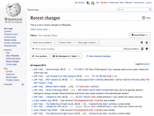
"View newest changes" is in blue, in the middle of a lot of blue links. Maybe this should be reviewed to have a more visible button. The live updates button is in blue, maybe the "View newest changes" link should become a blue button as well? @Pginer-WMF, what do you think?
Event Timeline

Restricted Application added a subscriber: Aklapper. · View Herald Transcript

We need to understand a bit more which is the cause of the current behaviour. I think there could be different factors:

  • Users got into the habit of refreshing that way and it make take time even when noticing the option to do different to adopt a new habit.
  • Users associate the "newest changes" option with the previous options that was not that useful. It used to show only the new ones without an option to go back.
  • Users don't notice the "newest changes" and they would use it if they knew it was there. This can be caused by the option appearing only when there are actual changes to show (which I think makes sense but may be unexpected from those coming from the old UI) or not noticing it visually when it is there.

So when we hear feedback about this it is very important to make follow-up questions to understand whether they are aware of such option, and if that is the case which are the reasons why they don't use it. Obviously without suggesting that reloading the page is wrong, which is a legitimate way of acting and we should explore ways for the tool to work better in those circumstances.

Regarding the visual prominency, in the original ticket (T163426) I proposed to use some indicators and transitions to make the option more prominent (visually connecting it with the list and making the event of the option appearing more noticeable). If the problem is about noticing the option, we can reconsider supporting those since they seemed to work well during our user research. You can check those live in this prototype.

Thanks Pau. I'll make further investigation following your advice.

Findings so far:

  • check RCs and close the tab. Later they repopen it.
  • click on a link make the user leaving the page (don't open a new page)
  • hit F5 to refresh
Trizek-WMF triaged this task as High priority.

(1) I agree with the following @Pginer-WMF comment

Users don't notice the "newest changes" and they would use it if they knew it was there. This can be caused by the option appearing only when there are actual changes to show.

It takes some time for users to learn to wait for the 'View newest changes' to appear. Personally, I do not think that we should have that additional learning curve to use that feature - the feature should be present all the time, which, kind of, brings to another feature with the same purpose - 'Live updates'.

(2) 'Live updates' does not let you to interact with the new arrivals - on high-traffic wikipedias the list will be pushed down constantly.

(3) I disagree that the previous option "Show new changes starting from..." was not very useful. Apart from the fact that you cannot do reset and return to the normal display we had reset at some point though), the feature allowed a user to interact with the updates that came after certain point of time - the filters could be applied, the result set did not go away, so the users might navigate away and return to review the same chunk of updates.

(4) Having two similar options (View newest changes and Live updates) on one page might present some confusion to users - do they work together? Or not? After 'View newest changes appears, should I click on 'Live update' button to see them? etc

(1) ... It takes some time for users to learn to wait for the 'View newest changes' to appear. Personally, I do not think that we should have that additional learning curve to use that feature - the feature should be present all the time, which, kind of, brings to another feature with the same purpose - 'Live updates'.

Users get used to refresh regularly because they were not given any clue on when there were actually new changes to show. Having an option that promises to give you new changes and leaves you to "No changes during the given period match these criteria." message is a bit disappointing.
The proposed pattern announces you that new messages are available, so that you don't have to worry if that would be the case. It is a very common pattern on feeds that get updated.

(2) 'Live updates' does not let you to interact with the new arrivals - on high-traffic wikipedias the list will be pushed down constantly.

Yes. That's how live updates works. The purpose is to support background monitoring. Users can pause the list whenever they want if they spot anything that requires further interaction.

(3) I disagree that the previous option "Show new changes starting from..." was not very useful.

During the research I got the impression that users were not aware of the feature existing already in Recent Changes. I'm sure the feature was useful for some users, but it had some problems that make it difficult to know what to expect from it and how the results were connected to the previous list. The labelling was very confusing (e.g., "Show new changes starting from 09:24, 26 September 2017"). You had to click in order to check if there are changes, and you may get disoriented by ending with an empty list and lacking a clear way out. The proposed change tries to clarify the labelling, and avoids creating separate places to avoid such confusion.

(4) Having two similar options (View newest changes and Live updates) on one page might present some confusion to users - do they work together? Or not? After 'View newest changes appears, should I click on 'Live update' button to see them? etc

When we did our research the purpose of both options seemed clear to our users, but we'll check for the feedback we get once these are available.

I'm stepping back from that task, because I haven't collected more feedback on how people refresh the page.

If we integrate the "view newest changes" indicator with the other controls (as illustrated in T178486), we can increase it's prominence by using a "reload" icon. The concept of "refresh/reload" seems to be established in the minds of several of the users, so it would help to communicate that this is the new way to refresh as opposed to the browser equivalent button.

RC-combined.png (768×1 px, 273 KB)

@jmatazzoni, let's move it to RFP?

The design in T178486 is not quite finalized. Let's wait for that so this doesn't have to get done twice.