Page MenuHomePhabricator

Interface adjustments: Make the "View newest changes" link more prominent and combine pagination and time period selectors
Closed, ResolvedPublic

Description

We've decided not to pursue a number of features that had been planned for the New Filters UI—and for which we'd reserved open space. Meanwhile, users have shown a great desire for compactness of the UI, so as to leave more room for search results.

The following changes will enable us to save vertical space and create a more effective UX. These changes should be made on all pages that have the New Filters UI, including Recent Changes and Watchlist.

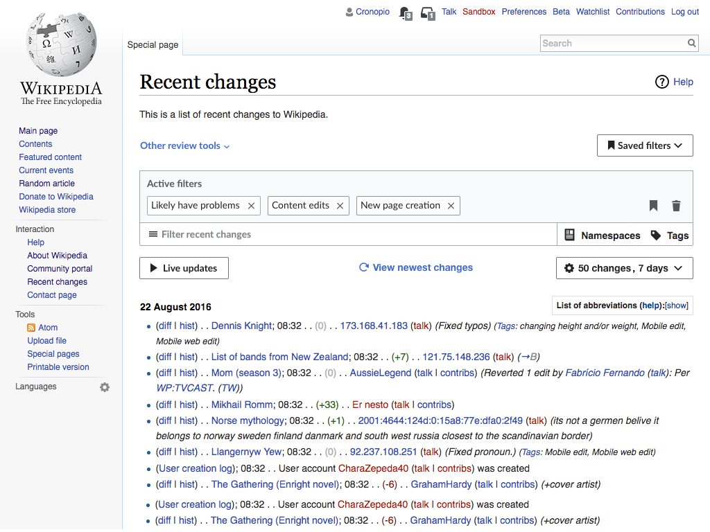
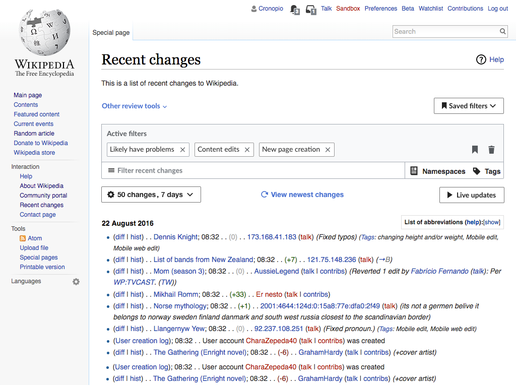
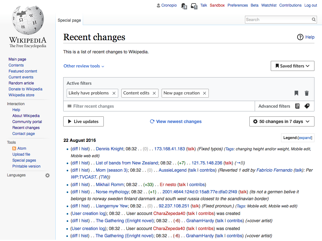
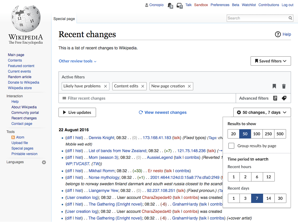
Combine number of results and the time period panels

  • The number of results and the time period panels are combined into one (for layout, see illustration below).
  • Current settings are reflected in the title of the button, in the following format: x changes, x days.
    • The button also gets a gear/settings icon.
  • Labels are added to the two panels, to differentiate them:
    • Results to show
    • Time period to search

Make the "View newest changes" link more prominent

Because the "View Newest Changes link loads results more quickly than full page reload, we want to encourage it's usage. If we integrate the "view newest changes" link with the other controls, we can increase it's prominence and save some space. Here are the details:

  • Move the indicator to it's new position: integrated in the same row as the other display controls (live updates and the combined number of results+time period), centered between them.
  • Add a reload icon.

The mockups below illustrate these idea:

RC-combined-sides.png (768×1 px, 258 KB)
Untitled-3.png (768×1 px, 291 KB)

Related Objects

Event Timeline

I've had various people who told me they were surprised by not seeing all edits from the last 7 days when they select "7 days", even if 50,000 edits have been made. Would it be possible to add a note or a tooltip saying "number of edits displayed is capped to 500"?

I don't remember if the "view newest changes" link was aligned with the buttons on the previous mockups. If not, we should definitely implement it. And I'm still for converting this link to a real button. ;)

F10141406 is IMO the best way to implement the time selector. It still displays the range selected (so users can know what is the current configuration), and have a button on the left emphases the "view newest changes" link.

A couple of questions/comments:

  1. I think it is in fact important to surface the settings, so I would argue for that design.
  2. How would this work if we do this and the other ticket you prioritized, T177206?
  3. There was one user who thought the "natural" place for the "View Newest Changes" link was at left, because apparently that is where he's looking when reviewing. Any merit to that idea?
  4. I just wrote a ticket, T178326 , to move the List of Abbreviations up, based on a user's complaint that it squeezes the results. It's an easy change to make now, but would your new plan remove the space where we would have moved that or is there a spot for it still?

A couple of questions/comments:

  1. I think it is in fact important to surface the settings, so I would argue for that design.

Yes it is important. The question is whether it is important enough to deserve that prominence. That is, how often do users access these options? would they be able to check them even if they are behind the options menu when needed?

  1. How would this work if we do this and the other ticket you prioritized, T177206?

Both are independent. One (T177206) hides/shows the filter area. The other (this one) combines two selectors to get more space.

From the different options for the present ticket, if we chose the more verbose one it may requires to check how much room we'll have for fitting both the "Mark all as seen" and "View newest changes" in the Watchlist, and decide where to place the controls in that row.

  1. There was one user who thought the "natural" place for the "View Newest Changes" link was at left, because apparently that is where he's looking when reviewing. Any merit to that idea?

I think that showing it at the left or at the center is acceptable. It works as a continuation of the list. The left side is useful for stable controls that affect the list which is why we are giving priority to that.

  1. I just wrote a ticket, T178326 , to move the List of Abbreviations up, based on a user's complaint that it squeezes the results. It's an easy change to make now, but would your new plan remove the space where we would have moved that or is there a spot for it still?

This ticket proposes to integrate the "View newest changes" link with the rest of the controls. That eliminates the need to keep additional white space before the list. Having said that, it may be still possible to move the legend a bit up considering that the list of results starts with the date label on the left. In the example below, I have removed the "view newest changes" gap and just by removing the legend's margin bottom it fits there without breaking the first result:

Screen Shot 2017-10-17 at 11.49.23.png (376×627 px, 80 KB)

The Triage team has approved this for action in Q2.

Re. displaying the day/number settings, @Pginer asks:

Yes it is important. The question is whether it is important enough to deserve that prominence.

Based on the stats Roan pulled last week, 8 of the first 25 most popular settings are days or number; 2 of those are defaults. So people are using it pretty frequently. The question for me is more about whether people need to see that information. I think you do. Frequently, I when I am getting strange results, I look and it's because I have too many results selected or because I didn't pick enough days or something. So I think the info is very useful for diagnosing and understanding the results.

Please also do be mindful of harmonizing this plan with what's proposed in T177206.

The Triage team has approved this for action in Q2.

Re. displaying the day/number settings, @Pginer asks:

Yes it is important. The question is whether it is important enough to deserve that prominence.

Based on the stats Roan pulled last week, 8 of the first 25 most popular settings are days or number; 2 of those are defaults. So people are using it pretty frequently. The question for me is more about whether people need to see that information. I think you do. Frequently, I when I am getting strange results, I look and it's because I have too many results selected or because I didn't pick enough days or something. So I think the info is very useful for diagnosing and understanding the results.

Ok. If these are used for more repeated adjustment of the set of results, we can surface the info. Although I 'd encourage to try to keep the label as compact as possible to save space. For example using "50 changes in 7 days" instead of the more verbose "Show last 50 changes" + "7 days" labels. I think that the context should be clear enough for the shorter label to work.

Please also do be mindful of harmonizing this plan with what's proposed in T177206.

Makes sense. I created a separate ticket so that we can see how the different pieces fit together:
T178486: Explore how the different approaches to make filters more compact work together

jmatazzoni renamed this task from Combine pagination and time period selectors to Interface adjustments: Make the "View newest changes" link more prominent and combine pagination and time period selectors.Nov 21 2017, 10:26 PM
jmatazzoni removed Pginer-WMF as the assignee of this task.
jmatazzoni updated the task description. (Show Details)

@Pginer-WMF, I updated the description, above, so that we can move forward on these two changes. But I wanted to check with you, since I'm recommending we not do the collapsible WL at this time (T177206). Since we're not doing that, we have more choices about placement, I think. I fooled around a little in PhotoShop (see some sketches below), but soon realized that there are more options than I'd thought, and you should finalized the decisions. Specifically:

  • What do you want to do with the Legend? We could leave it where it is (while adjusting the padding, as in T178326). Or we could move it up, as shown below.
  • Do you want to think again about which buttons go where? Putting View Newest in the center does give it more prominence, but I can see various arguments....

I'm will be fine with what you choose. Have a think and reflect what you choose above, adding any specifications needed for spacing, etc. Or just answer below and I'll transfer to the Description.

View Newest CenteredVN Centered, Update on rightLegend aligned
revised tools_view-newest-centered.png (768×1 px, 249 KB)
revised tools__switched_view-newest-centered.png (768×1 px, 249 KB)
revised tools_legend-aligned.png (768×1 px, 250 KB)

Since we're not doing that, we have more choices about placement, I think.

I'm inclined to go with the "View Newest Centered" version. Each approach has it's own pros and cons since there are several moving pieces. I'll provide some more details below.

RC-combined-sides.png (768×1 px, 258 KB)

  • What do you want to do with the Legend? We could leave it where it is (while adjusting the padding, as in T178326). Or we could move it up, as shown below.

Having the legend in the same row as the rest of the controls would be great, but I see two challenges:

  • Especially with translations to more verbose languages, the area may already become too crowded.
  • The legend can be expanded, and we don't want to push the whole list of results down. If it is still possible for the list of results to accommodate the expanded legend, we can reconsider this.
  • Do you want to think again about which buttons go where? Putting View Newest in the center does give it more prominence, but I can see various arguments....

One key question is for which state we want to optimise the layout. Leaving extra room for optional elements may result in unexpected space when those are not present. While optimising for the absence of optional elements makes them contribute to crowd the final result when they appear.

The "View Newest Centered" version works well when "View newest changes" is visible, making the call to action more effective. For the case where there are no new changes, it generates a gap between the options, but now that we present the display options as settings (with the cog icon), I think it is not an uncommon pattern to have them pushed to the right, so I don't expect to be surprising.So overall it seems to provide a good balance on both cases.

Change 393622 had a related patch set uploaded (by Petar.petkovic; owner: Petar.petkovic):
[mediawiki/core@master] Combine changes limit and time period selectors

https://gerrit.wikimedia.org/r/393622

Change 393622 merged by jenkins-bot:
[mediawiki/core@master] Combine changes limit and time period selectors

https://gerrit.wikimedia.org/r/393622

Checked in wmf.11 - all specs are in place.

QA Recommendation: Resolve