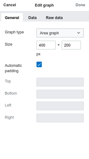
The graph dialog is making poor use of the space in mobile:
The menu takes up too much space, leaving inadequate room for the pages.
| Tchanders | |
| Sep 4 2018, 3:16 PM |
| F26002614: IMG_0380.jpg | |
| Sep 18 2018, 3:32 AM |
| F25778624: image.png | |
| Sep 11 2018, 8:05 PM |
| F25766875: image.png | |
| Sep 11 2018, 10:16 AM |
| F25766854: image.png | |
| Sep 11 2018, 10:16 AM |
| F25766866: image.png | |
| Sep 11 2018, 10:16 AM |
| F25651090: image.png | |
| Sep 4 2018, 5:45 PM |
| F25614005: graph_dialog_general.png | |
| Sep 4 2018, 3:16 PM |
The graph dialog is making poor use of the space in mobile:
| Subject | Repo | Branch | Lines +/- | |
|---|---|---|---|---|
| Improve layout of the visual editor graph dialog | mediawiki/extensions/Graph | master | +101 -106 |
| Status | Subtype | Assigned | Task | ||
|---|---|---|---|---|---|
| Resolved | matmarex | T202575 Epic: Be more consistent about dialog availability in mobile visual editor | |||
| Resolved | Tchanders | T203470 Fix graph dialog in mobile visual editor |
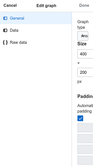
In this case, I'd propose changing the booklet layout (menu at the side) to an index layout, like this (from the score inspector):
Change 459255 had a related patch set uploaded (by Tchanders; owner: Tchanders):
[mediawiki/extensions/Graph@master] Improve layout of graph dialog
That looks and works much better in my opinion, also given that it's just three options.
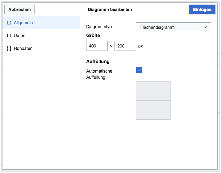
One thing I'd like to note is, the labels and widgets should align top & bottom in 320px to 481px media query range. That would circumvent weird px breakout in next line and make labels like “Automatic padding” which got weirdly translated to “Automatische Auffüllung” (<= I have no idea what that should refer to as German native speaker) stay in one line
Status quo in German:
@Volker_E I don't think we should change the layout align to 'top' right now as it is quite a regression on desktop.
We should probably look in to making the 'left' align field layouts responsive, but for now we just want to make the dialogs usable on mobile with the least disruption, and then we'll iterate.
Sorry, forgot you put that, but even so I don't think we should hack in a downstream media query to transform left align to top align.
Change 459255 merged by jenkins-bot:
[mediawiki/extensions/Graph@master] Improve layout of the visual editor graph dialog
@Esanders Why not? It's already hacked in to be left and right aligned context-specifically. Why not continue treating it as a special case and improve that case on mobile?
It's already hacked in to be left and right aligned context-specifically.
What do you mean by that?
The new layout looks good. But there are some alignment issues for the Data tab as well on a very small screen (iphone5s). The delete icons are not aligned with the input fields. I can mark this as verified if these issues are being tracked on a separate task.