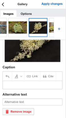
The gallery dialog is difficult to use in mobile because of the space given over to the menu of images on the left:
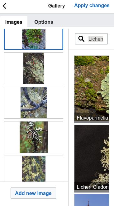
However, it is important to see those images relatively clearly, so this might require a bit of a redesign.
| Tchanders | |
| Sep 4 2018, 3:44 PM |
| F26493241: image.png | |
| Oct 10 2018, 7:45 PM |
| F26492322: image.png | |
| Oct 10 2018, 7:45 PM |
| F26492299: image.png | |
| Oct 10 2018, 7:45 PM |
| F26493103: image.png | |
| Oct 10 2018, 7:45 PM |
| F26492432: image.png | |
| Oct 10 2018, 7:45 PM |
| F26476296: image.png | |
| Oct 10 2018, 1:36 PM |
| F26476262: image.png | |
| Oct 10 2018, 1:36 PM |
| F26476237: image.png | |
| Oct 10 2018, 1:36 PM |
The gallery dialog is difficult to use in mobile because of the space given over to the menu of images on the left:
| Subject | Repo | Branch | Lines +/- | |
|---|---|---|---|---|
| Improve the gallery dialog layout for mobile | mediawiki/extensions/VisualEditor | master | +81 -18 |
| Status | Subtype | Assigned | Task | ||
|---|---|---|---|---|---|
| Resolved | matmarex | T202575 Epic: Be more consistent about dialog availability in mobile visual editor | |||
| Resolved | Tchanders | T203477 Improve gallery dialog for mobile visual editor |
My main question here is if the current experience is completely impossible to do. If the answer is yes, then I think we should consider temporarily disabling and then addressing the fact that this would most likely require a new pattern specific to smaller screen size.
cc/ @Volker_E
The current experience requires an image carousel and a main edit panel. We might be able to make the image carousel smaller, horizontal and along the top (the OOUI side panel layout "MenuLayout" let's us position it on any side, so this shouldn't be too hard). We'd also need to shrink (to icon only?) and reposition the "add image" button.
Agreed, those are the fixes that I would take a look at. I like the thought of responsive buttons for mobile too.
What is the priority for this task?
cc/ @Deskana @JTannerWMF
Large-scale work on improving this dialogue isn't really in scope now, and its complexity means there's probably not much we can do in the way of small-scale improvements. There was a bit of discussion about removing it from the mobile visual editor for now—is that the approach people feel we should take?
Change 465622 had a related patch set uploaded (by Tchanders; owner: Tchanders):
[mediawiki/extensions/VisualEditor@master] WIP Improve the gallery dialog layout for mobile
After talking to @iamjessklein yesterday and in light of @Esanders' comments above, I've put something together along those lines:
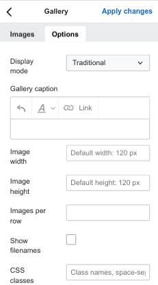
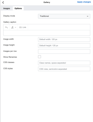
| Image details | Add new image | Options | |
| Desktop |  | 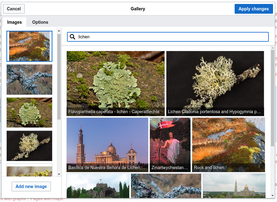 | 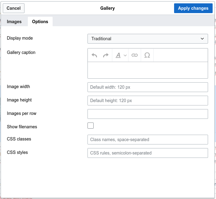 |
| Mobile |  | 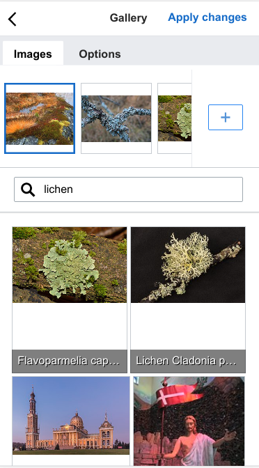 | 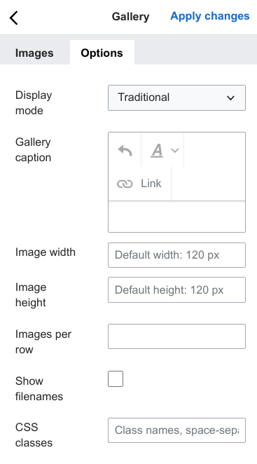 |
| Large mobile | 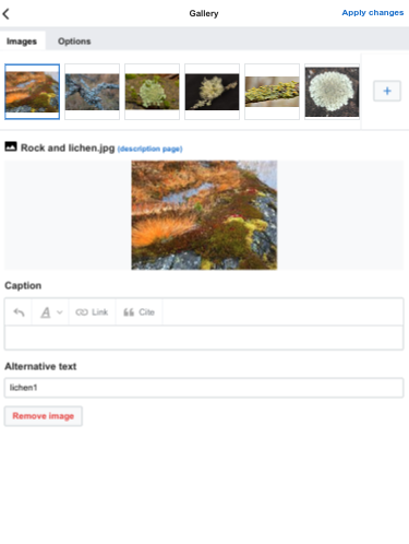 | 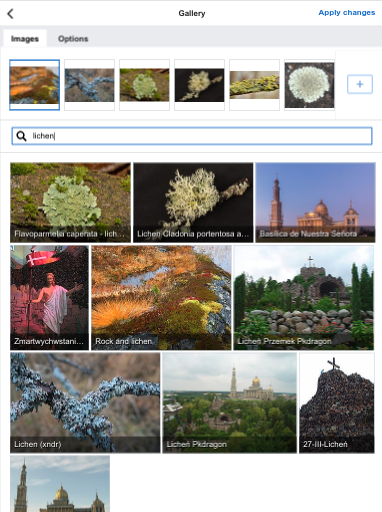 | 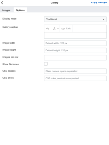 |
I think this could be a good compromise that gets the dialog into a usable state, ready for more time to be spent on it if it's ever prioritised in the future.
These are great fixes @Tchanders
Since our criteria for this fix is "better than broken" I would say that this passes, with a few tweaks:
@Tchanders Thanks for the screens, simplifies discussion a lot.
I would not sacrifice the label but I guess, what @iamjessklein is requesting rightfully is an (trash) icon + label combination.
If this functionality is important and should be emphasized, I'd also consider to turn “Add image” in an icon + label button similar to CX 2 treatment of new translation https://www.mediawiki.org/wiki/Content_translation/V2#/media/File:CX2_switch.png
Additionally I'd pledge for a label top input bottom treatment on mobile. Vertical scrolling is not that big of a deal for users compared to orienting text input in a super-small input area (compare size of action buttons on “Gallery caption” vs actual textarea).
Thanks for the feedback.
The new patch set does the following, in response to suggestions above from @iamjessklein and @Volker_E, and in the code review from @Esanders (with reference to the screenshots below):
| 1 | 2 | 3 | 4 | 5 |
 |  |  |  |  |
I think the remaining points are important but need more general discussion:
Change 465622 merged by jenkins-bot:
[mediawiki/extensions/VisualEditor@master] Improve the gallery dialog layout for mobile