Page MenuHomePhabricator

[Spike] Wikipedia logo and navigation link elements should scale accordingly with font-size increases
Closed, ResolvedPublic3 Estimated Story PointsSpike

Assigned To
Authored By
alexhollender_WMF
Oct 15 2018, 2:29 PM
Referenced Files
F34646054: IMG_2953.jpg
Sep 17 2021, 1:46 PM
F34646016: IMG_2936.jpg
Sep 17 2021, 1:46 PM
F34646035: IMG_2942.jpg
Sep 17 2021, 1:46 PM
F34646015: IMG_2935.jpg
Sep 17 2021, 1:46 PM
F34646106: IMG_2960.jpg
Sep 17 2021, 1:46 PM
F34646103: IMG_2962.jpg
Sep 17 2021, 1:46 PM
F34646058: IMG_2948.jpg
Sep 17 2021, 1:46 PM
F34646109: IMG_2956.jpg
Sep 17 2021, 1:46 PM

Description

This was discovered here: T204807#4652971

Description

iOS has a setting that allows you to increase the font-size on your phone. The Wikipedia mobile site is responsive to that setting (i.e. the font gets bigger), however there are some non-text elements that don't scale accordingly.

Wikipedia logonav icons
IMG_2012.png (1×750 px, 161 KB)
Screen_Shot_2018-10-09_at_1.06.16_PM.png (1×790 px, 159 KB)

These two elements were noticed because they are quite prominent, however it might be worth going through the website more extensively looking for other elements that don't scale.

Environments

  • iOS / Safari & Chrome browsers

Questions to answer

  • Is this bug still reproducable
  • Is there anything we can do here?
  • If so, how much work is involved?

QA Results - Prod

ACStatusDetails
1T207038#7361971

Event Timeline

ovasileva triaged this task as Medium priority.Oct 15 2018, 11:14 PM
ovasileva moved this task from Incoming to Needs Prioritization on the Web-Team-Backlog board.

@Jdrewniak do you have any idea why these icons are not scaling? I don't know enough about how this iOS font handler works.

Side note, when I visit the settings page on iOS, changing font sizes seems to have no impact. Is this just me

@Jdrewniak do you have any idea why these icons are not scaling? I don't know enough about how this iOS font handler works.

Side note, when I visit the settings page on iOS, changing font sizes seems to have no impact. Is this just me

@Jdlrobson are you testing with iOS 9+? The dynamic type feature we enabled in T207789 will only take effect in iOS 9+ browsers...

Jdlrobson lowered the priority of this task from Medium to Low.EditedOct 30 2018, 10:00 PM
Jdlrobson added a subscriber: ovasileva.

@ovasileva also let me know if the priority here needs bumping. A spike would be the obvious next step for the font issue problems.

Jdlrobson renamed this task from [Bug] All UI elements should scale accordingly with font-size increases to [Bug] Mobile UI elements should scale accordingly with font-size increases.Aug 2 2021, 7:56 PM
Jdlrobson renamed this task from [Bug] Mobile UI elements should scale accordingly with font-size increases to [Bug] Wikipedia logo and navigation link elements should scale accordingly with font-size increases.
Jdlrobson renamed this task from [Bug] Wikipedia logo and navigation link elements should scale accordingly with font-size increases to [Spike] Wikipedia logo and navigation link elements should scale accordingly with font-size increases.Aug 23 2021, 5:02 PM
Jdlrobson added a project: Spike.
Jdlrobson updated the task description. (Show Details)
Restricted Application changed the subtype of this task from "Task" to "Spike". · View Herald TranscriptAug 23 2021, 5:02 PM

The solution should be technically quite simple and doesn't only affect iOS.
The logo is currently carrying width and height attributes, whose values are limited to pixel:
<img src="/static/images/mobile/copyright/wikipedia-wordmark-en.svg" width="119" height="18"">

Try by setting your font-size to anything different than default ('Medium') in browser settings, here in Google Chrome:

image.png (314×1 px, 26 KB)

Overriding those either with inline styles or a CSS selector to carry relative unit like rem should result in resized logos on all platforms according to user preferences.

I think the logo is the only thing that needs fixing here. See T207789 for how we could do that

Nav elements scale well. Both icons and text are using relative units.

Screen Shot 2021-09-03 at 9.19.06 AM.png (700×2 px, 141 KB)

Change 719599 had a related patch set uploaded (by Jdlrobson; author: Jdlrobson):

[mediawiki/skins/Vector@master] Logo scales with font-size

https://gerrit.wikimedia.org/r/719599

Change 719501 had a related patch set uploaded (by Jdlrobson; author: Jdlrobson):

[mediawiki/core@master] Logos defined with pixels should be scaleable in browsers\"\"

https://gerrit.wikimedia.org/r/719501

Jdlrobson moved this task from QA to Code Review on the Web-Team-Backlog (Kanbanana-FY-2021-22) board.
Jdlrobson added a subscriber: Edtadros.

Change 719501 merged by jenkins-bot:

[mediawiki/core@master] Logos defined with pixels should be scaleable in browsers

https://gerrit.wikimedia.org/r/719501

@Jdlrobson I'm not sure what the acceptance criteria are, so here are my findings:

  1. Smallest

IMG_2918.PNG (2×1 px, 1 MB)

  1. Largest

IMG_2919.PNG (2×1 px, 954 KB)

  1. Largest using Accessibility

IMG_2920.PNG (2×1 px, 981 KB)

Moving to QA in Prod. Per standup, I will be testing on Italian wiki and looking at just the logo.

Test Result - Prod

Status: ✅ PASS
Environment: enwiki, itwiki
OS: macOS Big Sur
Browser: Chrome
Device: MBP
Emulated Device: NA

Test Artifact(s):

QA Steps

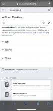
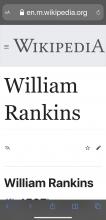
✅ AC1: Verify the wikipedia logo is resized as text is resized by iOS.
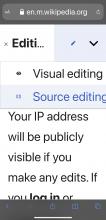
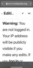
The logo size does increase/decrease as expected. I verified this in itwiki as well. The rest of the images below are for reference. As the text gets really large there are elements on the screen that overlap, and search requires scrolling to the right to see the magnifying glass icon. A user may not know it is there. Search text size doesn't increase.

Default Size
IMG_2939.jpg (2×1 px, 128 KB)
IMG_2935.jpg (2×1 px, 201 KB)
IMG_2936.jpg (2×1 px, 239 KB)
IMG_2937.jpg (2×1 px, 232 KB)
IMG_2933.jpg (2×1 px, 324 KB)
IMG_2934.jpg (2×1 px, 196 KB)
IMG_2938.jpg (2×1 px, 293 KB)
Smallest Size
IMG_2940.jpg (2×1 px, 120 KB)
IMG_2946.jpg (2×1 px, 284 KB)
IMG_2944.jpg (2×1 px, 215 KB)
IMG_2943.jpg (2×1 px, 200 KB)
IMG_2942.jpg (2×1 px, 186 KB)
IMG_2941.jpg (2×1 px, 292 KB)
IMG_2945.jpg (2×1 px, 213 KB)
Large Size
IMG_2947.jpg (2×1 px, 176 KB)
IMG_2950.jpg (2×1 px, 201 KB)
IMG_2949.jpg (2×1 px, 209 KB)
IMG_2953.jpg (2×1 px, 280 KB)
IMG_2954.jpg (2×1 px, 305 KB)
IMG_2952.jpg (2×1 px, 298 KB)
IMG_2951.jpg (2×1 px, 332 KB)
IMG_2948.jpg (2×1 px, 314 KB)
Largest Size
IMG_2955.jpg (2×1 px, 295 KB)
IMG_2962.jpg (2×1 px, 249 KB)
IMG_2958.jpg (2×1 px, 235 KB)
IMG_2957.jpg (2×1 px, 251 KB)
IMG_2960.jpg (2×1 px, 296 KB)
IMG_2959.jpg (2×1 px, 292 KB)
IMG_2961.jpg (2×1 px, 348 KB)
IMG_2956.jpg (2×1 px, 237 KB)

@Jdlrobson, I'm assigning this to you just to highlight the behavior at the largest text size. The issues with search text size, the search clear x button misalignment, and overlapping text are outside of the scope of just the logo, but I thought you would like to note them in case you feel they warrant a fix. If everything looks good let me know and I'll move it over to Ready for Signoff.

The logo looks great in all of these.
Thanks for the detailed analysis of all the other font sizes. Things don't look great there, but someone viewing the site could always toggle "view desktop mode" to clean that up so at least some workround exists.

Have created T291503 to capture potential future work.

Change 807204 had a related patch set uploaded (by Krinkle; author: Krinkle):

[mediawiki/core@master] resourceloader: Resolve SkinModule wordmark/tagline tech debt

https://gerrit.wikimedia.org/r/807204

Change 807204 merged by jenkins-bot:

[mediawiki/core@master] resourceloader: Resolve SkinModule wordmark/tagline tech debt

https://gerrit.wikimedia.org/r/807204