Page MenuHomePhabricator

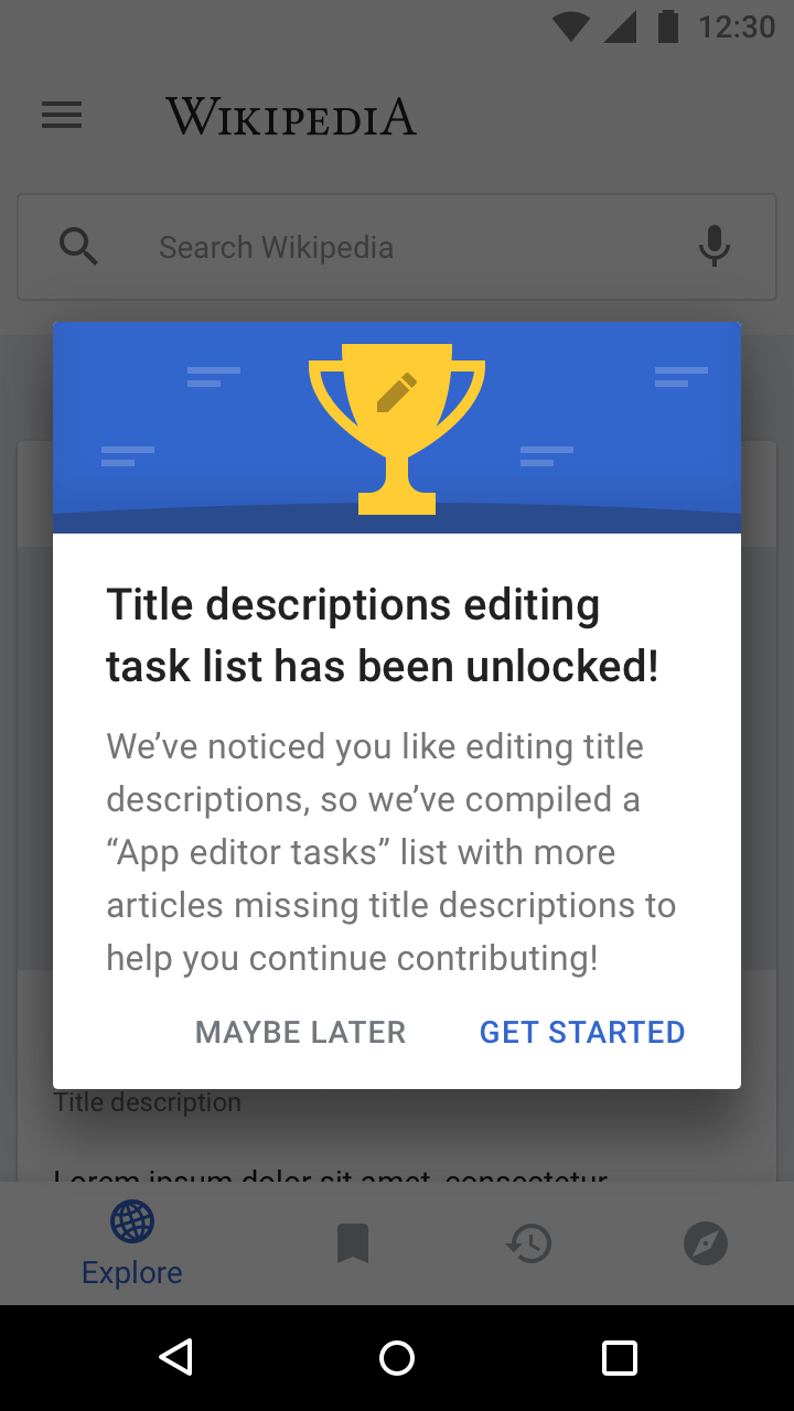
Create a custom dialog that includes an image
Closed, ResolvedPublic1 Estimated Story Points

Description

Why are we doing this?

The edit action queue flow includes a number of dialogues that are similar in nature but relate to different tasks, having an image can help to further 'illustrate' the different task types to users. Additionally we can reuse these throughout the app and potentially for fundraising asks.

User story

As an Android user, I would like app dialogues to be friendly and informative. Visual elements help me to navigate through the app.

Mocks

Event Timeline

cmadeo renamed this task from As a user of Title description editing, I would like to be able to know when I have unlocked Title descriptions when the app is open to Create a custom dialog that includes an image.Nov 14 2018, 6:28 PM
cmadeo updated the task description. (Show Details)

Change 475946 had a related patch set uploaded (by Sharvaniharan; owner: Sharvaniharan):
[apps/android/wikipedia@master] Create custom dialog with image

https://gerrit.wikimedia.org/r/475946

@cmadeo @schoenbaechler Image for the dialog is not provided in the Zeplin mocks.
Few more questions:
--With the margins provided, and the width of the dialog, along with the text size in mock, the text appearance is not the same. The title runs to 3 lines.
--Left margin of title and description is 24dp, right is 27dp?

@cmadeo @schoenbaechler Image for the dialog is not provided in the Zeplin mocks.

Sorry about that, updated the Zeplin mock to include an export of the image

Few more questions:
--With the margins provided, and the width of the dialog, along with the text size in mock, the text appearance is not the same. The title runs to 3 lines.

Thanks for the heads up on this, the wrap is a bit unfortunate so I'll work on some new copy. That being said I'm sure this will need to wrap on a bunch of languages (eg. DE, etc).

--Left margin of title and description is 24dp, right is 27dp?

A mistake on my end, the left and right margins should both be 24dp

Thank you so much @cmadeo ! will wrap this up now :)

@cmadeo A very general design question stemming from this task:
In your mock, the negative dialog button ("Maybe Later") is in a different color than the positive button. The standard behavior is for both buttons to be the same color.
We can potentially override this color, but then the question becomes: do we want this style to apply to *all* dialogs in the app, for the sake of consistency? (This would also be the simpler way to go, as long as we're already making customizations.) Or do we want to leave the buttons with the standard (uniform) color?

@Dbrant, my apologies, I had carried this over from iOS without checking Android. Please keep both buttons the same color.

Moving this to Blocked to indicate 'Development done and waiting for other tasks for the prototype to be completed, but does not need QA'.

Dialog looks good from a design perspective on 2.7.269-alpha-2019-02-05. Screenshot from ONEPLUS A6003:

Screenshot_20190207-153658.jpg (2×1 px, 428 KB)

Moving it to the “Ready for signoff“ column.