Page MenuHomePhabricator

Design "refreshed toolbar" v1.0
Closed, ResolvedPublic

Description

Task overview

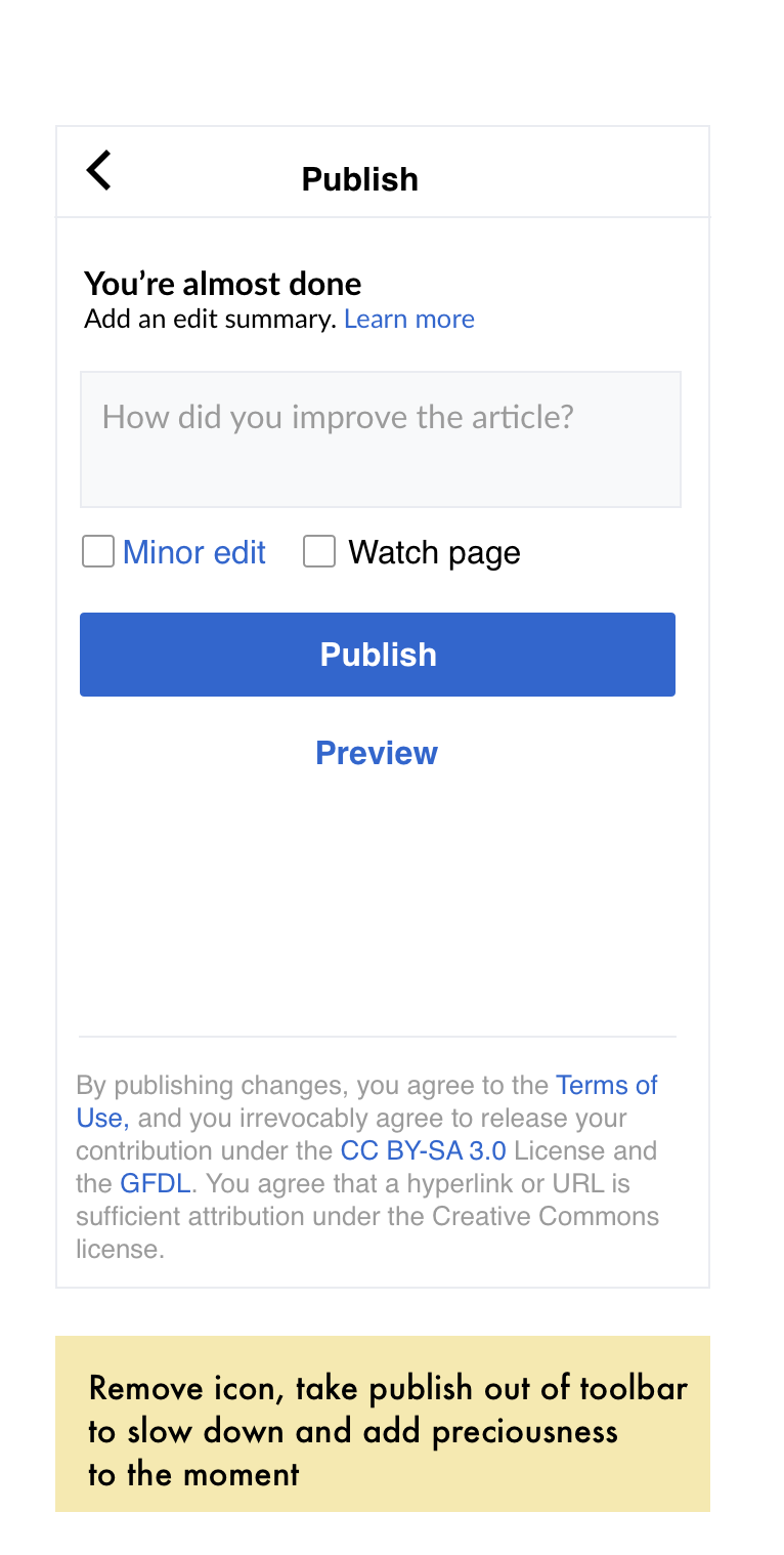
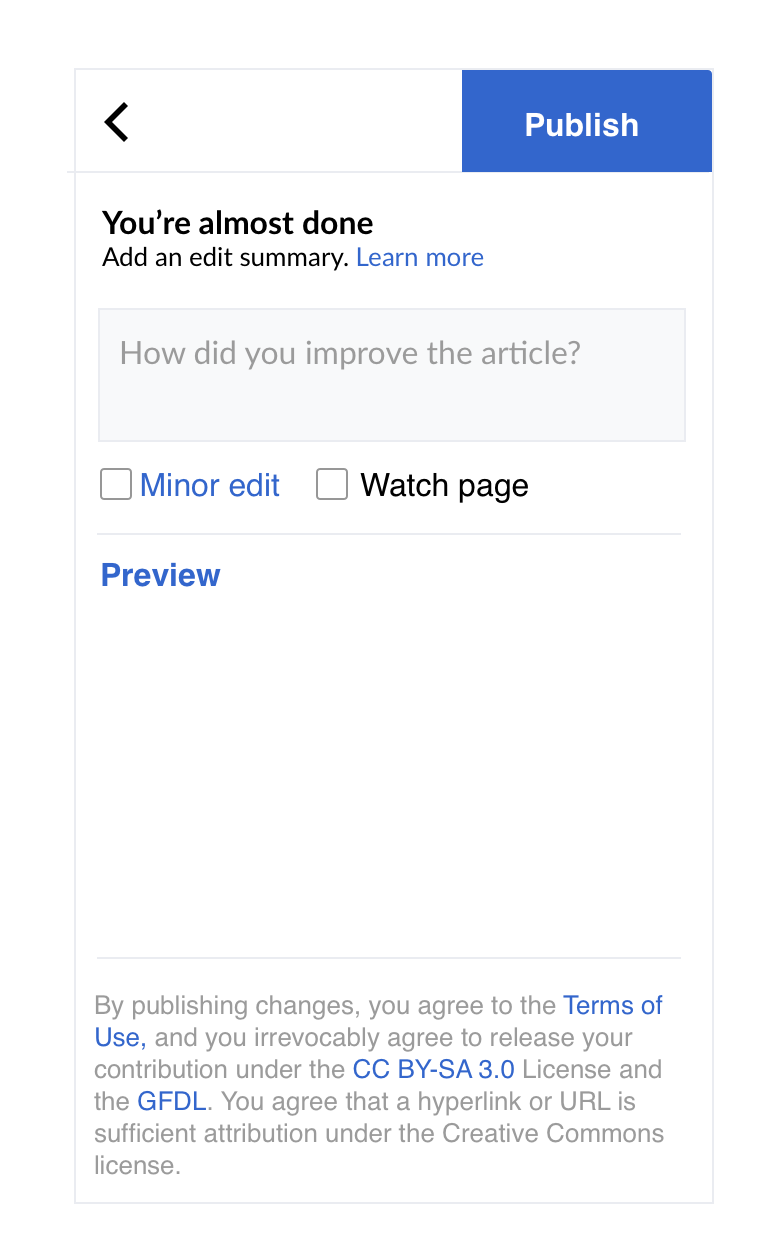
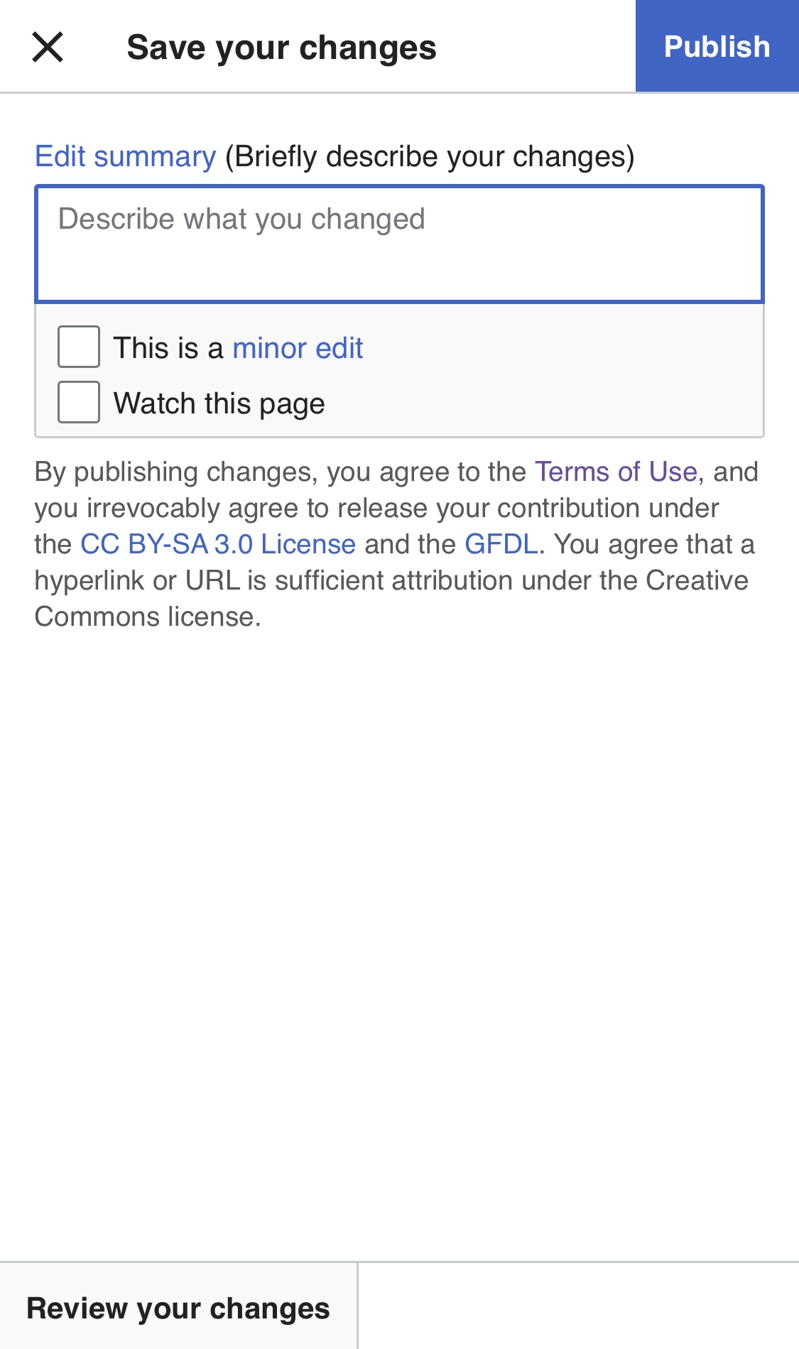
This task involves the design improvements we are committed to including in the release of v1.0 of the "refreshed toolbar."

"v1.0"

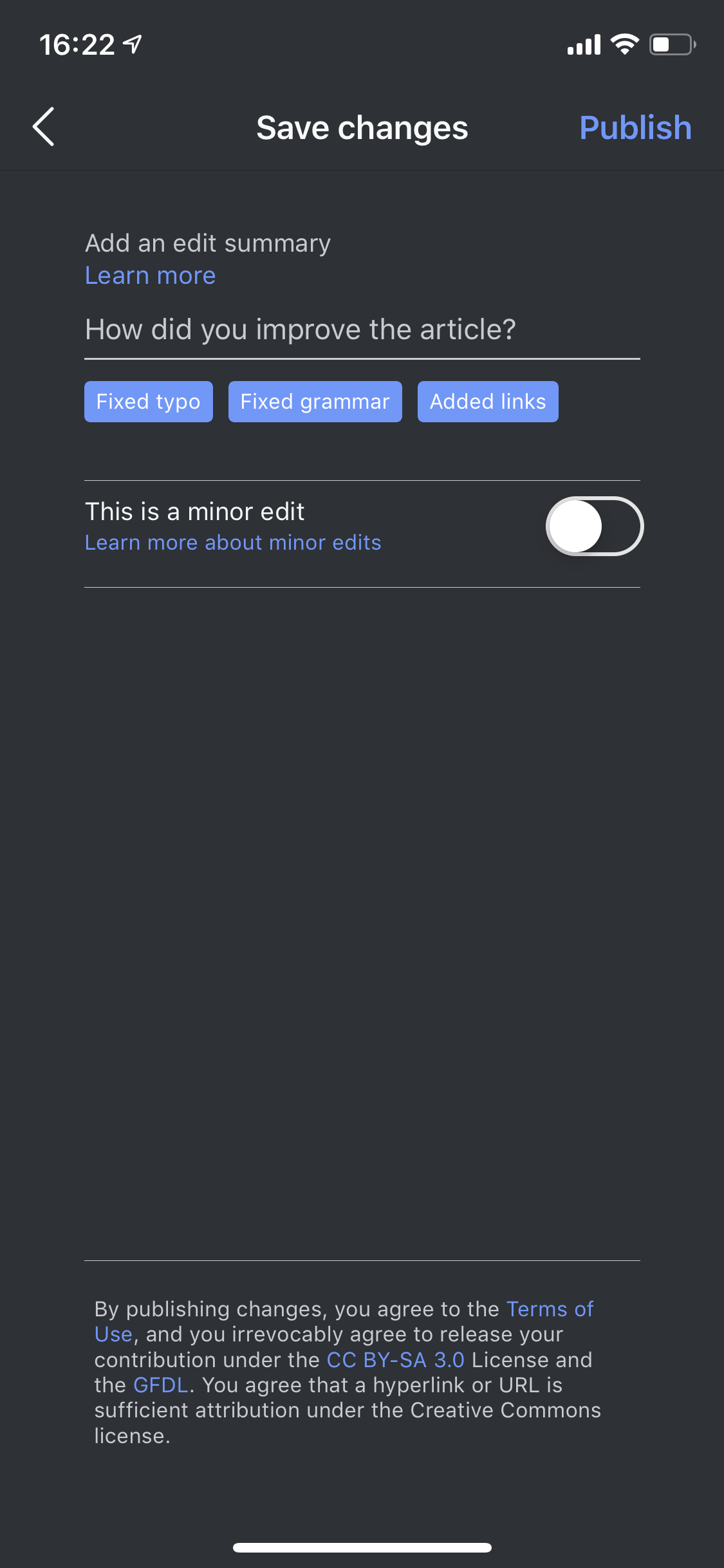
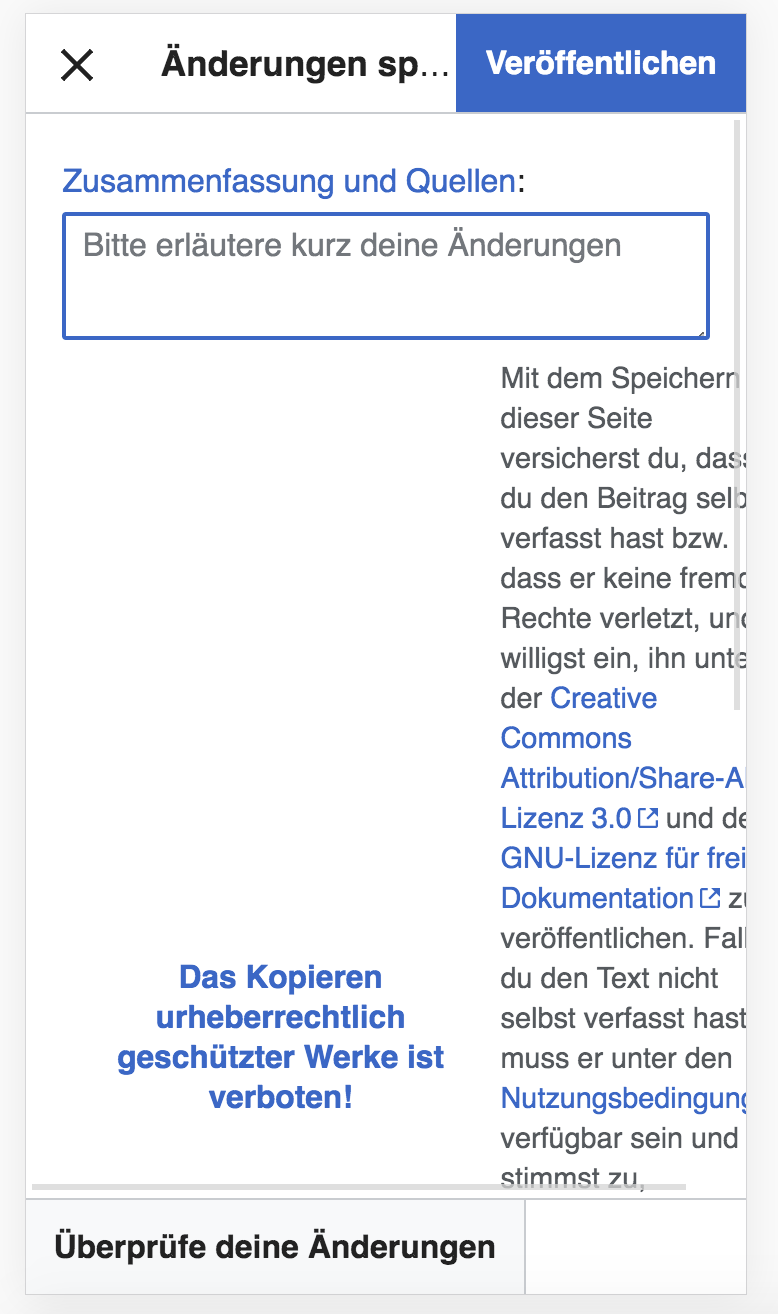
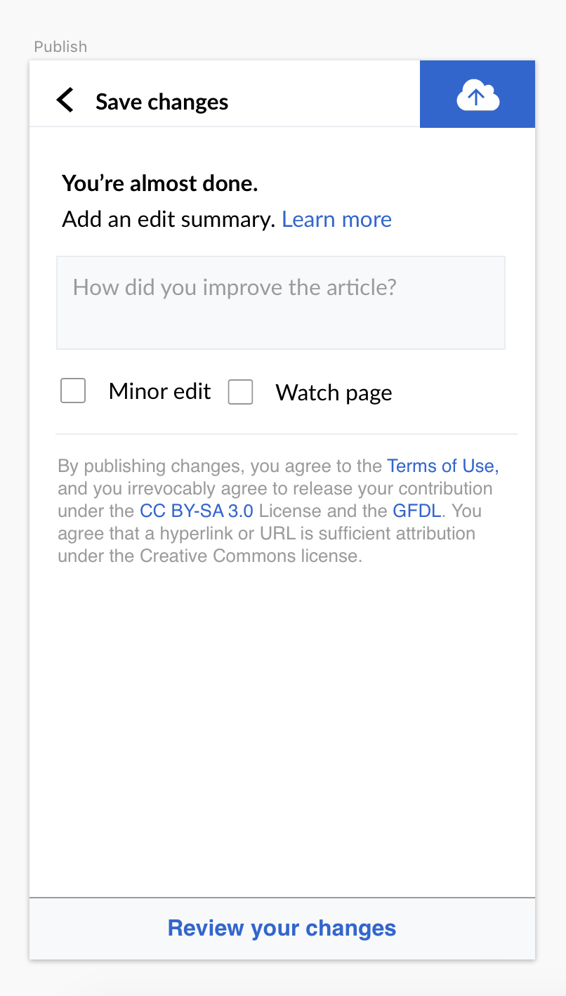
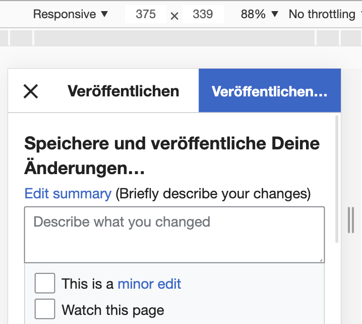
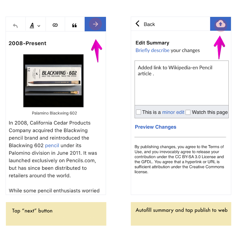
v1.0 of the refreshed toolbar will include new icons that make it clear to contributors how to review and publish their changes and get back into editing mode after entering the publish flow.

Contributor stories

Story A
When I finish making an edit
...I want to know what to tap next
...so that I can complete review my changes

Story B
When I finish reviewing my changes
...I want to know what to tap next
...so that I can publish my changes

Story C
When I notice I made a mistake [no matter where I am in the edit flow]
...I want to know what to tap
...so that I can get back into edit mode to make the necessary revisions

"Done"

  • Contributors know what actions to take to review their changes/edits
  • Contributors know what actions to take to publish their changes/edits
  • Contributors know when they are moving from editing to publishing mode.
  • Contributors know how to get back into editing mode after entering the publish flow

Designer: @iamjessklein
Engineer: @DLynch
Design Review: @Volker_E
Engineer Review: @Esanders
Product Review: @ppelberg


Mocks + Prototype

User Flow: https://wikimedia.invisionapp.com/freehand/document/u73rMI8Nu
Zeplin Board: https://zpl.io/2ZJ9KOG

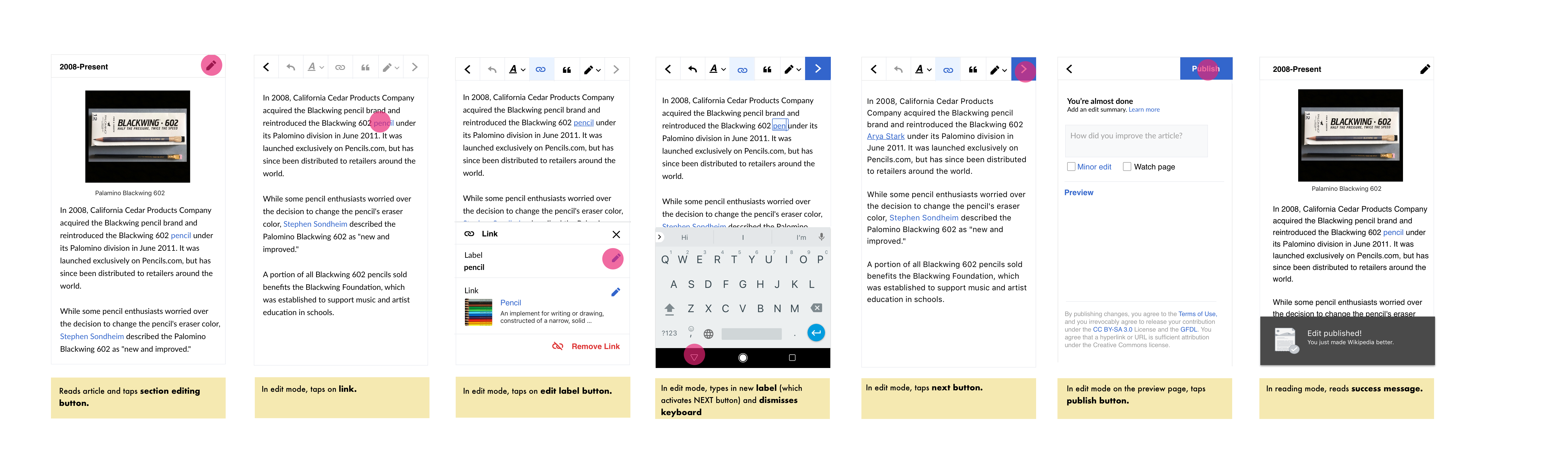
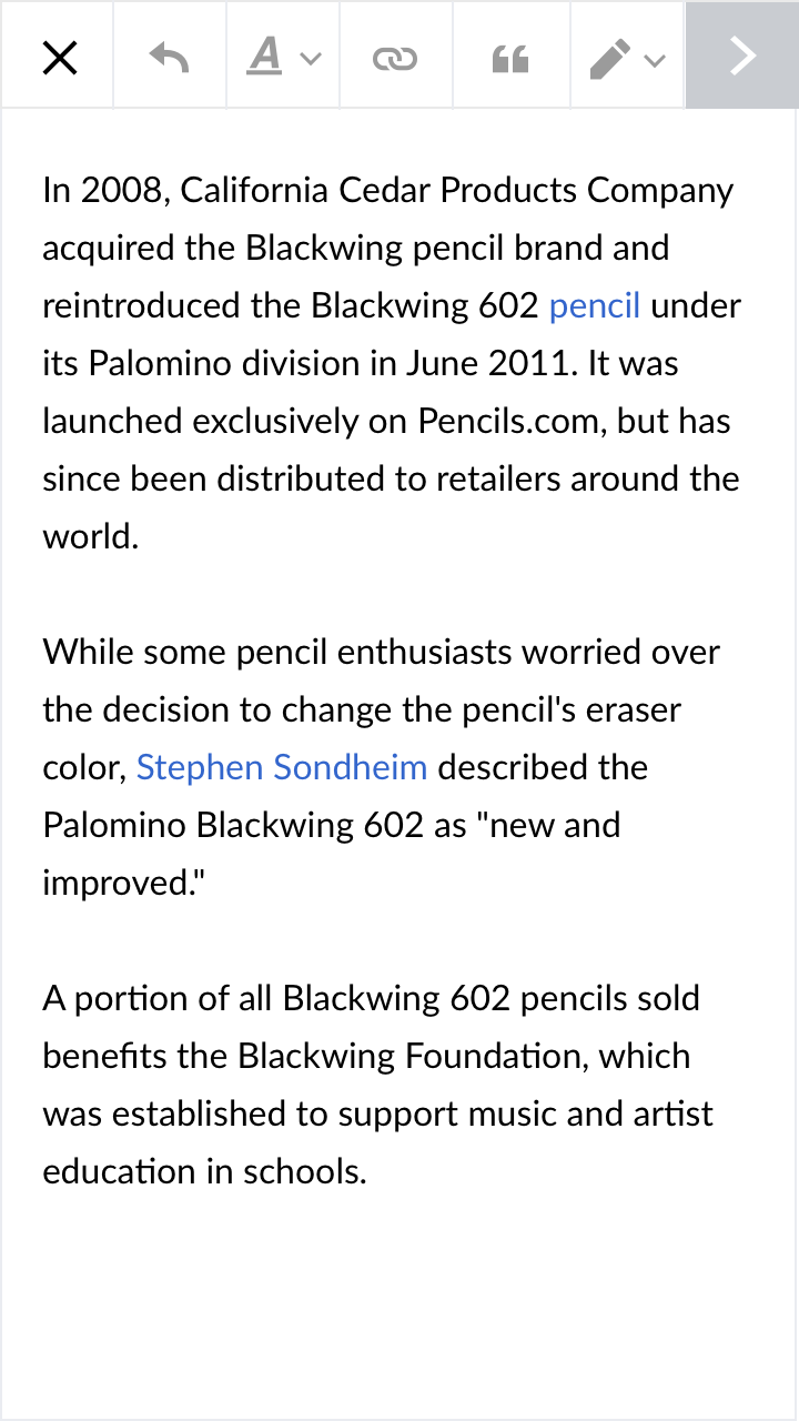
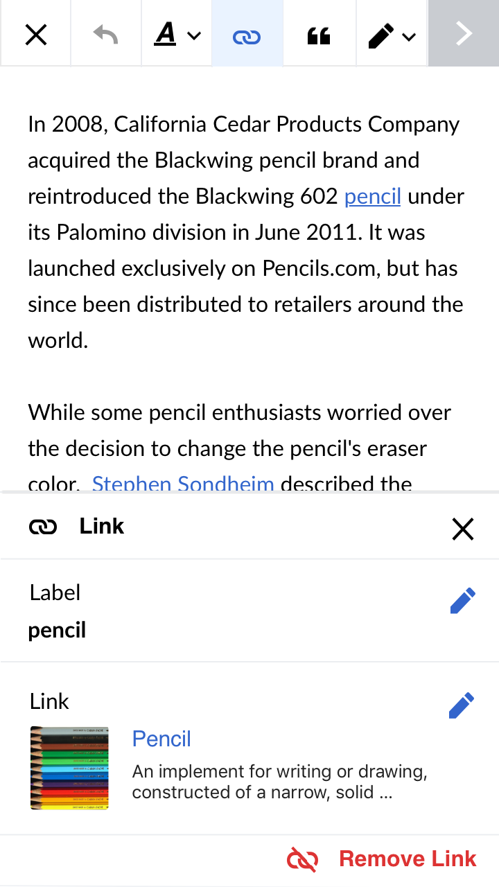
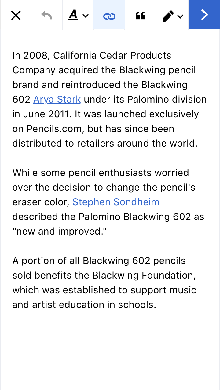
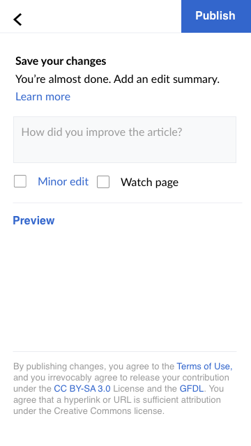
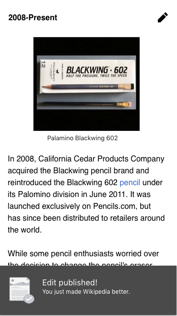
Reads article and taps section editing buttonIn edit mode, taps on linkIn edit mode, taps on edit label buttonIn edit mode, types in new label (which activates next button) and dismisses keyboardIn edit mode, taps next buttonIn edit mode on preview screen, taps publish buttonIn reading mode, reads success message
1.png (640ร—360 px, 130 KB)
Section Editing@2x.png (1ร—720 px, 178 KB)
Edit Card@2x.png (1ร—720 px, 198 KB)
Next@2x..png (1ร—720 px, 192 KB)
6.png (640ร—360 px, 47 KB)
7.png (640ร—360 px, 128 KB)

Event Timeline

Restricted Application added a subscriber: Aklapper. ยท View Herald TranscriptJun 12 2019, 3:00 PM
ppelberg renamed this task from Propose updated toolbar iconography to Design "refreshed toolbar" v1.0.Jun 13 2019, 2:39 AM
ppelberg updated the task description. (Show Details)

The first set of changes to the toolbar will be to the iconography. I would like to consider next and publish to web icons.

  • The next button will be used when a user is ready to take an edit to publish. It's next and not publish to signal that there will be one additional step (adding a message)
  • The publish button should be obvious and indicate that the edit is going live to the Web.

Here's the context that they will appear in:

icons.png (762ร—798 px, 243 KB)

As the ultimate idea here is to create a single state toolbar, this experiment will help us to see if we can support and get buy-in on icons in that real estate (instead of text which will take up much more space).

I took a first pass at a few publish icons. The mockups are here and on Freehand.

publish@2x.png (2ร—3 px, 523 KB)

After an initial round of feedback, I took a stab at trying to bring more importance to this moment of publishing to the web. (The fact that the publish was live so quickly has often been described as uncomfortably surprising to Editors). This iteration, I took the button out of the toolbar and moved it into the publish flow as an actionable button (removing the need for an icon). I also used this opportunity to tweak the design of that page.

round2@2x.png (1ร—766 px, 154 KB)

After some more feedback, I have yet another iteration, which now places the publish button up into the toolbar as a primary button. There are several reasons to do this, but my main concern right now is that the icon designs are not 100% unequivocally localizable and therefore this could potentially make publishing more confusing.
๐Ÿ‘ or ๐Ÿ‘Žor general thoughts?

Screen Shot 2019-06-27 at 5.31.01 PM.png (1ร—766 px, 106 KB)

๐Ÿ‘Having the most important action โ€œPublishโ€ universally understandable by providing a localizable label is preferable. The icons for an abstract concept like publish need some user accommodation. And as the view provides the space for a label button, the proposed approach seems to me like the best possible option!

1) Keeping "Publish" in the navigation bar
@iamjessklein, I share the opinion that keeping the publish action in the navigation bar [1] makes sense for right now.

With this said, I appreciate what you mentioned about how the current publish flow could lead contributors [2] to feel "uncomfortably surprised" by how quickly their edits get published. Tho, I wonder if these contributors' "surprise" stems from them not having an obvious opportunity to review/preview their changes before publishing.

It looks to me like the the design you shared in T225634#5287116 is starting to address this point by making "Preview" button more prominent. Maybe it makes sense to show the current "Review your changes" [or something like it] view by default? Here is a ticket to track our thinking on this: T226951 [2]

2) Arrow icon
This looks good. I agree with you in assuming contributors will expect tapping an arrow means "next" not "publish."

A related question:

  • Do you have the entire edit-to-publish flow posted anywhere? I ask this in an effort to see how the "โœ”๏ธ" accept changes" and "โžก advance to edit summary" steps relate.

I've looked through what's currently up in this Freehand, tho it seems to be different from what we talked about in chat [3].

3) Switching to text-only button for "Publish"
The seems right.


  1. "Navigation bar": I'm using this different word so as to keep it distinct from the "toolbar"
  2. "Review your changes": I'm not suggesting we build this yet
  3. "Publish flow":
    • โœ”๏ธ: accept changes; advance to preview
    • โžก: save changes; advance to publish
    • "Publish": publish changes

Looks like you are still designing on this @iamjessklein, when we are ready for the engineers to start building lets put it in Ready for Pick Up

This comment was removed by ppelberg.

@iamjessklein assuming "Task 1" in this Freehand is the latest iteration of the v1 design, what's left to be done is:

  • Mockup a button that floats above the keyboard to dismiss the keyboard. This would only be implemented on Android where A) we can float buttons above the keyboard and B) a button โ€“ similar to "Done" on iOS โ€“ does not exist.
  • A mockup that shows how a contributor will navigate between the two editing toolbars:
    • "Toolbar 1": contains the affordances for switching editing interfaces and closing the editor entirely.
    • "Toolbar 2": contains tools for: undo, formatting text, linking, citing, and advancing (read: "next")

I drafted a version of the toolbar where the toolbar has a static state. In order to get to this I made the following changes:

  • Removed the title
  • Added the close button to main toolbar
  • Combined links and citation into one button
  • Added a prominent next button
  • Changed the Wikitext toggle into an input button

I also did some tweaks to publish screen which will guide users into publishing concise summaries and in turn, when they are approaching 500 characters change to a warning message.

Here's the mockup, please add comments to freehand

toolbar@2x.png (3ร—3 px, 1 MB)

I placed the latest version of what I believe is in scope for this release on Freehand. I put it on freehand and not Zeplin because I want to confirm one thing. Will the label input models be in this release or next?

Here's the screen that will be impacted. The difference is how much we are relying on the native keyboard affordances of the mobile device to communicate to the user that their changes have been accepted. User testing clearly shows that alternate to the currently implemented solution needs to be designed (which we think is going to be the form input for the label).

Screen Shot 2019-07-20 at 10.25.26 AM.png (1ร—1 px, 226 KB)

cc @ppelberg @DLynch

Where is the edit mode switcher in this version?

Form-based approach to link label editing
@iamjessklein, for the purposes of designing and testing the toolbar, you can assume the form-based approach to editing the label of an existing link will not be implemented.

thanks @ppelberg I updated the freehand with the label input and toggle tweaks.
Note: this toolbar is 360 width and 48 height - with each button tap target at 51px.

toolbarv1-present@2x.png (1ร—6 px, 1 MB)

Freehand User Flow = updated
Zeplin = updated
Phabricator ticket description = updated

@ppelberg @DLynch please thumbsup ( ๐Ÿ‘) or thumbsdown ( ๐Ÿ‘Ž) so we can get resolution on this ticket. Thanks

This looks great, @iamjessklein. Thumbs up (๐Ÿ‘) pending clarity about the following question

Question: In the "Save your changes" screen [1], why is it preferable to show the title of the screen in the "body" of the screen as opposed to in the top/navigation bar?

I ask this with the following in mind:

  • One of our objectives with this work is to make the steps to publish an edit more clear. Part of that, I think, is making sure it is clear to contributors what the purpose of each screen is.
  • It seems like the common design pattern* for showing people what the purpose of each screen is, is including a title within a screen's "top"/"navigation" bar. See:
1. Refreshed Toolbar v12. Mobile VE3. iOS app
6.png (640ร—360 px, 47 KB)
IMG_3866.jpg (1ร—1 px, 219 KB)
IMG_3867.PNG (2ร—1 px, 294 KB)

*"Common design pattern": I appreciate these are app, not necessary web, specific guidelines

Thanks @ppelberg - in my original designs, I did have that text in the toolbar space, however the feedback that I was given at the time by our team was that it could be potentially cumbersome when it gets translated and localized. I moved it out of the toolbar, because in addition to this text we also have the "publish" button using text and not iconography, so we potentially will have two very long phrases of text. This is what that currently looks like on Visual Editor:

Screen Shot 2019-07-26 at 9.40.34 AM.png (1ร—844 px, 260 KB)

Screen Shot 2019-07-26 at 9.43.03 AM.png (1ร—778 px, 185 KB)

@ppelberg for additional reference - this was my original sketch. Keep in mind that we decided against the cloud icon.

Screen Shot 2019-07-26 at 10.07.39 AM.png (1ร—806 px, 118 KB)

Gotcha, okay...thank you for explaining this, @iamjessklein.

Update
After discussing this with Jess and @Volker_E just now, we decided:

  1. The screen title will โ€“ for now โ€“ live in the screen's title/nav/app bar. The screen title will read "Save changes" the button in the toolbar will read "Publish"
  2. In a future iteration, we will come up with a version that addresses localization. That work will happen in this task: T229130

Good decision! Just for completion, the alternative bespoken in our conversation with (redundant short) title.

image.png (642ร—718 px, 68 KB)

Based on the feedback on the mockups from the team, we should add a few more tasks:

  • Tweak the mockups to reflect the change of the < button to close for this iteration [T229427]
  • Tweak the mockups legal message placement to account for keyboard being up
  • Confirm the applied changes to the Save dialog on desktop doesn't cause any issues, and highlight if there any places we think mobile needs to behave differently.
  • Check how the character limit counter edge case looks now that we've removed the frame
  1. The screen title will โ€“ for now โ€“ live in the screen's title/nav/app bar. The screen title will read "Save changes" the button in the toolbar will read "Publish"

When we introduced the "publish" wording a few years ago, we clearly missed this message. "Save changes" should be "Publish changes".

With that fixed I think that having a dialog bar with "Publish changes | Publish" is a bit absurd.

When we introduced the "publish" wording a few years ago, we clearly missed this message. "Save >changes" should be "Publish changes".

With that fixed I think that having a dialog bar with "Publish changes | Publish" is a bit absurd.

I agree, the change made more sense when we had the icon. The next best option would be to leave the title bar empty so that the button is the primary call to action and orienting message.

Thoughts @ppelberg ?

Separate thread:
We also said when moving to native affordances for dismissing the keyboard that the Android one is really bad and that we would consider augmenting it with out own button floating above the keyboard.

We also said when moving to native affordances for dismissing the keyboard that the Android one is really bad and that we would consider augmenting it with out own button floating above the keyboard.

@iamjessklein / @ppelberg can speak to this further, but my recollection is that in the design discussions we looked at it and decided the native Android affordance wasn't so bad overall and we'd wait for the user testing to see whether it was an issue in practice.