Page MenuHomePhabricator

Site header doesn't fit on screen in advanced contributors mode
Closed, ResolvedPublic3 Estimated Story Points

Description

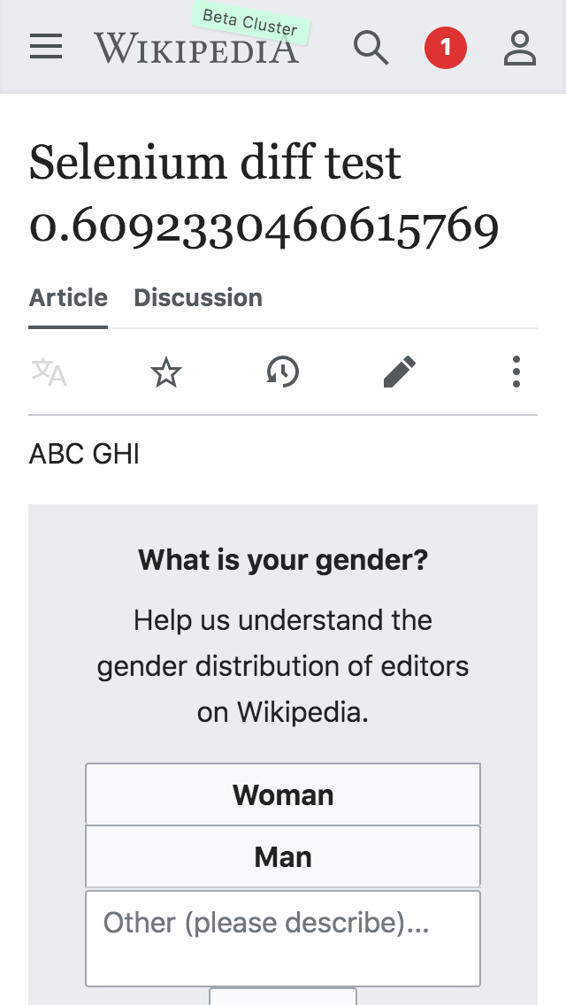
I'm on an iPhone SE.

IMG_8339.PNG (1×640 px, 103 KB)

Looks like there's plenty of extra space between the header icons that could be shrunk on smaller screens. Probably just need to add a CSS media query.

Sign off steps

  • The fix is a hack that will need to be reverted. Make sure this task is not resolved, and is removed from the sprint board/moved to blocked on others. It will need to be tested again when T229440 is done, test on different device sizes (s, m, and l roughly)

QA Results

ACStatusDetails
1T230232#5516106

Event Timeline

Change 533534 had a related patch set uploaded (by Niedzielski; owner: Stephen Niedzielski):
[mediawiki/skins/MinervaNeue@master] [hack] [toolbar] tighten the icon spacing

https://gerrit.wikimedia.org/r/533534

Nice, I was going to complain about this too :)

Change 533534 merged by jenkins-bot:
[mediawiki/skins/MinervaNeue@master] [hack] [toolbar] tighten the icon spacing

https://gerrit.wikimedia.org/r/533534

ovasileva set the point value for this task to 3.Sep 3 2019, 5:11 PM

The red circle is bleeding to the right again as a result of this change :-(:

Screenshot 2019-09-04 at 9.49.12 AM.png (169×427 px, 60 KB)

^^ I can reproduce that on iPhone 6 Plus and Pixel 2 XL

This comment was removed by Edtadros.
Edtadros subscribed.

Test Result

Status: ✅ PASS
OS: macOS Mojave
Browser: Chrome
Device: MBP
Emulated Device: iPhone 5/SE

Test Artifact(s):
✅ AC1 - Header icons fit on screen

T230323.png (1×640 px, 97 KB)