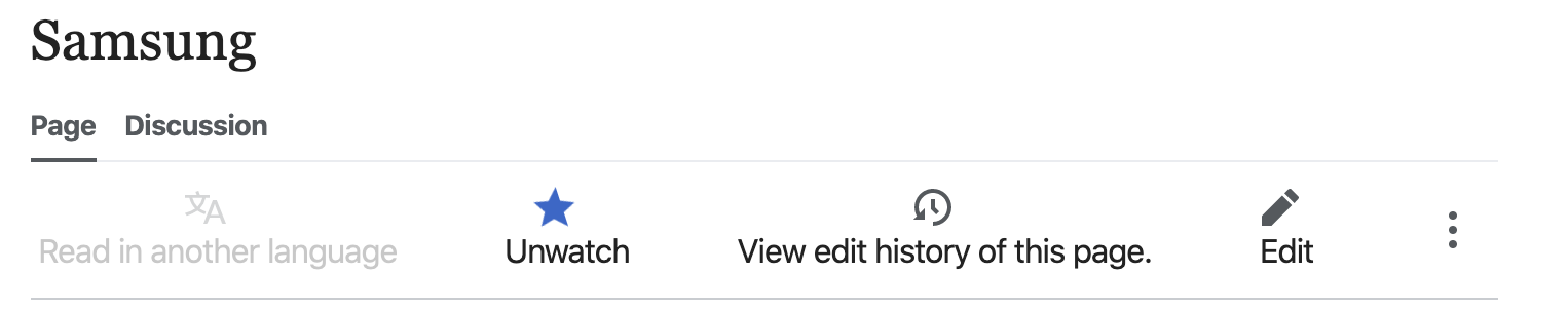
Description
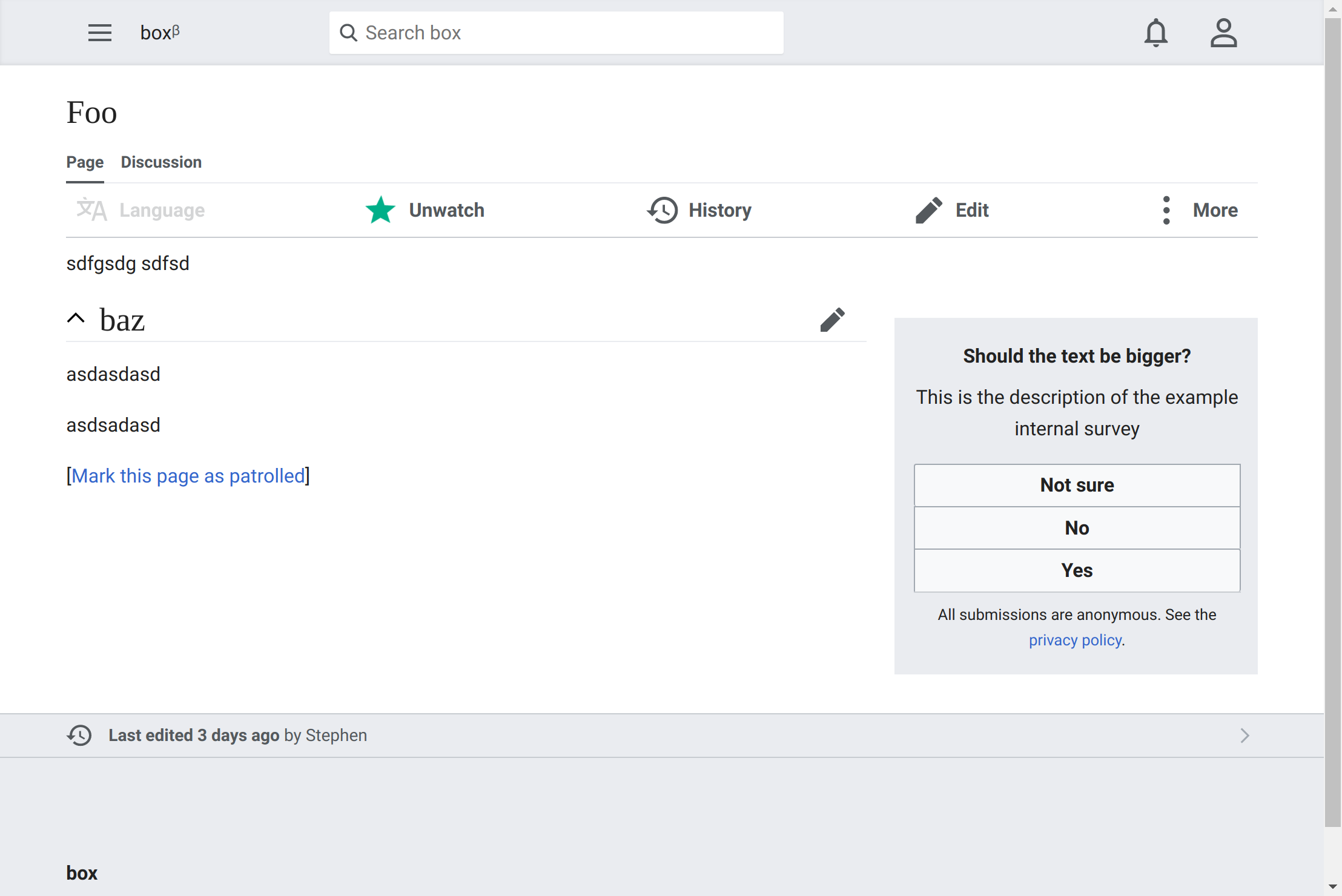
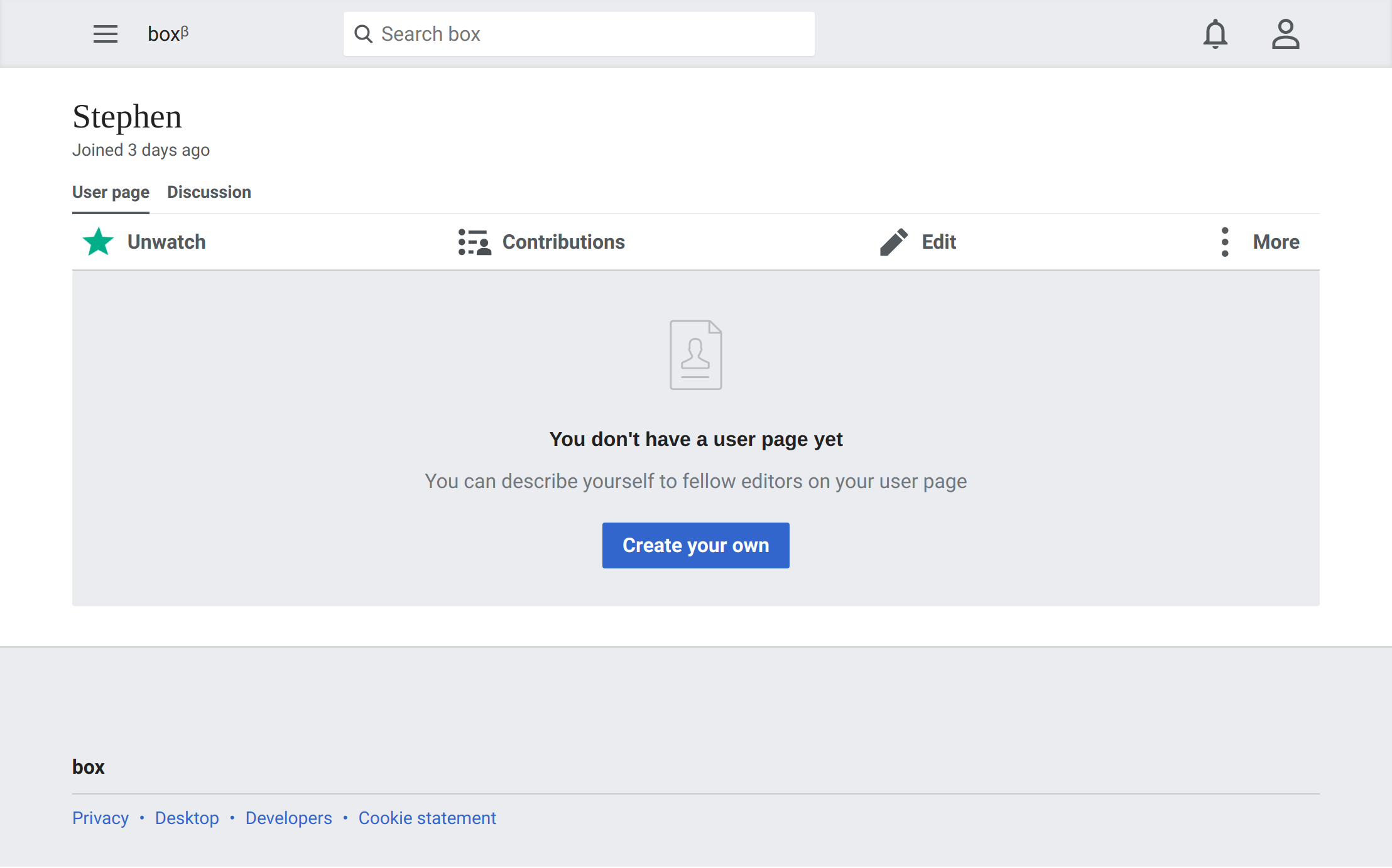
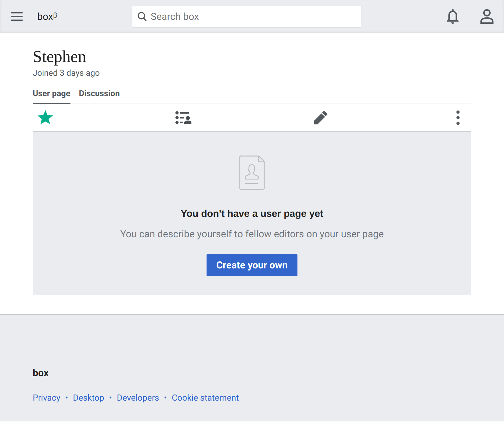
On tablet and desktop screens there is enough space to display labels next to the toolbar actions. This will help with usability.
Design
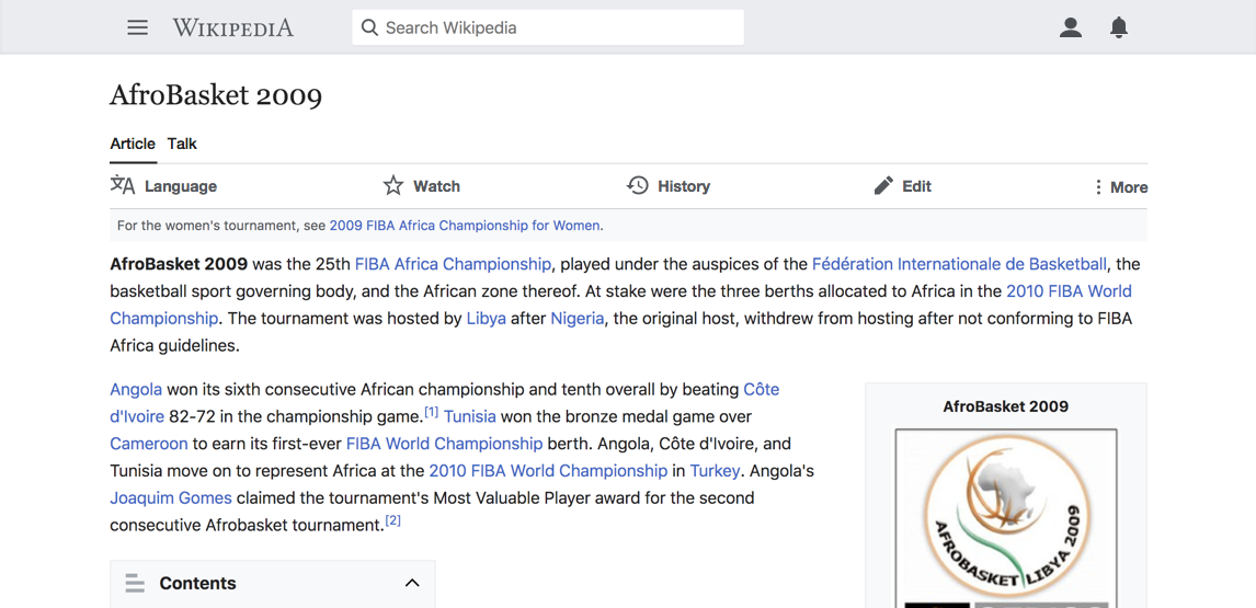
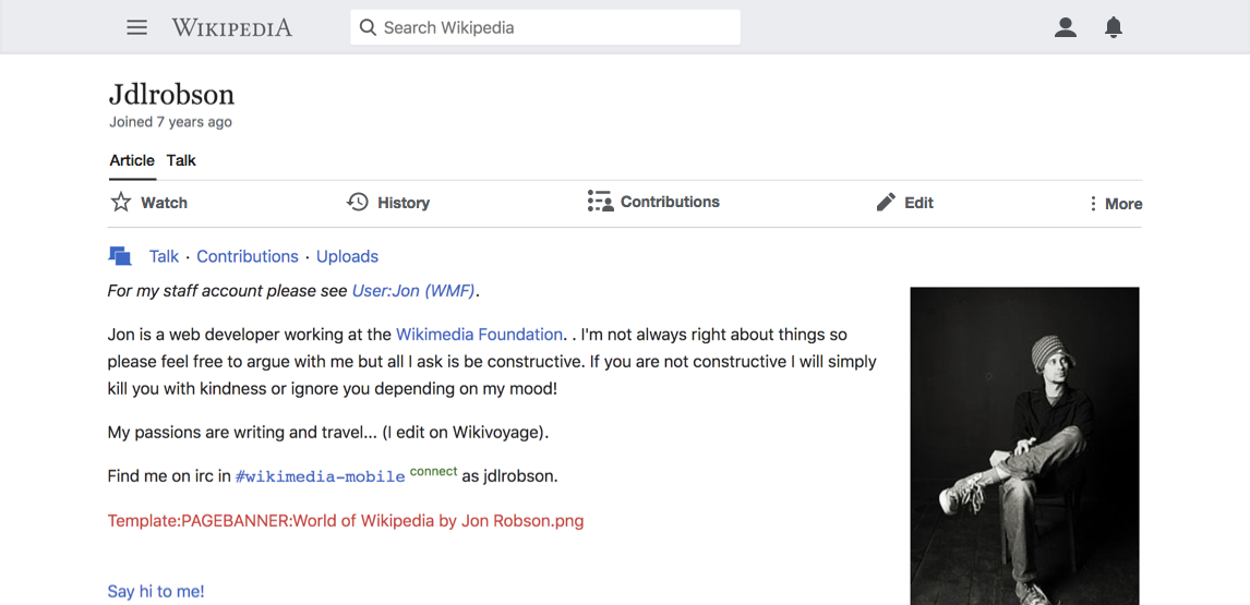
| article page toolbar | user page toolbar |
 |  |
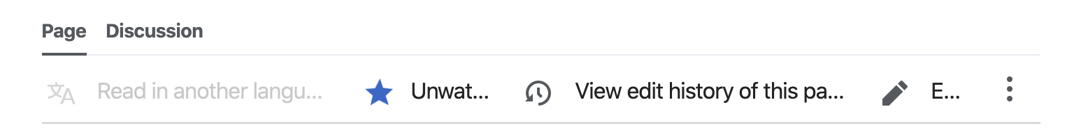
*note: eventually it would be great if at a certain width the alignment of the elements shifted, since it looks weird to space them equally across such a wide screen. E.g.

Developer notes
Icons with labels use mw-ui-icon-before class. Icons without use mw-ui-icon-element. We need a new class mw-ui-icon-adaptive that exhibits both characteristics depending on the resolution.
- New class is provided inside core of Minerva as a skinStyle of mediawiki.ui.icon
- Replace the class names for the page actions icons with the new class
This should be for both AMC and non-AMC
QA steps
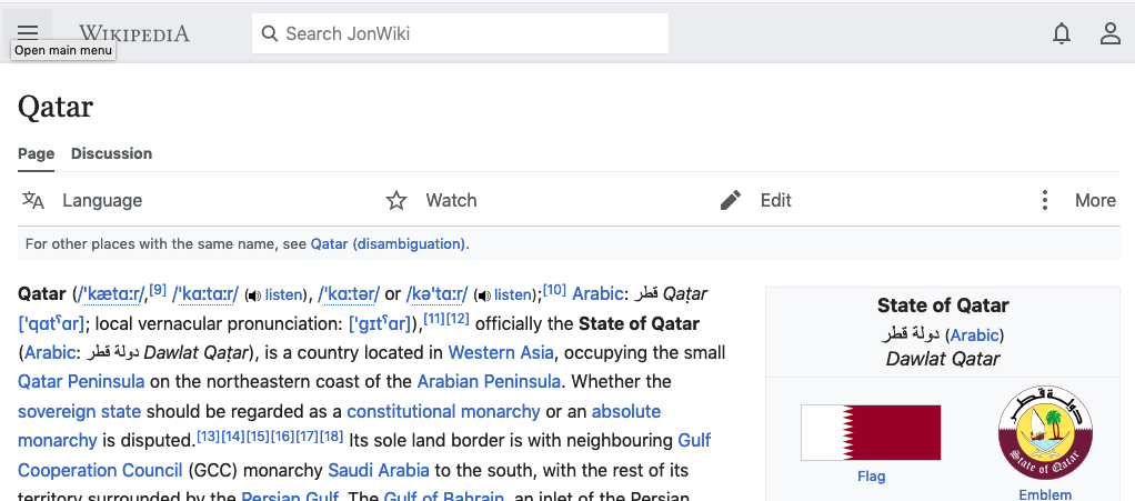
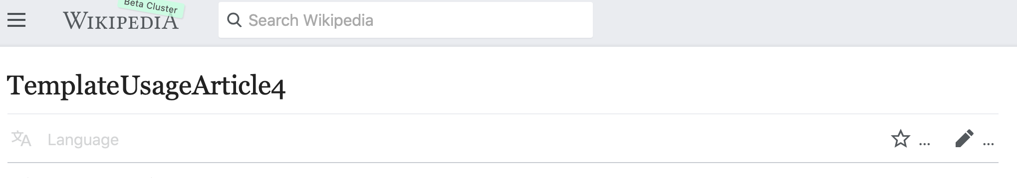
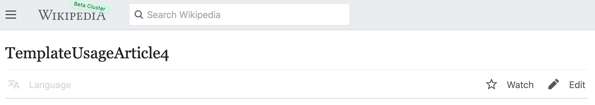
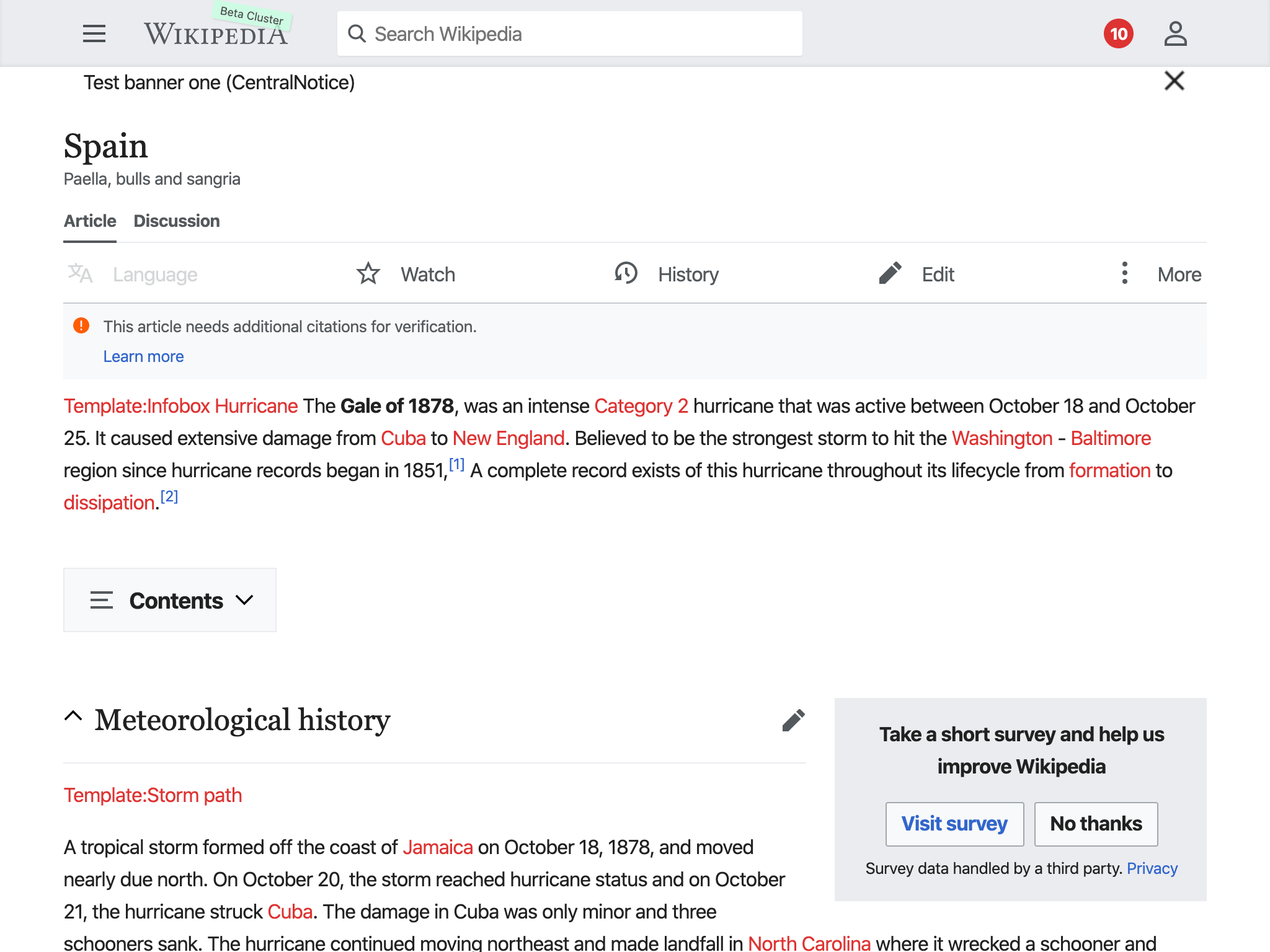
Test on https://en.m.wikipedia.beta.wmflabs.org/wiki/Spain with AMC enabled.
- Test on mobile device:
- Can you see the icons?
- Labels shold be hidden
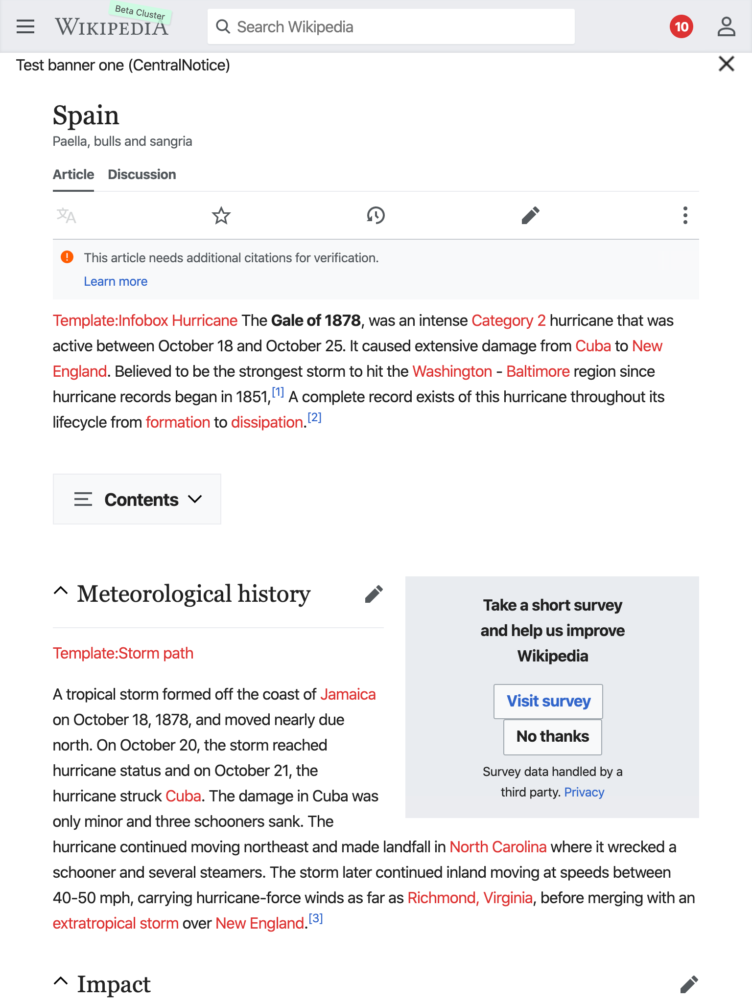
- Test on desktop device
- Can you see the icons?
- Labels should show
- Labels should hide when you resize the screen
QA Results
| AC | Status | Details |
|---|---|---|
| 1 | ✅ | T226562#5669265 |
| 2 | ✅ | T226562#5669265 |