Why are we doing this?
We would like to have a way for users to provide feedback to the development team via the app. Users can report bugs, issues or general comments.
Acceptance criteria
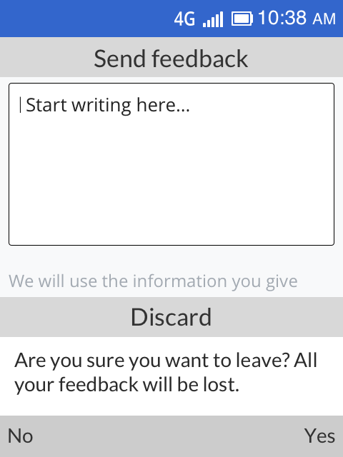
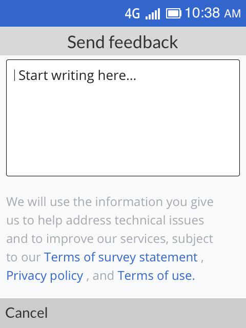
- A user can submit feedback through an open text field within the feedback menu on the app
- They will not be required to provide any identifiable information and can submit feedback anonymously
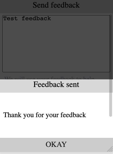
- The user will receive a comment letting them know that we are thankful for their feedback. "Thank you for your feedback!"
- As feedback is anonymous, we will not communicate back to the user with responses to their questions/comments
- Will need to work without a user providing/having an email address or phone number
- As there is no rating or comments on the KaiStore at this point, the feedback will be stored by and for the product dev team only
- A user understands that by giving feedback, they accept the privacy policy and terms of use
Proposed designs
Zeplin ➡ https://app.zeplin.io/project/58dc46f4a83d1e477dd83859/dashboard?seid=5eafd44fb7bd22b0d503847c
| Empty state | Ready to send | Confirmation |
|---|---|---|
 |  |  |
| Focused State | Updated Settings Menu |
|---|---|
 | 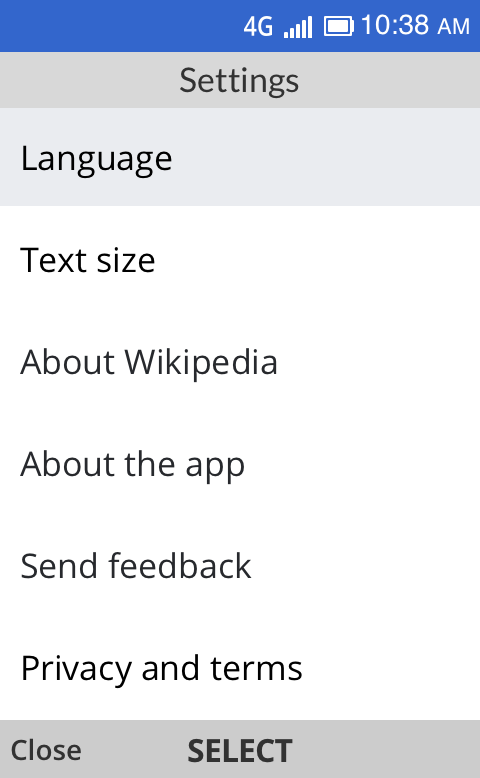 |
Design details
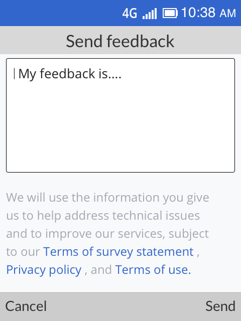
- "Send" softkey is not visible to users before entering the feedback.
- If control is on text box then cursor keeps blinking until users start writing feedback.
- If there is multiline text then allow for scrolling within the text box.
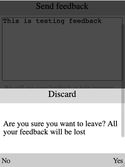
- Confirmation message appears in popup form on main feedback screen.
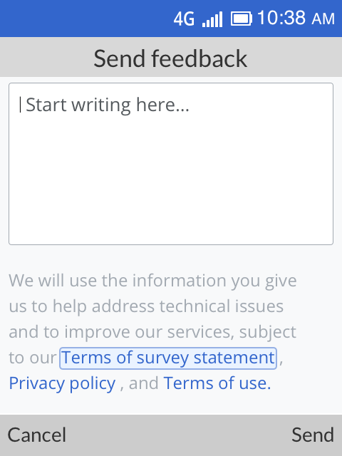
- When other links are focused then text box becomes inactive.
- When device is offline, "No internet connection" error screen is displayed immediately after selecting "send feedback" on the menu
- Use up/down keys on D-PAD to switch control between the text box and fine print and use left/right keys to switch between links