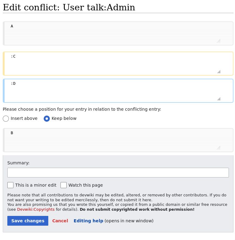
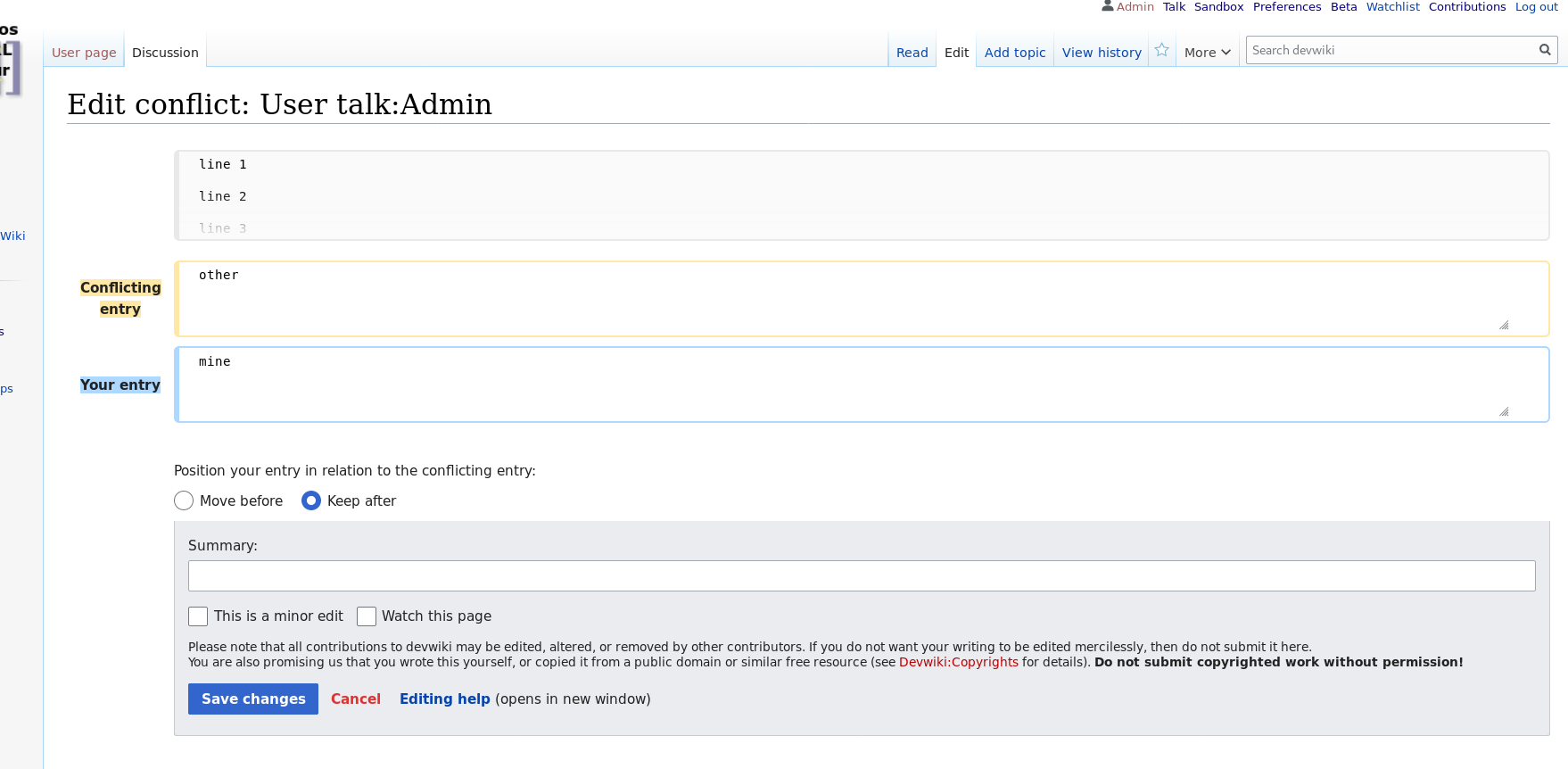
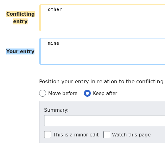
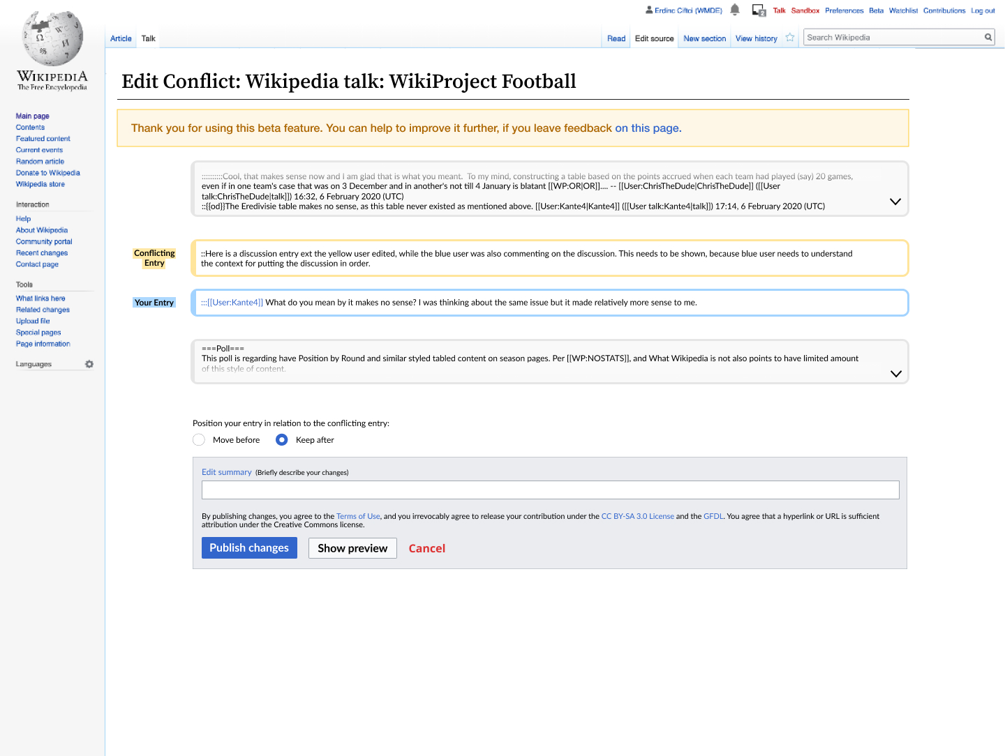
Page MenuHomePhabricator

Non-javascript adjusting comment order in editing conflict resolution for talk pages
Closed, ResolvedPublic2 Estimated Story Points

Assigned To
Authored By
Lena_WMDE
Feb 11 2020, 1:24 PM
Referenced Files
F31788088: image.png
Apr 30 2020, 11:05 AM
F31788083: image.png
Apr 30 2020, 11:02 AM
F31788017: Screenshot from 2020-04-30 11-56-08.png
Apr 30 2020, 9:59 AM
F31778012: image.png
Apr 24 2020, 12:55 PM
F31761587: image.png
Apr 17 2020, 1:07 PM
F31761582: image.png
Apr 17 2020, 1:07 PM
F31761441: (NON JS) Radio Buttons.jpg
Apr 17 2020, 11:15 AM
F31722418: (NON JS) 4.0.jpg
Apr 2 2020, 8:27 AM

Description

Mock-up:

(NON JS) Radio Buttons.jpg (1×1 px, 478 KB)

User Story:
As a user entering an edit conflict
And without javascript
I want to be able to change the order of the conflicting comments
So that I can make sure that my response is sorted in the correct order

Acceptance criteria:

  • The user can decide in which order the conflicting comments appear i.e. which comment comes first
  • The text will be published in the order selected on save
  • The interface should be usable with keyboard commands
  • The interface should be screenreader compatible

Notes:

Event Timeline

Lena_WMDE updated the task description. (Show Details)
Lena_WMDE set the point value for this task to 5.Feb 11 2020, 1:31 PM

I've just added the Mock-Up we came up with @ecohen but actually we have two kind of open questions that we still consider from the UX side:

  1. We are not so sure about the wording of "Please choose a position for your entry in relation to conflicting entry:" more input would be appreciated.
  2. Instead of radio button, we've chosen this design for selecting a position that is inspired by the "ButtonSelectWidget" OOUI item. But this might not work if there are more then two conflicting entries. So would that be a case? @awight (Any Dev input is appreciated. )

I've just added the Mock-Up we came up with @ecohen

Very nice solution to a difficult problem!

  1. We are not so sure about the wording of "Please choose a position for your entry in relation to conflicting entry:" more input would be appreciated.

It seems good enough for now. My only input is that we might explain the specific use case for swapping the entries: "Normally, your comment would appear last, as shown here. However, in some cases your text should appear first, for example when the conflicting text is a reply to a different thread. If so, you can use the 'Insert above' button below."

  1. Instead of radio button, we've chosen this design for selecting a position that is inspired by the "ButtonSelectWidget" OOUI item. But this might not work if there are more then two conflicting entries. So would that be a case? @awight (Any Dev input is appreciated. )

There will always be exactly two conflicting entries in this workflow :-)

We discussed this as a group and agreed to keep the text as short as possible. So the wording will be: "Please choose a position for your entry in relation to the conflicting entry:"

I've just updated the mockup with the same text @Lena_WMDE posted.

@Erdinc_Ciftci_WMDE @ecohen I'm starting to believe that without JS, we don't get any of the nice toggle buttons. Here's a demo page of pure-PHP controls offered by the library, please try it with your browser in no-JS mode: https://doc.wikimedia.org/oojs-ui/master/demos/demos.php

I think this is the full set of what we can do w/o JS.

awight moved this task from Doing to Sprint Backlog on the WMDE-QWERTY-Sprint-2020-04-15 board.

Change 589564 had a related patch set uploaded (by Awight; owner: Awight):
[mediawiki/extensions/TwoColConflict@master] [WIP] No-JS talk page interface for swapping rows

https://gerrit.wikimedia.org/r/589564

Updated the task with a new mockup using radio buttons.

@ecohen Thanks for the adjustments! A few more little details... this is currently what the JS view looks like, note that the "Conflicting entry" text has no background color and the actions block at the bottom is not indented. Should I change those two things for consistency with the latest mockup?

image.png (668×778 px, 51 KB)

Here's the no-JS view, do you want me to add the text to the left of the boxes and indent everything on the page, including the actions block with edit summary and save buttons?

image.png (787×769 px, 56 KB)

JS version:

  • Yes, please indent the actions block.
  • I'm not sure where there is a version with a background color for "conflicting entry"? I'm not seeing it but I think it is fine as is.

No-JS version:

  • Yes, indent everything, including the actions block to keep it consistent
  • Yes, add text to the left of the boxes labeling the different comments/entries
  • Also, in the latest mockup I switched the order, with the 'choose order actions' to the bottom of the content and above the actions block. After looking at it again, I think it makes more sense to group it with the publishing actions and not interrupt the flow. If it's too late to make this change it's ok, but if it's possible to lump it with the changes above that would be great.

Thanks!

Change 592260 had a related patch set uploaded (by Andrew-WMDE; owner: Andrew-WMDE):
[mediawiki/extensions/TwoColConflict@master] Add formatting for row labels on the talk page

https://gerrit.wikimedia.org/r/592260

Change 592260 merged by jenkins-bot:
[mediawiki/extensions/TwoColConflict@master] Add formatting for row labels on the talk page

https://gerrit.wikimedia.org/r/592260

In T244858#6065725, @ecohen wrote:
  • I'm not sure where there is a version with a background color for "conflicting entry"? I'm not seeing it but I think it is fine as is.

I think I'm not describing it well, also not sure: In this task's description, the current mockup has background colors for the "Conflicting Entry" and "Your Entry" labels in the leftmost column. I've accidentally merged a patch which does add this background color, so feel free to confirm again whether this was intentional? It's just a few lines of .less either way, obviously.

The rest of your comments are coming through loud and clear, thank you!

Grouping order-reversal with the publishing actions is a really nice change, good idea.

@ecohen One more question, this time off-topic: what do you think about combining this radio group with the <> button in the JS-enhanced interface? Clicking the button would animate the rows, and also toggle the radio button. It seems like a win-win for accessibility, to give both textual and visual, explicit and implicit audiences something to interpret.

@ecohen @Erdinc_Ciftci_WMDE current screenshot, please review.

image.png (862×1 px, 104 KB)

Ah I think I understand what you mean now about the background. You mean the background highlight of the two labels for the entries? Yes, I would keep it. I see it in all of the designs in the figma file, so it's definitely intentional. It also keeps it consistent with the 2Col styling of the version labels.

Current screenshot for the no-JS version looks great. Thank you for sharing. I am wondering if it has the same issue with the gray boxes though? Is it scrollable?

Re: combining the 'flip' button with the radio button, I wouldn't do it. I understand what you mean but I think the feedback of the two comments switching positions should be enough to communicate and having two ways to do the same thing could actually cause more confusion.

In T244858#6083661, @ecohen wrote:

I am wondering if it has the same issue with the gray boxes though? Is it scrollable?

Good catch. No, it's got the same bug as for the article namespace conflicts. Best thing to do is probably to track this bug separately, and mention that it also affects the talk page interface, because the fix is probably just a small extension of the article page fix. I don't see a task for this specific bug yet, so I'll make visible here by adding to the acceptance criteria.

Re: combining the 'flip' button with the radio button, I wouldn't do it. I understand what you mean but I think the feedback of the two comments switching positions should be enough to communicate and having two ways to do the same thing could actually cause more confusion.

Okay, thanks for the feedback!

Here is the ticket: T250397. Just realized it actually already includes both, so we're good to go.

Hi @awight just to let you know the issue with the gray boxes is tracked here for both article and talk pages: T250397.

O_O thanks, I don't know how I overlooked that. Even searched the workboard for "gray" and "grey", or so I thought...

Change 592616 had a related patch set uploaded (by Awight; owner: Awight):
[mediawiki/extensions/TwoColConflict@master] Split out CSS for talk page interface

https://gerrit.wikimedia.org/r/592616

Change 592616 merged by jenkins-bot:
[mediawiki/extensions/TwoColConflict@master] Split out CSS for talk page interface

https://gerrit.wikimedia.org/r/592616

I'm running into another OOUI bug, which is making it impossible to satisfy this criterion:

The interface should be usable with keyboard commands

In this case, the RadioSelectInputWidget accepts tabIndex = 1, but the attribute is never applied to rendered radio inputs. @Volker_E should we report this as a separate issue? If we submit a patch is there capacity to review?

awight changed the point value for this task from 5 to 2.

This is how it looks now:

Screenshot from 2020-04-30 11-56-08.png (632×577 px, 59 KB)

I don't know, but I find the whitespace above and below the two radio buttons a little weird. @ecohen, can you confirm if this matches the mock good enough?

Change 589564 merged by jenkins-bot:
[mediawiki/extensions/TwoColConflict@master] No-JS talk page interface for swapping rows

https://gerrit.wikimedia.org/r/589564

I think the space above is fine, but would have 16px padding between the radio buttons and the summary box. Will be better about adding specifications to future designs. Thanks @thiemowmde

Change 593484 had a related patch set uploaded (by Awight; owner: Awight):
[mediawiki/extensions/TwoColConflict@master] More space at bottom margin

https://gerrit.wikimedia.org/r/593484

This comment was removed by awight.

Change 593484 merged by jenkins-bot:
[mediawiki/extensions/TwoColConflict@master] More space at bottom margin

https://gerrit.wikimedia.org/r/593484

Change 593485 had a related patch set uploaded (by Thiemo Kreuz (WMDE); owner: Thiemo Kreuz (WMDE)):
[mediawiki/extensions/TwoColConflict@master] Harden swap algorithm against possibly incomplete input

https://gerrit.wikimedia.org/r/593485

Change 590994 had a related patch set uploaded (by Thiemo Kreuz (WMDE); owner: Thiemo Kreuz (WMDE)):
[mediawiki/extensions/TwoColConflict@master] Improve test coverage for new code in HtmlTalkPageResolutionView

https://gerrit.wikimedia.org/r/590994

Change 590994 merged by jenkins-bot:
[mediawiki/extensions/TwoColConflict@master] Improve test coverage for new code in HtmlTalkPageResolutionView

https://gerrit.wikimedia.org/r/590994

Change 593485 merged by jenkins-bot:
[mediawiki/extensions/TwoColConflict@master] Harden swap algorithm against possibly incomplete input

https://gerrit.wikimedia.org/r/593485

WMDE-Fisch moved this task from Demo to Done on the WMDE-QWERTY-Sprint-2020-04-29 board.