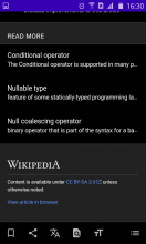
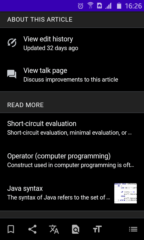
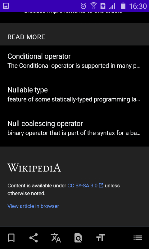
Currently the three "read more" items are constrained to a single line with ellipsis. This is often not enough to give the full context of the description. It might be better to expand this presentation to more than one line, or even not constrain it at all.
Description
Description
Details
Details
| Subject | Repo | Branch | Lines +/- | |
|---|---|---|---|---|
| On Android truncate read more description to 2 lines | mediawiki/services/mobileapps | master | +9 -2 |
Event Timeline
Comment Actions
IIUC, this was created based on the feedback given by a user in the mobile-l mailing list: https://lists.wikimedia.org/pipermail/mobile-l/2020-May/010720.html
So, I think this applies to the Wikipedia apps but possibly also to the mobile website.
Just sharing info I'm aware of :)
Comment Actions
I hate to push back, but no where else do we allow two lines for preview in a list view (eg. on the top read card, in the news, on this day all on Explore). If possible I'd personally prefer to keep this styling consistent, if this was feedback we'd received multiple times or multiple times in user testing I would be more concerned but I'm reluctant to make this change based on a single instance of feedback (the other designs have all tested well in usability testing).
One problem I am currently seeing though is that the images aren't appearing in this section. I will file a ticket for that.
Comment Actions
Totally legit feedback for iOS @cmadeo. On Android, it’s a bit different. We already allow text to naturally flow to two (and even three) lines in several list instances (e.g. “Trending” on Explore, Reading lists).
However, if this is feedback from just one person, we should weigh consistency across platforms over this single request. Also, the less differences in Mobile HTML on Android and iOS, the less maintenance for us.
Comment Actions
Ah, I'm sorry @schoenbaechler I didn't realize we had this difference across the apps! I wonder if it's possible to allow the text to flow on Android but not on iOS?
Comment Actions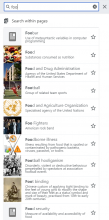
This was indeed just one bit of feedback from a single user.
I will add, however, that when performing a search in Mobile Web, there doesn't seem to be any constraint on the description length:

Comment Actions
I will add, however, that when performing a search in Mobile Web, there doesn't seem to be any constraint on the description length:
And I'll add that it's useful to show the full description as it's certainly difficult to make sense of the description when it's truncated. When it's truncated, one would've to open the article to see the full description which seems to beat the purpose of showing the description at all (I assume the purpose to be that: one would get an idea of what the article is about without having to open it).
Of course, one could argue that in the ideal case the descriptions should be shorter but given Wikipedia's nature I don't think we have much control over that (at least in a broad sense). Also, even if the descriptions were short, I'm not sure it would fit in one line given all the diverse screen sizes there are in mobile. For instance, I use a 4.2" device for day-to-day use. I'm only able to see six words (~45 characters) of the descriptions in a single line. If it's 2 lines, then its ~90 characters. That's not even 1/2 of the maximum description length (250) that the Android app suggests.
To conclude, I certainly would love it if the full description was shown instead of truncating it.
Comment Actions
Thanks for all the feedback on this (especially @Kaartic for his insights). Per discussion with @cmadeo, we’re suggesting the following:
- On iOS, keep it as is (truncate to one line) in order to keep it consistent with the rest of the app.
- On Android, truncate the description at two lines in order to easily scan list items and to keep it consistent with the rest of the app.
Also, we shouldn’t forget that we have a page previews feature on Android. It was designed for the exact purpose of “(...) understanding a word or concept within the context of the subject they are reading” (see Page Previews on MediaWiki).
@MSantos could you please apply the changes as defined here? Thx.
Comment Actions
On Android, truncate the description at two lines in order to easily scan list items and to keep it consistent with the rest of the app.
Certainly better than the one line description with truncation.
It would have been nice if the description could be made expandable rather than being truncated so that interested readers could easily read the full description by expanding it. But I doubt that's possible without interfering with the existing behaviour of showing the link preview when tapping on the article title.
Also, we shouldn’t forget that we have a page previews feature on Android. It was designed for the exact purpose of “(...) understanding a word or concept within the context of the subject they are reading” (see Page Previews on MediaWiki).
Nice point about the link previews. It certainly would be helpful to gather more information quickly. I now wish the apps starts showing the descriptions (fully) in the link previews, though 😉
Comment Actions
Hello, I'm the one that posted about this first.
I use Android. 2 lines would be better, but it would be much better to have the full short description. It's never that big.
we shouldn’t forget that we have a page previews feature on Android
No, the "page preview" does not show the short description below the title. It only shows the beginning of the article.
Comment Actions
Change 610276 had a related patch set uploaded (by Jgiannelos; owner: Jgiannelos):
[mediawiki/services/mobileapps@master] On android truncate read more description to 2 lines
Comment Actions
Change 610276 merged by jenkins-bot:
[mediawiki/services/mobileapps@master] On Android truncate read more description to 2 lines
Comment Actions
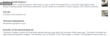
Below is a screenshot of a test I ran using http://localhost:8888/en.wikipedia.org/v1/page/mobile-html/Cat, added the class pcs-platform-android to the root <html> tag, and in the dev console ran
pcs.c1.Footer.add({
  menu: {
    items: [pcs.c1.Footer.MenuItemType.lastEdited, pcs.c1.Footer.MenuItemType.pageIssues, pcs.c1.Footer.MenuItemType.disambiguation, pcs.c1.Footer.MenuItemType.talkPage],
    fragment: "pcs-menu",
    editedDaysAgo: 3
  },
  readMore: {
    itemCount: 33,
    baseURL: 'https://en.wikipedia.org/api/rest_v1',
    fragment: "pcs-read-more"
  }
})
Comment Actions
Hello, this is still an issue with the Wikipedia app.
The "read more" 3 articles' description is incomplete. ("..." at the end).
It should show a full description, or at least show a full sentence.