Page MenuHomePhabricator

Newcomer tasks: Fix bottom padding on the mobile success notification at the top of the Post-edit dialog
Closed, ResolvedPublic

Description

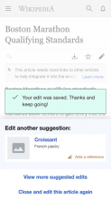
There should only be 16px space between the success message widget and the next suggestion drawer
Proposed fix is to change margin-bottom to 0px (from 26px) on .mw-ge-help-panel-postedit-drawer .mw-ge-help-panel-postedit-message.

Actual: shows 42px between the two components)
image.png (824×1 px, 263 KB)
Expected
image.png (640×360 px, 58 KB)

Event Timeline

Change 666870 had a related patch set uploaded (by Kosta Harlan; owner: Kosta Harlan):
[mediawiki/extensions/GrowthExperiments@master] Newcomer tasks: Fix bottom padding on the post-edit dialog

https://gerrit.wikimedia.org/r/666870

Change 666870 merged by MewOphaswongse:
[mediawiki/extensions/GrowthExperiments@master] Newcomer tasks: Fix bottom padding on the post-edit dialog

https://gerrit.wikimedia.org/r/666870

Etonkovidova subscribed.

For @RHo quick review

Before (from the task description)After (with the fix)
image.png (824×1 px, 263 KB)
Screen Shot 2021-03-05 at 12.04.52 PM.png (568×1 px, 218 KB)
testwiki wmf.33betalabs (with the fix)
Screen Shot 2021-03-05 at 12.16.03 PM.png (679×420 px, 73 KB)
IMG_9583.PNG (1×640 px, 179 KB)