Page MenuHomePhabricator

Variant D (desktop): embed onboarding dialog into suggested edits module
Closed, ResolvedPublic

Description

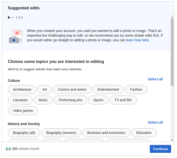
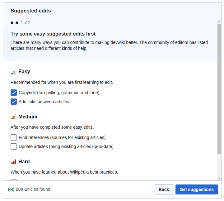
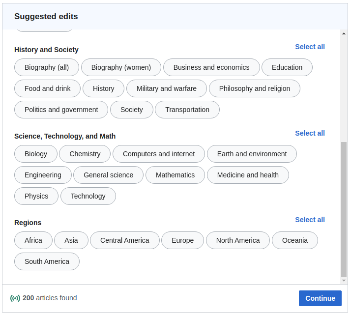
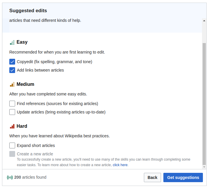
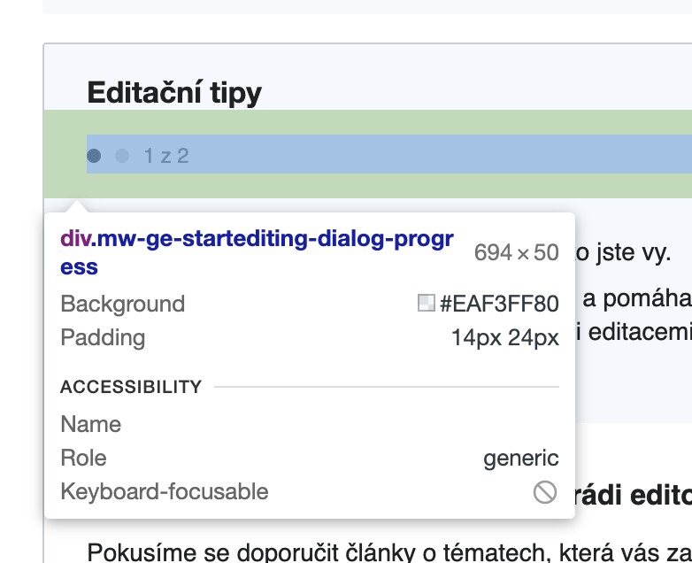
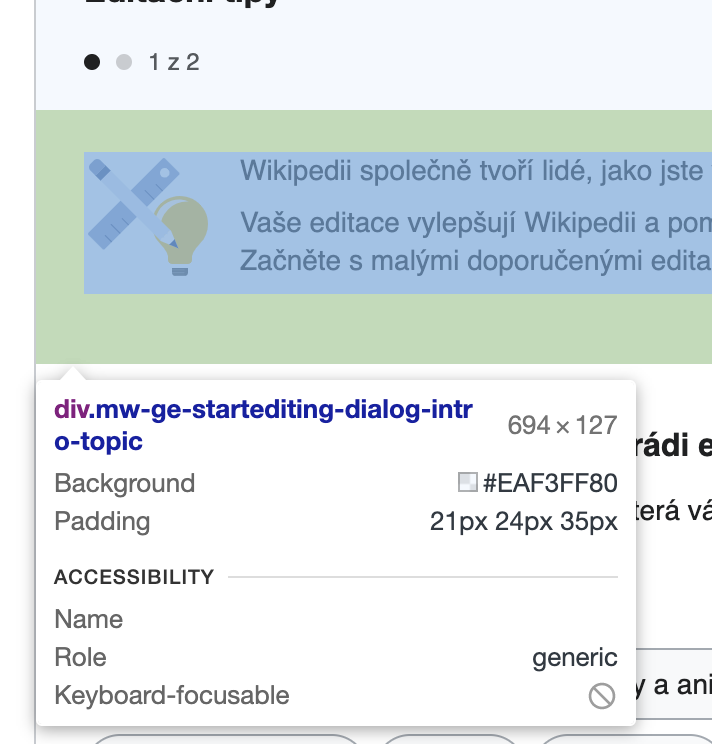
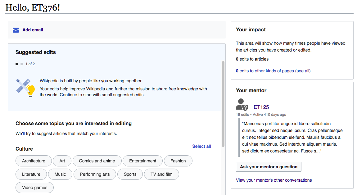
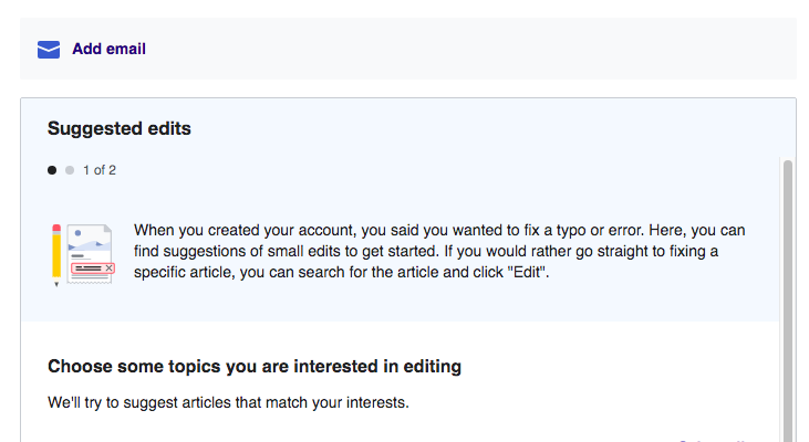
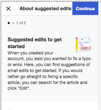
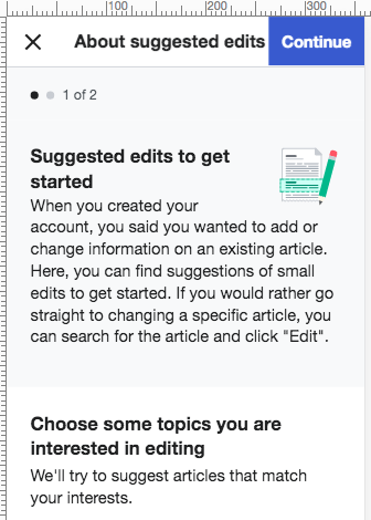
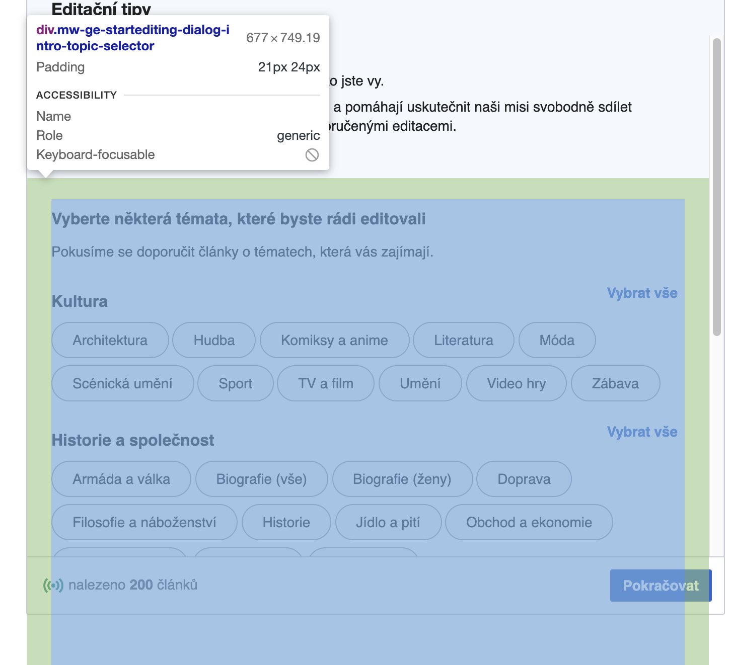
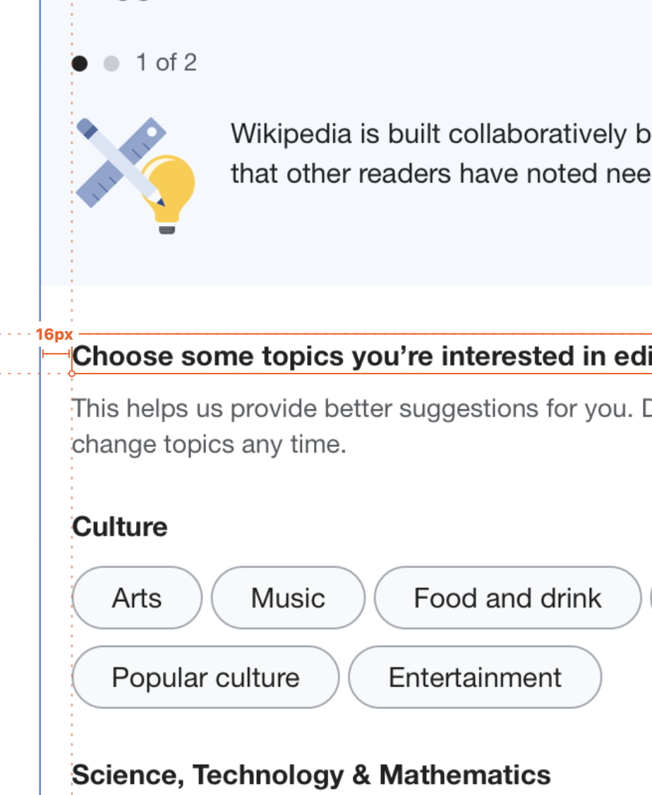
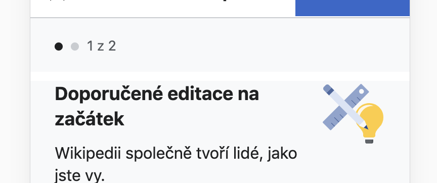
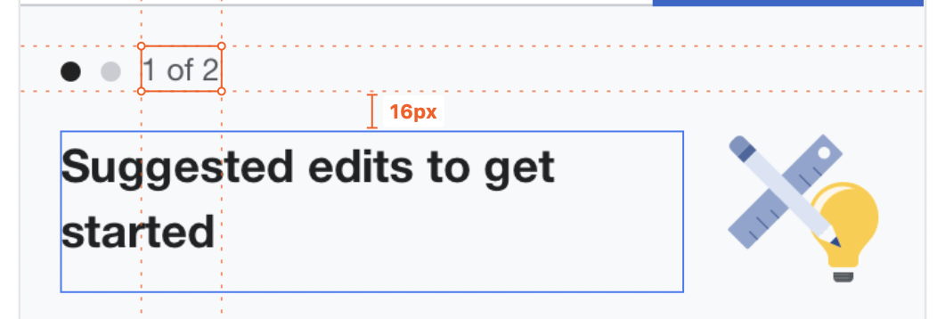
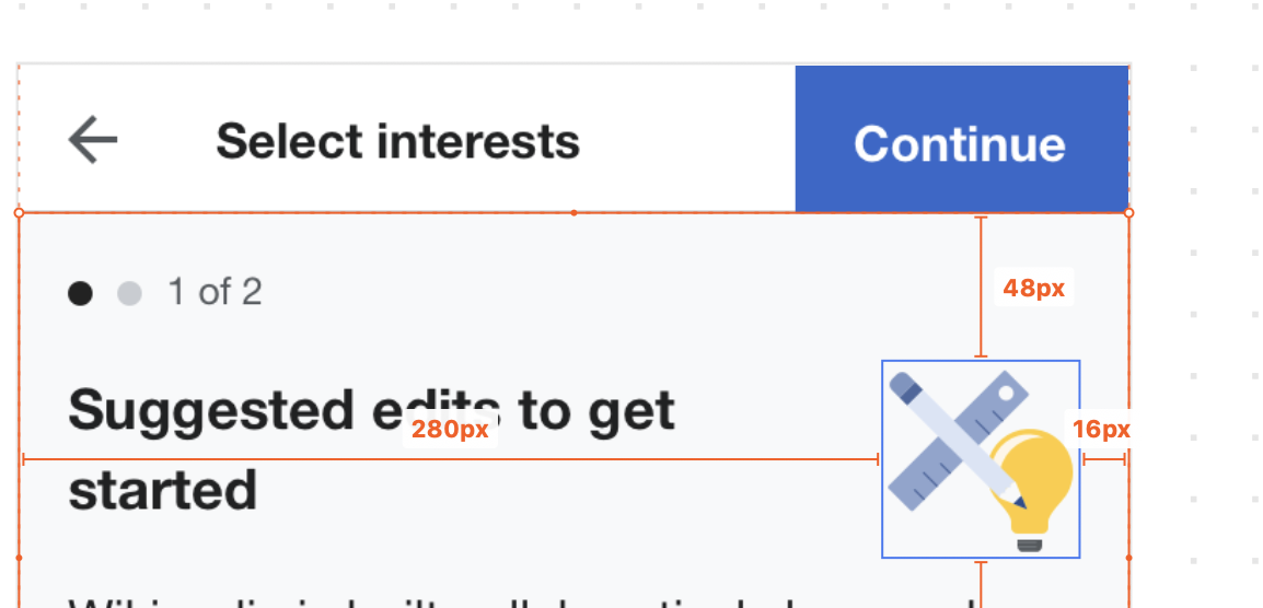
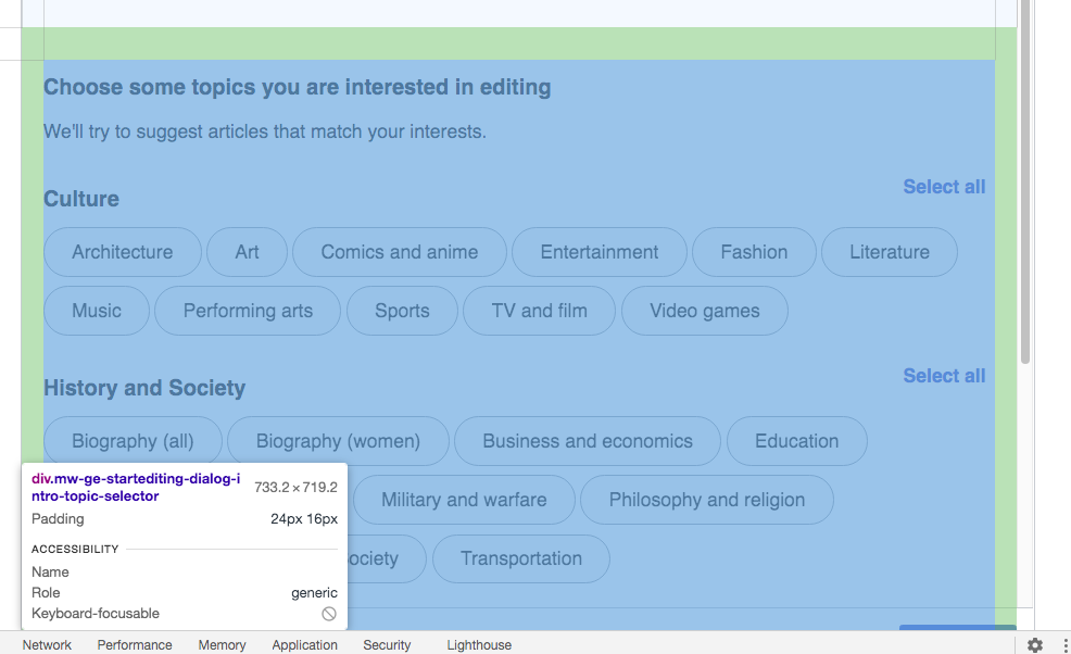
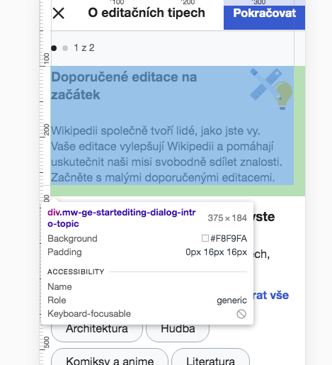
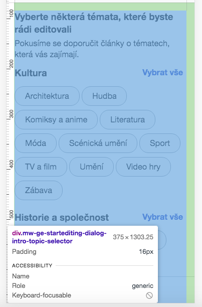
T250343: Variant tests: D-desktop describes the onboarding dialog being embedded into the suggested edits module when it is not yet initiated. This includes the intro overlay as it exists currently (in variant A), and a modified version of the difficulty overlay as described in T258017: Variant D: difficulty overlay in onboarding.

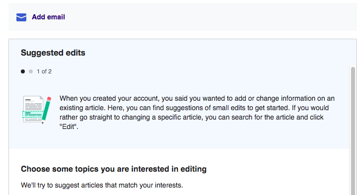
Once onboarding is complete, the suggested edits module becomes initiated, and is replaced with its regular contents. There's no way to get back to the onboarding flow.

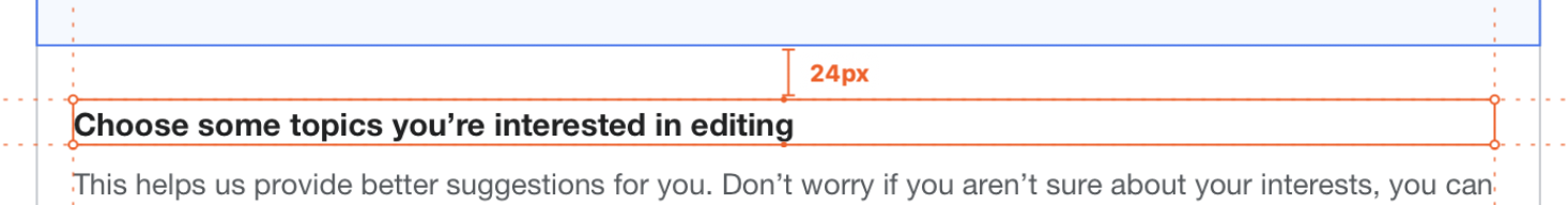
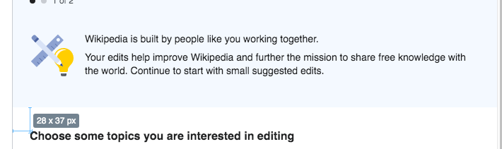
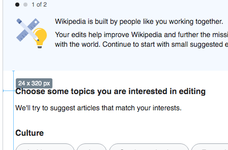
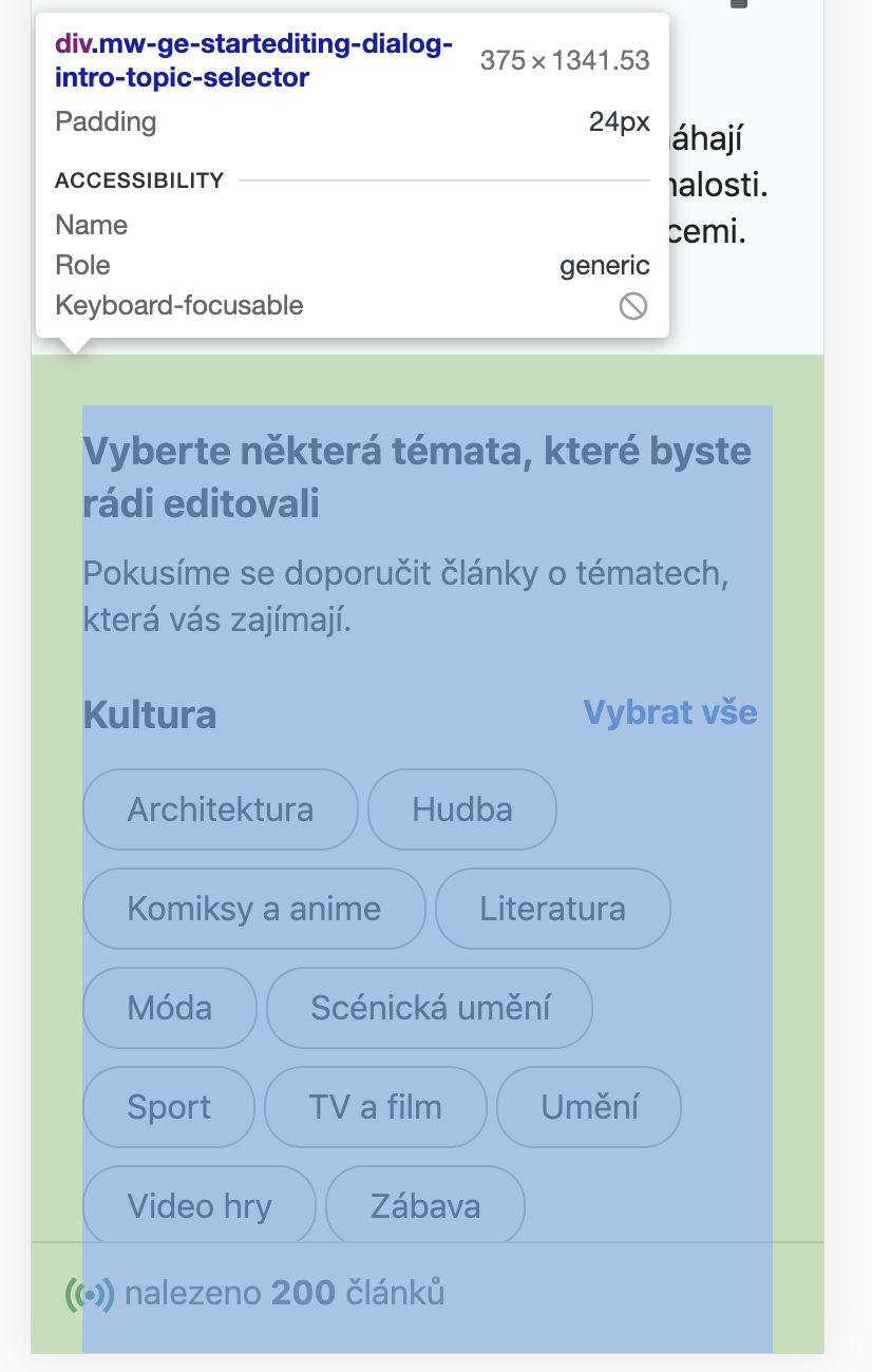
The module should be a fixed height (the height of the suggested edits module) with an internal scroll.

Mockups: step 1, step 2

Event Timeline

Change 629528 had a related patch set uploaded (by Catrope; owner: Catrope):
[mediawiki/extensions/GrowthExperiments@master] Embed StartEditingDialog into the homepage in variant D on desktop

https://gerrit.wikimedia.org/r/629528

Code review from @kostajh led to a question for @RHo: should the embedded onboarding dialog keep the same height when moving between steps, like it does when it's a "real dialog"? The mockups suggest that it should, because the height is identical in the step 1 and step 2 mockups. But these are also misleading / not to scale: the step 1 mockup depicts 3 topic categories, but there are really 4, so step 1 is much taller than depicted. In practice, the height difference between step 1 (1067px) and step 2 (736px) is 331px, whereas the mockups show a consistent height of 748px and an implied height difference (if step 2 was shrunk to fit) of only 32px. Adding 300+ px of blank space to the bottom of step 2 seems like a lot, so I thought I should check first before I did that.

Code review from @kostajh led to a question for @RHo: should the embedded onboarding dialog keep the same height when moving between steps, like it does when it's a "real dialog"? The mockups suggest that it should, because the height is identical in the step 1 and step 2 mockups. But these are also misleading / not to scale: the step 1 mockup depicts 3 topic categories, but there are really 4, so step 1 is much taller than depicted. In practice, the height difference between step 1 (1067px) and step 2 (736px) is 331px, whereas the mockups show a consistent height of 748px and an implied height difference (if step 2 was shrunk to fit) of only 32px. Adding 300+ px of blank space to the bottom of step 2 seems like a lot, so I thought I should check first before I did that.

Hi @Catrope - sorry my bad, I didn't clearly state that the suggested edits module should have it's height fixed to the size it will be when the suggestions are shown. So that's why there'd potentially be an inner scroll in the module (as depicted in this mock in the Zeplin):

image.png (954×968 px, 258 KB)

Change 629528 merged by jenkins-bot:
[mediawiki/extensions/GrowthExperiments@master] Embed StartEditingDialog into the homepage in variant D on desktop

https://gerrit.wikimedia.org/r/629528

Change 630912 had a related patch set uploaded (by Catrope; owner: Catrope):
[mediawiki/extensions/GrowthExperiments@master] StartEditingDialog: Use fixed height when embedded on the homepage

https://gerrit.wikimedia.org/r/630912

The patch above sets the height of the onboarding panel to (approximately, within a few pixels) the height that the suggested edits module will be when it activates, and makes the contents scrollable. It also tightens up the padding on the footer, per the Zeplin mock (it was inheriting the much more spacious padding from the dialog).

Screenshot from 2020-09-29 10-57-25.png (643×722 px, 72 KB)
Screenshot from 2020-09-29 10-57-40.png (645×720 px, 62 KB)
Screenshot from 2020-09-29 10-57-31.png (641×714 px, 71 KB)
Screenshot from 2020-09-29 10-57-47.png (653×719 px, 64 KB)

Change 631166 had a related patch set uploaded (by Kosta Harlan; owner: Kosta Harlan):
[mediawiki/extensions/GrowthExperiments@master] StartEditing: Disallow escaping when user is in variant D

https://gerrit.wikimedia.org/r/631166

Change 630912 merged by jenkins-bot:
[mediawiki/extensions/GrowthExperiments@master] StartEditingDialog: Use fixed height when embedded on the homepage

https://gerrit.wikimedia.org/r/630912

hi @Catrope / @kostajh - as I was reviewing T258017, I noticed this screen has more than expected padding around the intro illustration and paragraph dialog:

Actual:
image.png (636×782 px, 64 KB)
and
image.png (744×712 px, 74 KB)
vs Expected:
image.png (258×498 px, 43 KB)
image.png (200×708 px, 39 KB)
image.png (226×98 px, 6 KB)

Same goes with the topics area, which for the desktop should be 16px left and right padding, and 24px for top and bottom.

image.png (192×1 px, 64 KB)
image.png (182×1 px, 59 KB)

@Catrope -- I noticed a requirement that was missed here, about two messages that need to be changed/added. This applies to mobile, too. They are the personalized messages based on welcome survey response. Basically, these new messages excise the part that tells the user to cancel out of the dialog before searching and clicking edit, because you can't cancel out of Variant D onboarding. I imagine it will be annoying to have to messages that are virtually the same between Variant C and D except for a couple words. How about this: we make the messages below the ones that go on Variant A, C, and D for this personalization. I think it's okay to skip the "cancel" part even when there is a dialog with a cancel button. Users can figure that out.

  • The copy will be largely the same as what was shown in the overlay, with some slight changes since the element is no longer an overlay. The following are the only two changed messages:
    • For users who said they wanted to correct a typo or error: When you created your account, you said you wanted to fix a typo or error. Here, you can find suggestions of small edits to get started. If you would rather go straight to fixing a specific article, you can search for the article and click "Edit".
    • For users who said they want to add or change information in an existing article: When you created your account, you said you wanted to add or change information on an existing article. Here, you can find suggestions of small edits to get started. If you would rather go straight to changing a specific article, you can search for the article and click "Edit".

Change 631166 merged by jenkins-bot:
[mediawiki/extensions/GrowthExperiments@master] StartEditing: Disallow escaping when user is in variant D

https://gerrit.wikimedia.org/r/631166

Change 631881 had a related patch set uploaded (by Catrope; owner: Catrope):
[mediawiki/extensions/GrowthExperiments@master] StartEditingDialog: Remove reference to "Cancel" button in intro messages

https://gerrit.wikimedia.org/r/631881

@Catrope -- I noticed a requirement that was missed here, about two messages that need to be changed/added. This applies to mobile, too. They are the personalized messages based on welcome survey response. Basically, these new messages excise the part that tells the user to cancel out of the dialog before searching and clicking edit, because you can't cancel out of Variant D onboarding.

Well spotted, sorry for missing this.

I imagine it will be annoying to have to messages that are virtually the same between Variant C and D except for a couple words.

I see that I have trained you well :-P

How about this: we make the messages below the ones that go on Variant A, C, and D for this personalization. I think it's okay to skip the "cancel" part even when there is a dialog with a cancel button. Users can figure that out.

  • The copy will be largely the same as what was shown in the overlay, with some slight changes since the element is no longer an overlay. The following are the only two changed messages:
    • For users who said they wanted to correct a typo or error: When you created your account, you said you wanted to fix a typo or error. Here, you can find suggestions of small edits to get started. If you would rather go straight to fixing a specific article, you can search for the article and click "Edit".
    • For users who said they want to add or change information in an existing article: When you created your account, you said you wanted to add or change information on an existing article. Here, you can find suggestions of small edits to get started. If you would rather go straight to changing a specific article, you can search for the article and click "Edit".

Done in the attached patch.

Change 631881 merged by jenkins-bot:
[mediawiki/extensions/GrowthExperiments@master] StartEditingDialog: Remove reference to "Cancel" button in intro messages

https://gerrit.wikimedia.org/r/631881

Etonkovidova subscribed.

(1) I did not see any changes made to address this comment - https://phabricator.wikimedia.org/T258019#6510238. Moving to Needs More Work .
e.g. 37px instead of 24px

Screen Shot 2020-10-05 at 5.40.36 PM.png (628×1 px, 146 KB)

The overall look:

Screen Shot 2020-10-05 at 5.46.11 PM.png (211×710 px, 38 KB)

(2) Checking the customized messages based on https://phabricator.wikimedia.org/T258019#6510951 - seem to be correct:

Variant D

Desktop betalabsmobile betalabs
Screen Shot 2020-10-05 at 6.41.01 PM.png (400×731 px, 52 KB)
Screen Shot 2020-10-05 at 6.44.03 PM.png (368×337 px, 42 KB)
Screen Shot 2020-10-05 at 6.42.27 PM.png (393×719 px, 55 KB)
Screen Shot 2020-10-05 at 6.42.52 PM.png (470×336 px, 59 KB)

Change 632830 had a related patch set uploaded (by Catrope; owner: Catrope):
[mediawiki/extensions/GrowthExperiments@master] StartEditingDialog: Padding fixes

https://gerrit.wikimedia.org/r/632830

(1) I did not see any changes made to address this comment - https://phabricator.wikimedia.org/T258019#6510238. Moving to Needs More Work .

Fixed in the attached patch.

Change 632830 merged by jenkins-bot:
[mediawiki/extensions/GrowthExperiments@master] StartEditingDialog: Padding fixes

https://gerrit.wikimedia.org/r/632830

(1) I did not see any changes made to address this comment - https://phabricator.wikimedia.org/T258019#6510238. Moving to Needs More Work .

Fixed in the attached patch.

Done Seems to me that it was the only one open issue here - moving to Design review.

Screen Shot 2020-10-09 at 4.56.31 PM.png (295×448 px, 39 KB)

Hi, moving back as a couple of padding issues remain on Desktop:

ActualExpectedDetails
image.png (684×1 px, 121 KB)
image.png (200×708 px, 39 KB)
Left and right padding in the desktop module intro topic area should only be 16px (not 24px)
image.png (684×1 px, 121 KB)
image.png (200×708 px, 39 KB)
Bottom padding in the desktop module intro topic area should only be 24px (not 35px)
image.png (1×1 px, 192 KB)
image.png (192×1 px, 64 KB)
Left and right in the desktop module topic selector area should only be 16px (not 24px)
image.png (1×1 px, 192 KB)
image.png (1×924 px, 236 KB)
Top and padding in the desktop module topic selector area should be 24px (not 21px)

I've also noticed new issues on the Mobile version now:

ActualExpectedDetails
image.png (362×864 px, 31 KB)
image.png (358×1 px, 76 KB)
There should not be a white gap between the stepper and intro text
image.png (362×864 px, 31 KB)
image.png (556×1 px, 121 KB)
Left and right padding in the mobile module should only be 16px (not 24px)
image.png (714×804 px, 84 KB)
image.png (422×1 px, 162 KB)
Bottom padding in the mobile module intro topic area should only be 16px (not 40px)
image.png (1×826 px, 131 KB)
image.png (982×1 px, 254 KB)
Left and right in the desktop module topic selector area should only be 16px (not 24px)
image.png (1×826 px, 131 KB)
image.png (194×1 px, 69 KB)
Top and padding in the mobile module topic selector area should be 16px (not 24px)

I'm confused about the left/right padding; I'm working on a patch currently to address the comment in T258016#6527139

There, @Catrope wrote:

There already is 16px padding (or margin) on the left+right hand sides in both panels, although it's 24px on the intro panel and 1em (=16px) on the difficulty panel for some reason. This appears to have been done deliberately, and only on mobile (on desktop both panels have 24px left+right side padding). If you want me to remove this odd exception and make it 24px everywhere, I would be more than happy to do that.

and @RHo replied:

Yes, but can we make it so that on Mobile there is 1em (16px) padding on left and right everywhere?

So, my patch is implementing 24px left/right padding on Vector (desktop) and 16px left/right padding on Minvera (mobile). But based on the previous comment on this task (T258019#6536126) it sounds like that was incorrect reading on my part?

Clarified with @RHo in chat, the intention is for 16px side padding on desktop and mobile. (And that is implemented in this patch.)

Change 634596 had a related patch set uploaded (by Catrope; owner: Catrope):
[mediawiki/extensions/GrowthExperiments@master] StartEditingDialog: Styling tweaks for variant C/D

https://gerrit.wikimedia.org/r/634596

Desktop issues:

Left and right padding in the desktop module intro topic area should only be 16px (not 24px)

Kosta's patch fixed this

Bottom padding in the desktop module intro topic area should only be 24px (not 35px)

My patch on T258016 fixed this.

Left and right in the desktop module topic selector area should only be 16px (not 24px)

This is also part of Kosta's fix.

Top and [bottom] padding in the desktop module topic selector area should be 24px (not 21px)

Fixed in my new patch.

Mobile issues:

There should not be a white gap between the stepper and intro text

This should already be fixed, Kosta pointed it out to me soon after I broke it, and I fixed it that same day.

Left and right padding in the mobile module should only be 16px (not 24px)

This is also fixed by Kosta's patch.

Bottom padding in the mobile module intro topic area should only be 16px (not 40px)

I'll take this as an answer to my questions at T258017#6549150: yes you do want these vertical paddings to be 24px on desktop and 16px on mobile. I will do that in a separate patch that tackles both the ones identified here and in T258017.

Left and right in the desktop [sic] module topic selector area should only be 16px (not 24px)

Kosta's patch fixed this.

Top and padding in the mobile module topic selector area should be 16px (not 24px)

This will also be part of the separate 24->16 change.

I think this belongs in Code Review. Please move it to the right place if I'm wrong!

Change 634596 merged by jenkins-bot:
[mediawiki/extensions/GrowthExperiments@master] StartEditingDialog: Styling tweaks for variant C/D

https://gerrit.wikimedia.org/r/634596

Change 635904 had a related patch set uploaded (by Catrope; owner: Catrope):
[mediawiki/extensions/GrowthExperiments@master] StartEditingDialog: Use smaller padding for mobile in various places

https://gerrit.wikimedia.org/r/635904

Change 635904 had a related patch set uploaded (by Catrope; owner: Catrope):
[mediawiki/extensions/GrowthExperiments@master] StartEditingDialog: Use smaller padding for mobile in various places

https://gerrit.wikimedia.org/r/635904

This changes the top and bottom padding on the topic selector div from 24px to 16px on mobile, as discussed in T258019#6557184.

Change 635904 merged by jenkins-bot:
[mediawiki/extensions/GrowthExperiments@master] StartEditingDialog: Use smaller padding for mobile in various places

https://gerrit.wikimedia.org/r/635904

For @RHo review - I re-used the screenshots from Actual column in your table in this comment. In the table below Actual has become Before.

BeforeCurrent after the fixDetails (from the previous table)
image.png (684×1 px, 121 KB)
Screen Shot 2020-11-03 at 4.33.20 PM.png (304×587 px, 55 KB)
Left and right padding in the desktop module intro topic area should only be 16px (not 24px)
image.png (684×1 px, 121 KB)
Screen Shot 2020-11-03 at 4.33.20 PM.png (304×587 px, 55 KB)
Bottom padding in the desktop module intro topic area should only be 24px (not 35px)
image.png (1×1 px, 192 KB)
Screen Shot 2020-11-03 at 5.23.01 PM.png (602×986 px, 111 KB)
Left and right in the desktop module topic selector area should only be 16px (not 24px)
image.png (1×1 px, 192 KB)
Screen Shot 2020-11-03 at 5.23.01 PM.png (602×986 px, 111 KB)
Top and padding in the desktop module topic selector area should be 24px (not 21px)

Mobile

BeforeCurrent after the fixDetails (from the previous table)
image.png (362×864 px, 31 KB)
Screen Shot 2020-11-03 at 5.34.59 PM.png (331×404 px, 46 KB)
Screen Shot 2020-11-03 at 5.35.33 PM.png (325×443 px, 43 KB)
There should not be a white gap between the stepper and intro text
image.png (362×864 px, 31 KB)
Screen Shot 2020-11-03 at 5.39.34 PM.png (383×416 px, 54 KB)
Left and right padding in the mobile module should only be 16px (not 24px)
image.png (714×804 px, 84 KB)
Screen Shot 2020-11-03 at 5.42.42 PM.png (515×469 px, 81 KB)
Bottom padding in the mobile module intro topic area should only be 16px (not 40px)
image.png (1×826 px, 131 KB)
Screen Shot 2020-11-03 at 5.44.48 PM.png (612×403 px, 75 KB)
Left and right in the desktop module topic selector area should only be 16px (not 24px)
image.png (1×826 px, 131 KB)
Screen Shot 2020-11-03 at 5.44.48 PM.png (612×403 px, 75 KB)
Top and padding in the mobile module topic selector area should be 16px (not 24px)

Thanks everyone, this looks much better! I am still seeing an issue with the intro text wrapping below the illustration though which I have filed as T267569.