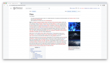
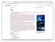
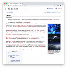
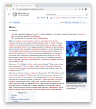
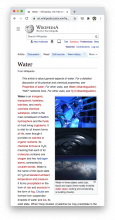
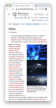
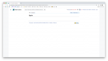
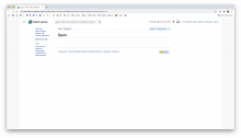
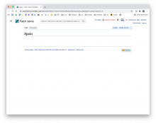
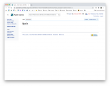
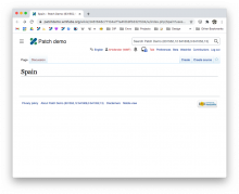
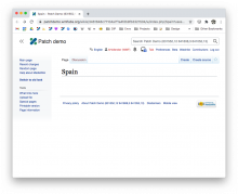
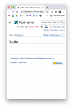
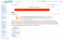
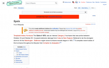
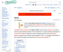
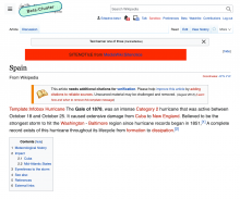
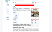
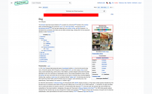
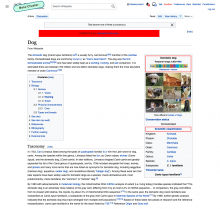
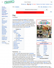
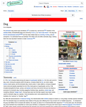
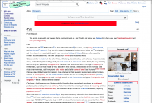
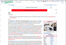
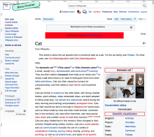
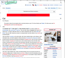
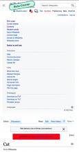
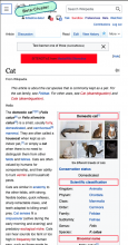
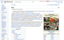
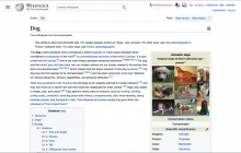
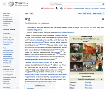
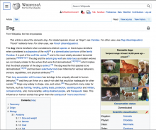
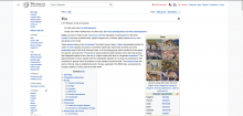
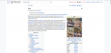
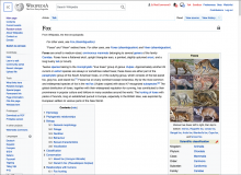
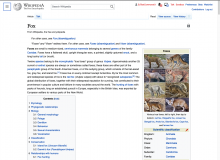
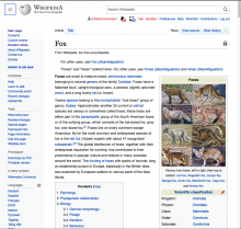
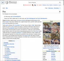
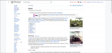
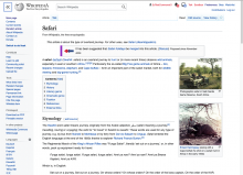
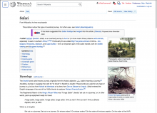
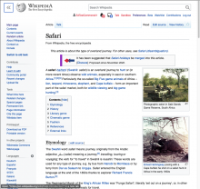
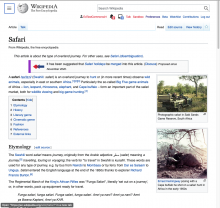
Loweing the min-width from Vector will allow the Vector skin to be more fluid. While removing the min-width is trivial, we may want to consider other parts of the design in addition to this work.
Note: we are committed to revisiting the presentation of the tabs at the top of the page as a part of the aesthetic refinements at the end of the project.
Designs
| width | current | fixed | notes |
| 1920px | - | no changes | |
| 1385px | user links should not wrap until they run out of space. I think this might be related to the search container having flex-grow: 1 | ||
| 1054px | - | no changes | |
| 917px | - | no changes (looks like once min-width is removed this size will be fine as-is) | |
| 500px | search bar should remain in top position across from logo, don't think it needs a min-width at that point | ||
Acceptance criteria
- The design adapts all the way down to 500px
- For now, at anything lower than 500px, the design will not adapt any further to focus engineering efforts.
Developer notes
The logo https://en.wikipedia.org/static/images/mobile/copyright/wikisource-wordmark-zh.svg is the widest of all our deployed logos so make sure to use this during development.
Questions to be answered during development
- What adjustments need to be made to the header/sidebar/tabs at lower resolutions?
QA Results - Beta
| AC | Status | Details |
|---|---|---|
| 1 | ✅ | T264218#6756382 |
QA Results - Prod
| AC | Status | Details |
|---|---|---|
| 1 | ✅ | T264218#6773616 |
