A green with more yellow looks more natural, and is far more common in other UI libraries
| current | proposed (approx) |
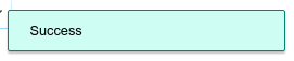 | 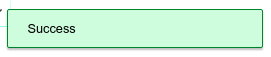 |
| Hue 166° | Hue 140° |
I think a hue between 110° and 150° would be better (current hue is ~166°)
Note also that our blues and yellows have hues of ~210° and ~40° respectively so this would put the green closer to the midpoint between those (125°).
Some examples from other UI libraries:
- https://getbootstrap.com/docs/4.0/components/alerts/ (140°)

- https://stock.adobe.com/uk/images/notification-messages-for-web-design-success-warning-error-info-message/130798901 (113°)

- https://github.com/fkhadra/react-toastify (132°)

- https://jossmac.github.io/react-toast-notifications/ (153°)

- Phabricator (JX.Notification) (144°)


Fortunately green is one of the less used colours from our styleguide, so there shouldn't be too many places to update.