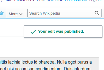
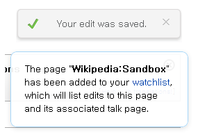
Style of "Your edit was saved." message is not like 'adding or remove watchlist' and 'SUL'. I suggest 'check' mark isn't removed but background style is changed.
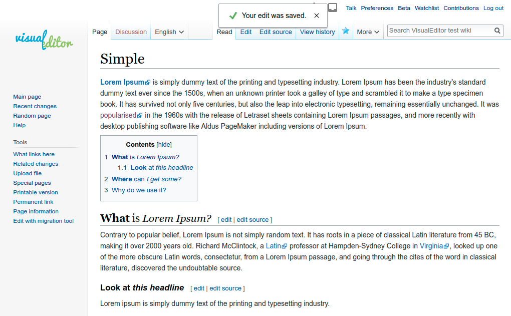
Style comparison from @Ara's comment below
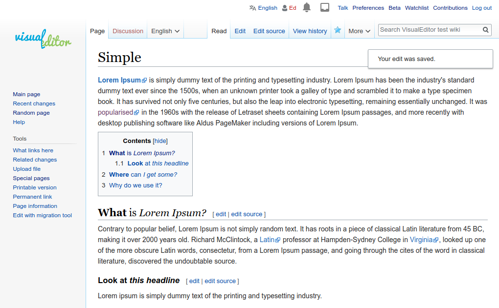
Edit: this are now more similar, but have different placements and icons
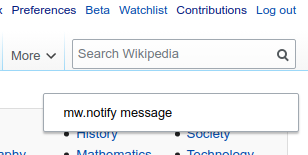
mw.nofity: top right, no icons
postEdit: top center, tick and close icons:

Proposal

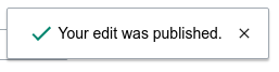
Use success message box styling for postedit success notification
Until the green background is fixed: