mobile toaster (from screen bottom) seems more ideal since it does not cover UI elements near the top of the screen.
Version: unspecified
Severity: normal
See Also:
https://bugzilla.wikimedia.org/show_bug.cgi?id=65984
| • Jaredzimmerman-WMF | |
| Jun 1 2014, 5:57 AM |
| F26196642: image.png | |
| Sep 25 2018, 12:22 PM |
| F13935: Screenshot_2014-09-17_00.18.05.png | |
| Nov 22 2014, 3:21 AM |
| F13934: Screenshot_2014-09-17_00.16.38.png | |
| Nov 22 2014, 3:21 AM |
mobile toaster (from screen bottom) seems more ideal since it does not cover UI elements near the top of the screen.
Version: unspecified
Severity: normal
See Also:
https://bugzilla.wikimedia.org/show_bug.cgi?id=65984
| Status | Subtype | Assigned | Task | ||
|---|---|---|---|---|---|
| Open | None | T113560 Standardize MediaWiki components (tracking) | |||
| Open | None | T158181 Aim for workflow equivalence for MediaWiki on desktop and mobile web | |||
| Declined | None | T67983 toaster overlay for watchlisting is inconsistent between mobile and desktop |
bingle-admin wrote:
Prioritization and scheduling of this bug is tracked on Trello card https://trello.com/c/uPHdl4jP
(In reply to Bartosz Dziewoński from comment #4)
:D But really. I left a note at bug 65984 comment 1 that also applies to this bug. It would be super-helpful if we could attach mock-ups or links to demos of what's being discussed here. At it is, this ticket is really difficult for me to follow.
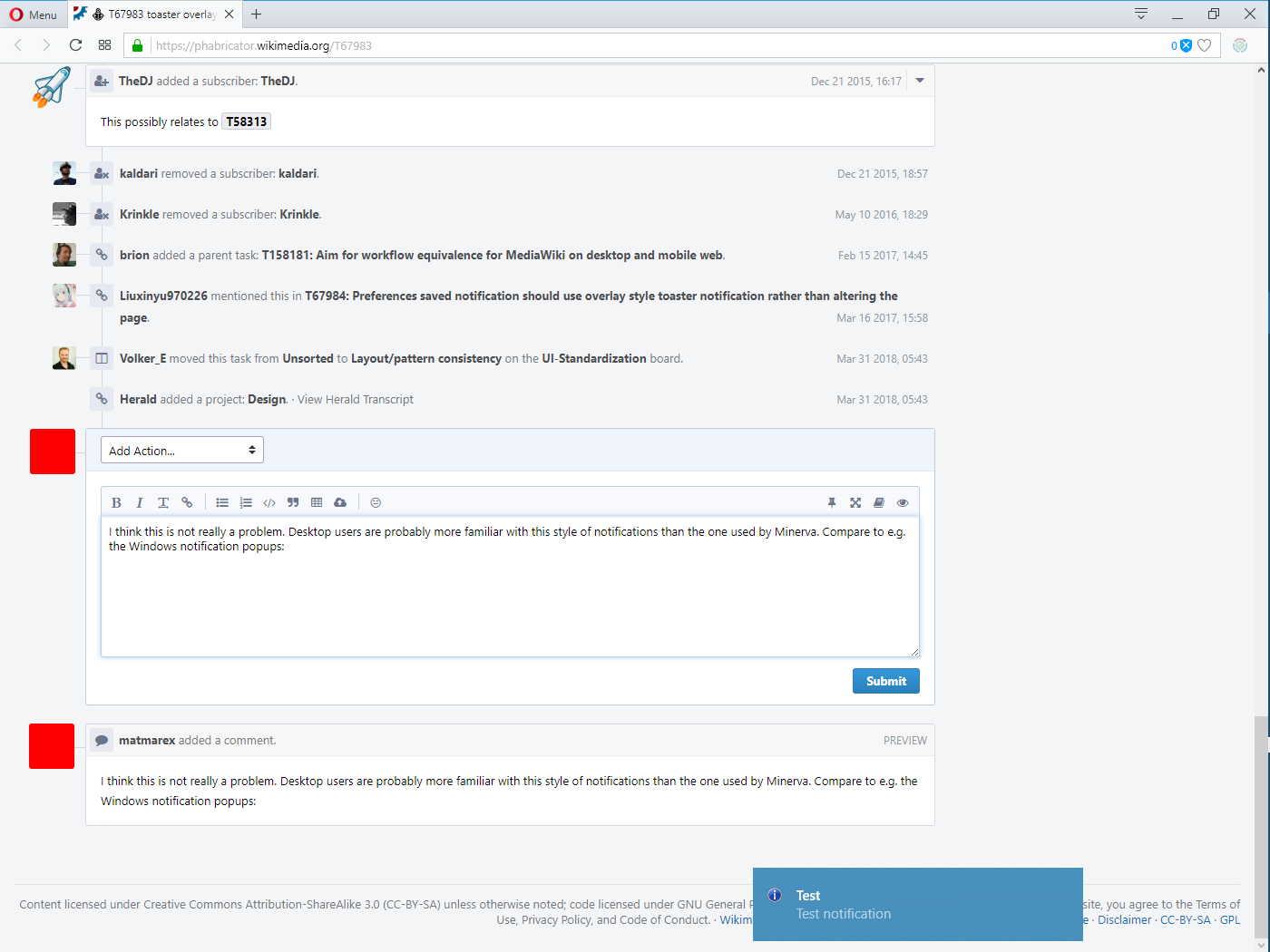
I think this is not really a problem. Desktop users are probably more familiar with this style of notifications than the one used by Minerva. Compare to e.g. the Windows notification popups: