Problem: The current design looks like several different chunks of content, but we want it to read as a group and as distinct from the content that already exists on the page.
Proposed Solution: Add a background color [i]
Design
| Logged OUT/source | Logged OUT/visual | Logged IN/visual |
|---|---|---|
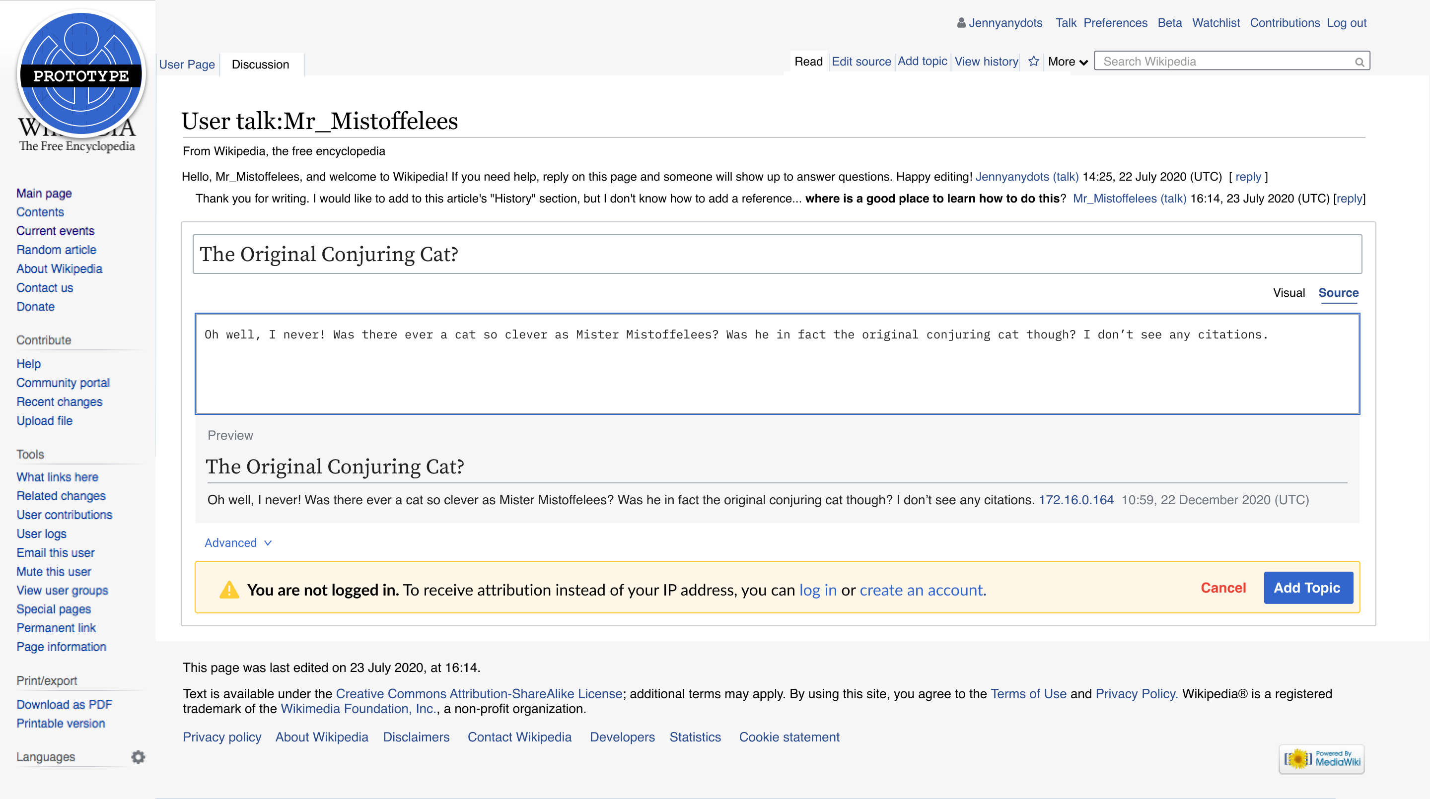 | 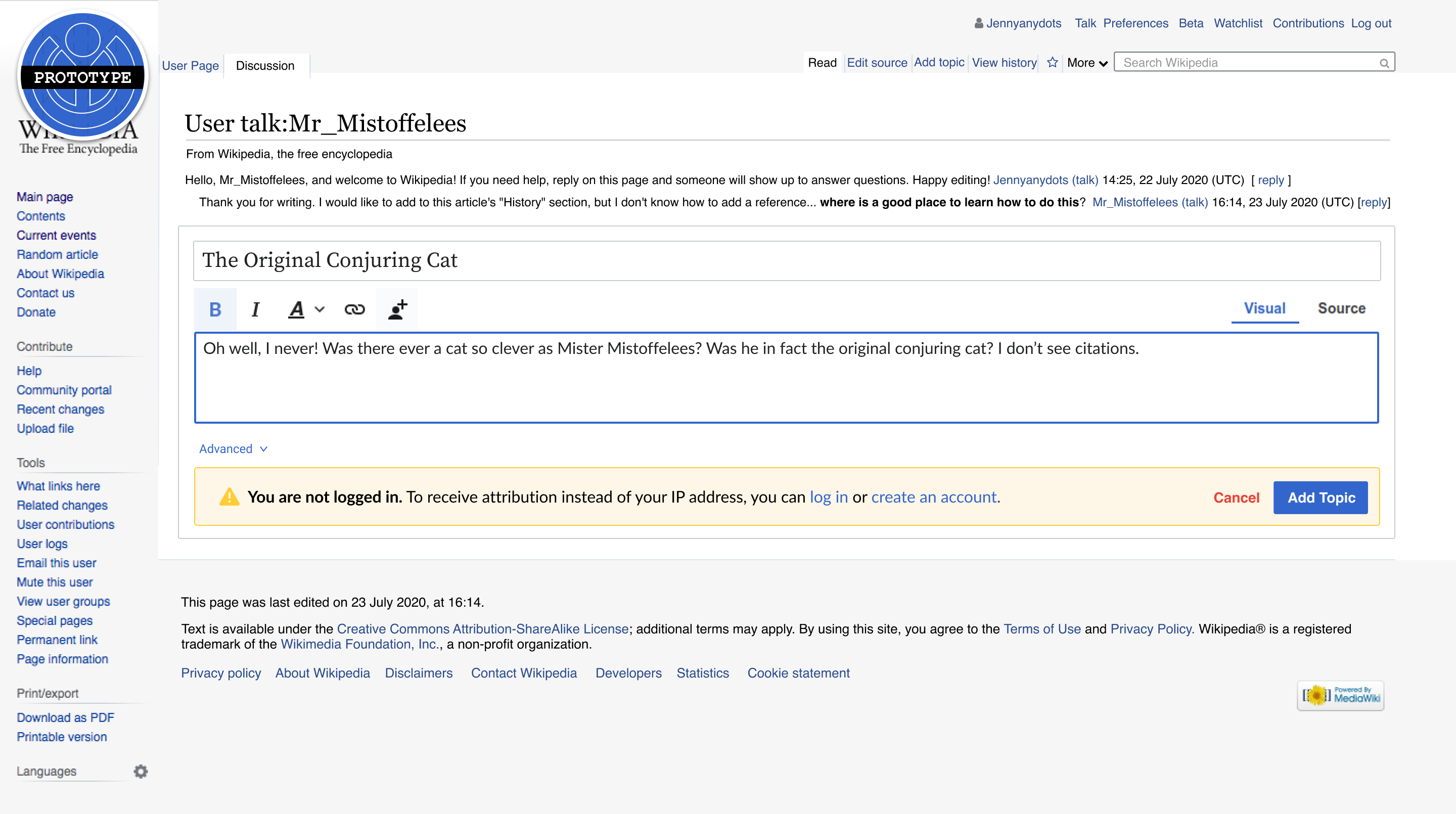 | 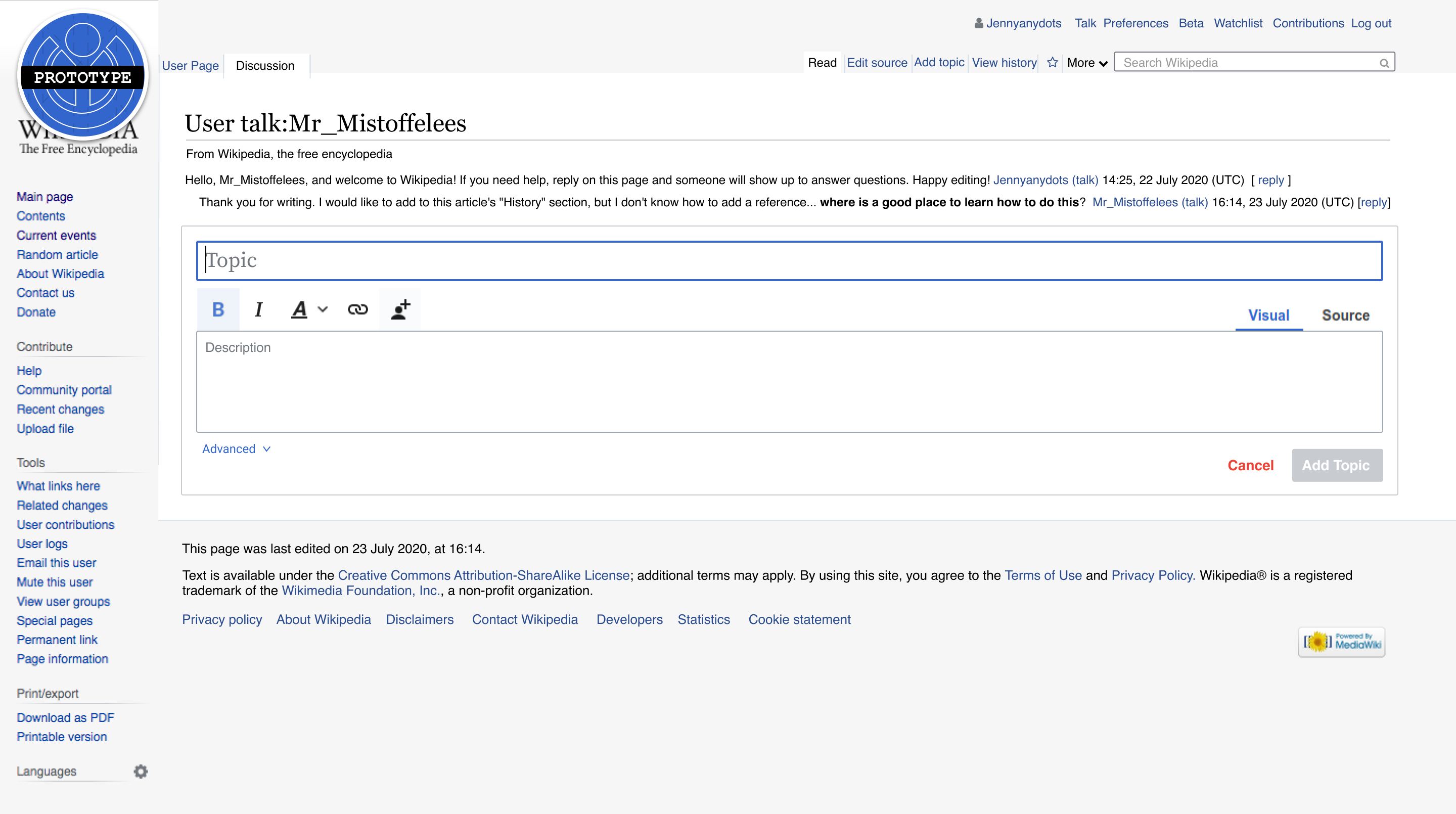 |
Done
- The designs shown in the ===Design section above are implemented
- Note: while the "Logged IN/source" state is not depicted above, the general design being proposed – a light border surrounding/encapsulating the tool and its related components – should be implemented for the tool and all of its various "states" (e.g. logged IN/OUT, source/visual).
i. Things to consider:
- historically we have not had color behind toolbars
- there might be a situation where a contributor is exposed to many blocks of competing colors with the background, the preview and the notification messages.