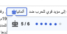
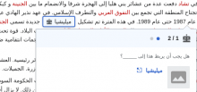
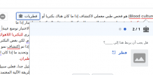
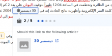
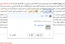
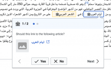
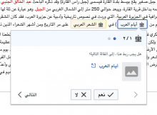
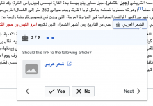
In Arabic Wikipedia, we see that the robot icon for the link suggestions is really up close to the text, with some extra whitespace being highlighted afterward:
Description
Details
| Status | Subtype | Assigned | Task | ||
|---|---|---|---|---|---|
| Resolved | MMiller_WMF | T252822 [EPIC] Growth: "add a link" structured task 1.0 | |||
| Resolved | kostajh | T268704 Add a link: frontend product specifications | |||
| Resolved | • mewoph | T269638 Add a link: Suggestions mode | |||
| Resolved | • mewoph | T282401 Add a link: icons in Arabic too close to text |
Event Timeline
@MMiller_WMF for you information I tested with 3 different browsers (firefox, chrome and brave on GNU/linux), but it seems that the robot icon is normal if the language was Arabic:
But I noticed the problem if the language was English/Latin:
Change 689191 had a related patch set uploaded (by MewOphaswongse; author: MewOphaswongse):
[mediawiki/extensions/GrowthExperiments@master] Add a link: explicitly set annotation icon's margin for mixed directionality
Change 689543 had a related patch set uploaded (by Kosta Harlan; author: MewOphaswongse):
[mediawiki/extensions/GrowthExperiments@wmf/1.37.0-wmf.5] Add a link: explicitly set annotation icon's margin for mixed directionality
Change 689191 merged by jenkins-bot:
[mediawiki/extensions/GrowthExperiments@master] Add a link: explicitly set annotation icon's margin for mixed directionality
Change 689543 merged by jenkins-bot:
[mediawiki/extensions/GrowthExperiments@wmf/1.37.0-wmf.5] Add a link: explicitly set annotation icon's margin for mixed directionality

