Page MenuHomePhabricator

Optimize "Extract text" button concerns
Closed, ResolvedPublic

Description

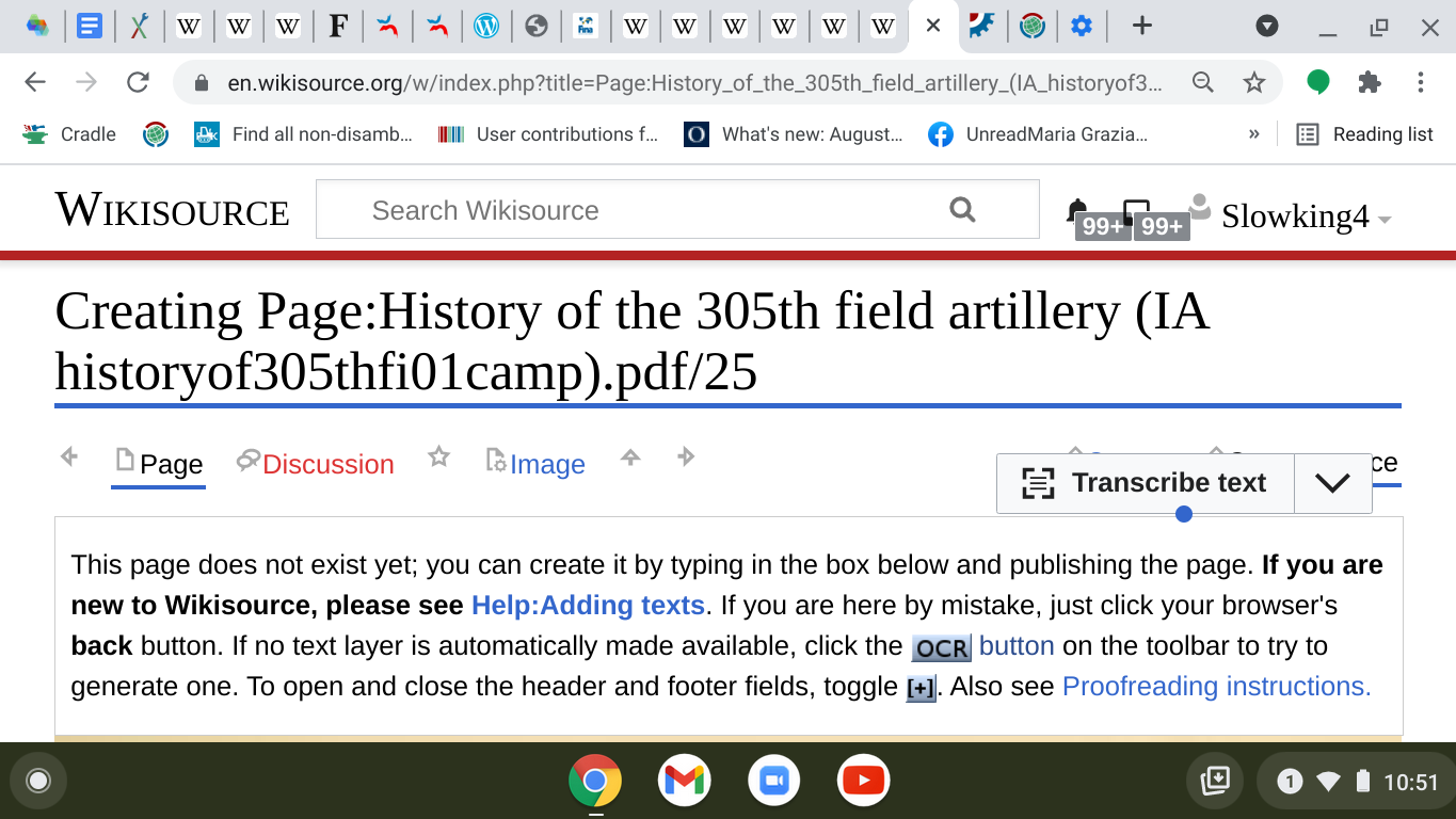
Hello all, there was been concern around the new Transcribe Text [Extract Text] UI in Wikisource and we wanted to address concerns and document all of the options for moving forward. This phabricator ticket will outline rationale for all so that you each have a view into options for next steps. Please vote on your preference after you consider the pros and cons.

Note: We must wrap work for this OCR improvements wish by July 26 given that we must move on to fulfilling wishes for the 2021 wishlist.

As we understand them, the concerns around the new UI include:

  • Breaking workflows, the new Extract Text button placement is outside of the toolbar; which is a place established contributors associate with editing
  • Inability to turn off the new UI
  • Since the new Extract Text button affords all contributors the option to Transcribe Text when they proofread documents, folks want the ability to turn it off.

Before we lay out all the options, I wanted to restate underlying goals of the improvements:

  • Improved speed and efficiency of underlying engines
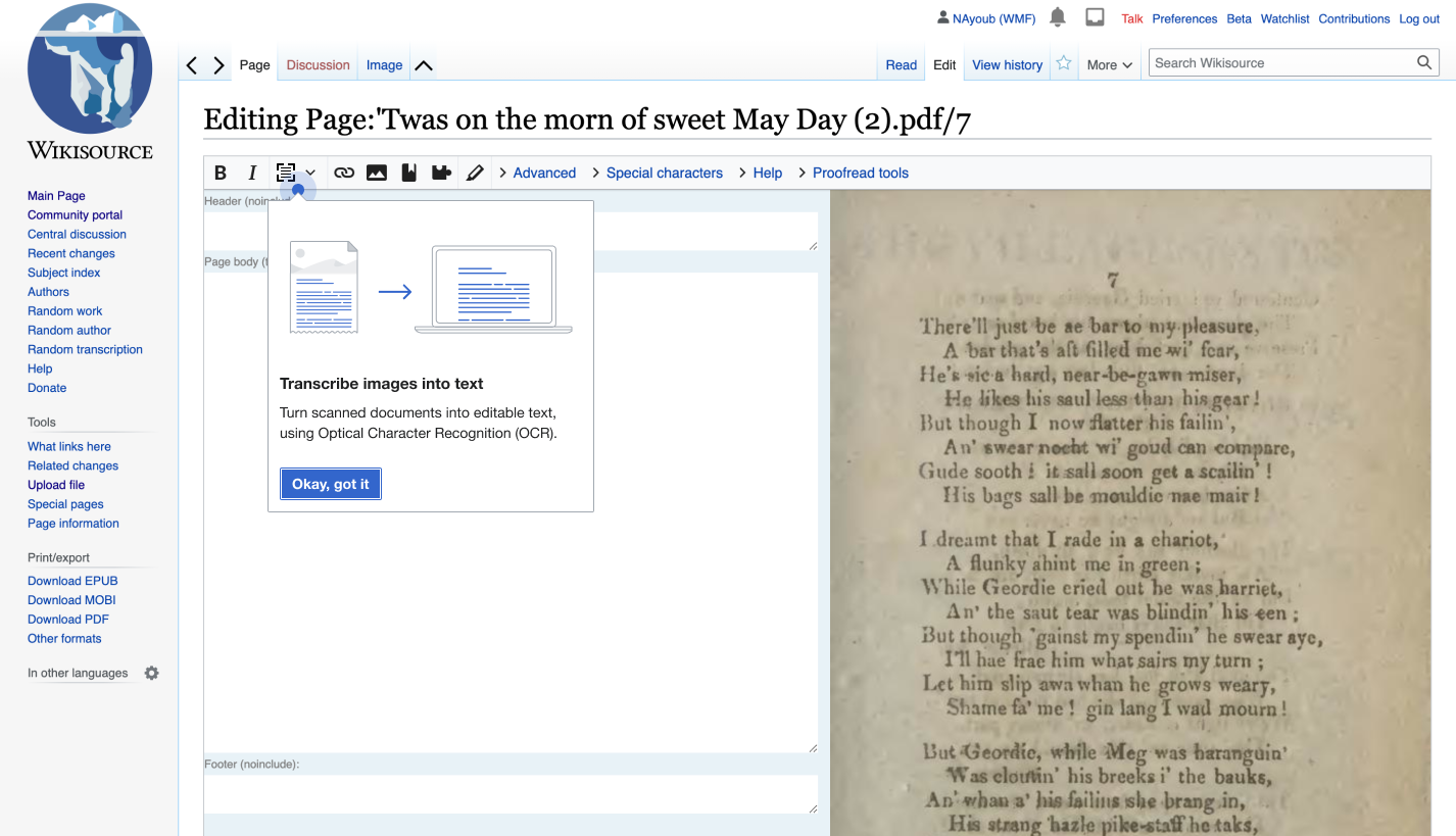
  • Accessibility for new Wikisource contributors, allowing new contributors to understand what OCR is and how to use it in their proofreading
  • Empowering all users with the ability to transcribe without having to know about it as a special gadget -- removing the technical learning curve and "insider" knowledge about transcription tools
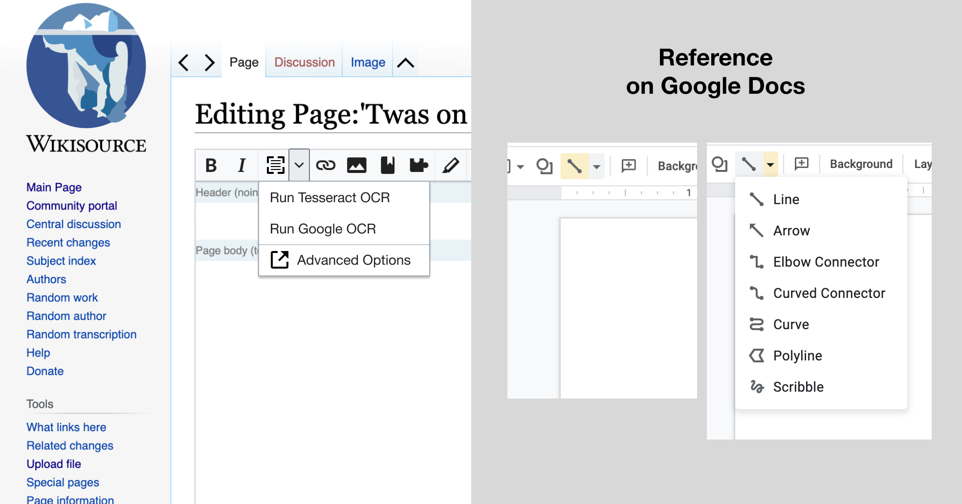
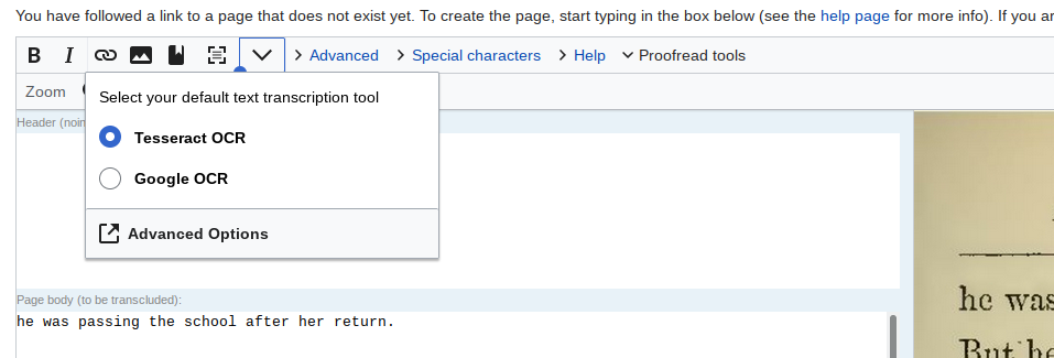
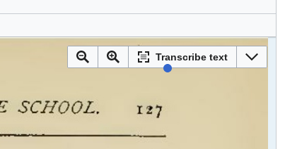
OPTION A

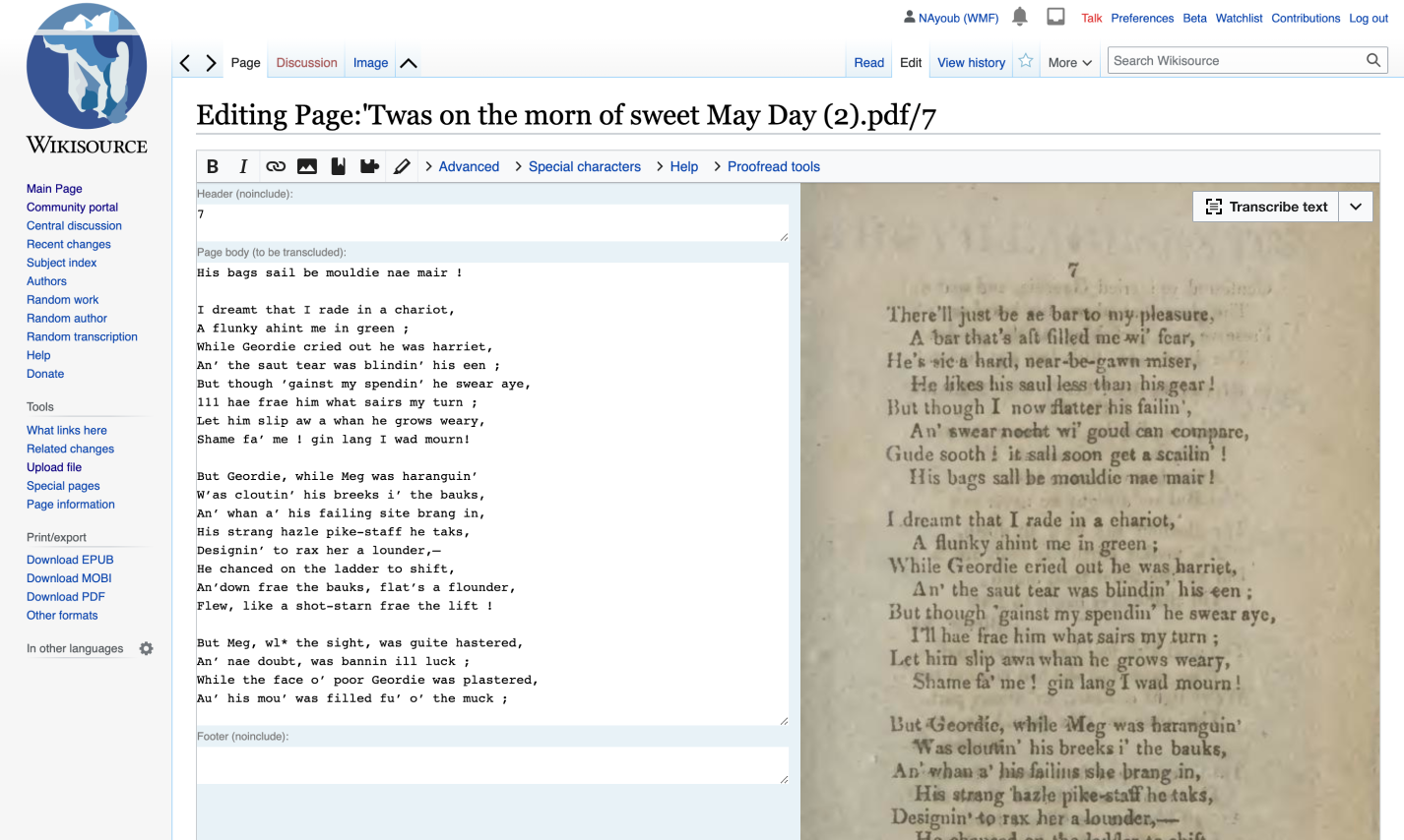
  • Transcribe Text button overlayed on document image that is to be transcribed

OCR After.png (854×1 px, 568 KB)

Pros:

  • More accessible copy, since we are removing the technical copy than OCR (which is an acronym unknown to non-technical contributors)
  • A 1-click transcription button (defaults to Tesseract, but users can change preference)
  • Button overlayed on document, making it clear that this will apply to the document image, not the proofread box

Cons

  • Breaks existing workflows
  • Inability to be turned off
  • Could potentially block document text (edge case)
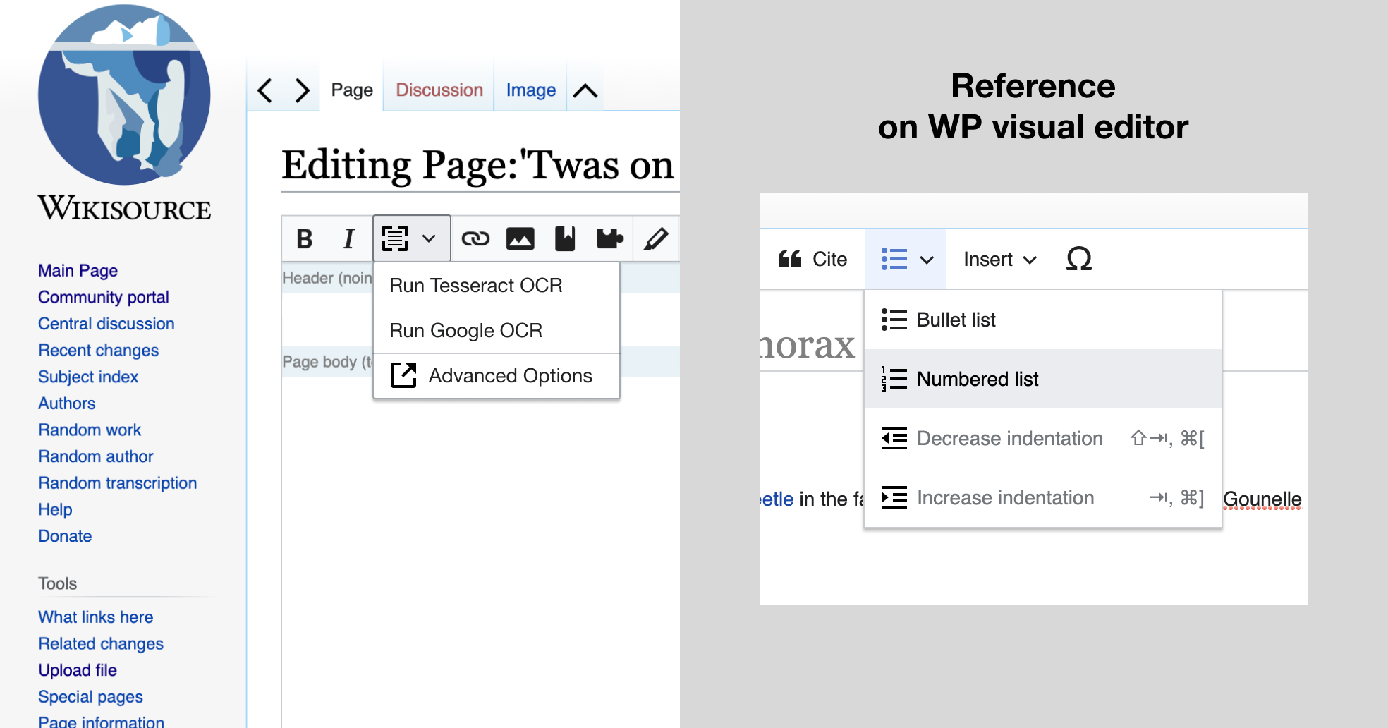
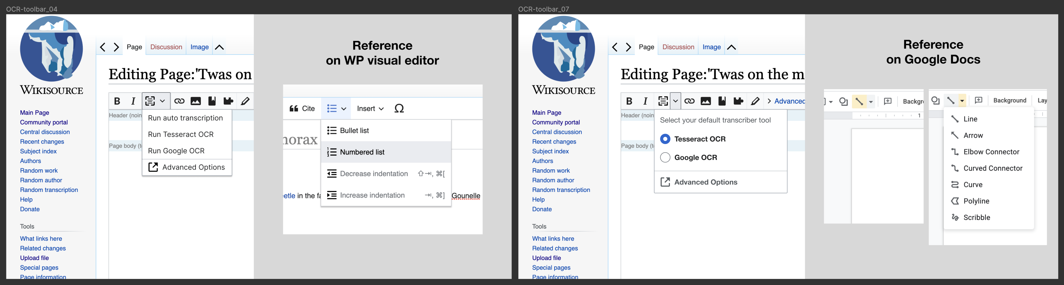
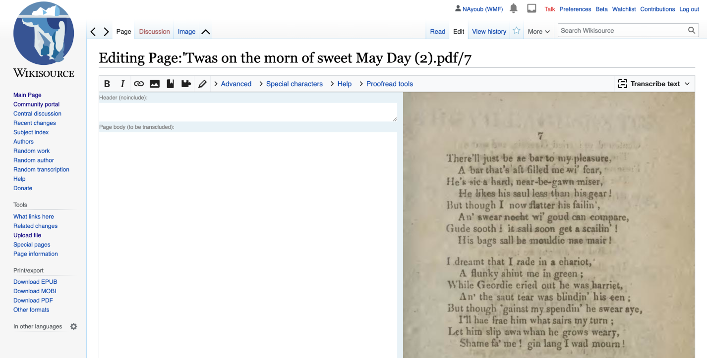
OPTION B

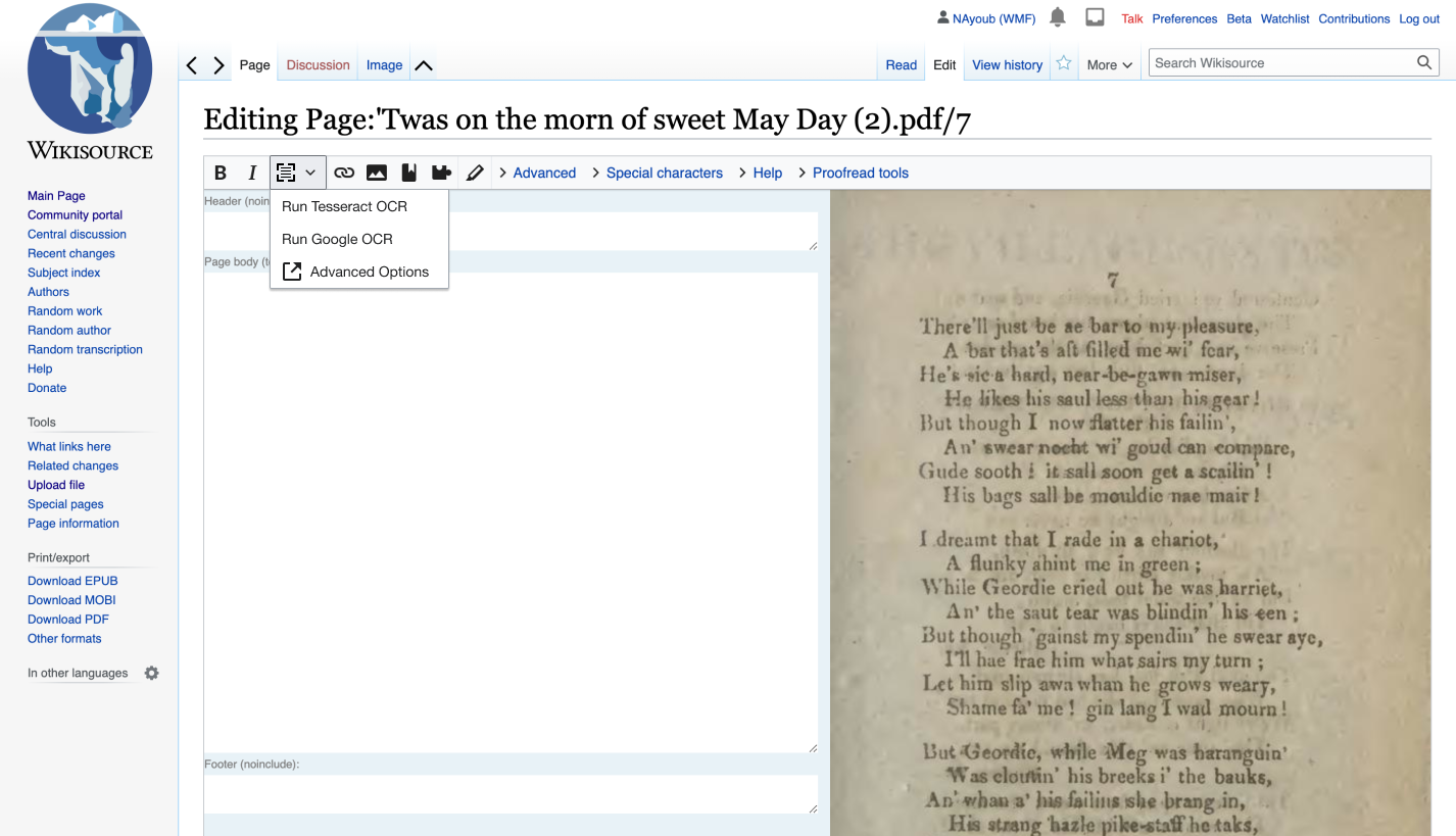
  • Transcribe Text button inside the toolbar

OCR-toolbar_04.png (819×1 px, 470 KB)

OCR-toolbar_03.png (819×1 px, 470 KB)

OCR-toolbar_02.png (819×1 px, 480 KB)

OCR-toolbar_01.png (819×1 px, 472 KB)

Pros:

  • Does not break existing workflow

Cons:

  • More technical button UI, less accessible to new contributors [perhaps rather than showing the OCR logo, we can show the word "Transcribe" in the toolbar)
  • Adding to an already saturated toolbar (may be hard for new contributors to understand the button is related to image document scanning since it is not next to the page)
  • ALTERNATIVE OPTION
    • Leave our changes in option A as is, and give people the ability to turn off the new UI in user preferences

Open questions

Since we believe there is value in giving everyone the ability to transcribe, we should remove duplicate gadgets to remove tech debt. Should communities decide to do this locally or opt out of this cleanup? Please note that the new functionality would not require to enable Tesseract or Google ocr on.

Community Tech Resources
Please understand that as you propose solutions, we are set to "wrap work" on this wish by July 1.
We can devote time addressing concerns but must move on to completing wishes in the 2021 wishlists. When you propose alternatives, please be aware that technical complexity will be a factor in determining whether we can feasibly tackle this. We recommend being sure to:

  • Re-use existing paradigms, such as our Preferences Tab
  • Re-use components that already exist, such as buttons and UI elements that are elsewhere on the page.

Event Timeline

nayoub updated the task description. (Show Details)
nayoub subscribed.

Leave our changes in option A as is, and give people the ability to turn off the new UI in user preferences

I suggest if the button stays where it is, that the toggle for it be placed in the proofreading toolbar. It is valid to want turn the button off when a work does not need any OCR, even if you do still want to use the upgraded OCR tool when you do need OCR.

I think the new "Extract text" UI widget is optimal for discoverability and onboarding new users, but suboptimal in most other ways and particularly for established users. It is distracting and blocks the scan image and will force users to pan and zoom in some fraction of cases, and is divergent from established UI concepts where this sort of functionality is found in the editor toolbar. I also think the UI in Option B is good enough for new users and would not be detrimental for existing users; there are lots of challenges with onboarding new users on Wikisource so hyper-optimizing for that in this one function does not seem proportionate.

I also think there are two axis here.

The first is to enable the new UI widget to be removed for those who want that. That can be implemented as an actual Special:Preferences preference, as a toggle button on the normal toolbar, or, least optimal but possibly acceptable, through a defined way for a project to make their own gadget to turn it off (i.e. an ID we can hide with a display:none stylesheet).

The second axis is making the functionality available for users even if they dislike and want to disable the new UI widget. For this it would be good to provide essentially the UI described in Option B.

I think it would be good to address both these needs: ability to hide new UI and making new functionality available even if the user does not like the new UI.

I think removing old gadgets is an orthogonal issue. CommTech should remove the old CommTech products that this solution replaces (i.e. the GoogleOcr gadget), but existing community tools (like the Tesseract-based Ocr gadget that uses the phetools backend on Toolforge, and, I think, IndicOCR) needs to be up to the communities how they wish to handle. There may be any number of reasons why a project would choose to keep such tools around to supplement the new tool and deciding which Gadgets a project may use is outside CommTech's remit. Advice, encourage, offer to help… sure. But CommTech can't and shouldn't decide to remove community tools.

The cons of Option B say "Requires 2-click to run the engines" but this isn't necessarily the case. We could have a button with config dropdown next to it, pretty much exactly the same operation as the current widget, but in the toolbar. Then, it'd only require one click.

Also, T285999 now exists for adding the above 'alternative option', which is a toolbar button that toggles a preference to hide/show the image widget.

Samwilson renamed this task from Optimize "Transcribe Button " concerns to Optimize "Extract text" button concerns.Jul 2 2021, 11:33 PM

@Samwilson thanks for that technical clarity, will remove that 2-click "Con" from Option B. 🐝

@Inductiveload @TommyJantarek @Xover and @Bodhisattwa also pinging you here to add your thoughts! Thanks for all of your perspectives on this ticket T283897

Ok, an attempt at some concrete suggestions…

First, relative the the task description, the concerns with the new UI are, I think, better put as:

  • It breaks the established UI conventions. Both in MediaWiki and in similar software elsewhere. Buttons that operate on a text field are usually placed in a horizontal toolbar over that text field. This is the case for the 2010 wiki editor, the 2017 source editor, Visual Edit, and all the inline (VE-based) editors used by the Desktop Improvements project. All the existing OCR tools are implemented thus. And even in Microsoft Word, even for functions that acquire data from external sources, the UI is a button in their version of a toolbar (the "Ribbon"). Heck, even Phabricator's editor uses this UI convention. And this convention is fairly natural too: the text field is where you are doing something active; where you edit, correct, format, etc. If the scan image wasn't there you could still transcribe books, just less effectively. This was the case before the ProofreadPage extension was developed. This is the same way you can show a preview of the wikipage: it's an important additional facility but it is adjunct to the text field. The user's mental model of the wikipage is always going to be focussed on that text field, not the scan image.
  • It is distracting. The same properties that make the new UI great for discoverability and onboarding new contributors also tend to be drawbacks for even minimally experienced contributors: it is relatively large, it is positioned such that it is extremely noticeable, and it's even got a throbbing animation. For a newbie this makes it easy to discover and invites exploration, but for everyone else it becomes distracting. In a not insignificant number of cases it will actually obscure part of the content of the scanned page, and the primary activity of Wikisource is to minutely compare the transcribed text with the scanned image. And even when it does not its very visibility makes it distracting when trying to focus on the text.

The requests for the ability to turn it off stem from these problems, and are essentially a request for a workaround for the subjectively perceived problems with the new UI. Being able to disable it (per-user) is not really an important feature in itself: it only becomes so when a given user perceives it as having negative cost—benefit for their particular workflow. It may be prudent to have the option as a safety valve, because sometimes it is literally impossible to make everyone happy, but then we're talking more using a single top-level HTML element with a known ID so that a project can provide a Gadget to set display:none on it if they have significant parts of the community that are unhappy with it.

That all as context, the ideal UI would probably be something like:

  • The new UI (widget over the scan image) is treated as a first-run wizard type dealie. All users get it by default, the throbber is still there for the first first-run, and the whole floating UI stays where it is until the user makes an active choice to hide it. It is friendly and easy to use for new users, and experienced users are perfectly capable of dismissing new-user affordances when they need to. Ideally, whether to show or hide the "first-run" UI is a setting in Special:Preferences somewhere (so it can be turned back on for users that dismiss it by mistake or change their minds), but so long as it can be dismissed some way by experienced users that prefer the below that's "good enough".
  • In addition, the existing GoogleOcr button in the wikieditor toolbar is replaced with a button that triggers the same action as the new floating "Transcribe Text" button. That is, it is a one-click invocation of OCR with whatever engine was most recently used.
  • Next to this button on the toolbar, there's a new button that provides access to the same things that are in the dropdown of the floating UI (engine selection and advanced options). The button can trigger a dropdown menu, or pop up a dialog, or whatever, depending on what's feasible. I don't think the 2010 Wikieditor toolbar really supports dropdowns, but from an end user perspective I don't think the particular UI widget used there is critical.

The most typical workflow within which the new OCR tool will be used is the sequential transcription of pages from a single book. If the text layer embedded in the file is poor or missing and needs the new OCRR tool, then most likely all pages in the work need it. The workflow is then run OCR → proofread and format → preview → save → next page → run OCR → …. The "run OCR" step should ideally be as invisible as possible: it should only take one click, and run fast. Ideally, iff needed at all, it should probably run automatically (zero-click); and it should have been pre-fetched so subjective time is essentially zero. The old phetools OCR does this: when a single page from a book is requested, it pre-generates OCR for all pages. On the first page the user waits for the full processing, but on subsequent pages the OCRr is just returned from cache. In purely technical terms it performs relatively slowly (it could easily be as much as ten times slower than the new tool), but in subjective user experience it is almost instantaneous because the slow processing happened server-side and ahead of time. You can think of it as speculative execution: we don't know that the user will request the next page, but most of the time they will, so this wastes very few computing resources while saving significant amounts of user time.

And I'm not seeing anyone clamouring for the option to disable the OCR functionality. The pushback is on the UI for it (as per above), which seems to optimise for new contributors at the expense of already established contributors, and the original plan to "take away" community developed and supported tools.

Recasting this as something like a "requirements" list:

  • OCR should always be available in the normal editor toolbar
  • OCR should be triggerable with a single button click (no menu/dropdown)
  • Engine selection and advanced options should be available, but not required to run OCR with defaults
  • If preserved, the new "first run / onboarding" UI should be possible to turn off, ideally per-user
    • (If we have to pick, the new UI is optional and the toolbar buttons required; but I think the new UI is awesome for onboarding and discoverability so it'd be a shame to miss out on that aspect of it.)

It is also possible some contributors would complain about new extra buttons in the editor toolbar, but at that point my opinion would be that we're past the point of contrariness that it is reasonable to cater for directly (any toolbar button can be hidden from user scripts using the wikieditor API if it really annoys you). There are also users who still refuse to use the 2010 editor (in favour of the 2007 editor) and thus don't have a toolbar at all. These users are aware that they have opted out of all technological improvements over the last decade and this would only be one more such. If the API for the OCR tool is robust enough the community can create custom UI for these (extremely few) users if needed (i.e. not something it makes sense for CommTech to expend scarce resources on).

And as always, I can't claim to speak for the community: it's just my best attempt based on experience as a technically-minded member of one of the Wikisources and that spends a lot of time helping other contributors with such issues.

your screenshot of your button assumes a large wide screen.
here is a small screen version

Screenshot 2021-07-12 10.52.01 AM.png (768×1 px, 232 KB)

@Xover thanks for the very clear synthesis! I am meeting with @nayoub today and the time and effort you spent into listing out your perceived requirements will help us. Wanted to ping you to make sure you understood the comments are being read and considered! Take care

Hey all, I believe there is a lot of echo'ed consensus on the new requirements @Xover and @Inductiveload posed. From the discussion in the English Scriptorium, as well as other comments and tickets I've seen I do believe there will always be some competing needs. However, I am optimistic about these new requirements from Xover:

OCR should always be available in the normal editor toolbar
OCR should be triggerable with a single button click (no menu/dropdown)
Engine selection and advanced options should be available, but not required to run OCR with defaults

And agree that we should perserve the onboarding UI on the proposed new OCR toolbar button which should disappear after a user first encounters the button for the first time.

We have designs for a button that meets those requirements below, and have one question about engineering feasibility, which is why you see two screenshots

OCR-toolbar_Option-1.jpg (1×1 px, 406 KB)

OCR-toolbar_Option-2.jpg (1×1 px, 420 KB)
:

@Samwilson, question for you since @nayoub and I were wondering how complex it would be to build a toolbar component where you can have the v down carat be its own button and the logo a different button? That would help us meet the 1-click seperate drop down requirements above. We did not find the interaction pattern anywhere else on the site or in OOUI so we were wondering if that was going to be more complex than anticipated.

For all watchers on this task, I wanted to say thanks again for your feedback. We'd love to hear your thoughts on these improvements to our original improvements. We hope people feel heard and thanks so much for the patience on this change as most of the team was on PTO last week.

PS: Please note that there may be some residue confusion from another ticket I made. I wanted to re-state that CommTech will also NOT be cleaning up the pre-existing OCR gadgets and we will leave that up to each community project to decide.

Worst case: Just write "OCR" in text - this definitely works because I used it in a gadget. Then figure out how to do an icon and if you can't currently, file an issue with WikiEditor: It would be somewhere in here: https://gerrit.wikimedia.org/r/plugins/gitiles/mediawiki/extensions/WikiEditor/+/refs/heads/master/modules/jquery.wikiEditor.toolbar.js#12 Fake it with ugly JS that stuffs an <img> in there while waiting for that to be implemented in Wikieditor if you absolutely must have the icon:

<img src="data:image/png;base64,iVBORw0KGgoAAAANSUhEUgAAABQAAAAUCAQAAAAngNWGAAAABGdBTUEAALGPC/xhBQAAACBjSFJNAAB6JgAAgIQAAPoAAACA6AAAdTAAAOpgAAA6mAAAF3CculE8AAAAAmJLR0QA/4ePzL8AAAAHdElNRQflBwEKGxbQtGD5AAAAVElEQVQoz2NgoA34jwTxiZGmEJ9t5CrkYfBHgzzYFUoxbESDUgRsIwREGbrQoCh2hYIMZWhQkKKYYWCQYziKBuWw+5qDwRoNclAY4EQqpG7qoSYAAH4XaJUUXZIJAAAAJXRFWHRkYXRlOmNyZWF0ZQAyMDIxLTA3LTAxVDEwOjI3OjIyKzAwOjAwDedNcgAAACV0RVh0ZGF0ZTptb2RpZnkAMjAyMS0wNy0wMVQxMDoyNzoyMiswMDowMHy69c4AAAAASUVORK5CYII=" />

To prove stuffing an <img> in the <a> element works:

2021-07-13_010408_153x151_screenshot.png (151×153 px, 6 KB)

Instructions for a non-icon dropdown: https://www.mediawiki.org/wiki/Extension:WikiEditor/Toolbar_customization#Add_a_drop-down_picklist

Note: This is still a 1-click solution because the dropdowns open on hover. This is currently used for e.g. the "heading" menu under "Advanced". (Actually, you can see the gadget I mentioned in the top right too)

2021-07-13_004850_451x260_screenshot.png (260×451 px, 18 KB)

The bigger question going forward is "can a dropdown have things like toggles or language selectors in it" and I think the answer is no, so you might need to have the as-yet-unimplemented-on-wiki advanced options in a separate dialog or something anyway.

Centralizing knowledge on approach here, from David lynch:

Oh, if this is WikiEditor-specific, then you'll have a harder time of it - I don't think there's a way to get it to happen without doing something hacky.

Our approach to a similar issue, adding the edit-mode switcher dropdown, is to create our own OOUI toolbar containing that button and insert it into the WikiEditor toolbar's element. (This isn't a dropdown in the same sense as you want to make, but once you're adding a custom toolbar anyway that's no issue.)

Visual reference for two toolbar options:

Screen Shot 2021-07-15 at 11.44.29.png (934×3 px, 464 KB)

(For reference, the VE example that @DLynch gave was this: https://gerrit.wikimedia.org/r/plugins/gitiles/mediawiki/extensions/VisualEditor/+/refs/heads/master/modules/ve-mw/preinit/ve.init.mw.DesktopArticleTarget.init.js#1327 )

Oh, if this is WikiEditor-specific, then you'll have a harder time of it - I don't think there's a way to get it to happen without doing something hacky.

I wonder how hacky is too hacky? Because it does work to create a dummy button in WikiEditor and then replace it with a ButtonGroupWidget (which can then be styled to have a narrow caret):

$( '.tool-button[rel="prp-ocr"]' ).replaceWith( extractTextWidget.$element );

ocr-toolbar.png (325×957 px, 60 KB)

That's reasonably hacky. :-) A better thing might be to add a new tool config to WikiEditor — it's already got oouiIcon so could perhaps have oouiWidget which could be any Widget (in this case, the existing ButtonGroupWidget). Does that sound okay?


Not to confuse things more on this ticket, but there's also work going on at the moment in T283917 to add a new zooming and panning library to ProofreadPage, and @Soda @Yash4357 and @SGill and I were talking yesterday about how that should be integrated into the normal editing form (in addition to the pagelist widget). The existing buttons are in the 'Proofread tools' section of the toolbar, where they're well away from the actual image that they operate on. We were thinking that it might be more appropriate to have the zoom in, out, and reset buttons next to the 'Extract text' button (in the same ButtonGroupWidget), something like this:

ocr-zoom-buttons.png (212×403 px, 32 KB)

That's reasonably hacky. :-) A better thing might be to add a new tool config to WikiEditor — it's already got oouiIcon so could perhaps have oouiWidget which could be any Widget (in this case, the existing ButtonGroupWidget). Does that sound okay?

That sounds at least plausibly workable. You're thinking a peer tool.type to button/toggle, which would just be passed an OOUI widget and insert it into the toolbar as-is, maybe wrapped in a minimal <div class="tool">?

I guess we could go all-out and just do tool.type == 'element' which would insert any arbitrary HTML element passed into the toolbar at the specified position. OOUI is very friendly to that style of interaction.

After running A/B, here are two options for the OCR button inside the toolbar. The first option here is with OOUI dropdown button inside the toolbar and the second one is the split button with "auto-OCR" on one side and the dropdown menu to change engines. I included the zoom icons that might be moved there, as they're pretty helpful for the user to understand that the dropdown arrow part of our button shouldn't be considered as options or a menu for the entire toolbar.

OCR_Mockups_New-option2.png (723×1 px, 407 KB)

OCR_Mockups_New-option.png (723×1 px, 406 KB)

@nayoub thanks for including the updated designs, looks great!

@Samwilson what do you think about the feasibility of this proposed design?
It meets all following requirements:

  • OCR should always be available in the normal editor toolbar
  • OCR should be triggerable with a single button click (no menu/dropdown)
  • Engine selection and advanced options should be available, but not required to run OCR with defaults

Thanks @NRodriguez, here is an example of how it could look like on a smaller device:

OCR_Mockup_Tablet.png (756×1 px, 296 KB)

This looks good! It gives the buttons close proximity to the image, without obscuring it. The right-alignment is already used for the search button in WikiEditor, so that's all good. Also, T285764 will be resolved if we move the button.

The only slightly odd thing I notice is that there's already a section called 'Proofread tools', to which it seems sensible to add 'Transcribe text' — but of course that'd not make it as discoverable. That section is where the zoom buttons already are, and it feels a bit odd to spread the proofread buttons around like this. (Admittedly, this is really getting into the area of T27068, so doesn't need to be figured out here.)

I've got most of a patch for getting this working. Just sorting out some issues with the pulsating dot.

Change 705613 had a related patch set uploaded (by Samwilson; author: Samwilson):

[mediawiki/extensions/Wikisource@master] Move OCR widget into the toolbar

https://gerrit.wikimedia.org/r/705613

Actually, it's not enough to just have WikiEditor allow arbitrary buttons, because it also doesn't allow a toolbar section alongside the main section. I've done it a different way, and we can see if that's unhacky enough.

Test wiki created on Patch Demo by MusikAnimal using patch(es) linked to this task:

https://patchdemo.wmflabs.org/wikis/41922f73b8/w/

Test wiki on Patch Demo by MusikAnimal using patch(es) linked to this task was deleted:

https://patchdemo.wmflabs.org/wikis/41922f73b8/w/

Test wiki created on Patch Demo by MusikAnimal using patch(es) linked to this task:

https://patchdemo.wmflabs.org/wikis/dcb6b9e99e/w/

Test wiki on Patch Demo by MusikAnimal using patch(es) linked to this task was deleted:

https://patchdemo.wmflabs.org/wikis/dcb6b9e99e/w/

Test wiki created on Patch Demo by MusikAnimal using patch(es) linked to this task:

https://patchdemo.wmflabs.org/wikis/706f5f65b7/w/

Test wiki created on Patch Demo by Samwilson using patch(es) linked to this task:

https://patchdemo.wmflabs.org/wikis/8a479f0c15/w/

Test wiki on Patch Demo by MusikAnimal using patch(es) linked to this task was deleted:

https://patchdemo.wmflabs.org/wikis/706f5f65b7/w/

Change 705613 merged by jenkins-bot:

[mediawiki/extensions/Wikisource@master] Move OCR widget into the toolbar

https://gerrit.wikimedia.org/r/705613

Test wiki on Patch Demo by Samwilson using patch(es) linked to this task was deleted:

https://patchdemo.wmflabs.org/wikis/8a479f0c15/w/

Confirmed that the extract button now loads on the tool bar and is functional
Wikisource – (982b187) 06:14, 18 August 2021 GPL-2.0-or-later
Browser tested on: Firefox version 91 Windows 10 / Chrome version 92 Windows 10 / Microsoft Edge version 91 Windows 10 / Safari version 14 Mac OS 11 / Microsoft Edge 92 11 Windows 10 / Opera version 72 Windows 10.
Test links:
https://en.wikisource.org/w/index.php?title=Page:The_New_York_Times,_1900-12-01.djvu/19&action=edit&redlink=1
https://wikisource.org/w/index.php?title=Page:Pandji_Woeloeng_1876.pdf/98&action=edit&redlink=1

Screen Shot 2021-08-20 at 4.57.05 PM.png (1×2 px, 875 KB)