Page MenuHomePhabricator

Add 'database' icon to WikimediaUI collection, Codex & OOUI
Open, Needs TriagePublic

Assigned To
None
Authored By
lucamauri
Jul 24 2021, 3:58 PM
Referenced Files
F35519250: Screenshot_2022_09_13_173627.png
Sep 13 2022, 3:43 PM
F34892274: image.png
Dec 22 2021, 3:01 AM
F34892270: image.png
Dec 22 2021, 3:01 AM
F34744229: image.png
Nov 13 2021, 12:28 AM
F34744232: image.png
Nov 13 2021, 12:28 AM
F34728926: image.png
Nov 3 2021, 11:35 PM
F34728929: image.png
Nov 3 2021, 11:35 PM

Description

Preamble

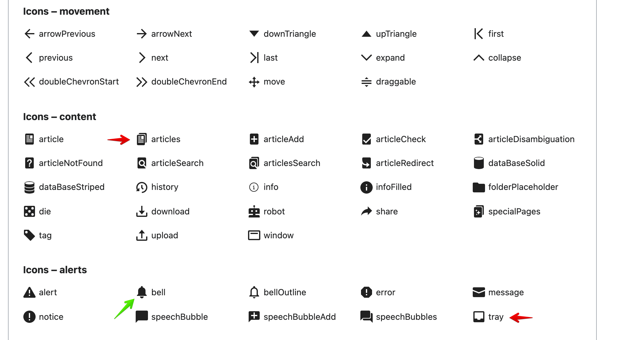
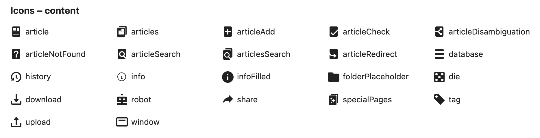
In T124191 we are working on a banner for automatically generated pages based on Wikibase data. For visual representation of the concept we were looking for an image or icon representing a database.
Using an image from Wikimedia Commons would be arbitrary and might end up showing a unwanted image under certain condition.

Problem

A better idea would be to use an icon from the OOUI library, but there is no suitable icon there.

Proposed solution

I would submit a database icon idea to be reviewed and eventually incorporated into OOUI.
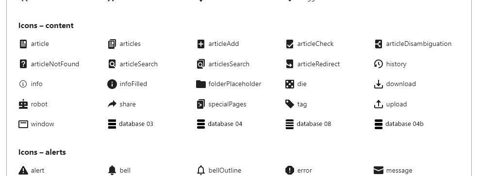
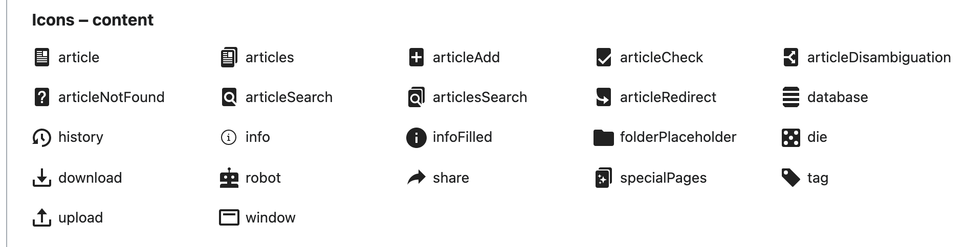
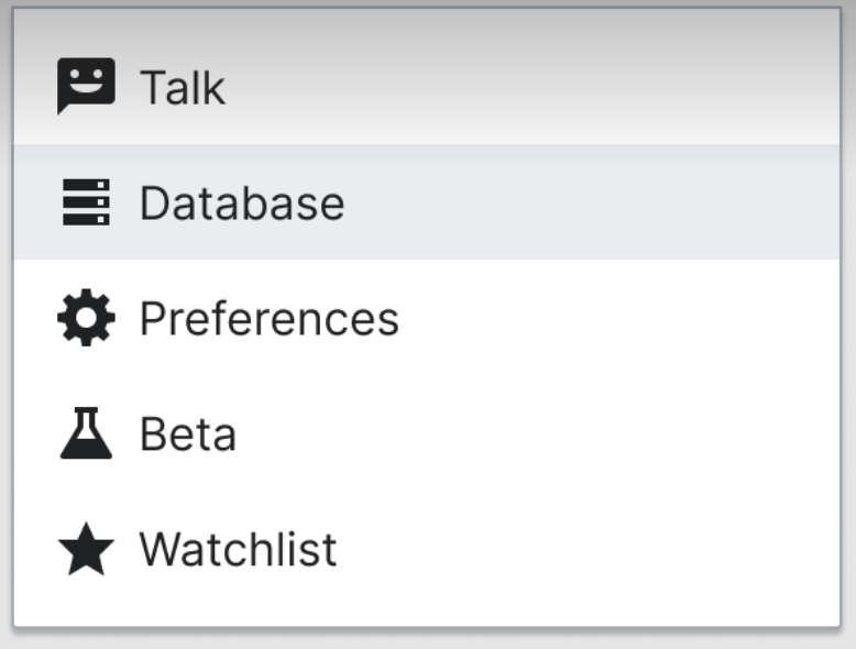
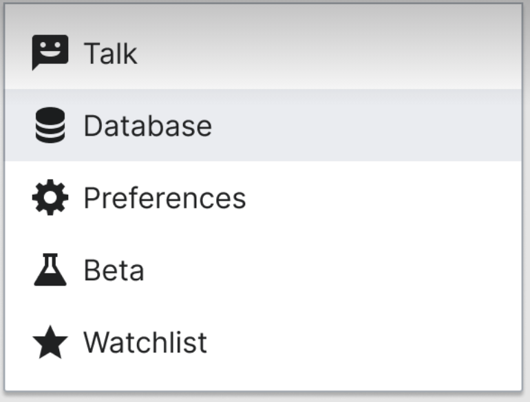
A database (or data source of some kind) is universally identified by a cylinder, I prepared a solid version and a striped one. Below please find a preview.

SolidWith stripes
OOUI-DB-Solid.png (600×600 px, 19 KB)
OOUI-DB-Stripes.png (600×600 px, 27 KB)

Source files

SolidWith stripes

Acceptance criteria

Event Timeline

Change 707440 had a related patch set uploaded (by Luca Mauri; author: Luca Mauri):

[oojs/ui@master] Add icon for database to OOUI

https://gerrit.wikimedia.org/r/707440

@lucamauri First off, this is very well prepared. Thank you very much for the design and development work, this has been in the top 10 contributor patches by fidelity in the 6 years at the Foundation! Sorry for the delayed response, we were holding a two week encompassing designer workshop T286051 & developer summit T285781 on the future Vue.js based successor of OOUI (where this icon will be included as well)

A few notes and considerations:

  • in the task and the patch you provide both variants, I'd limit the addition to one and lean towards the striped one for its more distinct look
  • One point about the icon that is concerning is the (fake) 3 dimensionality and depth to it. That sets it apart from the rest of the icon collection and doesn't fit in perfectly yet.

image.png (1×2 px, 157 KB)

See very narrowly if at all provided depth in other icons like 'articles' or 'tray' or being complete flat like in 'bell', 'die' or 'robot'.

@lucamauri First off, this is very well prepared.

Thanks :-) I need to give credit to @Ladsgroup for pointing me in the right direction with this contribution.

this has been in the top 10 contributor patches by fidelity in the 6 years at the Foundation!

Pardon me, I not sure I understand you here.

A few notes and considerations:

  • in the task and the patch you provide both variants, I'd limit the addition to one and lean towards the striped one for its more distinct look

I contributed with both of them because I couldn't decide which one to use myself. I'll be glad to drop the plain one.
Question: is a discussion in order on the icon to keep or shall I simply proceed deleting the plain right away?
Sorry, I am unfamiliar with the decision making process here.

  • One point about the icon that is concerning is the (fake) 3 dimensionality and depth to it. That sets it apart from the rest of the icon collection and doesn't fit in perfectly yet.

[cut]
See very narrowly if at all provided depth in other icons like 'articles' or 'tray' or being complete flat like in 'bell', 'die' or 'robot'.

I can surely see your point here, but then again, do we have other choices? As far as I can tell, a cylinder is the shape closest to a universally-accepted representation of a database.
Drawing it as seen from the front, would result in a featureless rectangle which I suppose would be unrecognizable.
Alternatives to cylinder might be a "table" icon like , but this might as well represent a spreadsheet or a generic HTML table. not necessarily a database table.
May I ask what you have in mind as an alternative?
Thanks

@lucamauri First off, this is very well prepared.

Thanks :-) I need to give credit to @Ladsgroup for pointing me in the right direction with this contribution.

this has been in the top 10 contributor patches by fidelity in the 6 years at the Foundation!

Pardon me, I not sure I understand you here.

I meant it was very well prepared, and it was unusual for design-specific patches in my time at the Foundation :)

I contributed with both of them because I couldn't decide which one to use myself. I'll be glad to drop the plain one.
Question: is a discussion in order on the icon to keep or shall I simply proceed deleting the plain right away?
Sorry, I am unfamiliar with the decision making process here.

I will take the responsibility here to go with the more common database icon representation and defend the decision in case objections are made later on.

  • One point about the icon that is concerning is the (fake) 3 dimensionality and depth to it. That sets it apart from the rest of the icon collection and doesn't fit in perfectly yet.

[cut]
See very narrowly if at all provided depth in other icons like 'articles' or 'tray' or being complete flat like in 'bell', 'die' or 'robot'.

I can surely see your point here, but then again, do we have other choices? As far as I can tell, a cylinder is the shape closest to a universally-accepted representation of a database.
Drawing it as seen from the front, would result in a featureless rectangle which I suppose would be unrecognizable.
Alternatives to cylinder might be a "table" icon like , but this might as well represent a spreadsheet or a generic HTML table. not necessarily a database table.
May I ask what you have in mind as an alternative?
Thanks

I'm not thinking about alternatives, but about amendment of the proposed icon to be clear. Was thinking of flatter disk viewing point and a filled top, not a ring that emphasizes the 3 dimensionality. Compare two icons highlighted with green arrows:

image.png (581×1 px, 737 KB)

this has been in the top 10 contributor patches by fidelity in the 6 years at the Foundation!

Pardon me, I not sure I understand you here.

I meant it was very well prepared, and it was unusual for design-specific patches in my time at the Foundation :)

I will take the responsibility here to go with the more common database icon representation and defend the decision in case objections are made later on.

Understood, thanks.

I'm not thinking about alternatives, but about amendment of the proposed icon to be clear. Was thinking of flatter disk viewing point and a filled top, not a ring that emphasizes the 3 dimensionality. Compare two icons highlighted with green arrows:

Ok, I see now.
Is one of these two layouts acceptable to you?

Flat topFlat top with border
OOUI-DB-Stripes-Flat.png (600×600 px, 25 KB)
OOUI-DB-Stripes-Flat-Border.png (601×600 px, 26 KB)

Is one of these two layouts acceptable to you?
[cut]

@Volker_E please also look at this two further versions that might result being more aesthetically pleasing:

Flat top with big borderFlat top with small border
OOUI-DB-Stripes-Flat-Thirds.png (600×600 px, 26 KB)
OOUI-DB-Stripes-Flat-ThirdsSmall.png (600×600 px, 26 KB)

@lucamauri Given that it has to be recognizable at 20 x 20 px, I'd choose “Flat top with big border” as best option!

@lucamauri Given that it has to be recognizable at 20 x 20 px, I'd choose “Flat top with big border” as best option!

Understood, I'll prepare the final file and publish a patch on Gerrit ASAP

@lucamauri Given that it has to be recognizable at 20 x 20 px, I'd choose “Flat top with big border” as best option!

I published the new patch and just got the +2 from Jenkins.

Here in comparison with the other icons:

image.png (476×1 px, 65 KB)

It still seems like a misfit for

  1. the reason I've shared above about flat vs fake 3d. Even with flattening the curve
  2. the stripes are too small. That was my fault, the big preview above mislead me. We have 2dp thick strokes as principle in the icon guidelines.

With the faux 3d effect being so distinct in contrast to other icons, I would recommend trying a direction like

image.png (1×702 px, 625 KB)

instead.

Volker_E renamed this task from Add 'dataBase' icons in Design Style Guide & OOUI to Add 'database' icon to WikimediaUI collection, Design Style Guide & OOUI.Aug 23 2021, 11:27 PM
Volker_E updated the task description. (Show Details)
  • Add to DSG Illustrator file, optimized SVG to icons folder and replace ZIP file

@Volker_E pardon me, with "Illustrator file" you mean an .AI file created with Adobe Illustrator?
If yes, I am sorry, but I don't have that software and I am not sure I can manipulate that file with the applications I use in a reliable way.

With the faux 3d effect being so distinct in contrast to other icons, I would recommend trying a direction like
[cut]
instead.

I will work on something along these lines ASAP and I will update the Task.

  • Add to DSG Illustrator file, optimized SVG to icons folder and replace ZIP file

@Volker_E pardon me, with "Illustrator file" you mean an .AI file created with Adobe Illustrator?
If yes, I am sorry, but I don't have that software and I am not sure I can manipulate that file with the applications I use in a reliable way.

No worries, not all of these acceptance criterias are expected from you. These are just necessary steps for an icon to be part of the system and in this volunteer case, somebody on the Wikimedia Design team, probably me, will go ahead and provide the addition to Illustrator/or soon to be source of truth Figma file.

[cut]
With the faux 3d effect being so distinct in contrast to other icons, I would recommend trying a direction like
[cut]
instead.

I Played around with sketches inspired by the image you posted, but I must say they are definitely too complex to be properly rendered at a small size.
I tried to simplify them as much as possible to retain some distinctive look without drawing anything too detailed.
The result in my opinion is unsatisfactory and we are now approaching something that resembles a "fat" hamburger menu.
Please see below a few iteration, looking forward to your comments.

Flat 01Flat 02Flat 03Flat 04Flat 05Flat 06Flat 07
DBFlat01.png (600×600 px, 17 KB)
DBFlat02.png (600×600 px, 18 KB)
DBFlat03.png (600×600 px, 21 KB)
DBFlat04.png (600×600 px, 25 KB)
DBFlat05.png (600×600 px, 20 KB)
DBFlat06.png (600×600 px, 19 KB)
DBFlat07.png (600×600 px, 22 KB)

Please see below a few iteration, looking forward to your comments.

@Volker_E here's another proposal.
Kindly advise if it still make sense working on this icon or if I should withdraw.

Flat 08
DBFlat08.png (600×600 px, 14 KB)

Thanks @lucamauri for the updates and your patience. First I've been on vacation and then in several other very important topics, for example T288980, hence my delayed response.

I really like Flat 03, 04 and 08. With the three parts one I'm a bit resistant as they might be confused to prominent 'menu' icon.
The alignment to icon template looks and seems great. Would you also show them aside of other icons with same output size, it seems important to have that comparison here?

The alignment to icon template looks and seems great. Would you also show them aside of other icons with same output size, it seems important to have that comparison here?

Dear @Volker_E, it unfortunately took some time for me to get back working on this.
Please find below a simulation of proposals 3, 4 and 8 near other icons of OOUI. Additionally, I also made a "b" version of the number 4 at full 20px height by enlarging the middle element only.

icons2.png (364×989 px, 21 KB)

I don't think 8 is really working well at that small size: version 3 or 4 are our best option, I believe, but I defer to your expert opinion.

Also used your proposals to try

image.png (484×1 px, 65 KB)
and
image.png (480×1 px, 65 KB)

The three lines version is the one that resembles most closely to other known database representations elsewhere, while the four line seems inharmonious.
database 03 from you also could be an option.
I'd suggest to move forward with the three lines variant shared above right now.

Change 707440 merged by jenkins-bot:

[oojs/ui@master] icons: Add 'database' icon

https://gerrit.wikimedia.org/r/707440

Change 736621 had a related patch set uploaded (by VolkerE; author: VolkerE):

[mediawiki/core@master] Update OOUI to v0.42.1

https://gerrit.wikimedia.org/r/736621

Change 736621 merged by jenkins-bot:

[mediawiki/core@master] Update OOUI to v0.42.1

https://gerrit.wikimedia.org/r/736621

image.png (480×1 px, 65 KB)

image.png (484×1 px, 65 KB)

WARNING: I'm not good at giving constructive comments here. My design skills are terrible. Also, I'm influenced by my lunch break.

Not to offend anyone, and having said I like the idea of edible databases; I wouldn't be surprised me if end-users would see these icons thinking about "cheeseburger" and "double-cheeseburger" respectively.

I think it's better to provide clearer icons than icons that need a label to be explained. Luca Mauri's original proposal did not require any disambiguation. I wouldn't know how to include it in the "big picture" though.

Hi @valerio.bozzolan, thanks for your feedback, and even if it's critical, I appreciate the honesty and the delivery. :)
I was waiting for @lucamauri to chime in and provide a final feedback. Aware that the lastly settled on is only related to the original proposals.

It was a hard decision, but your comments are a good angle to provide contextual knowledge for the choice of an 'edible database' icon.
First off, using icons without labels is in general a bad idea, from cultural, educational or accessibility point of view. We actively have been advising against using icons lone-standing due to learnability and identification issues.
Not even the edit pencil –

image.png (54×116 px, 1 KB)
our most prominent icon in Wikiverse is without flaws and issues. To give a few examples:

  • in order to understand it you would have to have seen and used a pencil in your life
  • it must be a common writing tool in your cultural context
  • you must make the connection between this iconic representation and the concept of a pencil
  • you must make the connection between a pencil and a digital editing interface, which has most probably nothing to do with each other in the real meaning

All of those are examples for how hard the visual representation of a concept is and that the context decides about recognizing and understanding. In that way the 'oil barrel' or the 'water bucket' ;) is by no means clearer to understand than the 'single cheeseburger'.

image.png (60×52 px, 2 KB)

The other point about the original one would be better as a single standing icon I cannot fully disagree. It might be slightly better understandable when you've seen other database icons in the past, I'm not sure. The issue though is, that we design an icon set for a full user-interface and therefore can't go for a per-icon optimization as that would result in a non-harmonious mess.

Please let me know how above resonates with you. So far we have only delivered the icon in OOUI and it's not used anywhere.

It might be slightly better understandable when you've seen other database icons in the past,

I found the pencil talk very enlightening since I admit I don't even hold a pencil anymore but..

The world around us is just very opinionated about pencils and databases as well.

(Note: some database results look like the actual flat version but are really false-positives like this "network database" that is not really a database but just "servers".)

That's not to say that we have to follow everyone else. It's just to say that the pencil icon is innately recognizable.

Instead, our icon tries to brings up to memory "the orthogonal projection of a disk array seen from the horizontal axis". Not feasible: the brain will just short-circuit to "hamburger".


Proposed compromise: maybe we can invest on a servers icon instead. I mean, let's remove all beveled edges so it doesn't look like bread in any way. Then, we can introduce a small white circle inside each rectangle, like a led (inspiration). In this way at least we get a good icon of servers from OOUI and adopt any other OOUI-not-compatible "disk arrays seen from a 20-30° angle" icon from somewhere else.

I was waiting for @lucamauri to chime in and provide a final feedback. Aware that the lastly settled on is only related to the original proposals.

Apologies if I made you wait, but please understood I had no idea you were waiting for a feedback from me.
First of all, I saw you merged the Gerrit change, so in my mind this was a final settlement.
Second, I expressed my opinion above with

version 3 or 4 are our best option, I believe, but I defer to your expert opinion.

and I stand with this suggestions.

All of those are examples for how hard the visual representation of a concept is and that the context decides about recognizing and understanding. In that way the 'oil barrel' or the 'water bucket' ;) is by no means clearer to understand than the 'single cheeseburger'.

image.png (60×52 px, 2 KB)

To this I must disagree.
We originally moved away from the "oil barrel" icon because of your original comment:

With the faux 3d effect being so distinct in contrast to other icons, I would recommend trying a direction like

I can understand the need for uniformity in the icon set, but never we discussed about the fact that the "oil barrel" would not be understandable.
A cylinder or striped cylinder is universally understood as a symbol for database or data storage in general, not only by IT professionals like us, but also by tech-savvy people in the general public. This is clearly represented by the simple search of the image for the word database in any search engine, as we also saw above.
A person unfamiliar with computers and IT won't understand any concept represented by the "oil barrel", nor by the "hamburger", nor by the curved arrow, not by the heart and many many others. On the other hand, a person familiar with IT concepts, would immediately translate the cylinder into a data storage, while the three-strpes icon is very similar to a widely representation of a general command menu.

So, to summarize, if we value uniformity over meaning, I can understand the choice of rejecting the "oil barrel" icon.
On the other hand, from the point of perspective of de facto conventions. I cannot support the concept that both icons hold the same level con recognizability: this is simply not the case.

Please let me know how above resonates with you. So far we have only delivered the icon in OOUI and it's not used anywhere.

As we need to use a 2D icon that must be reacognazible in a very small format, I don't think we do really have much choice here, this is the point.

WARNING: Close your children's eyes. I'm trying to OOUI-zing a database but using GIMP and a trackpad and 10 seconds of free time. Be inspired at your risk.

This is not a nice icon but it seems a database more than an hamburger.png (442×810 px, 2 KB)

@valerio.bozzolan @lucamauri Now with some more space, I want to add one more alternative proposal that my peer @aminalhazwani has provided after chatting with him about the problem statement of this task, compared with the original here:

image.png (590×778 px, 70 KB)
image.png (584×770 px, 72 KB)

[dark gradient on top is a screen capture leftover]

I think Option 1 on the left is clearly fitting in with the rest of the icons and might be advantageous. What do you think?

image.png (590×778 px, 70 KB)
image.png (584×770 px, 72 KB)

Thank you so much!

IMVHO both icons are just awesome, but the one of the left should be named "servers" or "storage". The one on the right, that is nice if ever adopted, should be named "database" O:)

Sorry, that I wasn't clear enough, number two is not an option as it really adds 3D depth to the otherwise flat icon environment. It falls out of the icon collection. So the question here is, is option 1 acceptable or not?

Ahah... is this a deadlock?

Trust me, option 1 it's awesome, but please call it servers. Also, option 2 is awesome (even if I know it seems not acceptable for OOUI as you remembered) but that's an awesome database icon.

Hi @Volker_E I tried to improve my above comment. In short, I think the issue is just related to the label, not the icon itself that is awesome.

@valerio.bozzolan In case that wasn't clear from my comment before, we can't add 3D icons to our flat icon collection.
The rule behind is

Front-facing. Icons are flat and front facing, not multi-dimensional.

Even though it would work on its own, it wouldn't work in our interface, but messing it up.

I understand that 3D is not OK.

My feedback is just: let's just rename this icon to "servers":

Screenshot_2022_09_13_173627.png (99×307 px, 8 KB)

That's a very lovely icon for servers, and consistent to Font Awesome and Material Design icons.

Volker_E renamed this task from Add 'database' icon to WikimediaUI collection, Design Style Guide & OOUI to Add 'database' icon to WikimediaUI collection, Codex & OOUI.Feb 13 2024, 12:43 AM