Page MenuHomePhabricator

[L] The default filter i.e. "All" is missing the Select state.
Closed, ResolvedPublicBUG REPORT

Description

List of steps to reproduce (step by step, including full links if applicable):**

  • Search for any media
  • On the search results page, open any of the filter drop down.

What happens?:

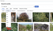
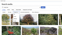
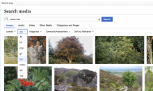
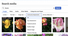
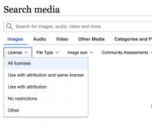
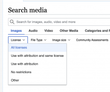
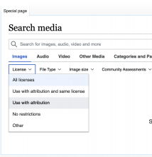
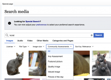
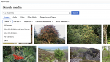
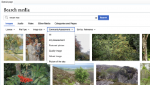
  • The default state of all the filters i,e, "All" is missing the visual indication of its current selection.

License Filter.png (1×2 px, 2 MB)

Community Assessments filter.png (1×1 px, 2 MB)

File Type Filter.png (1×1 px, 2 MB)

Image Size Filter.png (1×1 px, 2 MB)

What should have happened instead?:

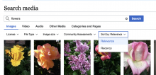
  • The selected filter in this case the default "All" should have the select state. The visual treatment for the select state should be similar to how the "jpeg" is selected in the example below.

Selected State for Filters.png (1×1 px, 2 MB)

Software version (if not a Wikimedia wiki), browser information, screenshots, other information, etc:
Event Timeline

Sneha renamed this task from The default state of the filter i.e. "All" is missing the Selected visual indication. to The default filter i.e. "All" is missing the Select state..Nov 12 2021, 3:07 PM
Sneha added a project: SDAW-MediaSearch.
Sneha removed subscribers: Aklapper, SDAW-MediaSearch.

hm.. This is going to be a bit tricky and need some thought on what we really want to happen.

At the moment the first selection (the ALL) technically is not actually selected, as All really means "do not set anything for this filter". If I would technically choose the first entry of each value, the UI will look like this:

image.png (225×949 px, 14 KB)

This does not seem to be a very good solution for UX, as the user will not be able to see the label of the dropdown. A possible solution would be to add prefix (like suggestions has). That show some text if anything is selected:

image.png (135×938 px, 8 KB)

The last possible solution would be to override the base component, to make it possible to select a value (the all in our case), but do not show it in the UI. This is not programmatically the best solution, but will provide a good UX improvement.

@egardner any change you can look at the above, as you were involved since the first few discussion and know the reason behind the select updates! :)

@SimoneThisDot That is a good point. I did not know that the selection in the drop down is connected to the label. I thought we can independently change the visual without affecting the main label. If that is not possible then the the other solution can be to leave the interaction and visual as is and just update the label from "All" to "All (Default)" to make it clear to the user. I am not sure how well it would translate though.

After a small discussion with Sneha we have agreed to replicate the implementation offered by google images that is what it was initially proposed.

  • When the default is set, do not show it in the filter
  • when the dropdown is open, show the first item as selected
  • If any other item of the dropdown is selected, show that in the filter menu

This will require us to move away from a standard menu component and will require to customize it, but we have agreed that this is the best option for UX purposes and to support our use case.

@CBogen not sure if you need further information on this task, but as you can see above we have agreed on the step going forward.

@CBogen not sure if you need further information on this task, but as you can see above we have agreed on the step going forward.

@Sneha, can you update the description with the desired implementation and move this from "needs design" to "ready for estimation"? thanks!

CBogen renamed this task from The default filter i.e. "All" is missing the Select state. to [L] The default filter i.e. "All" is missing the Select state..Dec 2 2021, 4:12 PM

Change 751384 had a related patch set uploaded (by Simone Cuomo; author: Simone Cuomo):

[mediawiki/extensions/MediaSearch@master] [L] The default filter i.e. \"All\" is missing the Select state.

https://gerrit.wikimedia.org/r/751384

Change 751384 merged by jenkins-bot:

[mediawiki/extensions/MediaSearch@master] [L] The default filter i.e. \"All\" is missing the Select state.

https://gerrit.wikimedia.org/r/751384

After a small discussion with Sneha we have agreed to replicate the implementation offered by google images that is what it was initially proposed.

  • When the default is set, do not show it in the filter
  • when the dropdown is open, show the first item as selected
  • If any other item of the dropdown is selected, show that in the filter menu

This will require us to move away from a standard menu component and will require to customize it, but we have agreed that this is the best option for UX purposes and to support our use case.

Checked on betalabs - "All" state selection works according to the above specs.

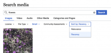
One clarifying point: for other menu items Select state has an additional indication that the item is, in fact, selected - the font becomes blue when the option is selected.

For example, selecting, "Sort by:Relevance" is a default option and opening the drop down menu a user would see the blue font and blue highlight.

defaultselected
Screen Shot 2022-01-13 at 4.22.44 PM.png (760×1 px, 1 MB)
Screen Shot 2022-01-13 at 4.35.52 PM.png (724×1 px, 399 KB)

Notice that Sort by:Relevance label will be never displayed blue indicating that it's a default state.

"All" option never displays blue font, only the highlight. @Sneha that how it was intended?

Screen Shot 2022-01-13 at 4.22.56 PM.png (862×1 px, 1 MB)

The BLUE is set to indicate that the item is currently on focus not that it is selected.

So for example, if you click on the all dropdown and click the "down arrow" you will notice that ALL will become blue now, but if you click on the reference and click the down arrow, because reference is actually focused the blue font will move to the second entry Recency.

The reason why they worked differently is that the first few dropdown are "preselecting" the first item as the Default, but the last one actually has a value of "reference" set..

So to summarise, the first few values show ALL as the default, while the last one has the actual value "Reference" set. Happy to change if you want them aligned, but I wanted you guys to know the main difference for this

The BLUE is set to indicate that the item is currently on focus not that it is selected.

The reason why they worked differently is that the first few dropdown are "preselecting" the first item as the Default, but the last one actually has a value of "reference" set..

So to summarise, the first few values show ALL as the default, while the last one has the actual value "Reference" set. Happy to change if you want them aligned, but I wanted you guys to know the main difference for this

I agree - "All" option is not actually selected, so then the blue font is probably not needed. I asked only to verify that we ok with the current design.

To summarize the present state with "All" filter being selected/focused on (for @Sneha).

(1) default state - a user has not yet made any selection.

a user clicks on the drop-down License menu - All licenses option has blue background indicating that it's selectedclick the keyboard down arrow to start navigating to different menu options- the blue font indicates that the option is focusednavigate to "Use with attribution" - "All licenses" is still selected (with the blue background)
Screen Shot 2022-01-20 at 1.49.11 PM.png (910×1 px, 96 KB)
Screen Shot 2022-01-20 at 1.49.23 PM.png (898×1 px, 99 KB)
Screen Shot 2022-01-20 at 1.49.38 PM.png (1×1 px, 110 KB)

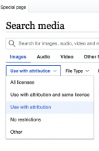
(2) a user selects an option other than "All" - in the example below it's "Use with attribution". When in the scenario (1), a user navigates with the keyboard to "Use with attribution" , a user presses Enter. The option *"Use with attribution" becomes selected (the blue background) and focused (the blue font).

Screen Shot 2022-01-20 at 2.03.21 PM.png (972×638 px, 84 KB)

The bottom line: the "All" filter never displays persistent selected and focused state as other options do. The blue background and the blue font for "All" options will be displayed only on hover-up or when a user navigates options with the keyboard. The issue is quite minor though.

Based on the conversation with @Sneha I'm re-opening the task (and moving to Ready for Development). The following spec in the task description was not yet implemented:

The visual treatment for the select state should be similar to how the "jpeg" is selected in the example below.

Selected State for Filters.png (1×1 px, 2 MB)

It looks the same to me @Etonkovidova

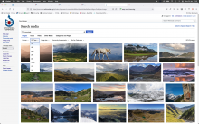
Screenshot 2022-01-24 at 11.49.21 (3).png (1×1 px, 2 MB)

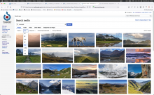
Screenshot 2022-01-24 at 11.50.52 (3).png (1×1 px, 2 MB)

Am I missing something?

Change 756984 had a related patch set uploaded (by Simone Cuomo; author: Simone Cuomo):

[mediawiki/extensions/MediaSearch@master] Show Active state on Default item

https://gerrit.wikimedia.org/r/756984

I'm a little confused about whether all remaining issues are dealt with (mostly because I'm confused about what those are)

AFAICT, this last patch fixed keyboard navigation for the first/default element. That works well now, and patch is merged.

I'm not sure exactly what the reported visual differences are that still needed fixing:

  • IDK what "bolded text" needs to be fixed? The items inside the dropdown are not bold; the dropdown label is, but I suppose we don't want that first the default "all" case, and it not being bold is intentional.
  • the only visual different that I could find, is that selected items, upon expanding the dropdown, have a blue text color (until one starts to hover other items); the initially selected default "all" item remains black. This is still the case.

Change 756984 merged by jenkins-bot:

[mediawiki/extensions/MediaSearch@master] Show Active state on Default item

https://gerrit.wikimedia.org/r/756984

I'm a little confused about whether all remaining issues are dealt with (mostly because I'm confused about what those are)

AFAICT, this last patch fixed keyboard navigation for the first/default element. That works well now, and patch is merged.

I'm not sure exactly what the reported visual differences are that still needed fixing:

  • IDK what "bolded text" needs to be fixed? The items inside the dropdown are not bold; the dropdown label is, but I suppose we don't want that first the default "all" case, and it not being bold is intentional.
  • the only visual different that I could find, is that selected items, upon expanding the dropdown, have a blue text color (until one starts to hover other items); the initially selected default "all" item remains black. This is still the case.

pinging @Sneha @SimoneThisDot and @Etonkovidova, do you know the answers to @matthiasmullie's questions? I don't have an understanding of what work remains here either.

Hi @matthiasmullie,

I do apologise, but I had some uncommitted changes locally, so you were right to say that there was no difference.

As suggested by Sneha, I have applied the Active State (blue text) also to the default filter entries (The first entry of the dropdown).

Before:

  • The first entry of the dropdown had the blue background (selected), but it did NOT have blue text (active)

NowL

  • The first entry is both active and selected.

Change 759701 had a related patch set uploaded (by Simone Cuomo; author: Simone Cuomo):

[mediawiki/extensions/MediaSearch@master] Add the Active State for the \"deafult\" entry

https://gerrit.wikimedia.org/r/759701

@CBogen @matthiasmullie What @SimoneThisDot said covers all the issues. How can we review the changes on interface?

Change 759701 merged by jenkins-bot:

[mediawiki/extensions/MediaSearch@master] Add the Active State for the \"deafult\" entry

https://gerrit.wikimedia.org/r/759701

Checked on commonswiki wmf.21 - 'All' filter is displayed as active and as selected:

Screen Shot 2022-02-09 at 5.15.31 PM.png (1×1 px, 722 KB)