Page MenuHomePhabricator

ToC: Interaction between ToC and collabsible sidebar (design spike)
Closed, ResolvedPublic

Authored By
ovasileva
Jan 10 2022, 6:21 PM
Referenced Files
F34939583: Screen Shot 2022-02-01 at 10.17.30 AM.png
Feb 1 2022, 3:28 PM
F34939564: Screen Shot 2022-01-31 at 2.36.22 PM.png
Feb 1 2022, 3:28 PM
F34934602: image.png
Jan 28 2022, 11:57 PM
F34934610: image.png
Jan 28 2022, 11:57 PM
F34934685: image.png
Jan 28 2022, 11:57 PM
F34934407: pin-able menus wide.webm
Jan 28 2022, 5:58 PM
F34931863: image.png
Jan 26 2022, 6:01 PM
F34931819: image.png
Jan 26 2022, 6:01 PM

Description

Background

Vector currently shows a main menu to the left of the article (for LTR languages). Our recent changes to the table of contents have moved the table of contents to the left of the article, creating a problem where the main menu and the ToC occupy the same space. Currently we don't have a good solution here; if you open the main menu it overlaps/hides the ToC.

Goal

The goal of this task is to find a solution that resolves the overlapping main menu and ToC.

Acceptance criteria

  • TBD

Event Timeline

ovasileva triaged this task as Medium priority.Jan 10 2022, 6:21 PM
ovasileva created this task.
ovasileva raised the priority of this task from Medium to High.

I enabled the addon to try the new TOC to give feedback. It generally looks nice but the interaction with sidebar is quite annoying atm, I was struggling to find TOC for a while until I realized it's fully hidden behind the sidebar that I keep open almost all the time (and I think it's my default).

The first question that comes to mind for me here is: do people need persistent access to the main menu (i.e. does it need to be able to open as a sidebar, and remain open)? Or would it be okay if people accessed the main menu in a way similar to how they access the new user menu, open it up, click a link, and then it closes?

Something to consider within this is that we will hopefully be moving the page tools out of the main menu. If we do make this change, how would that affect the question above?

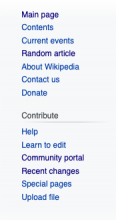
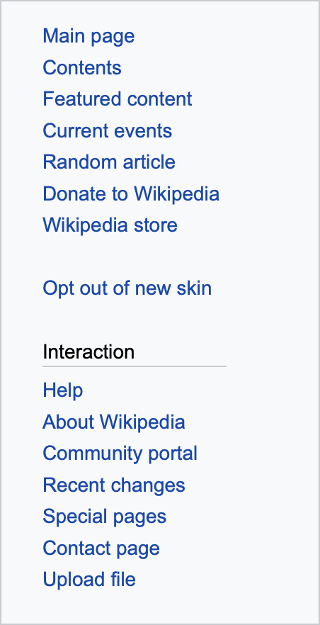
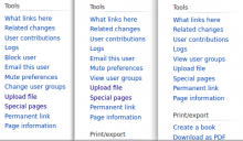
current main menupossible future main menu
Screen Shot 2022-01-22 at 9.48.03 AM.png (718×173 px, 48 KB)
Screen Shot 2022-01-22 at 9.49.02 AM.png (329×174 px, 21 KB)
Persistent access

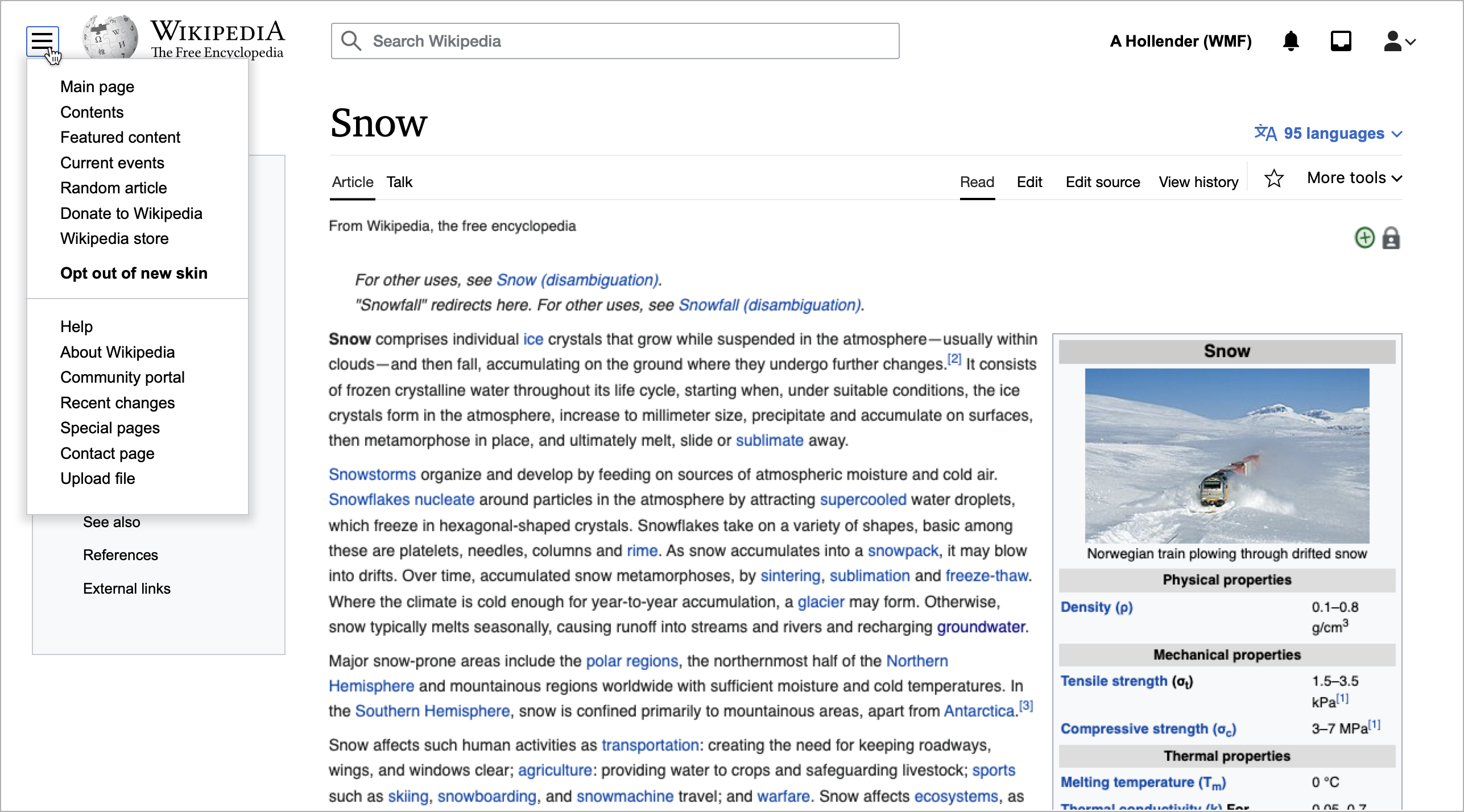
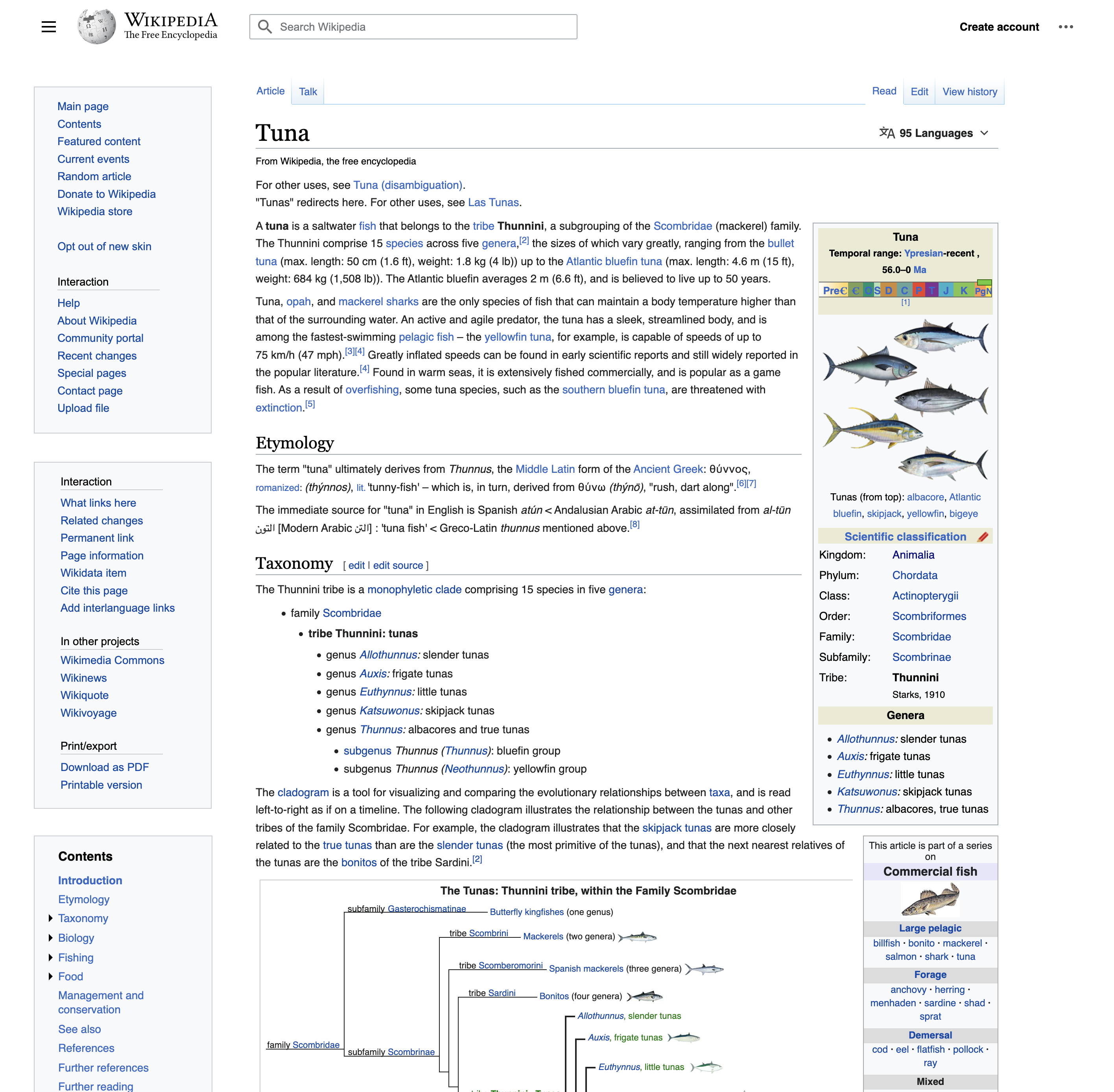
If we decide that people do need persistent access to the main menu we will have to figure out a way to present both the main menu and the table of contents at the same time (without them overlapping, as they do currently). This prototype (link) is a basic proof of concept that allows for both elements to be persistent on the screen at the same time. When you click the hamburger icon the main menu appears and pushes the table of contents down below it. As you scroll down the page, past the main menu, the table of contents sticks to the top of the screen. The obvious downside here is that when the main menu is open the table of contents is not visible at the top of the page, though this would change if we move the page tools out of the menu, as mentioned above.

Popover menu

If we decide that people do not need persistent access to the main menu we can simply render it as we do other menus (such as the User menu, or the ULS). Clicking the hamburger button would open the menu, and then whenever someone clicked a link within the menu (and navigated to another page) the menu would close. Alternatively clicking the hamburger menu again, or clicking anywhere on the page outside of the menu, would also close it. This is a basic prototype of that solution: link to prototype. This menu feels a big awkward because it is so long, however again if we mo

I think both options are fine.

I think it's fine putting the table of contents under the sidebar and using position sticky. I can always close the sidebar if I need to view the table of contents and it's a persistent setting so that works well for me. Right now the sidebar is open by default for anonymous users, but perhaps we want to change that as part of introducing the table of contents to help with that use case. From a development point of view that's definitely the easiest.

Regarding popover the existing behaviour does feel kind of strange. Perhaps Nirzar's 2017 designs for Minerva may be worth considering if we take that approach: T171701

In T298900#7644702, @alexhollender wrote:

@RHo @ovasileva @Jdlrobson curious to hear any thoughts on the comment above...

I also think both of these make sense to me as well. For logged-in users, providing persistent access to both elements might be important. We will gauge the priority of this once we're ready with analyzing the feedback from our last round of prototypes

In T298900#7644702, @alexhollender wrote:

@RHo @ovasileva @Jdlrobson curious to hear any thoughts on the comment above...

I think both options address a key issue of the ToC not being very discoverable at all currently when the sidebar open, though for both further visual explorations would be good as it seems in option 1 the ToC and menu being styled the same was slightly confusing at first, and whilst in option 2 the popover is differentiated much more from the ToC, it also feels slightly disjointed from the Wikipedia menu.

It is early days but I suspect that we may wish to enable customisation for those who want to continue with a persistent sidebar, which makes me lean towards option 1 as the path to iterate design on.
Finally, a stray question is how important it is for the "Donate" link to remain persistent?

after discussions with @ovasileva and @RHo I realized it might be helpful to zoom in a bit on the contents of the main menu, and split it in two (according to what I understand to be the functionality). if we do this we end up with three menus (including the Table of contents) that all need a home:

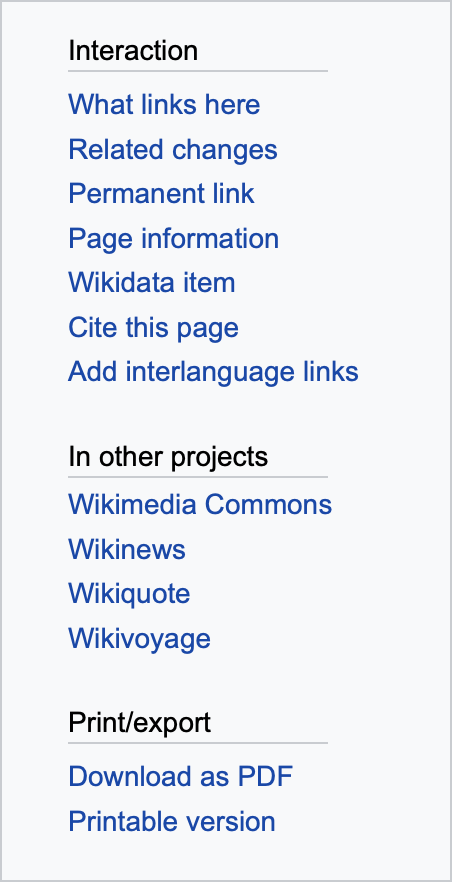
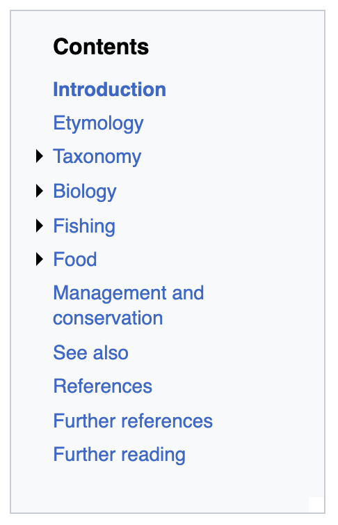
main menu (global navigation)article tools menu (page-specific navigation)table of contents menu (page-specific navigation)
image.png (882×452 px, 135 KB)
image.png (882×452 px, 143 KB)
image.png (754×486 px, 80 KB)
relevant for readers & editorsrelevant mainly for editors, some reader utility (print, etc.)relevant for readers & editors
I'm not sure persistent access is necessarypersistent access seems usefulpersistent access seems useful

Currently the main menu and the article tools menu are combined (and intertwined). I think it might be helpful to start thinking of them as two separate things as we aim to find appropriate homes for all three of these things. Starting with the longer term, I imagine something like this (which allows the ToC and the Article tools menu to be persistently available on screens larger than ~1600px):

below 1600px widthabove 1600px width
image.png (1×2 px, 2 MB)
image.png (1×3 px, 2 MB)
image.png (1×2 px, 2 MB)
image.png (1×3 px, 2 MB)

In the shorter term we could do solution 1 described in T298900#7642319, which provides persistent access to both the ToC and Main+Article tools menu. We could also consider splitting the Main menu and Article menus apart, which wouldn't really have any impact on functionality, but might help get people ready for the eventual split. That might look like (with the ToC sticking to the top of the page once you have scrolled past the other two menus):

image.png (2×2 px, 2 MB)

Thanks for prototyping many possibilities! My thoughts:

  • "global navigation" links
    1. I generally agree that on Wikipedias, these might not require persistent access. However, I think there are 2 exceptions:
      • "Random article" - This is something that many readers will click multiple times in a row (until they find one they want), expecting to not have to move their mouse/finger. (I recall there were some ideas about moving this link into the "search box" area as a dice [die] icon)
      • "Help" - I believe these links are helpful to always have prominent. Both to encourage new contributors, and to inform curious readers.
    2. On other projects, this might be different. E.g.
      • On Wikidata, there are core workflow assistants in this area of the sidebar ("Create a new Item" and "Create a new Lexeme")
      • Similar complexities at MediaWiki-wiki and Meta-wiki
  • "article tools menu" links
    • I agree these need persistent access, for both readers and editors.
    • The "Cite this page" link, and the "In other projects" links, are especially useful for readers (potentially).
    • The "Block user" link is crucial for admins. Other editors need constant access to the "What links here" or "Wikidata item" links. etc.
  • a new Layout idea:
    • I'd be curious to see a mockup with:
      1. The "table of contents menu" at the top-left
        • and shown in both the collapsed and the fully-expanded states,
        • for an article with many headers and/or subheaders (e.g.1 and/or e.g.2 and/or e.g.3)
        • for an article with few or zero headers (e.g.1 and/or e.g.2)
      2. The "article tools menu" links below the ToC
      3. The "global navigation" links collapsed
    • However, I'll note one core drawback of having the ToC at top, would be that each of the "article tools menu" links would no longer be in a consistent location from page-to-page, thus frustrating my muscle-memory. This is especially important for admins who need rapid and reliable access to the "Block user" links
  • Re: idea of placing the "article tools menu" on the right-hand side (if the window is wide-enough)
    • I would hesitantly discourage this,
    • on the other hand, it would partially solve the "consistent location" issue mentioned above
    • This whole topic touches on the issue of "user-created tools", and where/how we want to make them most easily accessible...
  • Blue vs Black link text
    • In some of the mockups, I see some black-text which is actually a link. I strongly caution against this design-pattern, because it makes "all black text a potential link" leading to users needing to mouseover/tap everything they think might be a link. Links should almost always be blue, but especially if they're within a menu that includes non-links.

Hope that helps!

Thanks for expounding on your thoughts for future @alexhollender_WMF and I agree that for this task solution 1 does seem more suited where there is allowance for persistence of the sidemenu in its current state, esp. as @Quiddity makes a good point that other projects may have more need to maintain the persistent sidebar items over the ToC.
In that case I wonder if it might be beneficial to separate the re-structuring and movement of sidebar menu items into a separate future task?

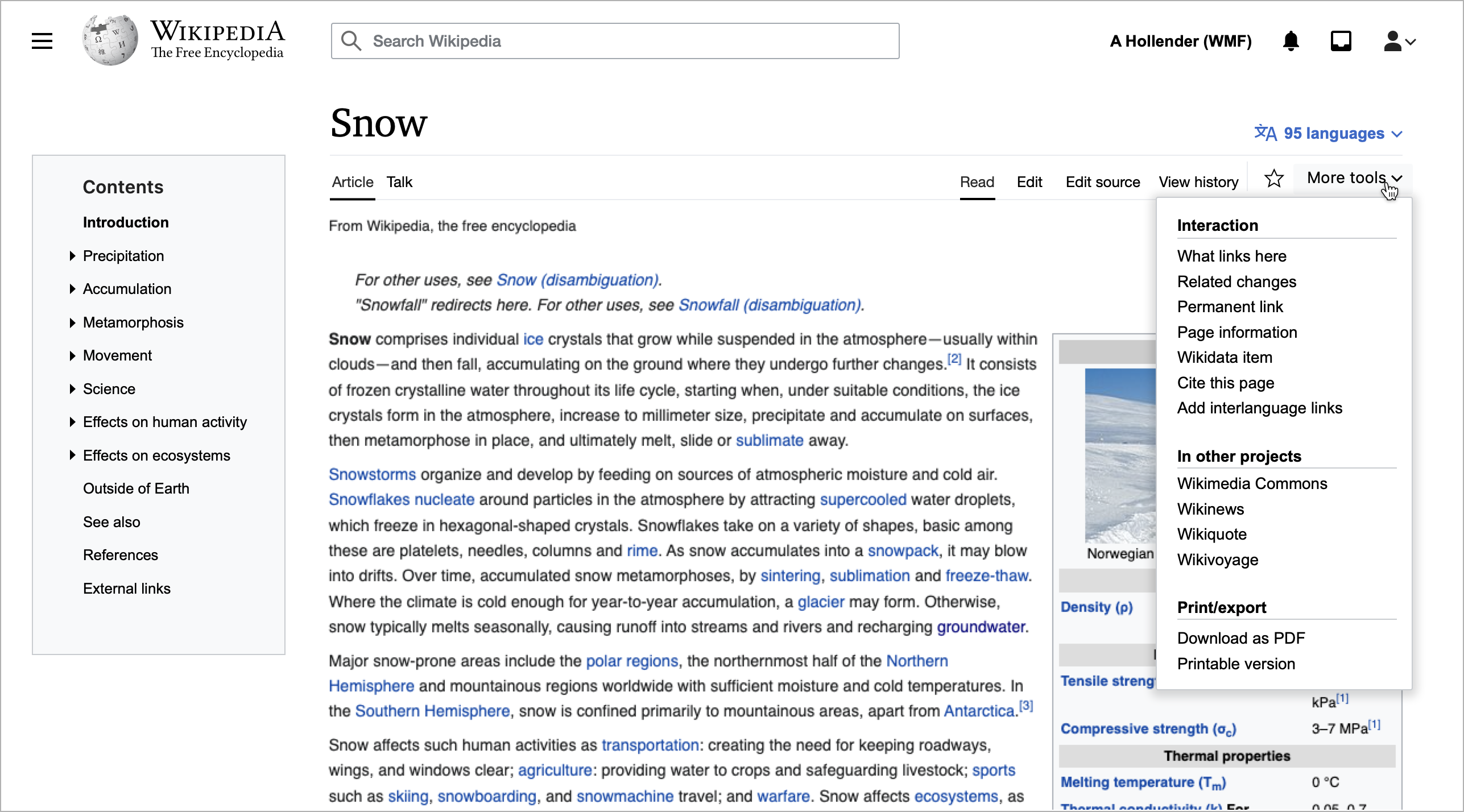
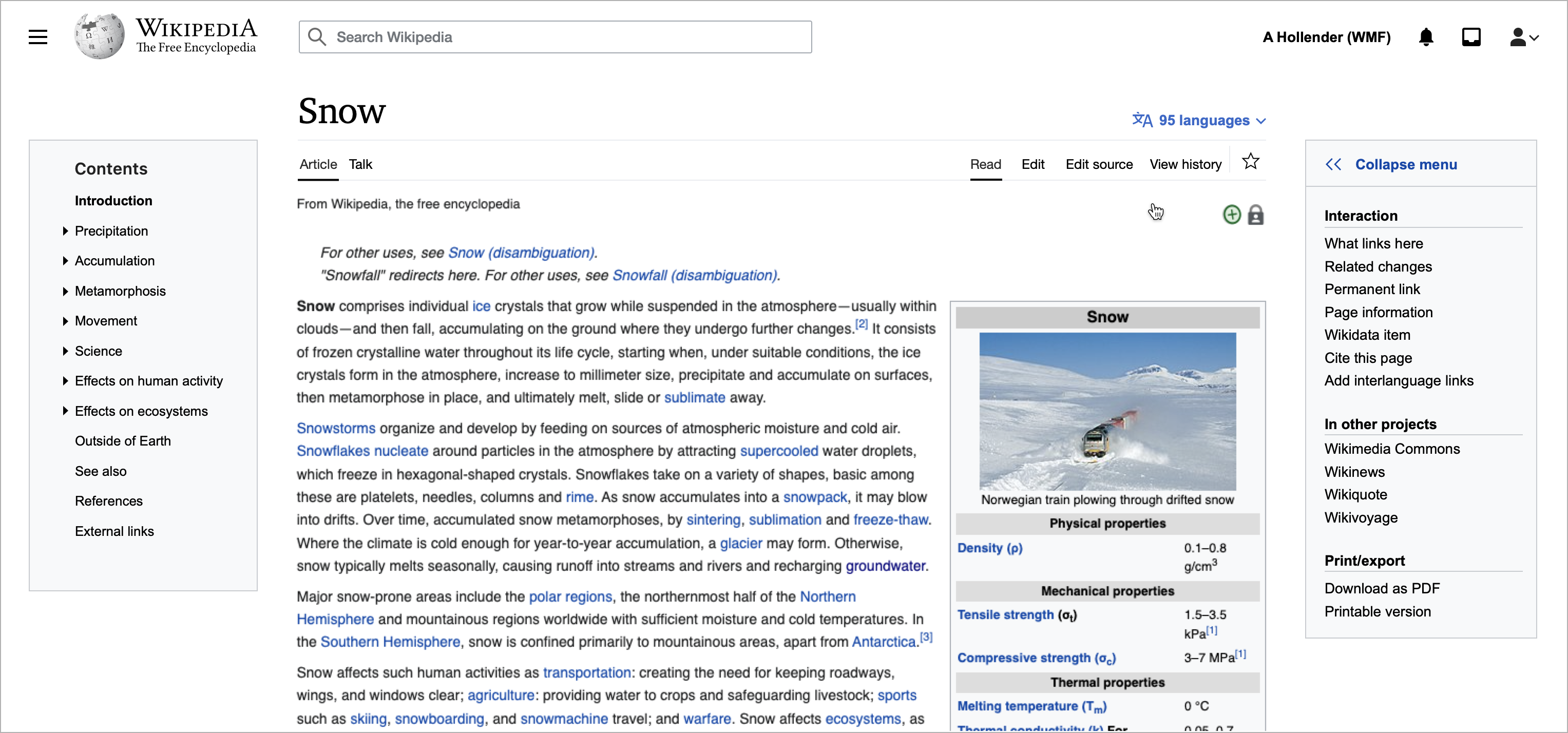
Thanks so much for the detailed feedback and considerations here @Quiddity. Following from some points you and others have raised (in this task, and in offline conversations), this new sketch/prototype:

  • allows for the Main menu and the Article tools menu to be "pinned" and therefore persistently accessible
  • assumes that the default state on Wikipedia would be for both menus to be collapsed and that people who want them persistently will manually pin the menus (ideally this would be configurable per-projects, such that other projects could choose for the default state to be pinned for logged-out and logged-in people)
  • places the article tools menu on the opposite side of the article from the table of contents
    • @Quiddity can you clarify what you mean by "it will create more inconsistencies in what each user sees, which complicates all written-documentation and many user-support questions"? As I understand it this would be true regardless of where the menus are, assuming they are somewhat modular/collapsable/hide-able
    • one drawback of this is that for smaller windows the article content gets squeezed between the left-sidebar (ToC, and sometimes Main menu) and the right-sidebar (Article tools). However this would be a person's choice, so maybe that's okay. Alternatively we could only allow for pinning of the Article tools menu once the window is wider than, say, 1500px (i.e. a width that we feel doesn't result in the article being squeezed too much when the menu is pinned).
Link to prototype


@ovasileva @Jdlrobson @RHo @KieranMcCann — it would be great if you all could take a look at the prototype above : )


Regarding the Article tools menu: one thing that stands out to me, particularly when considering things from a reader/learner perspective, is the potential benefit of the "In other projects" links. I can see the possibility of positioning those as this sort of "Explore more" or "Go deeper into this topic" type of experience, which feels different to me than so-called "tools". The tools are important and useful no doubt, but I'm not sure they offer the same type of opportunity to deepen your learning/exploration of a topic as much as the "In other project" links do. This prototype does not treat them differently/special, though I will follow up with another idea of how that could look/work.


@Quiddity regarding link color: I'm inclined to defer this to the Codex team. With OOUI we're already in a situation where buttons/links are sometimes black, and frameless (e.g. see Recent changes). I think this is a complex consideration; for example the boundary between a link and a button, which I think is central to this discussion, is not easy to draw. My personal opinion is that context is the key here: if you open a menu and each option is shown in black text (as with most operating systems) it is probably clear they are links/buttons/click-able, and I don't think that this results in people thinking that any text is click-able.

Re: Page-tools menu - Just to reiterate, these tools vary depending upon which namespace we are looking at, and our user-rights. E.g. Looking at a userpage, Admin/User/Logged-out will see:

image.png (281×482 px, 37 KB)
and that "block user" link is crucial for admins. That section also contains many gadget-links that editors use throughout their days, such as CropTool on Commons.

Re: New prototype - I like the idea of personal configurability, but I think it needs to be adapted for a much wider-variety of screen sizes - Some of those page-tools must be permanently and instantly accessible, even if I'm on a smaller screen laptop, or have my browser-window not-maximized.

Re: inconsistencies - Yeah, I should have omitted that point, sorry! (Yup, it would apply "regardless of where the menus are, assuming they are somewhat modular/collapsable/hide-able" - I guess I was just stating this as 'a thing to be reminded of', and not something that is solvable. -- Related to how I love a multitude of preferences, but also acknowledge they have inherent drawbacks!)

Re: link color - I believe this is really important, so I'll write some details. :)

  • People are more likely to click things that obviously look like links (i.e. without having to subconsciously deduce it from context).
  • During the 2014 Typography refresh, one of the beta-feature iterations included changing all the sidebar links from blue to black (screenshot), and there was a lot of negative feedback (example thread 1, and example thread 2).
  • When a list of items includes both non-link-headers and linked-list-items, and they are both styled with black text, and the rest of the site uses blue for text-links, some people will try to click the first heading in case that is a link. (e.g. "Interaction" and "What links here"). They will then be uncertain about other black text. E.g. which part of this are we encouraging people to click on? F34934602
  • Related example: In this section, find the first link....: https://meta.wikimedia.org/w/index.php?title=Brand/logo&oldid=22700355#Wikipedia_and_Wikimedia - We can only find it if we mouseover/tap half the sentence! That's confusing.
  • Another example: In this screenshot - F34934610 - I can see a clear differentiation between text that will take me to a different page, vs. text that will open a drop-down menu. (Relatedly: I think the Personal Tools (toolbar, and dropdown menu entries) links should be blue, and buttons are fine in black. One will take a few seconds to send me elsewhere (and a few seconds to go back), the other will just open a flyout window.)
  • I can understand and even agree with the perspective that the design is aesthetically improved by using black as the color for links (in various places), but I think it almost always negatively affects the usability.

hi @alexhollender_WMF - thanks for sharing the new pinning iteration on solution 2. While I like the direction this newer solution 2 in giving users control to persist the popover side-menu by pinning it (or presumably setting it as their default), ultimately I still prefer solution 1 as the less fussy solution. By less fussy I mean that there is no additional mental decision for the person to decide "I should pin this", and there is only one button toggle to open and close the side menu, whereas in this new pinning version the menu button next to the Wikipedia wordmark becomes inactive when the menu is pinned.

I do think it would make sense to separate out the discussion of moving article tools out of the side bar into another task. Firstly, this is based on my assumption that this main menu will in the initial iteration still contain all the article tools, in which case it seems important to include all the menu items in the design assessment. (solution 2 for example looks a lot neater when it's such a short list of items on the side menu). Secondly, I am not yet convinced about the pinned sidebar for article tools for use for that space. As I think @Quiddity brought up earlier in this task, your past explorations with this RHS area to incorporate more prominent or contextual article references could be an as good/better use of this space, or potentially there could be some combination of both (or something else). It seems like there is a richer area to explore there which would benefit from being in another task.

I love the idea of customizable menu locations. It looks like the "pinned menu" idea (in the prototype above) seeks to address some of the needs of admins that @Quiddity mentions (primarily that of having the menu visible at all times) and I think it could be adapted to smaller screens if all the menus are placed in the sidebar area instead of on both sides the article.

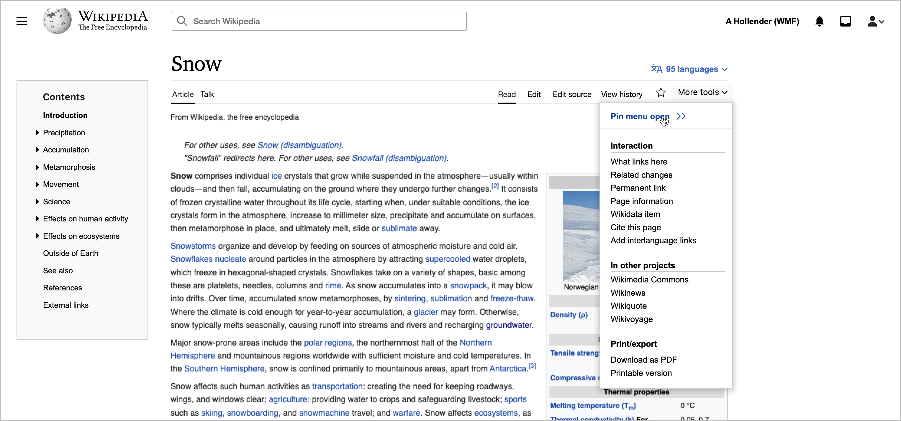
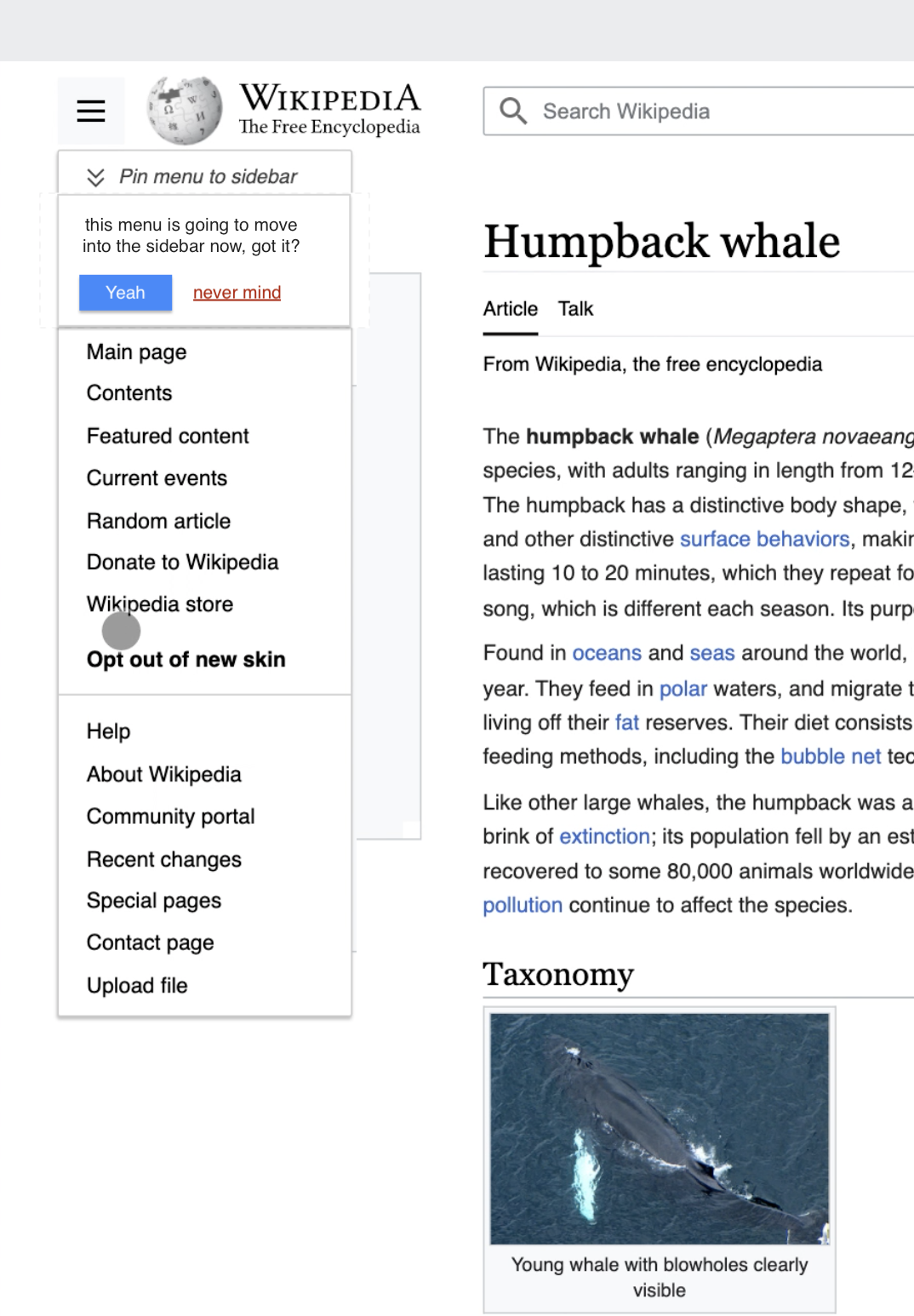
Looking at the prototype, if I were to image that I'm seeing these "pinned menus" for the first time, I'd look at that link and ask myself "what's going to happen if I click that?". I think the button label may not be enough, especially if I click that link by mistake, and suddenly my menu disappears.

I think that interaction might require some more explanation (at least at first), maybe we could add some sort of intermediary or confirmation step to help prepare people for what's about to happen (given this is quite a novel behaviour).

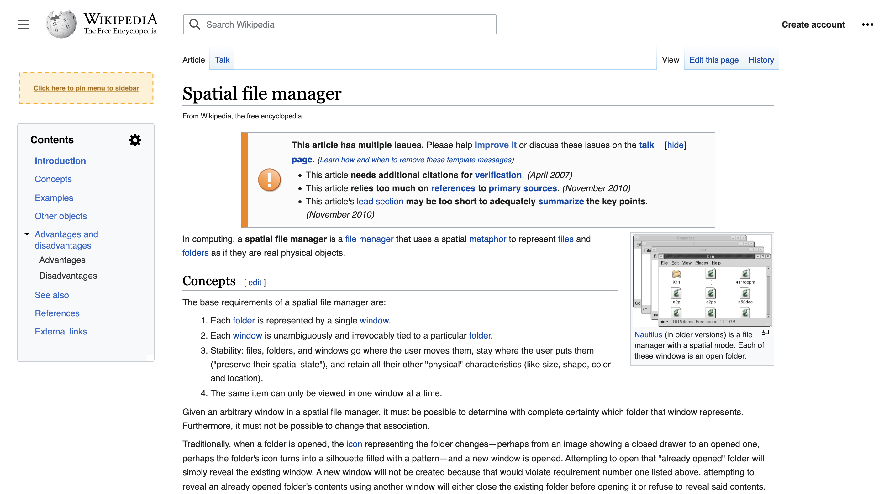
Screen Shot 2022-01-31 at 2.36.22 PM.png (1×2 px, 655 KB)
Screen Shot 2022-02-01 at 10.17.30 AM.png (1×1 px, 726 KB)
e.g. if after clicking 'pin menu to sidebar" you actually have to physically click on the place you want the menu to go:or, maybe we can show some sort of dialog the first time someone tries to pin a menu.

@RHo thanks for the continued evaluation and feedback here. I agree with you that this is (at least) a two-part change and that it makes sense to separate the second part into a separate task (T300673).

For now it seems like we've got a decent short-term solution (the Persistent access option from my initial comment): https://di-toc-with-menu-above.web.app/Tuna

The pinning feels a little overcomplicated to me. I think the dropdown without pinning will be unpopular since it requires a scroll to the top of the page, and by design hidden by default.

I like the behaviour you've got in https://di-toc-with-menu-above.web.app/Tuna feels right
Coupled with the persistence behaviour of the sidebar (open or closed is based on last view) I think this gives the best of both worlds. I think later, the sidebar could be hidden by default for anons or will be a lot shorter with the other changes you are proposed so I'm not too concerned about reade s not being able to find the table of contents in the long term.

as a first step we've decided to move forward with the version where the entire menu opens above the ToC, task here: T300875

alexhollender_WMF renamed this task from ToC: Interaction between ToC and collabsible sidebar to ToC: Interaction between ToC and collabsible sidebar (design spike).Feb 3 2022, 3:52 PM