After reviewing Add a link funnel data, we reevaluated the risk of the design change on T264460: Enable users to open the first suggested article directly from the mobile task preview as being a new vector for bouncing in an already lower performing mobile onboarding funnel.
We want to revert the change as we value providing a clearer path to browsing and selecting a newcomer task for the majority of users, more so than the minority of folks who would save one page load because they wanted to choose the first task in the feed from the homepage.
This task is to roll back the change, but to keep the improved CTA design added by @Sgs:
Mobile 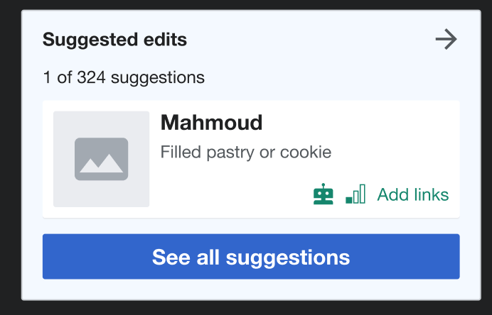 | Tablet  |
Expected behaviour: Selecting any part of the preview module (including the task first task and button) will open the Suggested edits module.